
Imagine walking into a space that feels like a breath of fresh air, where the colors of nature seamlessly blend with architecture. These ideas are all about bringing the outside in, creating spaces that are both calming and invigorating. Are you ready to be inspired by the beauty of natural palettes?
1. Earthy Tones

Think of the rich browns of soil, the soft greens of moss, and the warm yellows of the sun. These colors can make a room feel cozy and grounded. Use them in paints, fabrics, or even furniture.
The beauty of earthy tones is their versatility. They can be used in living rooms for a welcoming feel or in bedrooms to promote relaxation. Add a splash of white to keep it fresh and modern.
Embrace these tones with wooden furniture or clay pots. They are cost-effective and timeless, perfect for any budget.
2. Sea-Inspired Blues

Blue is calming, like the ocean on a clear day. It can turn any room into a serene oasis. From light sky blues to deep navy, the options are endless.
Mix blue with sandy beige or crisp white for a beachy vibe. This combination is perfect for bathrooms or bedrooms. Add seashells or driftwood for extra charm.
Use blue in small accents or go bold with a feature wall. It’s a popular trend that never goes out of style.
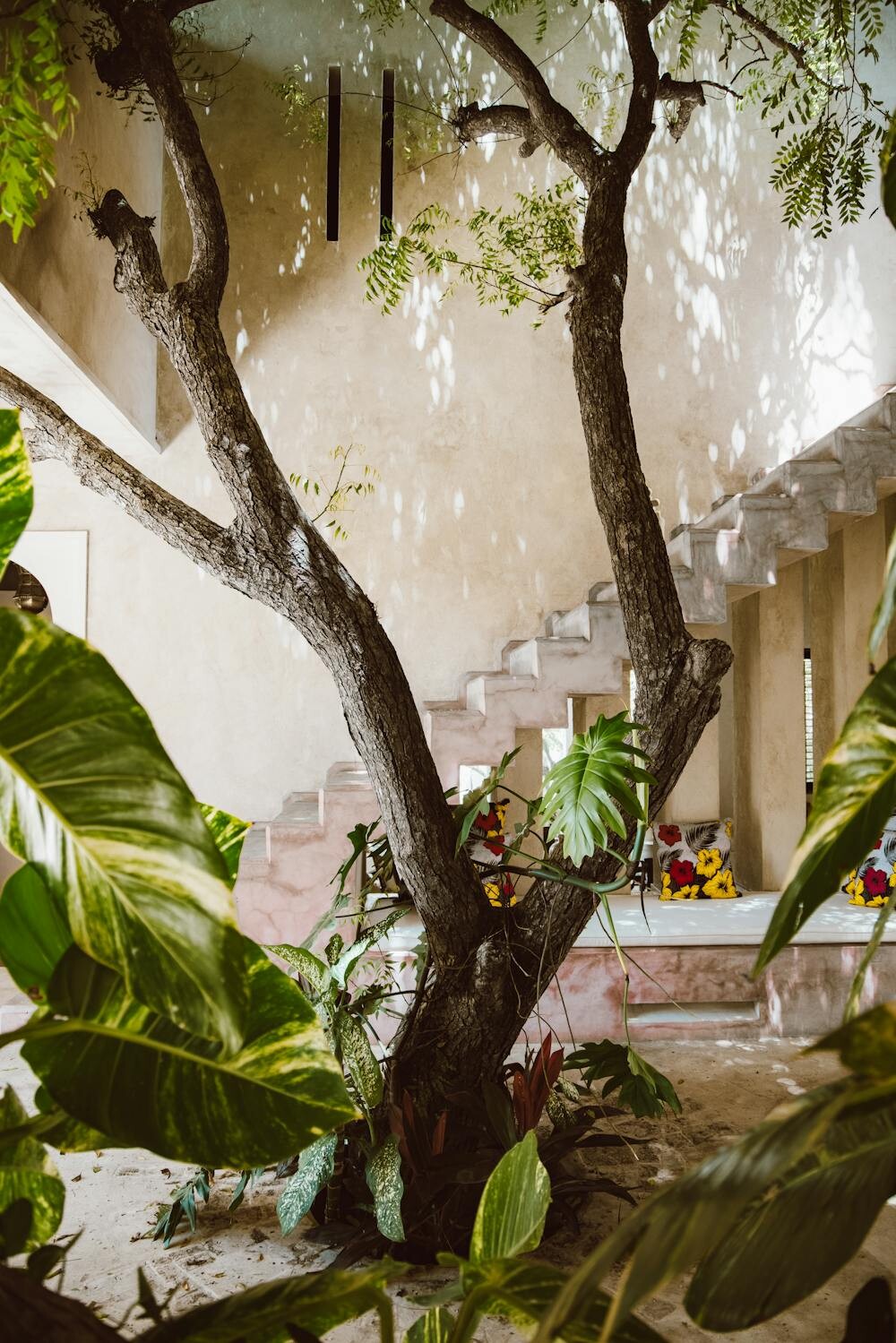
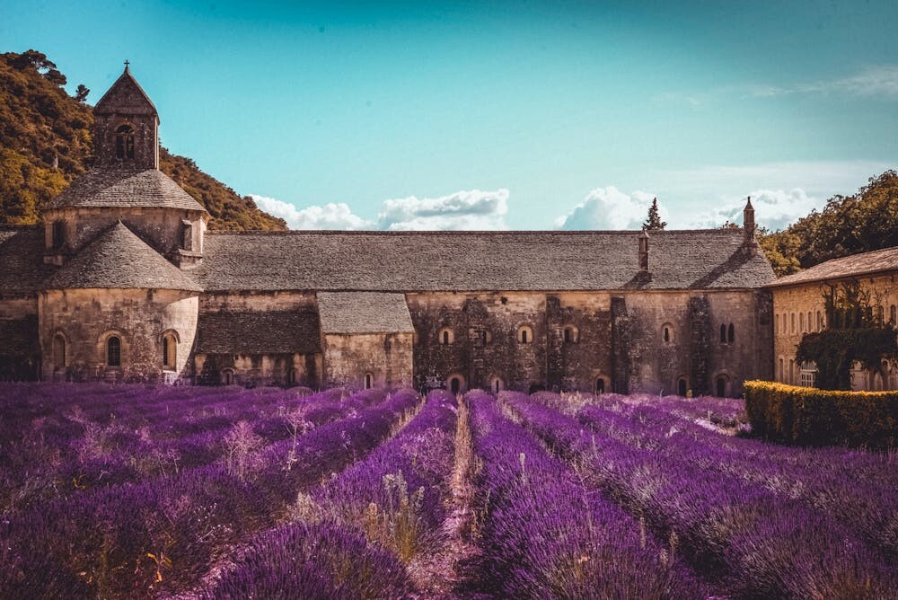
3. Forest Greens
Green is the color of life and renewal. It brings the freshness of the outdoors inside. Perfect for those who love nature.
Pair forest greens with natural woods for a harmonious look. This color is ideal for home offices or reading nooks, promoting focus and calm.
Incorporate greenery through plants or green-tinted glass. It’s an affordable way to add life to your space.
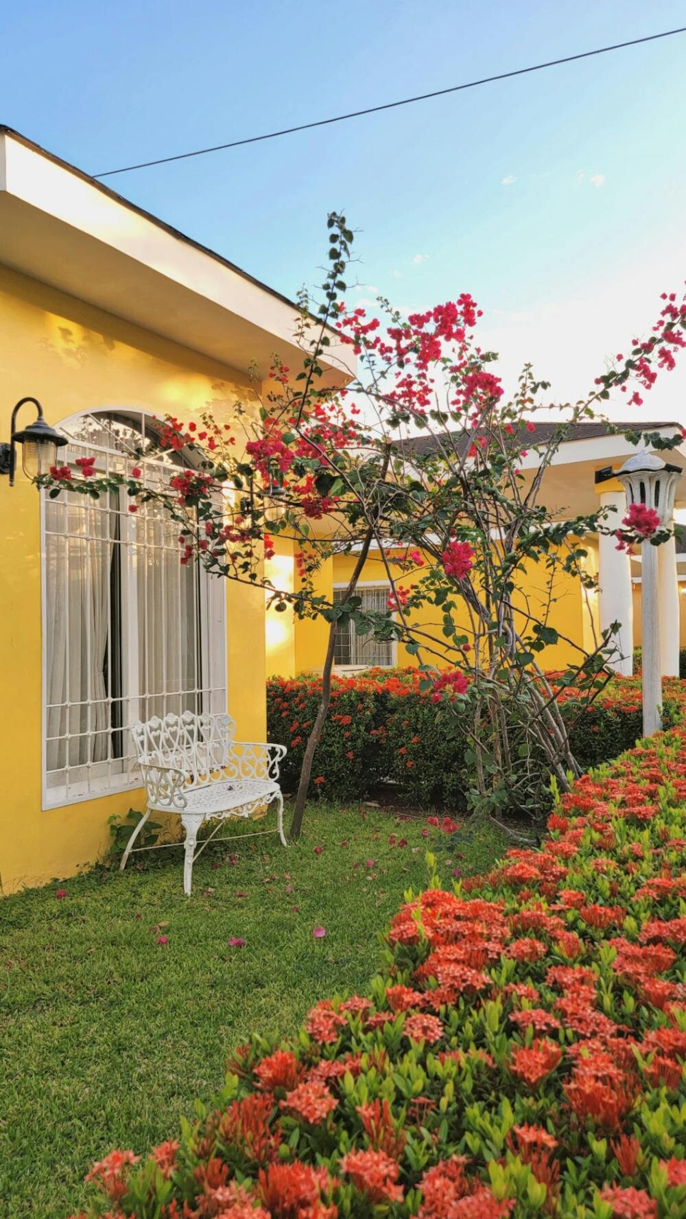
4. Sunset Oranges

Orange is vibrant and full of energy, like a sunset at the end of a perfect day. It can warm up any room and make it feel inviting.
Use orange in dining rooms or kitchens to stimulate conversation and appetite. Pair with soft browns or gold for a sophisticated touch.
Small accents like cushions or artwork in orange can be a cost-effective way to brighten up a space.
5. Stone Grays
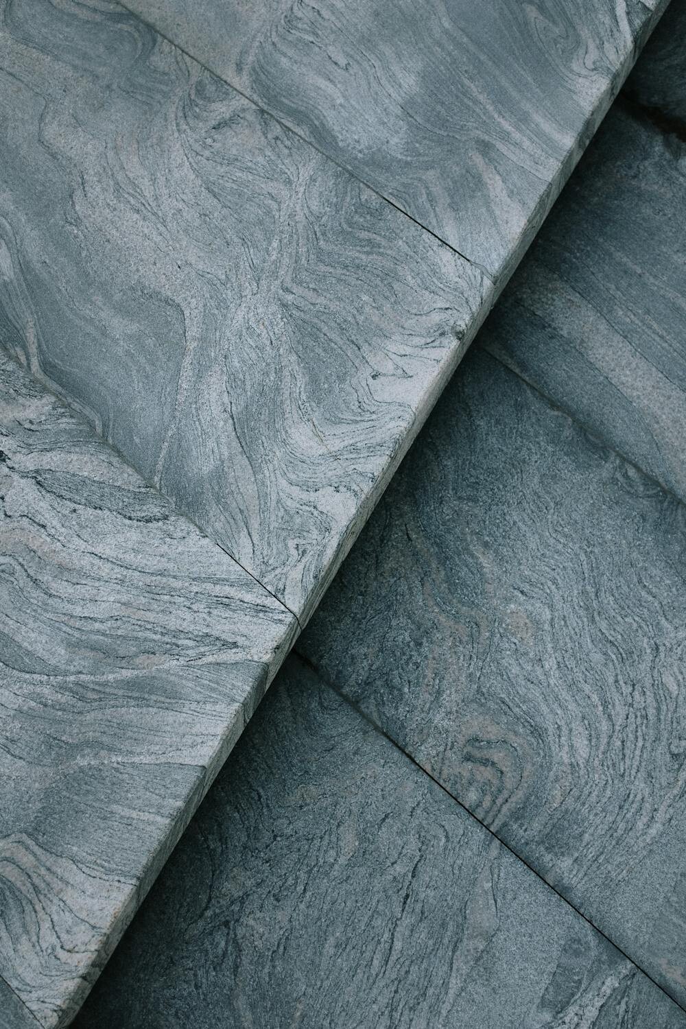
Gray is elegant and timeless. It mimics the cool tones of stones and rocks, creating a neutral backdrop for bolder colors.
Great for modern spaces, gray can be used in any room. It pairs beautifully with silver or metallic accents for a sleek look.
Add texture with gray wool throws or stone sculptures. It’s a chic option that suits any budget.
6. Warm Terracottas
Terracotta is earthy and warm, reminiscent of clay and sun-baked tiles. It adds a rustic charm to any space.
Perfect for living rooms or patios, terracotta creates a cozy atmosphere. Pair it with off-white or soft green for a balanced look.
Incorporate terracotta through ceramic pots or floor tiles. It’s a budget-friendly way to add warmth and character.
7. Soft Sand Beiges

Beige is the color of sand and driftwood, offering a soft and neutral palette. It’s versatile and easy to work with.
Use beige in bedrooms or living rooms for a calm and relaxing vibe. It’s a great base color that allows other colors to pop.
Combine beige with texture, like linen or jute, for a natural feel. It’s a cost-effective way to create a soothing space.
8. Leafy Greens
Leafy greens bring the freshness of a garden into your home. They are vibrant and full of life.
Perfect for kitchens or bathrooms, leafy greens energize and refresh. Pair with white or wood for a crisp, clean look.
Add green through paint, tiles, or plants. It’s an affordable way to make a big impact.
9. Desert Neutrals

Desert neutrals like tan, cream, and soft pinks reflect the calming tones of a desert landscape. They offer a warm, understated elegance.
Ideal for living spaces or offices, these colors create a relaxing atmosphere. Pair with natural fibers for a cohesive look.
Use in textiles like rugs or curtains for a subtle, sophisticated touch. These colors are timeless and budget-friendly.
10. Oceanic Turquoise

Turquoise is fresh and invigorating, like the clear waters of a tropical sea. It adds a pop of color that’s lively yet relaxing.
Use turquoise in bathrooms or kitchens for a refreshing vibe. Pair with white or light wood for a beachy feel.
Incorporate turquoise through tiles, glassware, or small accessories. It’s a vibrant option that won’t break the bank.
11. Mountain Slate

Slate is a deep, moody color, reminiscent of rugged mountain landscapes. It’s bold and sophisticated.
Perfect for feature walls or floors, slate adds drama and depth. Pair with light colors for contrast.
Use slate in tiles or stonework for a luxurious feel. It’s a stunning choice that adds value to your space.
12. Golden Wheat
Golden wheat is warm and sunny, like fields of grain swaying in the breeze. It brings warmth and light to any room.
Ideal for kitchens or dining rooms, this color enhances natural light and creates a welcoming environment.
Use in paint or upholstery for a soft, inviting touch. It’s a radiant option that’s easy on the budget.
13. Cloudy Whites

White is pure and versatile, like fluffy clouds on a clear day. It offers a blank canvas for creativity.
Use white in any room for a fresh, clean look. Pair with wood or metal for a modern touch.
Incorporate white through walls, furniture, or decor. It’s a classic choice that suits any style or budget.
14. Lavender Fields
Lavender is soft and soothing, like fields of flowers swaying in the wind. It’s perfect for creating a calm and peaceful space.
Ideal for bedrooms or nurseries, lavender promotes relaxation and tranquility. Pair with white or gray for a balanced look.
Add lavender through paint, textiles, or flowers. It’s a gentle option that adds a touch of elegance.
15. Rustic Browns
Brown is earthy and rich, like warm soil or aged wood. It adds depth and character to any space.
Use brown in living rooms or studies for a cozy, inviting atmosphere. Pair with green or beige for a natural palette.
Incorporate brown through wooden furniture or leather accents. It’s a durable choice that adds warmth and style.
16. Coral Reefs
Coral is vibrant and lively, like the colorful reefs of the ocean. It adds a bright, cheerful touch to any room.
Ideal for accent walls or accessories, coral creates a playful, energetic vibe. Pair with turquoise or white for a tropical feel.
Use coral in cushions, artwork, or decor. It’s an affordable way to add a splash of fun and color.
17. Smoky Charcoal

Charcoal is deep and mysterious, like smoke rising from a campfire. It adds drama and sophistication.
Perfect for feature walls or furniture, charcoal creates a bold, modern look. Pair with light colors for contrast.
Incorporate charcoal through paint, textiles, or metal accents. It’s a striking option that adds depth and elegance.
18. Sunlit Yellows
Yellow is cheerful and bright, like rays of sunshine. It can make any room feel warm and inviting.
Use yellow in kitchens or living rooms to create a lively, uplifting atmosphere. Pair with white or gray for a fresh look.
Add yellow through paint, accessories, or flowers. It’s a joyful choice that brings happiness and energy to your space.