
Art Deco colors can help a room feel neat, bold, and calm at the same time. These color ideas work well for each season and can fit many home styles.
1. Emerald and Gold for Winter Calm
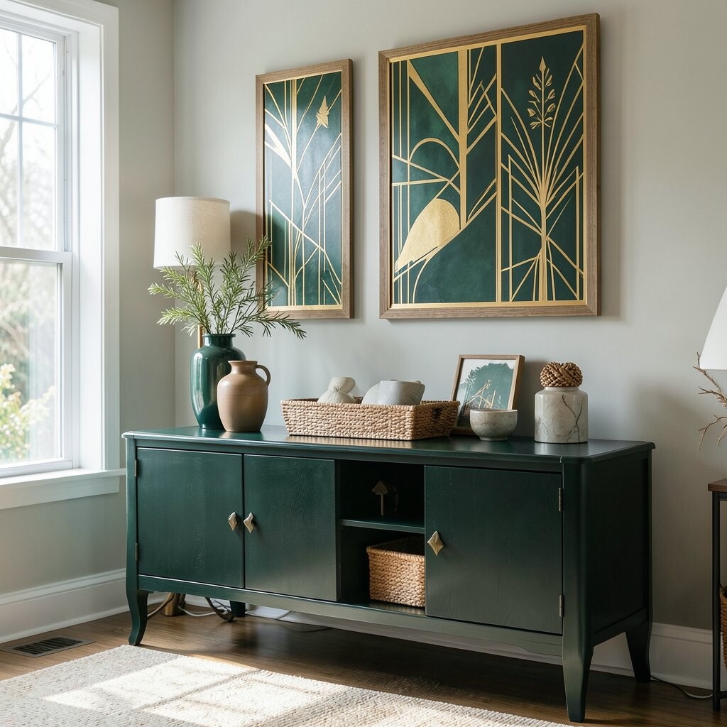
Emerald green and gold make a room feel deep and steady, which fits winter well. The green brings a rich, cool look, while the gold adds a warm shine.
You can use this scheme on pillows, lamps, frames, and small decor pieces. It works well in living rooms and entry spaces because it feels clean and polished without much effort.
This pair is a good choice if you want a look that feels fancy but not too loud. It can also work with low-cost items, since a few green throws or gold candle holders can change a room fast.
2. Ice Blue and Silver for a Fresh Winter Look
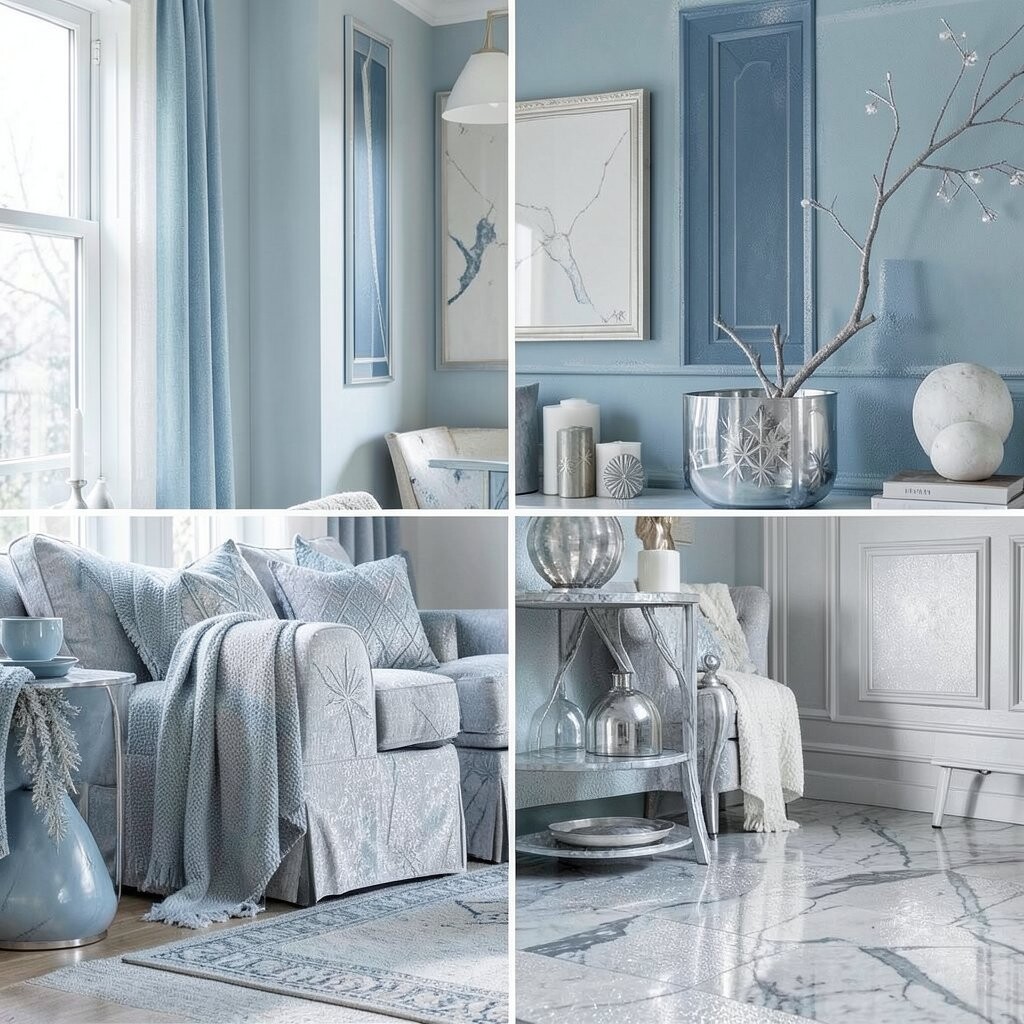
Ice blue and silver give a room a light, crisp feel that suits cold months. The mix can make a space seem open and neat, even if the room is small.
This scheme works well with glass, mirrors, and smooth metal accents. If you want a soft seasonal look, try pale blue blankets, silver trays, and white walls with a few shiny details.
One benefit of this style is that it feels clean without much color weight. It is also easy to match with items you may already own, so the cost can stay low.
3. Blush Pink and Black for Soft Spring Style
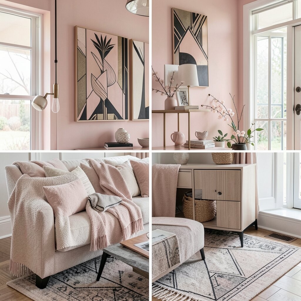
Blush pink and black make a strong Art Deco pair that still feels gentle. The pink adds a soft spring mood, while black gives the room shape and clear lines.
You can use this look in bedrooms, vanity areas, or reading corners. Try pink cushions, black frames, and a lamp with a simple shape to make the style feel planned.
This color scheme is unique because it feels sweet and sharp at once. It also gives you room to make it personal with art, fabric, or old pieces that fit the same look.
4. Mint Green and Brass for a Light Spring Room
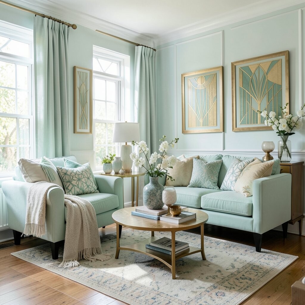
Mint green and brass feel fresh, bright, and easy to live with. The green gives a soft outdoor touch, and brass adds a warm glow that fits Art Deco style.
This scheme works well in kitchens, baths, and sunrooms. You can try mint towels, small brass knobs, or a tray with a clean shape to keep the look simple.
A big benefit is that it feels new without needing a full room redo. It can also be done at many price points, from low-cost decor to more costly hardware and light fixtures.
5. Coral and Navy for a Warm Spring Mix
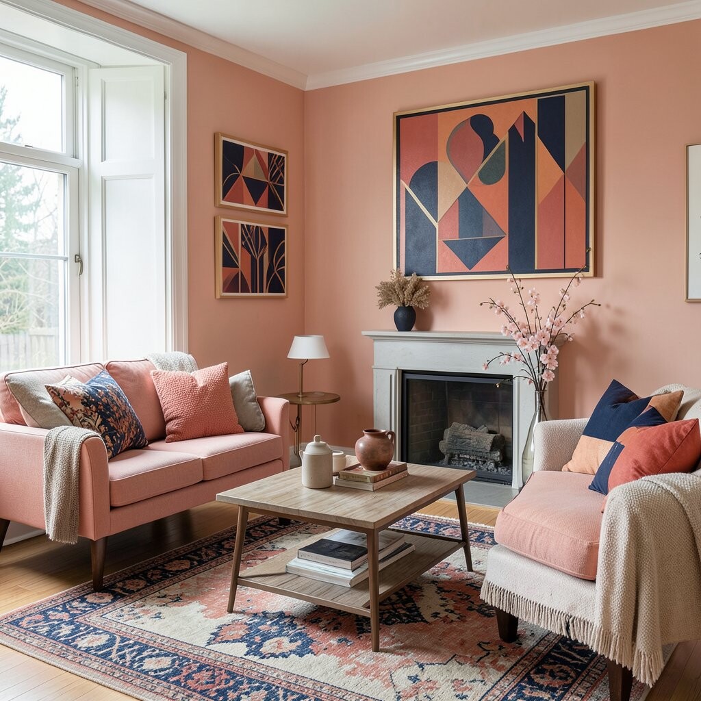
Coral and navy make a room feel lively but still balanced. Coral brings in a soft warm touch, while navy gives the space a strong base.
This pair works well for pillows, rugs, and wall art. If you want the room to feel more personal, add a navy vase with coral flowers or use both colors in a pattern.
The look stands out because it feels both fresh and steady. It is also a good trend choice for people who want color without using very bright shades.
6. Pale Yellow and Charcoal for Early Summer Light
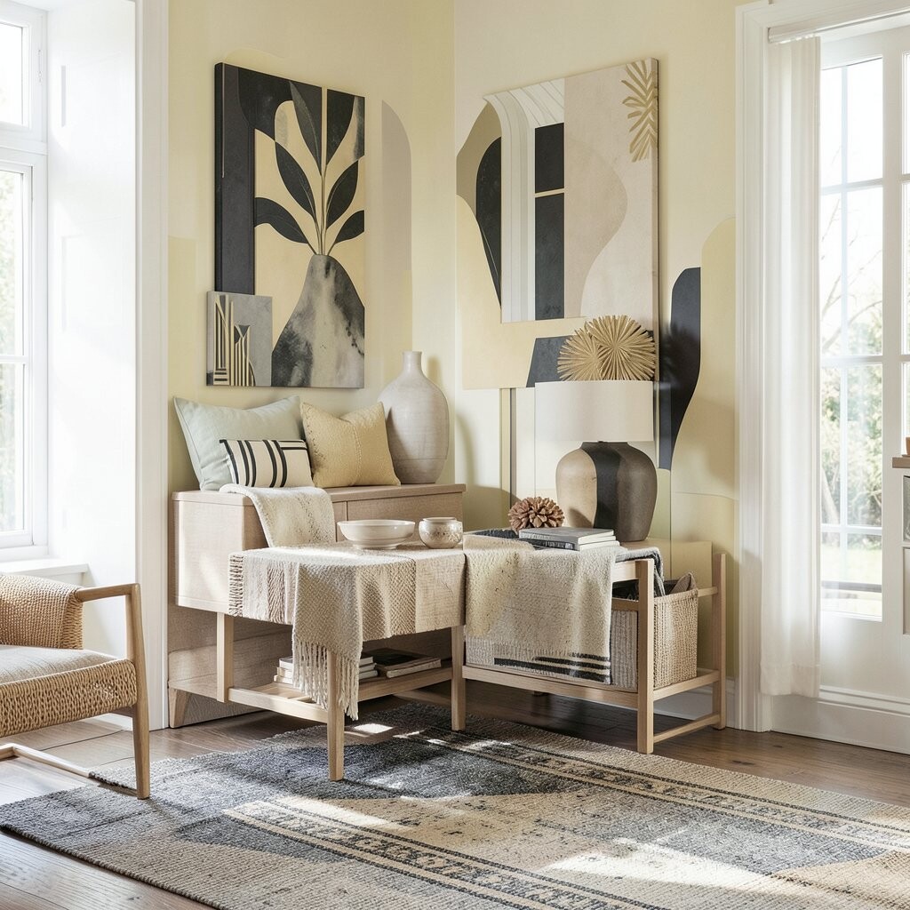
Pale yellow and charcoal can make a room feel sunny and calm at the same time. The yellow adds light, while charcoal keeps the space grounded and neat.
This scheme works well in dining rooms, kitchens, and small sitting areas. You can use yellow art, charcoal chairs, or a striped rug to give the room some Art Deco shape.
It is a smart choice if you want a warm look that still feels clean. Many people like it because it can fit both old and new pieces without much trouble.
7. Aqua and Walnut for a Cool Summer Feel
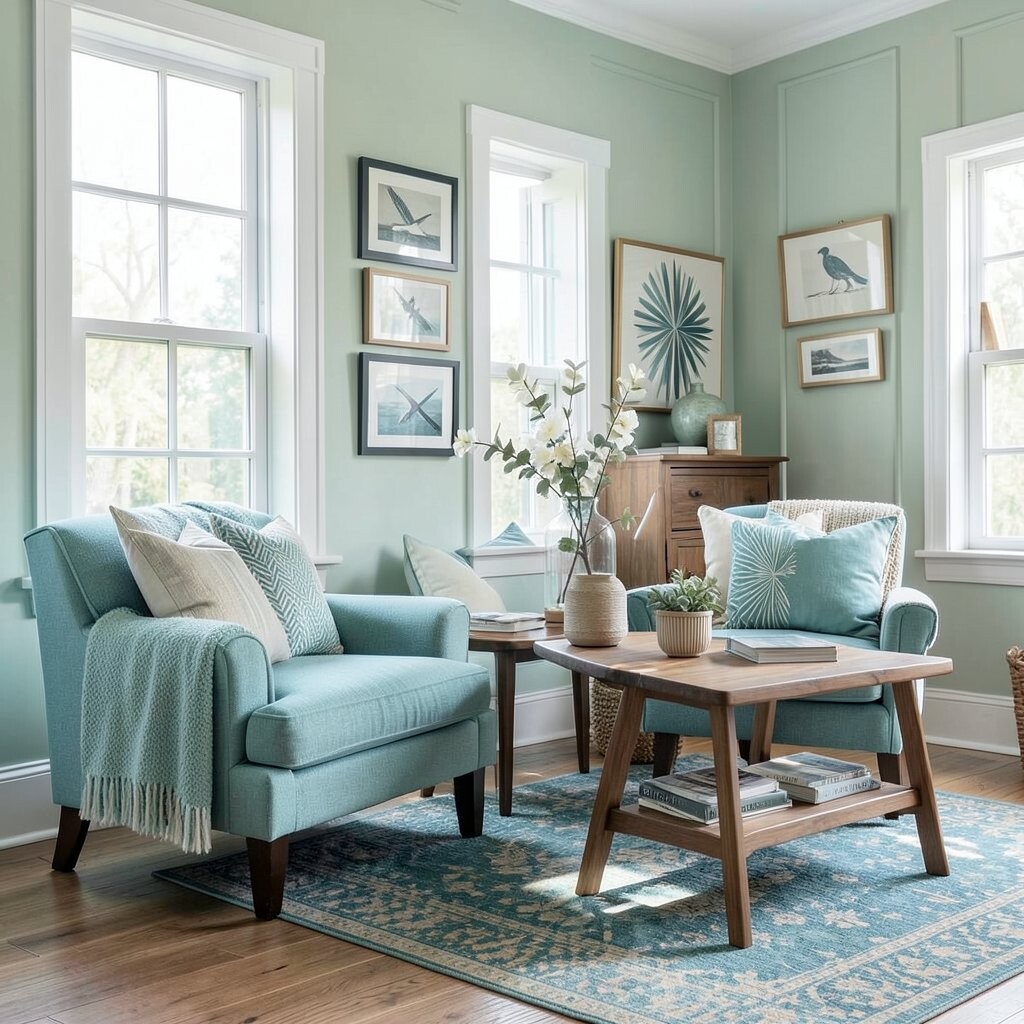
Aqua and walnut bring a clear, cool look that fits summer well. Aqua feels fresh and light, while walnut adds a rich wood tone that makes the room feel steady.
This color mix works well with wooden tables, woven baskets, and smooth glass decor. You can make it your own by using aqua pillows, a walnut shelf, or art with curved lines.
The scheme is nice for people who like color but do not want a room to feel busy. It can also be a cost-friendly choice if you use paint and a few decor items instead of many new pieces.
8. White and Chrome for a Clean Summer Base
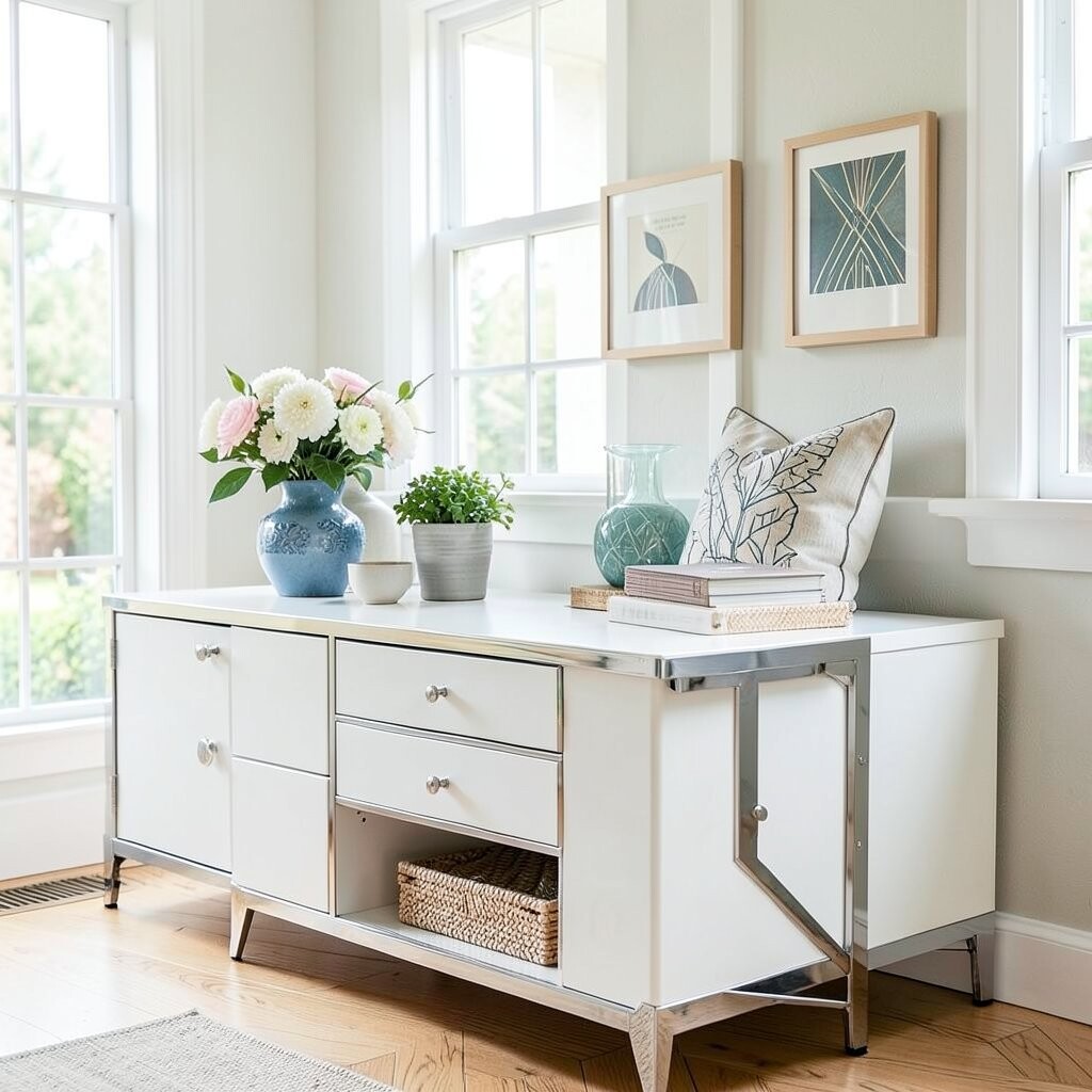
White and chrome create a bright, sharp room that works well in hot months. The white keeps things open, while chrome gives a smooth Art Deco shine.
This scheme is easy to use in almost any room. Try white curtains, chrome lamp parts, and simple mirrors to make the space feel neat and fresh.
One strong benefit is that this look can make a small room seem larger. It is also a flexible base, so you can add seasonal color later with flowers, art, or pillows.
9. Terracotta and Cream for Late Summer Warmth
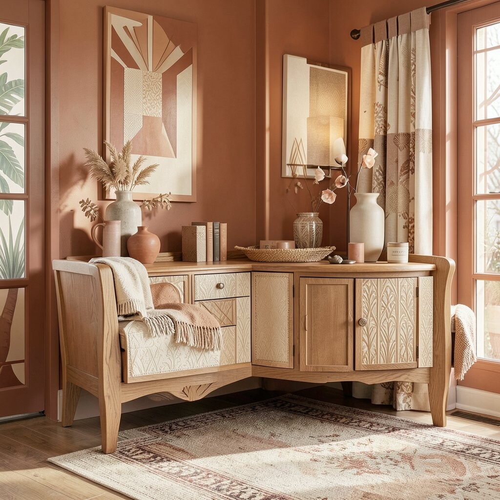
Terracotta and cream give a room a warm, soft feel that works well as summer ends. The terracotta adds earth tone depth, while cream keeps the look light and easy.
You can use this pair in throw blankets, pottery, and wall art. It fits well with natural wood and simple shapes, which makes it easy to mix into a real home.
This scheme feels unique because it is rich but not harsh. It also works well for people who want seasonal decor that stays useful after summer is over.
10. Ruby and Champagne for a Rich Fall Look
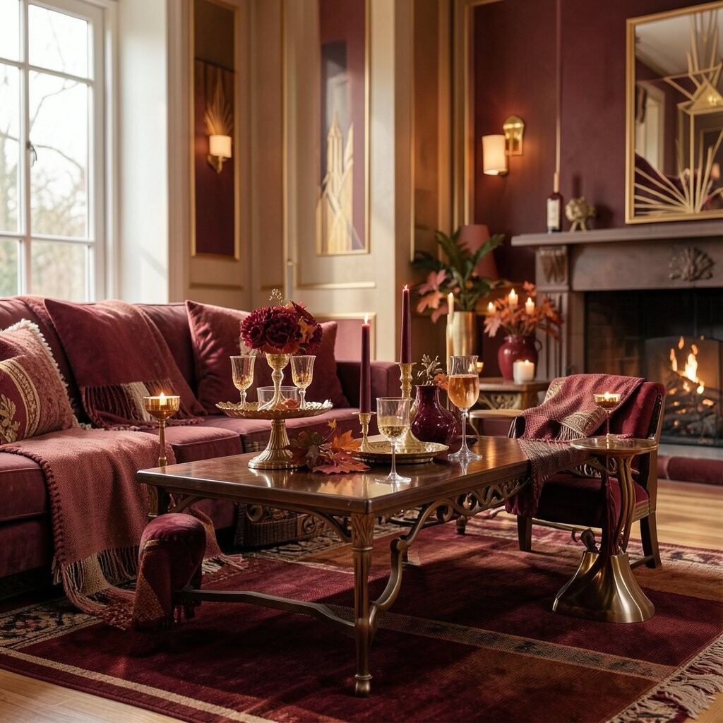
Ruby red and champagne make a room feel warm, full, and ready for cooler days. The red brings strong color, and champagne softens it with a light glow.
This scheme works well for fall dining tables, living rooms, and mantel decor. Try ruby cushions, champagne candles, or a patterned rug with clean Art Deco lines.
The style can feel costly even when you keep it simple. A few well-made pieces can do a lot, so you do not need to fill the room with many items.
11. Mustard and Forest Green for Autumn Depth
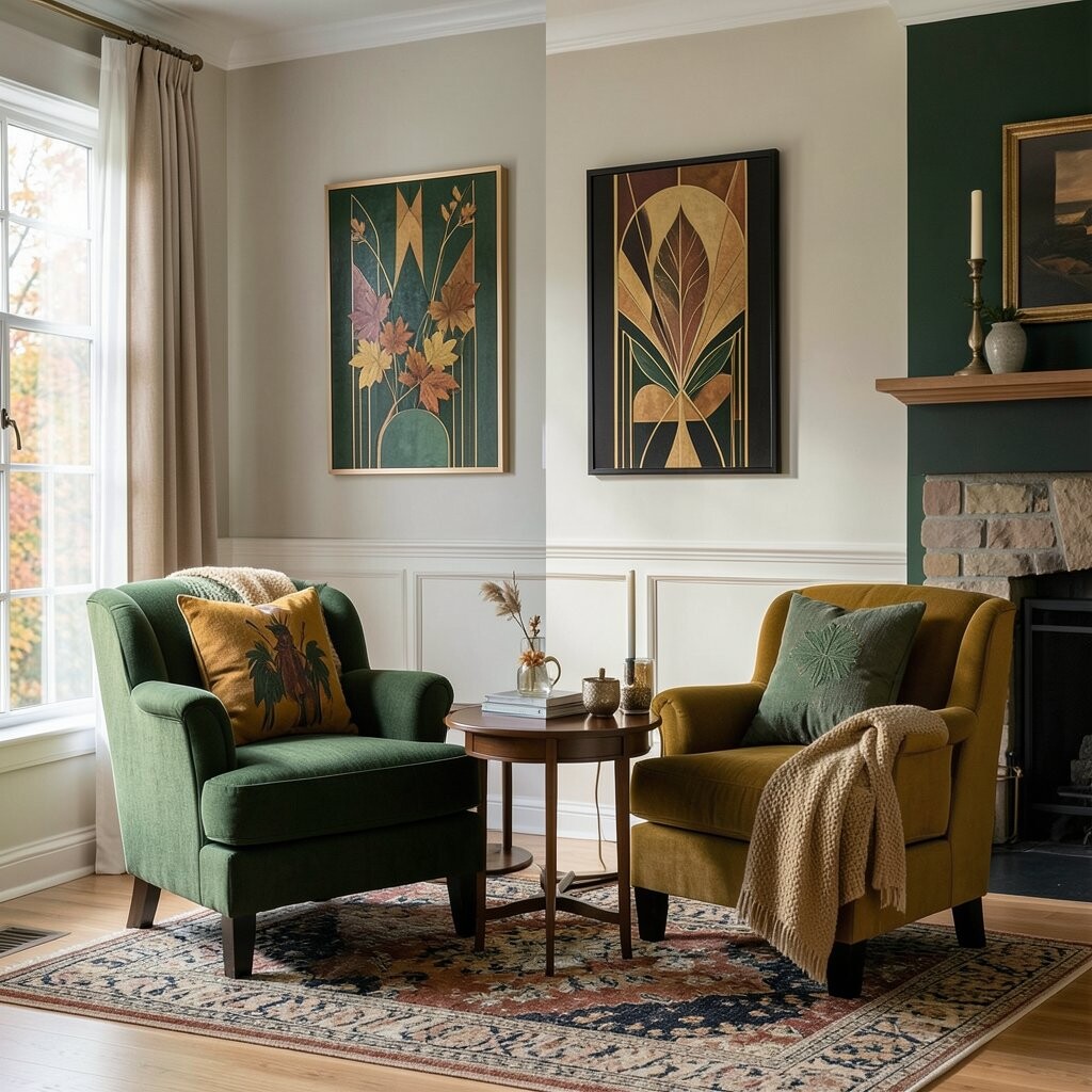
Mustard and forest green create a deep fall mix with a classic Art Deco feel. The mustard gives warmth, while forest green adds weight and calm.
This pair works well in rooms that already have wood, leather, or dark frames. You can make it more personal with old books, printed pillows, or a bold rug.
It is a good choice if you want a room that feels steady and lived in. The colors also fit current home trends because they look natural and rich without being too plain.
12. Copper and Cream for a Soft Harvest Mood
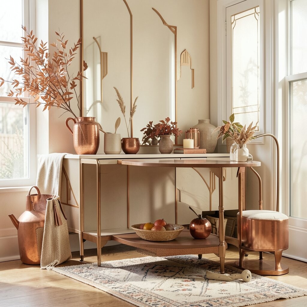
Copper and cream make a room feel warm, smooth, and inviting in fall. Copper adds shine and color, while cream keeps the look soft and open.
This scheme works well for table settings, bathroom trays, and shelf decor. It is easy to try with copper bowls, cream blankets, or a lamp with a simple curved shape.
The benefit of this color pair is that it feels special without being hard to use. It can also help a room look more put together with only a few new items.
13. Plum and Beige for a Calm Late Fall Style
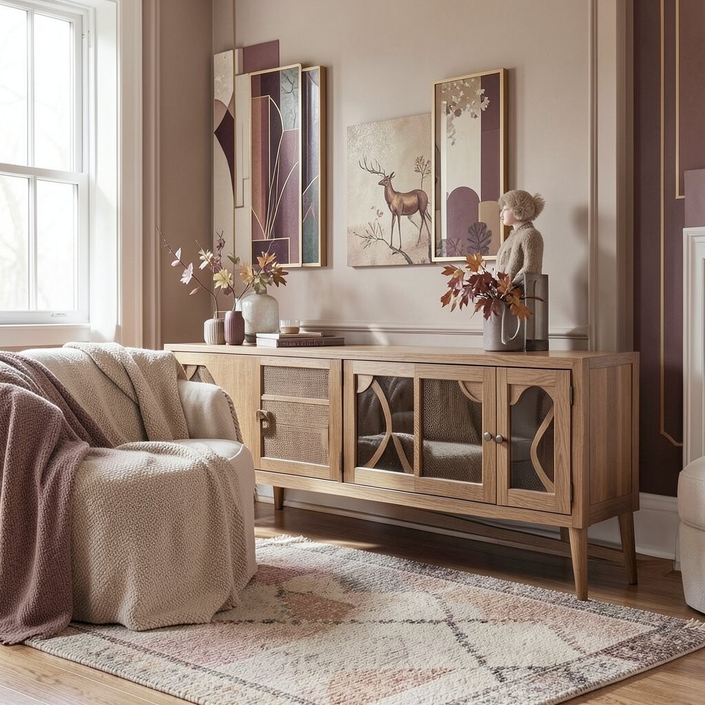
Plum and beige give a room a quiet, rich look that fits late fall well. Plum adds a deep color note, while beige keeps the space soft and relaxed.
You can use this pair in drapes, pillows, and framed prints. It works well for people who like color but still want a calm room that feels easy to live in.
This scheme is unique because it feels both classic and modern. It can also work on a budget if you choose a few key items and let the colors do the work.
14. Black, White, and Red for Bold Holiday Style
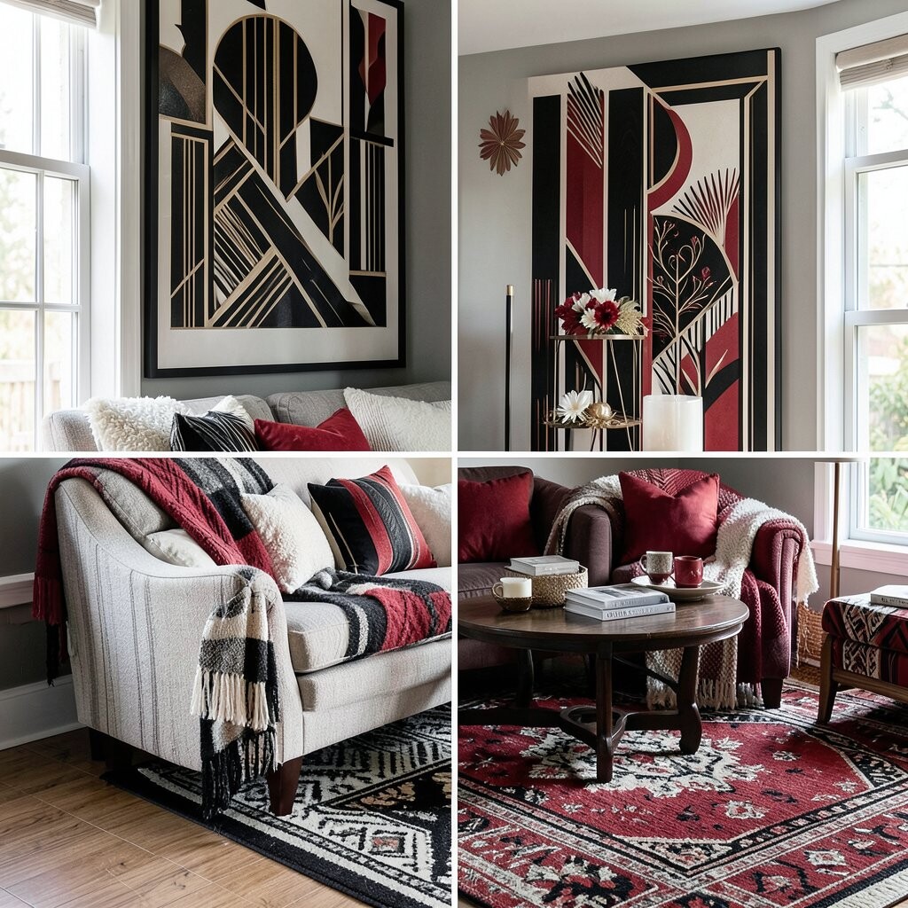
Black, white, and red make a strong Art Deco holiday mix that feels sharp and clear. The black and white give a clean base, while red adds a festive note.
This scheme works well on dining tables, front rooms, and entry areas. Try red ribbon, black candle holders, and white dishes to build a look that feels planned.
It is a smart choice for seasonal decor because it can work past the holiday time too. You can keep the black and white pieces all year and just swap the red accents when you want a new feel.
15. Deep Teal and Antique Gold for Year-Round Style
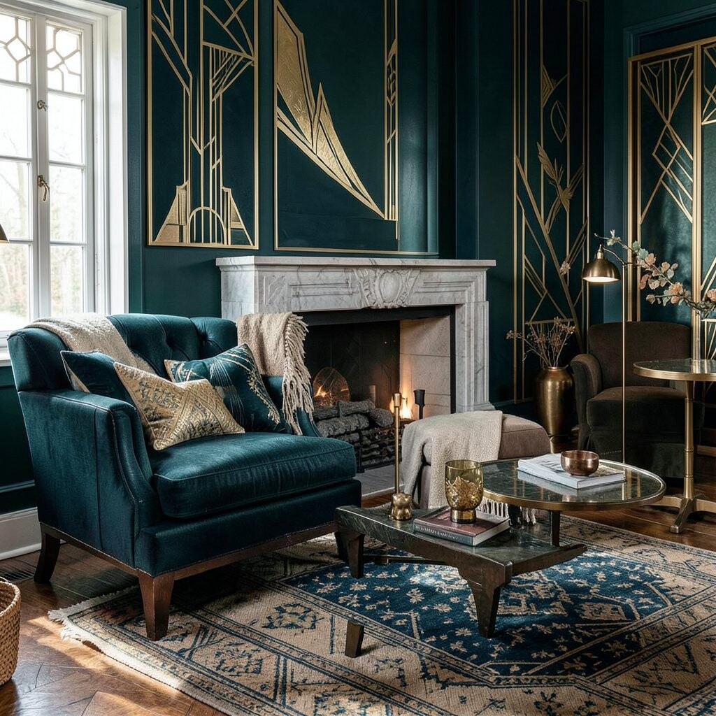
Deep teal and antique gold make a room feel rich, calm, and ready for any season. Teal gives a cool, deep base, and antique gold adds a soft old-style shine.
This pair works well in bedrooms, studies, and formal sitting rooms. You can use teal walls, gold frames, or a patterned pillow to keep the room tied to the Art Deco look.
The scheme is easy to make your own because it works with both modern and old decor. It can also be a good long-term choice, since the colors stay useful even when seasons change.