Art Deco still shows up in many design ideas today. It can add clean lines, bold shape, and a sense of order to a layout.
1. Geometric Shapes
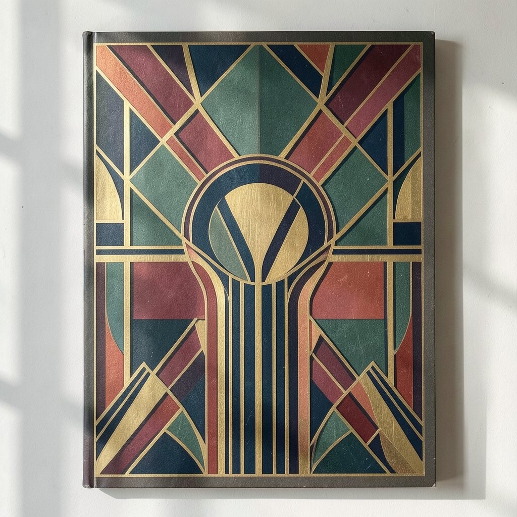
Geometric shapes are one of the most clear Art Deco signs in modern graphic design. You often see circles, triangles, arches, and sharp edges set in neat patterns.
This style works well because it makes a design feel clean and easy to read. It can also help a brand look careful and well planned without using too much detail.
You can use these shapes in posters, logos, web banners, and social posts. If you want a fresh look, try keeping the shapes simple and using a few strong colors.
2. Gold and Metallic Touches
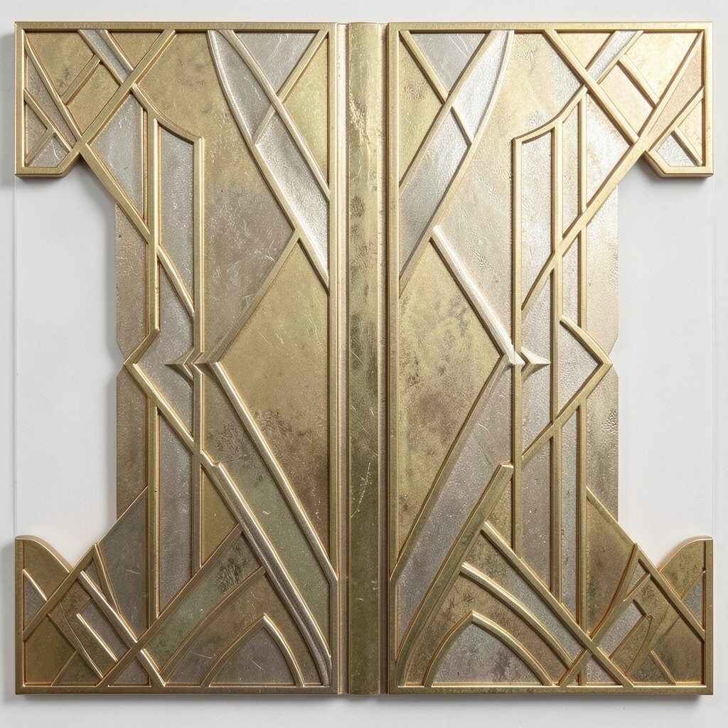
Gold tones and metallic looks are still tied to Art Deco style. In graphic design, they can make a piece feel rich, sharp, and neat.
These touches work best when used in small parts, like lines, text, or frame details. That keeps the design from feeling too heavy or messy.
Many designers now use fake metal effects instead of real foil, since that is often cheaper and easier to print. If you want a low-cost option, a flat gold color can still give a nice Art Deco feel.
3. Symmetry and Balance
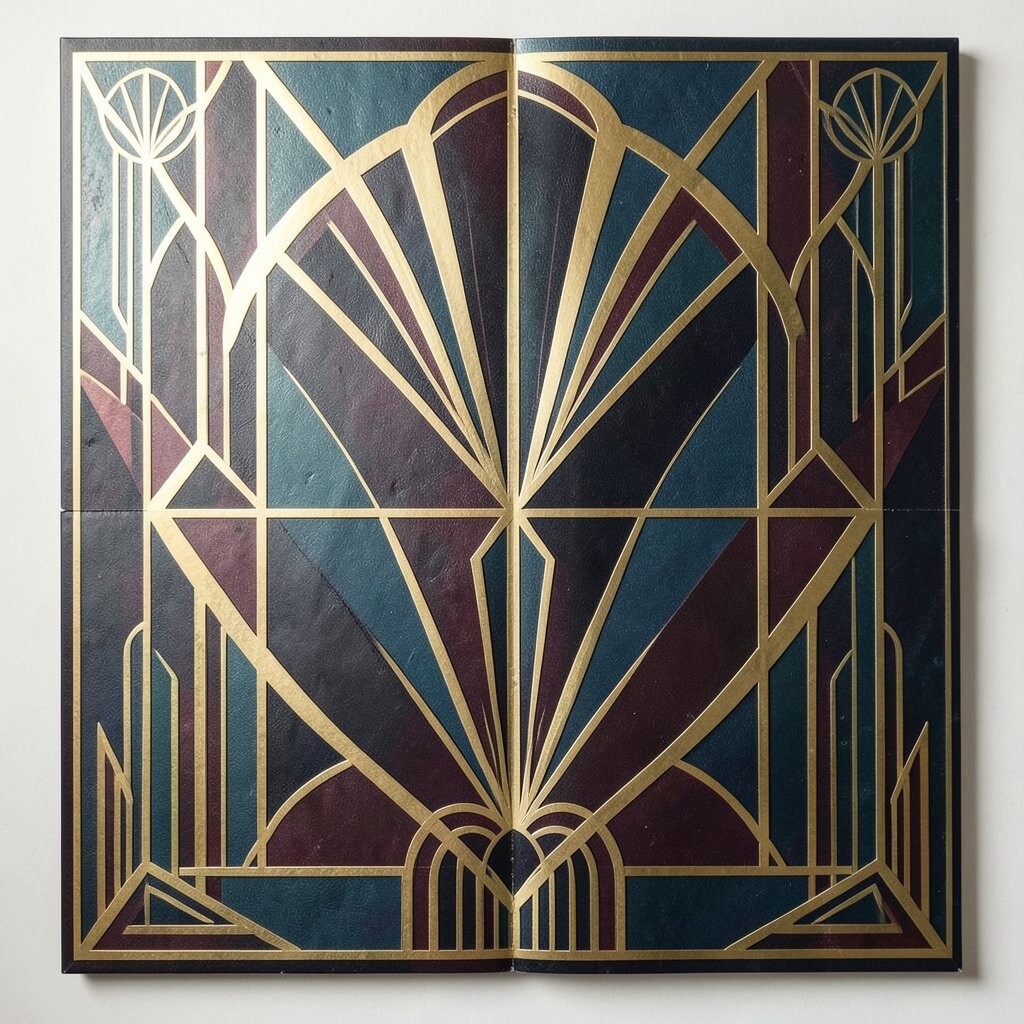
Art Deco often uses symmetry, where both sides of a design feel equal. This gives the work a calm and steady look.
Modern design still uses this idea because it helps the eye move in a simple way. It can also make a poster, cover, or ad feel more polished.
To make it personal, you can place your main image or text in the center and build out from there. This style is helpful for brands that want trust and order in their look.
4. Bold Typography
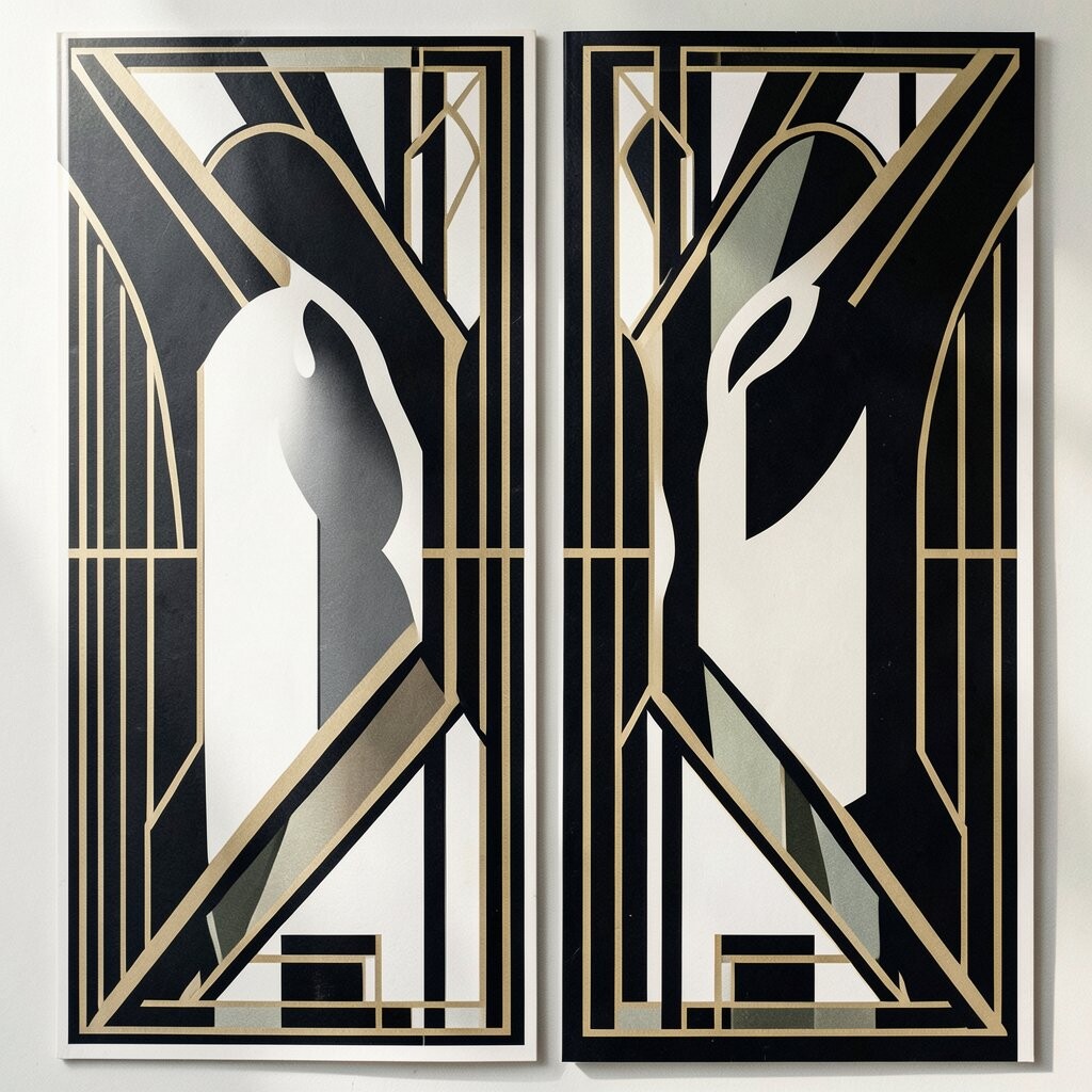
Art Deco fonts often have tall letters, clean lines, and a strong shape. Today, designers use bold type to bring that same feeling into logos and ads.
This style can help text stand out fast, even from far away. It is a good choice for headlines, event posters, and product labels.
Try pairing bold type with simple art so the page does not feel crowded. If you want a custom feel, change the spacing or make a few letters part of the image.
5. Sunburst Patterns
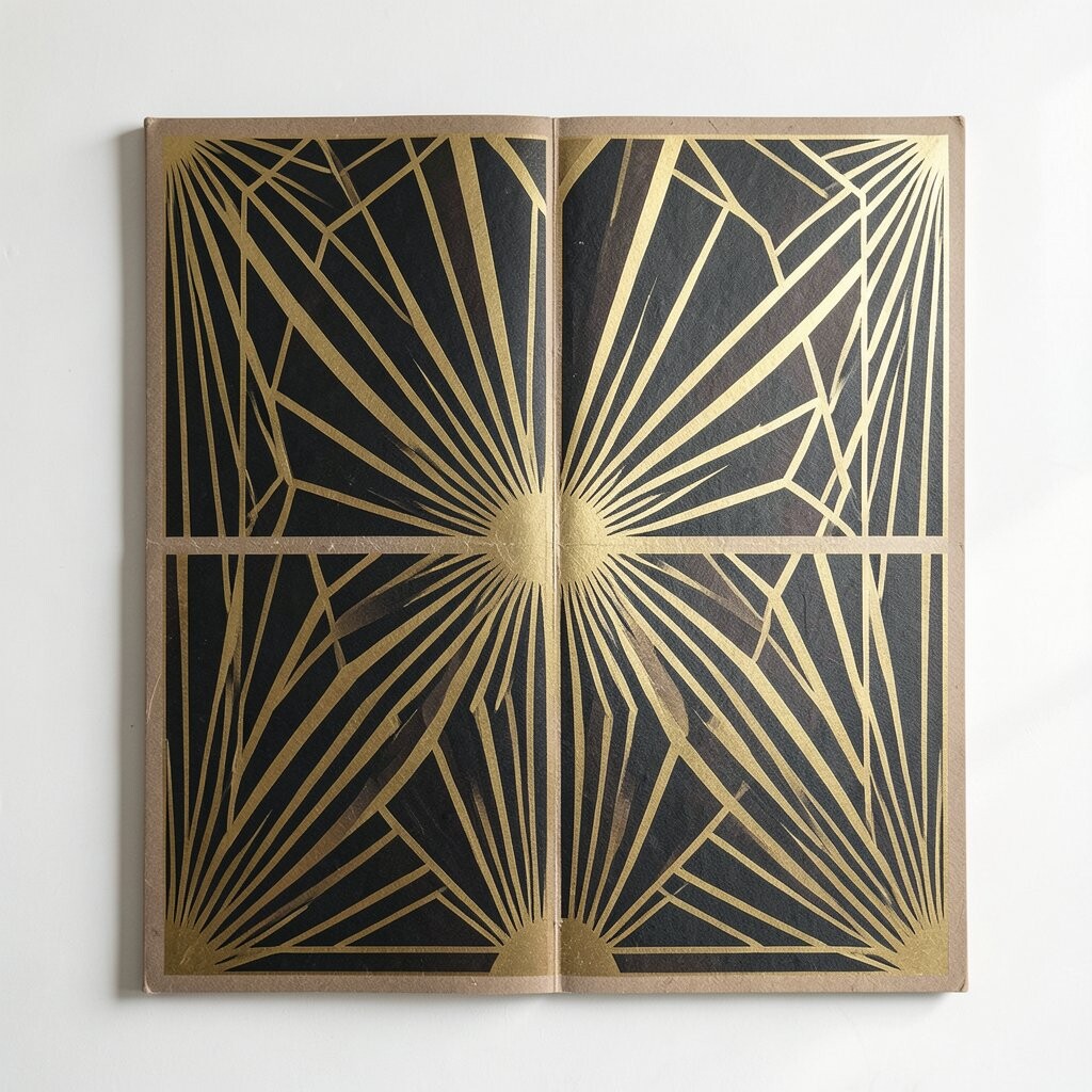
Sunburst shapes are a classic Art Deco detail that still shows up in modern design. They use lines that spread out from one point and make the page feel active.
These patterns can add motion without needing moving parts. They are often used behind text, around logos, or as a frame for a main image.
Designers like them because they are simple to make and do not cost much in digital work. If you want a trend-friendly look, keep the lines thin and the colors limited.
6. Fan Shapes and Shell Motifs
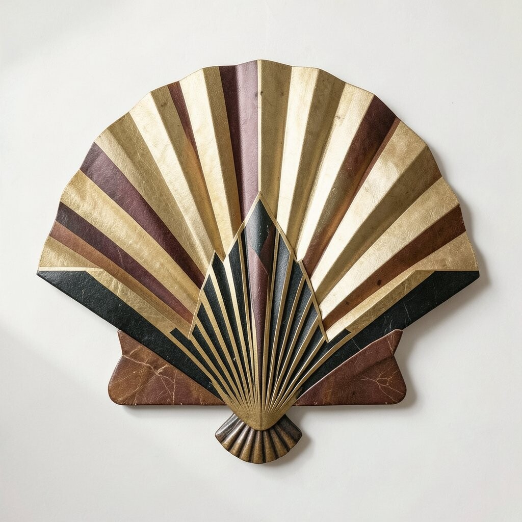
Fan shapes and shell-like forms are common in Art Deco work. In graphic design, they add a soft but structured look that feels neat and stylish.
These shapes are useful when you want a design to feel a little more special without using too many parts. They can sit above text, in corner art, or behind a product name.
You can make the look your own by changing the size, color, or line thickness. Many designers use them in wedding cards, beauty brands, and event graphics.
7. Black and White Contrast
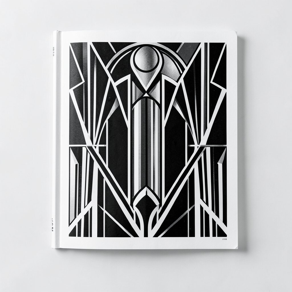
Black and white is a strong part of Art Deco design. The sharp contrast makes shapes, text, and frames easy to see.
This style feels modern because it looks clean and does not depend on many colors. It also works well for brands that want a classic look with low design cost.
You can add one small accent color if you want a bit more life. A gold line, red block, or pale blue shape can keep the design simple but not plain.
8. Decorative Borders
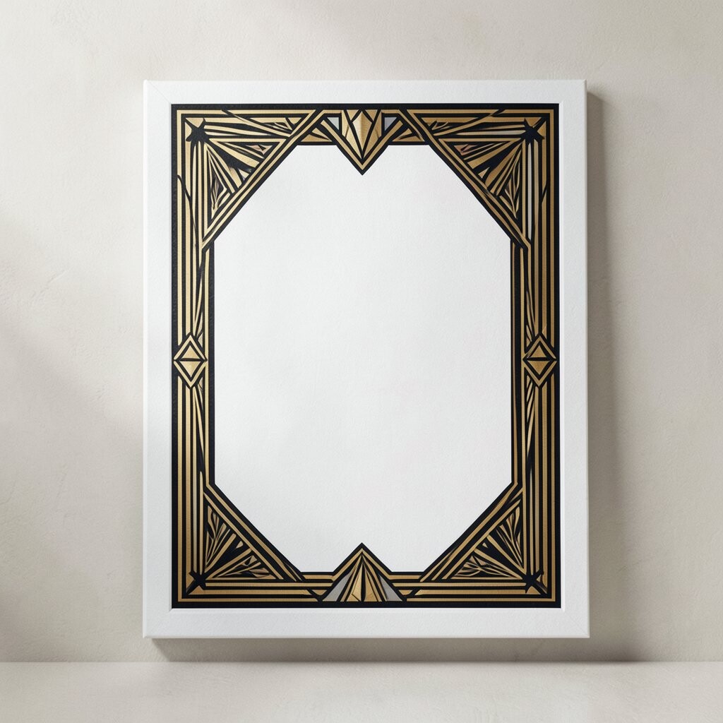
Art Deco often uses borders that feel neat and planned. These borders can be straight, stepped, or made with small repeating shapes.
In today’s graphic design, borders help hold a page together and guide the eye. They can make a poster, menu, or social post feel complete.
If you want a personal touch, try a border that matches your brand icon or event theme. Thin borders are often cheaper to print and work well on many screen sizes.
9. Stepped Forms
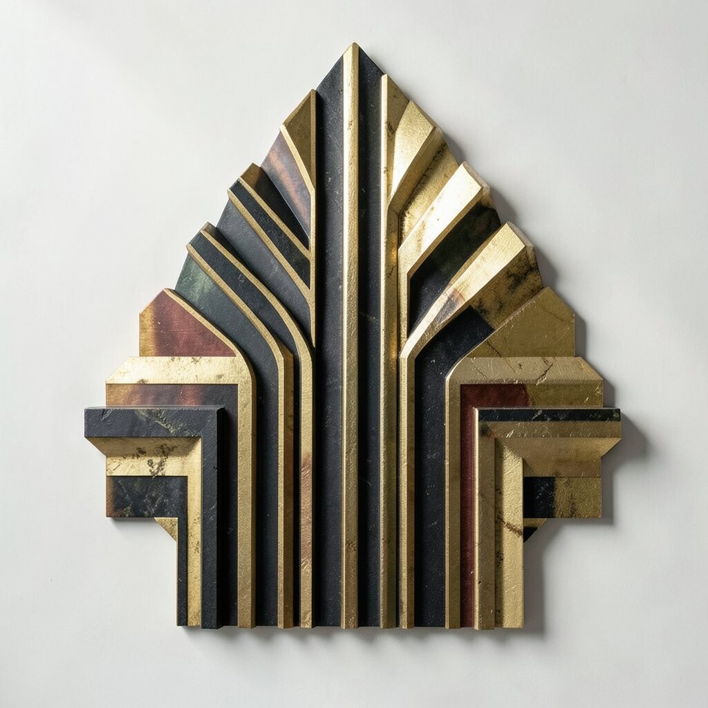
Stepped forms are shapes that look like stairs or layers moving down in small parts. They are a big part of Art Deco and still show up in many modern designs.
These forms can add depth without using shadows or 3D effects. They also help a layout look neat, planned, and a bit more rich.
Designers often use stepped forms in logos, architecture posters, and package art. If you want to keep it fresh, mix them with flat color and simple text.
10. Streamlined Lines
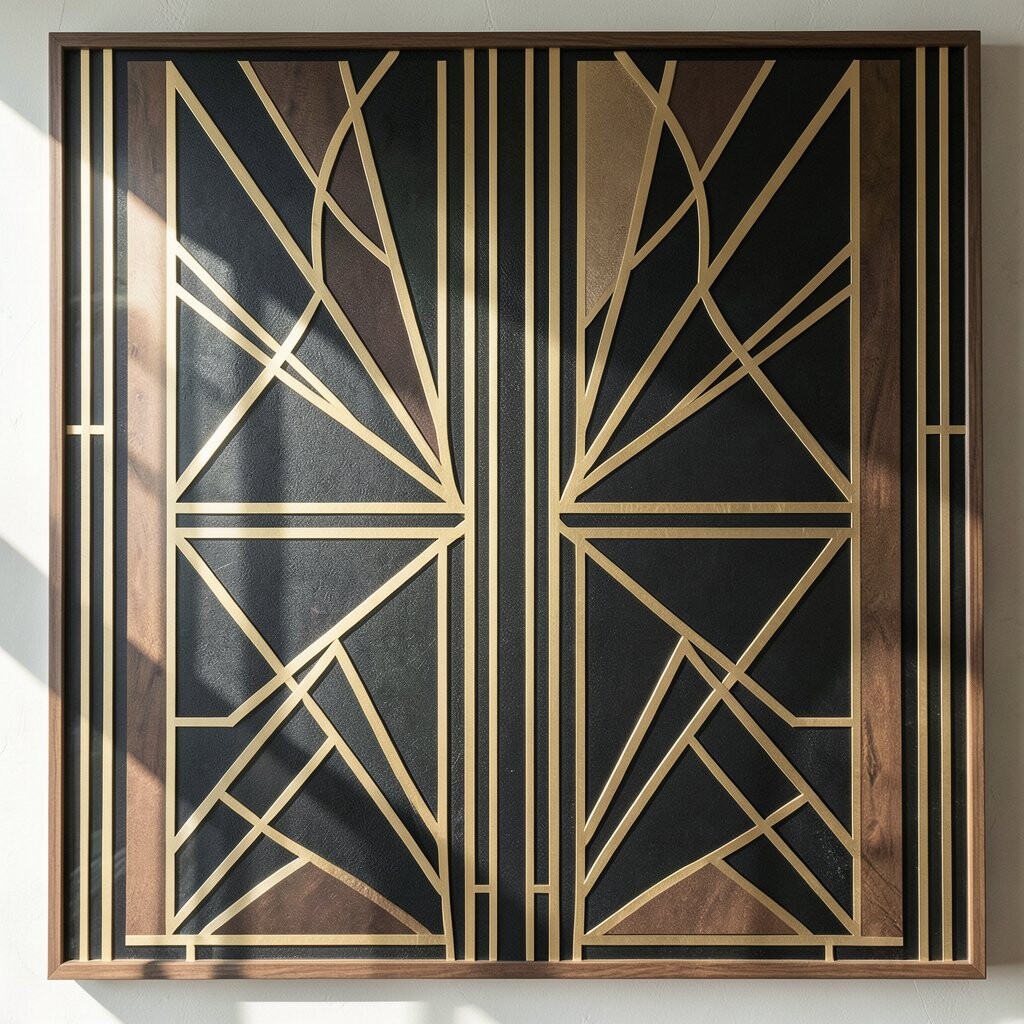
Art Deco is known for smooth lines that feel fast and clean. In graphic design, these lines can help a layout feel modern while still nodding to the past.
Streamlined lines work well in icons, backgrounds, and divider marks. They can also make a busy page feel calmer by giving the eye a clear path.
This style is easy to change for different uses, like a small app icon or a large wall poster. If you want a low-cost design choice, line art is often simple to make and reuse.
11. Luxe Texture Looks
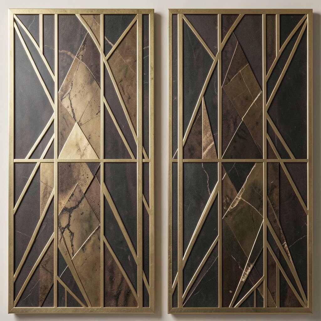
Many Art Deco designs have a rich look, even when they are flat on paper or screen. Today, designers copy that feeling with soft grain, faint shine, or smooth pattern work.
These texture looks can make a piece feel more thoughtful and less plain. They are useful for album art, beauty labels, and brand ads that want a classy tone.
You do not need real texture to get the effect, which helps keep costs down. A few light details can make the design feel deeper while still staying clean.
12. Themed Color Palettes
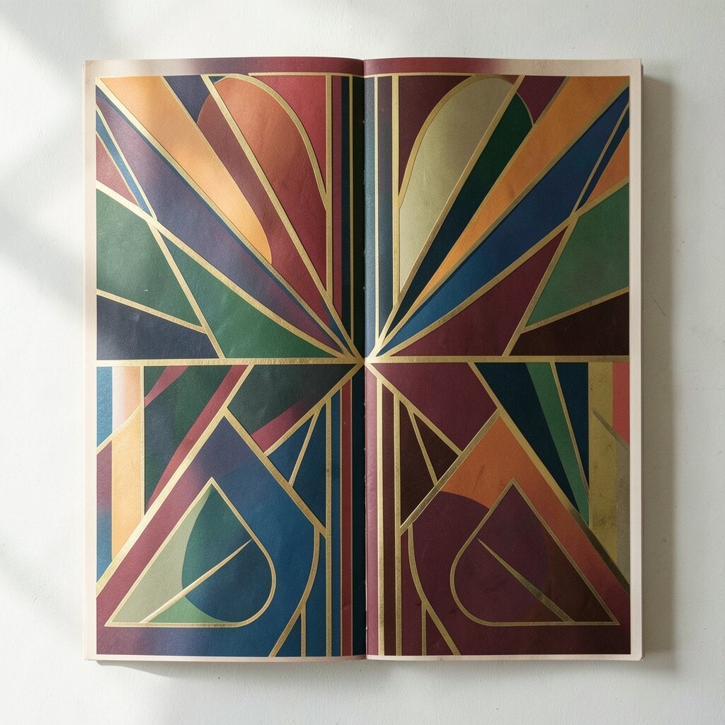
Art Deco often uses strong color sets like black, gold, cream, green, and deep blue. Modern graphic design still uses these palettes because they feel sure and neat.
A clear color theme can help a brand stay easy to know across print and digital work. It also makes it easier to build a full set of designs without guessing each time.
If you want a more personal result, pick colors that match your product or event. Trendy muted colors can work too, as long as the shapes and type stay bold.
13. Vintage-Inspired Icons
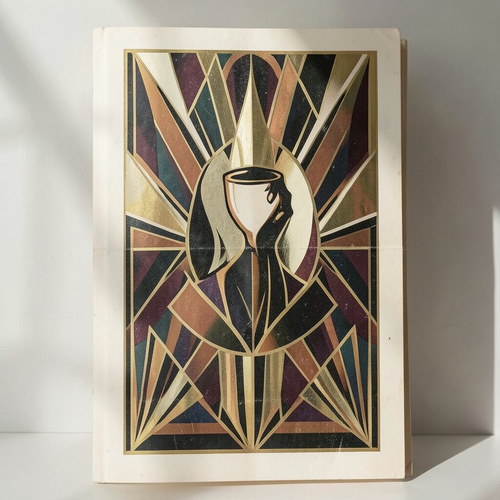
Art Deco icons often show lamps, towers, rays, fans, and other simple forms. In today’s design, these icons are used to give a project a classic but fresh look.
They work well because they are easy to read and can fit in small spaces. This makes them useful for apps, labels, menus, and brand marks.
You can make them fit your style by changing line weight or color. Since icons are small, they can be a low-cost way to add Art Deco detail without filling the whole page.
14. Modern Mix With Art Deco Details
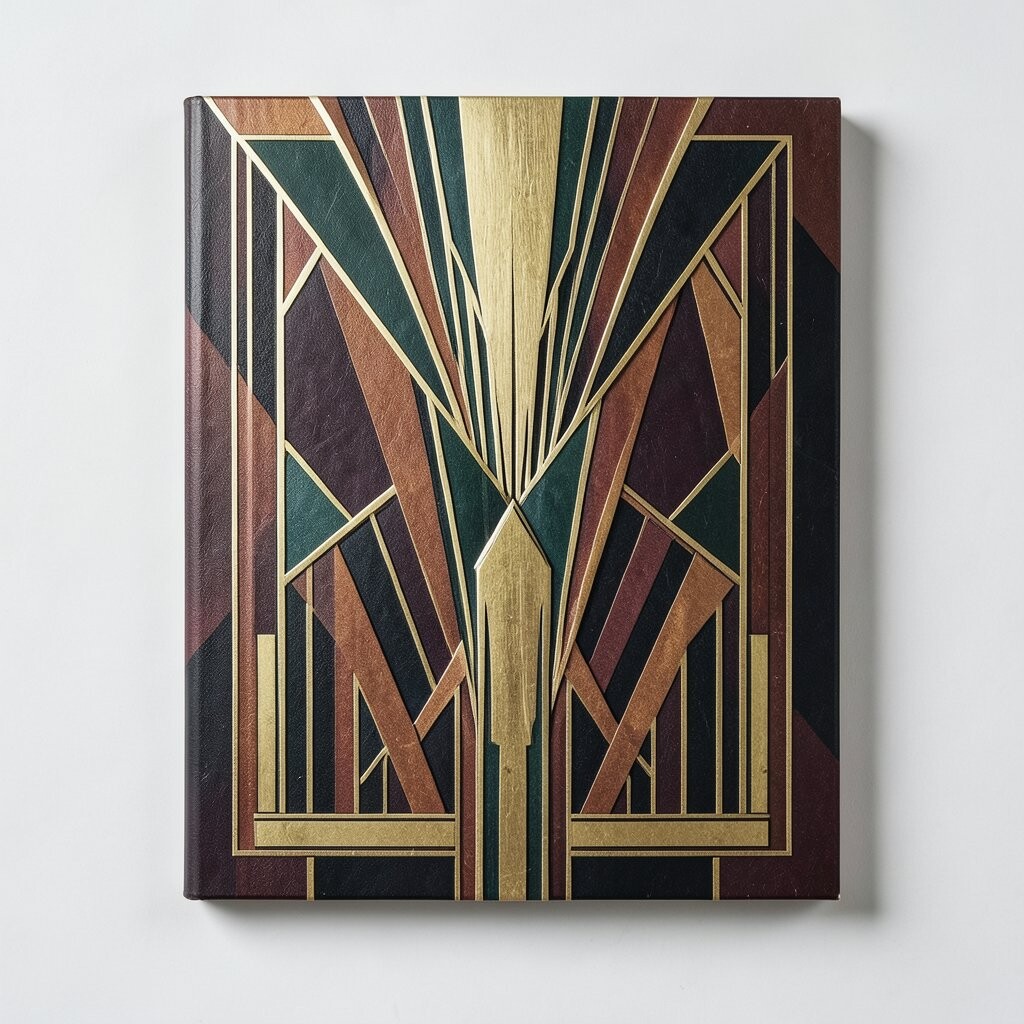
Many current designs mix Art Deco details with plain, modern layouts. This gives a clean base with just enough style to make the piece stand out.
This mix is popular because it feels fresh and easy to use in many places. It can work for websites, print ads, packaging, and social media posts.
To make it your own, try one or two Art Deco parts instead of using too many at once. A small gold frame, bold font, or geometric edge can be enough to give the right look.