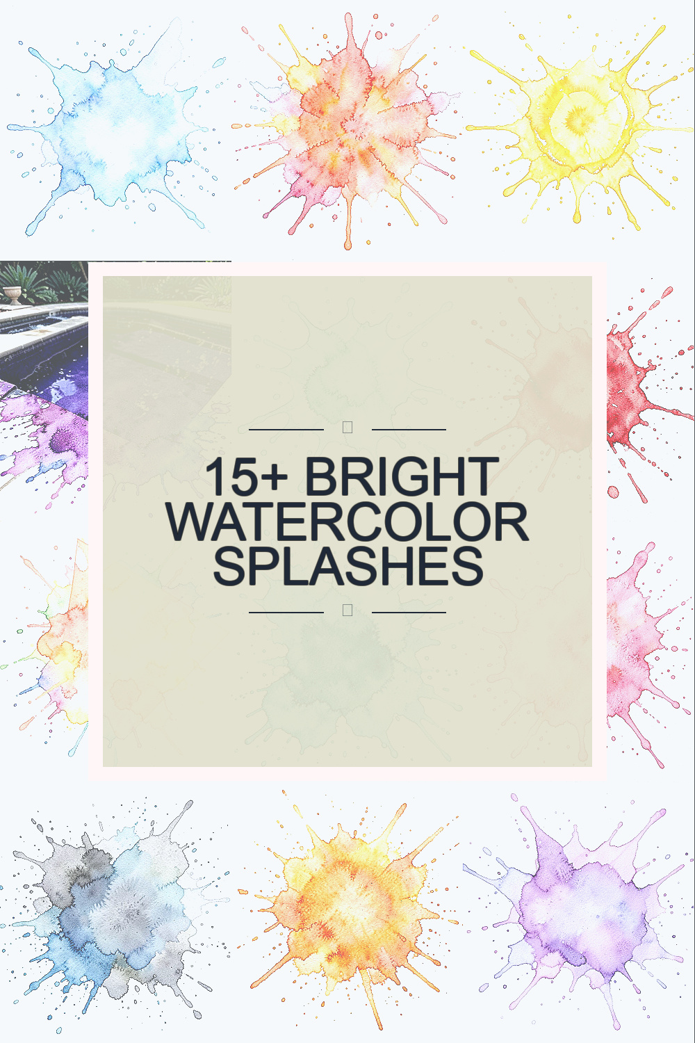
Watercolor splashes can make a page feel light and full of life. They are easy to use, and they can help many kinds of creative work.
1. Soft Blue Wash Splash

A soft blue wash splash looks calm and clean, like a drop of sky on paper. It works well for cards, posters, and simple art prints.
This style is nice because it gives color without crowding the page. You can use a cheap brush, a little water, and any blue paint you already have.
2. Bright Coral Burst
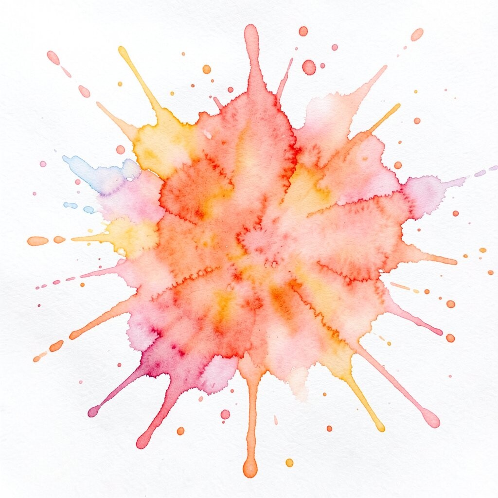
A bright coral burst adds a warm and lively feel to a design. The color stands out fast, so it can help your main word or image get attention.
This kind of splash is often seen in current art trends because it feels fresh and easy to mix with other colors. Try it on gift tags, journaling pages, or small shop signs if you want a look that feels fun but not too loud.
3. Sunny Yellow Splash

A sunny yellow splash can make a page feel open and light. It gives a happy look and works well with black text, white space, and simple line art.
This is a good choice if you want your piece to feel bright without using many colors. It is also low cost, since one tube of yellow paint can last a long time if you use thin layers.
4. Deep Purple Pool

A deep purple pool gives a rich look that still feels soft because of the water. It can make a small area on the page feel special and a little more serious.
You can use it for mood boards, event invites, or handmade labels. If you want it to feel more personal, mix in a bit of pink or blue and change the edge shape with a wet brush.
5. Mint Green Splash

A mint green splash feels fresh and clean, like new leaves after rain. It can help other colors look better by giving the page a calm base.
This splash is a good pick for brands that want a natural look without using brown or dark green. It is also easy to make at home with simple watercolor paints and plain paper.
6. Red Ink Style Splash
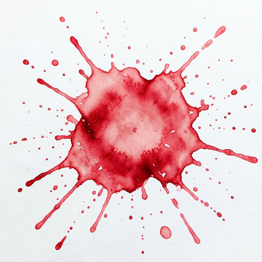
A red ink style splash has a bold look, but the soft edges keep it from feeling too harsh. It can be used to point the eye toward a note, name, or short message.
This style fits well with modern design trends that use bright marks on clean backgrounds. Try making the splash a little uneven so it feels more hand-made and less stiff.
7. Peach Corner Splash
A peach corner splash can sit in the edge of a page and leave room for text. It has a soft, warm feel that works well in invites, menus, and journals.
This kind of splash is useful when you want color but still need the page to stay neat. It is also a low-cost way to add style, since a small amount of paint can cover a lot of space.
8. Ocean Teal Splash
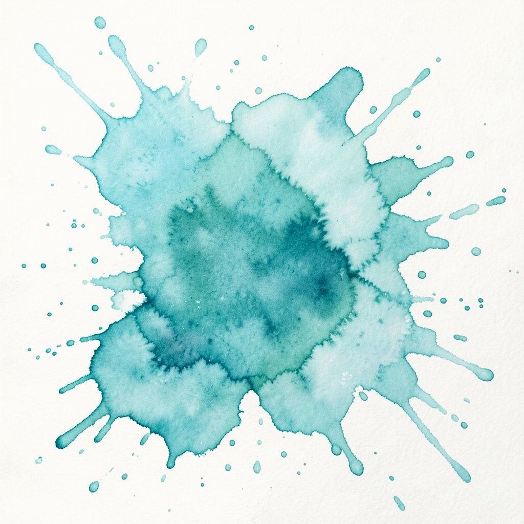
An ocean teal splash brings a cool and steady look to your art. The mix of blue and green can make a piece feel calm, deep, and simple at the same time.
You can use it for web graphics, wall prints, or notebook covers. If you want a personal touch, add a second splash in a lighter shade so the colors seem to move across the page.
9. Rose Pink Splash
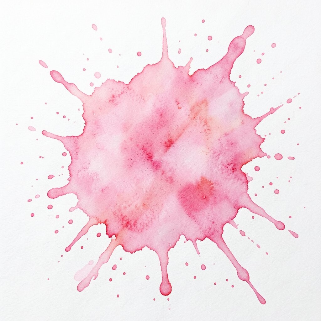
A rose pink splash gives a soft, sweet look that still feels bright. It can work well in cards, product tags, and small art pieces for homes.
This color is popular in many current handmade trends because it feels warm and easy to match. It pairs well with gold lines, gray text, or plain white space.
10. Gray and Blue Blend Splash

A gray and blue blend splash looks calm, neat, and a little modern. It works well when you want color that does not take over the whole page.
This style can help your text stay easy to read while still adding some life to the design. It is a smart choice for people who want a clean look on a small budget.
11. Orange Smudge Splash
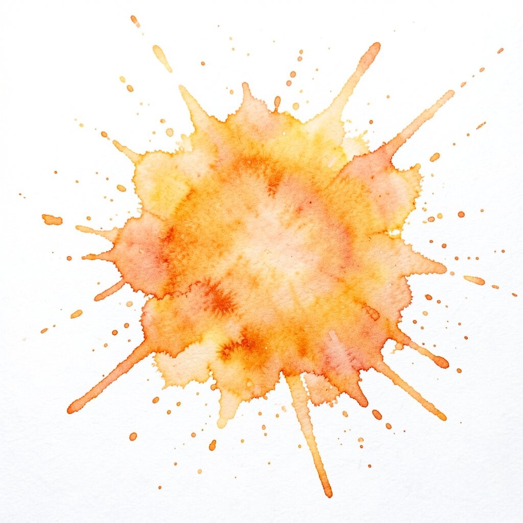
An orange smudge splash brings warmth and motion to a page. It can feel playful, which makes it good for school work, flyers, and craft projects.
You do not need much paint to make it work, so it is a cheap and simple choice. Try using different water levels to make the edges softer or sharper based on the style you want.
12. Lilac Mist Splash

A lilac mist splash has a light and gentle look that feels easy on the eyes. It can make a page seem soft without turning it plain.
This type of splash is great for planners, social posts, and small art pieces that need a quiet touch. Add a name, quote, or date on top to make it feel more like your own.
13. Lime Pop Splash

A lime pop splash adds a sharp burst of color that can wake up a dull page. It works well with black lines, bold text, and clean shapes.
This is a good pick when you want your design to feel current and full of energy. Since the color is strong, one splash can do a lot, which helps keep paint use low.
14. Warm Beige Splash

A warm beige splash gives a soft, earthy look that feels steady and simple. It can help brighter colors stand out without making the page too busy.
This splash is easy to match with hand-drawn icons, dried flowers, and other plain items. It is also useful for people who want a calm look that still feels handmade.
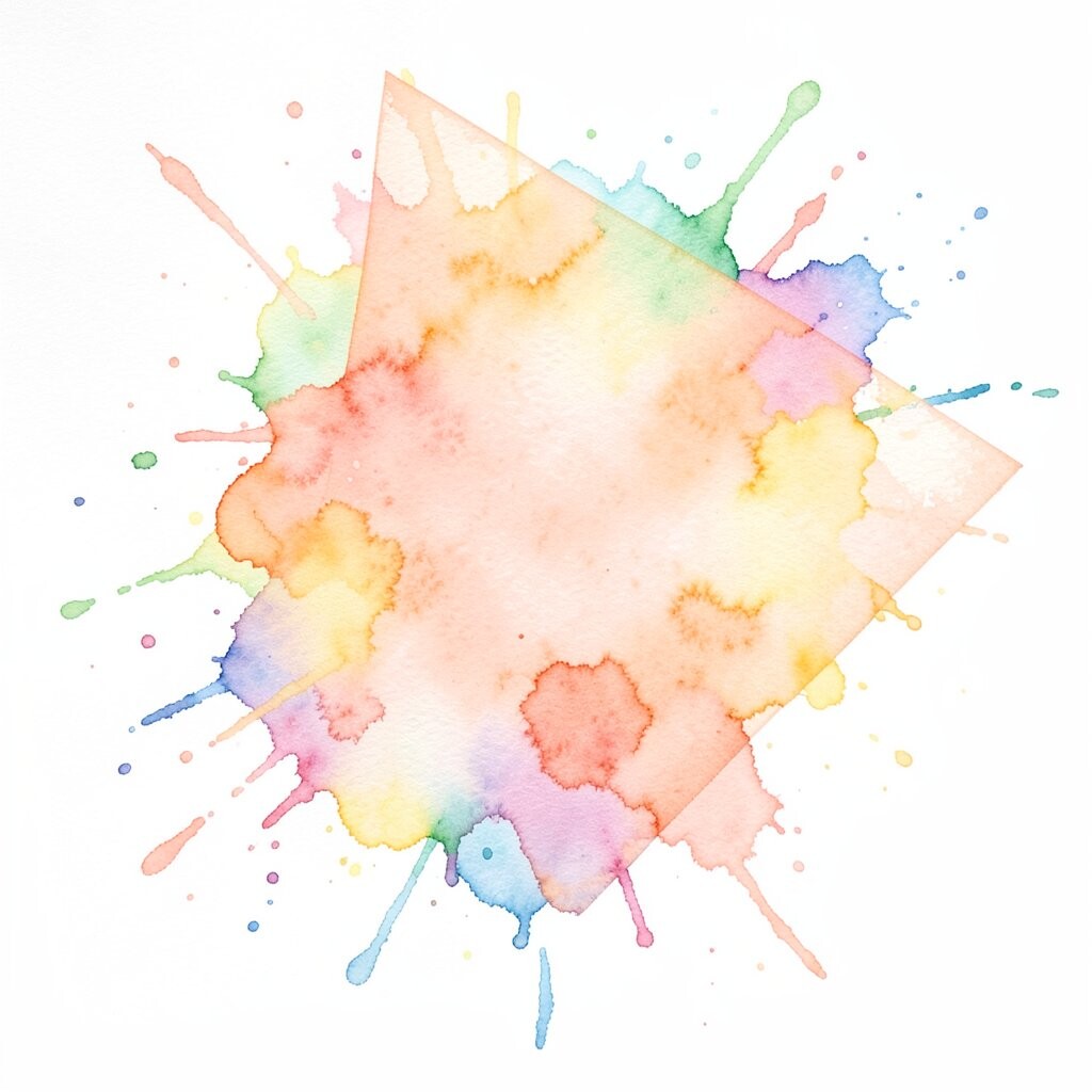
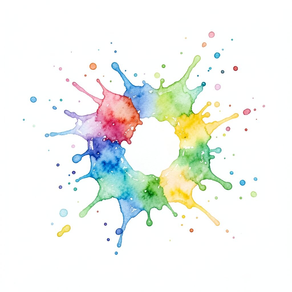
15. Mixed Rainbow Splash

A mixed rainbow splash brings many bright colors into one spot, and each edge can blend in a different way. It gives art a fun, loose look that can fit many styles.
This splash works well when you want each page to feel a little different from the last one. Try using it on party decor, note cards, or online shop banners for a look that feels cheerful and personal.
16. Clear White Space Splash
A clear white space splash uses very little paint and leaves much of the page open. The empty space becomes part of the design and helps the splash stand out more.
This idea is useful for modern work because it looks neat, simple, and easy to read. It also costs very little and gives you room to change the layout any way you want.