Earthy colors can make a room feel calm, warm, and easy to live in. They also work with many styles, so you can use them in a small change or a full room update.
1. Warm Clay and Soft Cream

Warm clay brings a soft red-brown look that feels natural and steady. Soft cream lightens the space and keeps the room from feeling too heavy.
This mix works well in living rooms, dining rooms, and bedrooms because it feels calm and easy to use every day. You can add clay through pillows, pots, rugs, or a painted wall, then use cream for curtains, bedding, or trim.
The look is simple, and it does not cost much if you start with small pieces. It also fits a lot of trends because warm, quiet colors are easy to match with wood, linen, and matte metal.
2. Olive Green and Sand Beige

Olive green gives a room a soft plant-like feel without being too bright. Sand beige adds a light base that makes the green stand out in a calm way.
This color scheme is good for people who want a room that feels relaxed but not plain. It can help a space feel fresh, and it works well with wood furniture, woven baskets, and simple art.
You can make this style your own by using more green for a bold feel or more beige for a soft look. It is also a smart choice on a budget because paint, fabric, and secondhand pieces often come in these colors.
3. Rust Orange and Taupe
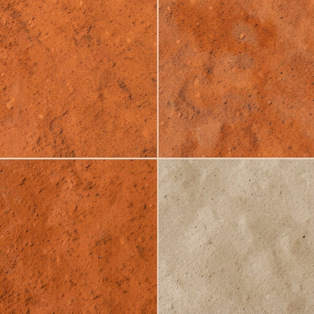
Rust orange has a worn-in, sun-baked look that feels warm and lived-in. Taupe keeps the room grounded and adds a smooth, quiet balance.
This pairing is nice for spaces where you want comfort and some color at the same time. It can help a room feel rich without using bright paint or busy prints.
If you want a stronger look, use rust in a chair, throw, or accent wall. If you want a softer look, let taupe lead and use rust in small parts, which keeps costs lower and makes changes easy later.
4. Moss Green and Stone Gray
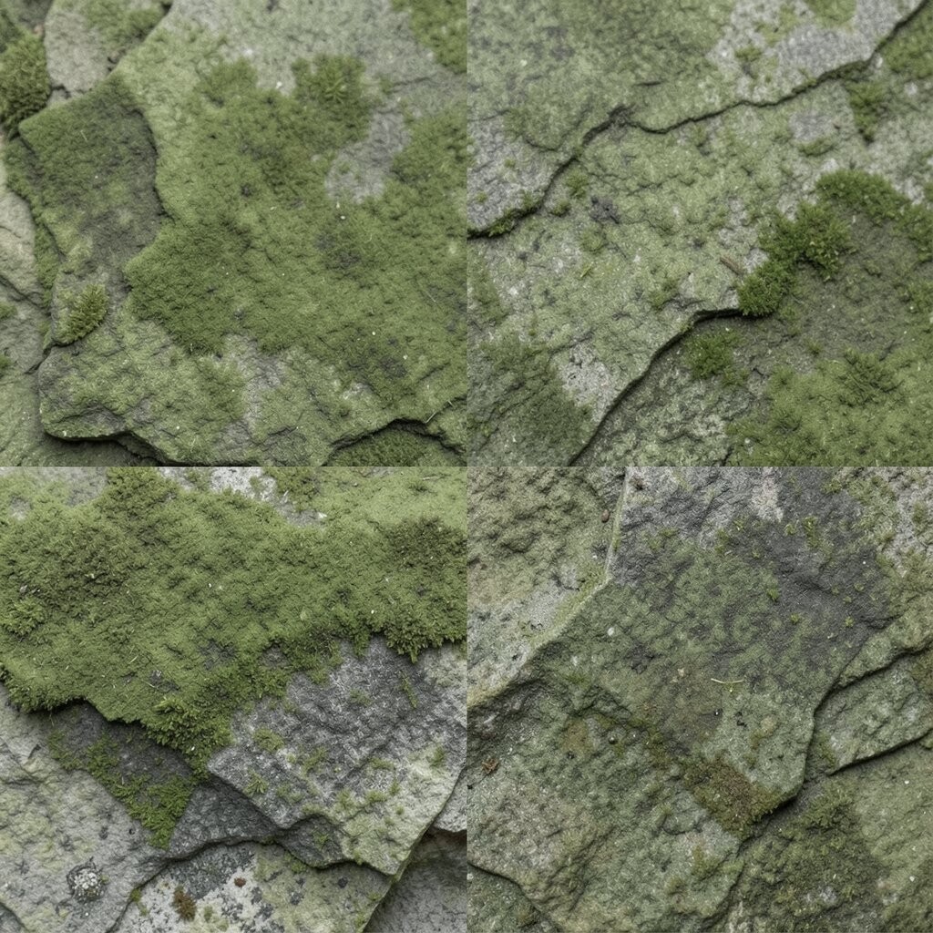
Moss green has a deep, leafy feel that can make a room seem calm and full. Stone gray adds a cool, steady note that keeps the palette from getting too dark.
This scheme works well in homes that use a lot of natural light, but it can also help a dim room feel balanced. It is a good match for simple shapes, clean lines, and wood with a light finish.
One nice thing about this look is that it can feel both old and new at the same time. You can use it in a low-cost way by painting one wall, then adding gray storage bins, green cushions, or a single rug.
5. Terracotta and Dusty White

Terracotta brings a baked earth tone that feels warm and a little rough in a good way. Dusty white softens it and keeps the room from feeling too heavy or too bright.
This color set is easy to use in kitchens, entryways, and living rooms because it feels clean and warm at once. It also works with clay pots, natural wood, and simple cloth pieces like table runners or pillow covers.
The style feels current without trying too hard, which is why many people like it now. If you want to save money, use terracotta in small items and let dusty white carry most of the room.
6. Forest Green and Warm Brown

Forest green has a deep, rich look that can make a room feel steady and calm. Warm brown adds a wood-like base that helps the green feel natural and safe.
This pairing is a strong choice for a study, den, or bedroom because it helps the room feel quiet and grounded. It also works well with leather, wood shelves, and soft lamps that add a warm glow.
You can make the room feel more personal by choosing a lighter brown for a friendlier feel or a darker brown for a more closed-in, cozy look. The colors are easy to find in furniture and decor, so you do not need a big budget to try them.
7. Ochre Yellow and Muted Olive
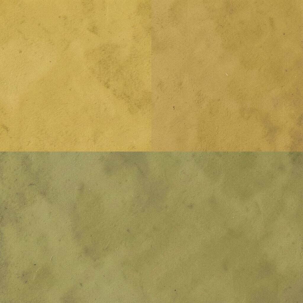
Ochre yellow has a soft sunlit look that brings warmth without feeling too sharp. Muted olive cools it down and keeps the whole room easy on the eyes.
This mix works well in rooms that need a bit more life, like a reading corner or breakfast nook. It can help the space feel warm during cold months and still feel useful all year.
Try using ochre in art, pillows, or a lamp shade, then place olive in larger items like a chair or rug. This balance makes the room feel planned, and it is simple to change if your taste shifts later.
8. Cocoa Brown and Sage Green
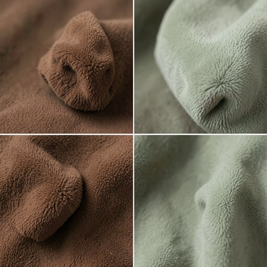
Cocoa brown has a deep, soft look that feels cozy and solid. Sage green adds a fresh, calm note that keeps the room from feeling too dark.
This scheme is a good fit for bedrooms and living rooms where comfort matters most. It also works well with soft fabrics, wood grain, and simple decor that does not need much effort to keep in place.
The look is easy to personalize because you can make it more soft, more rustic, or more neat depending on the items you choose. It is also a smart low-cost option since both colors are common in home goods and paint lines.
9. Muted Teal and Brown Clay
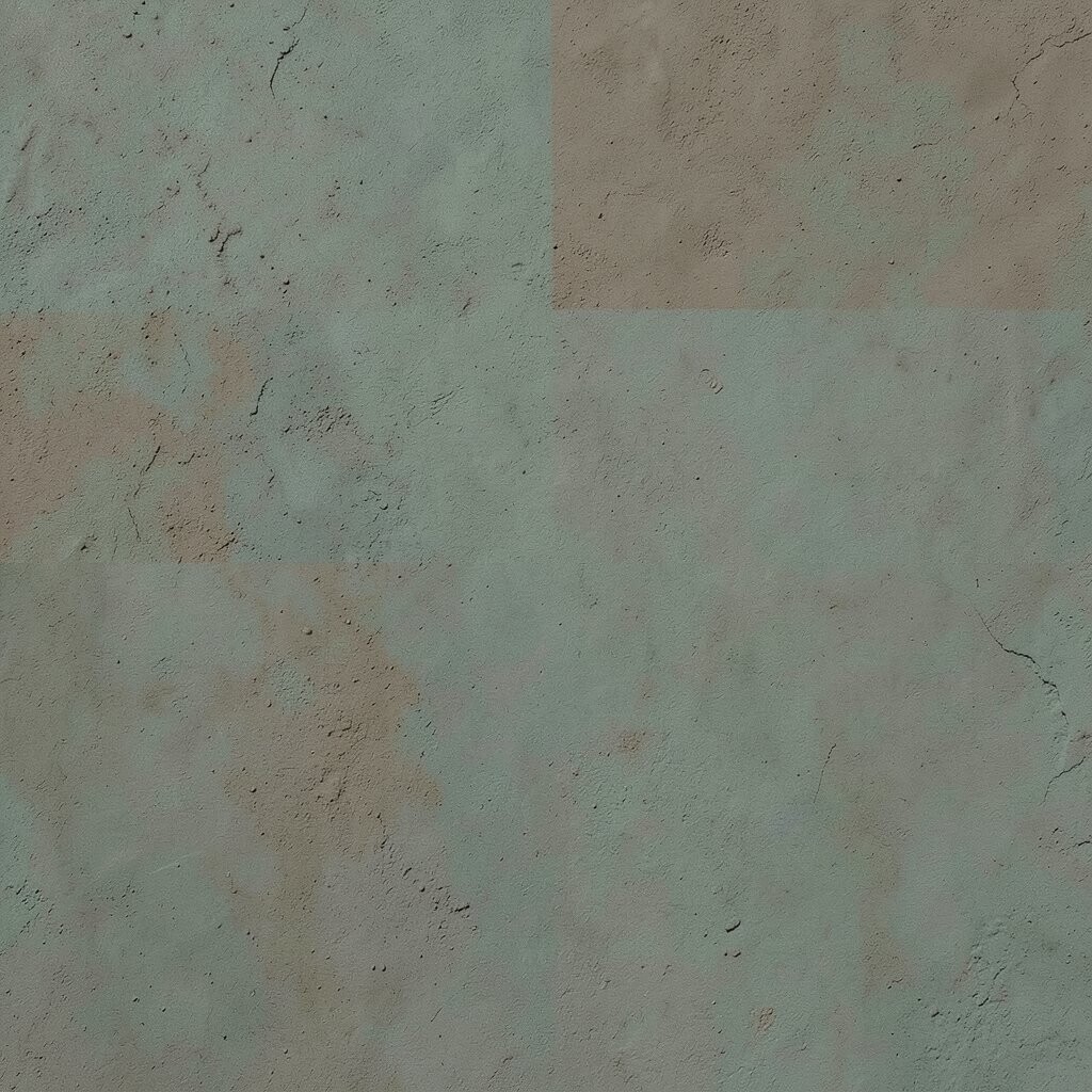
Muted teal gives a room a cool water-like note, but it stays soft and calm. Brown clay adds warmth and keeps the palette tied to the earth.
This mix works well for people who want color but do not want bright blue or bold green. It can help a room feel fresh, steady, and a little unique at the same time.
You can use teal on a sofa pillow, vase, or wall print, then bring in clay through a rug, pot, or blanket. The scheme looks current in many homes now, and it can be done with small changes that do not cost much.
10. Pebble Gray and Olive Brown

Pebble gray has a smooth, soft stone feel that works as a quiet base. Olive brown adds a warmer note that makes the space feel more natural and less cold.
This pairing is helpful in rooms that get a lot of use because it hides wear better than bright colors. It is also easy to match with wood, black frames, white walls, and simple fabrics.
If you want a more personal feel, add plants, handmade pieces, or textured fabric in the same color family. This color scheme is often easy on the budget because it works with many basic items you may already own.
11. Sepia Tan and Deep Sage
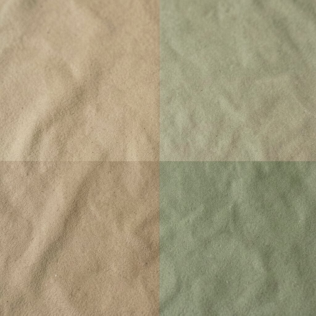
Sepia tan has a faded paper-like warmth that can make a room feel calm and gentle. Deep sage gives it a stronger green base and adds a touch of depth.
This look is good for spaces that need a quiet mood, such as a bedroom, office, or sitting room. It can help the room feel set apart from the rest of the house in a soft and natural way.
Use sepia tan on larger pieces like walls or curtains, then bring in deep sage with chairs, throws, or art. The scheme feels timeless, and you can keep costs low by using paint and fabric before buying new furniture.
12. Burnt Sienna and Soft Stone
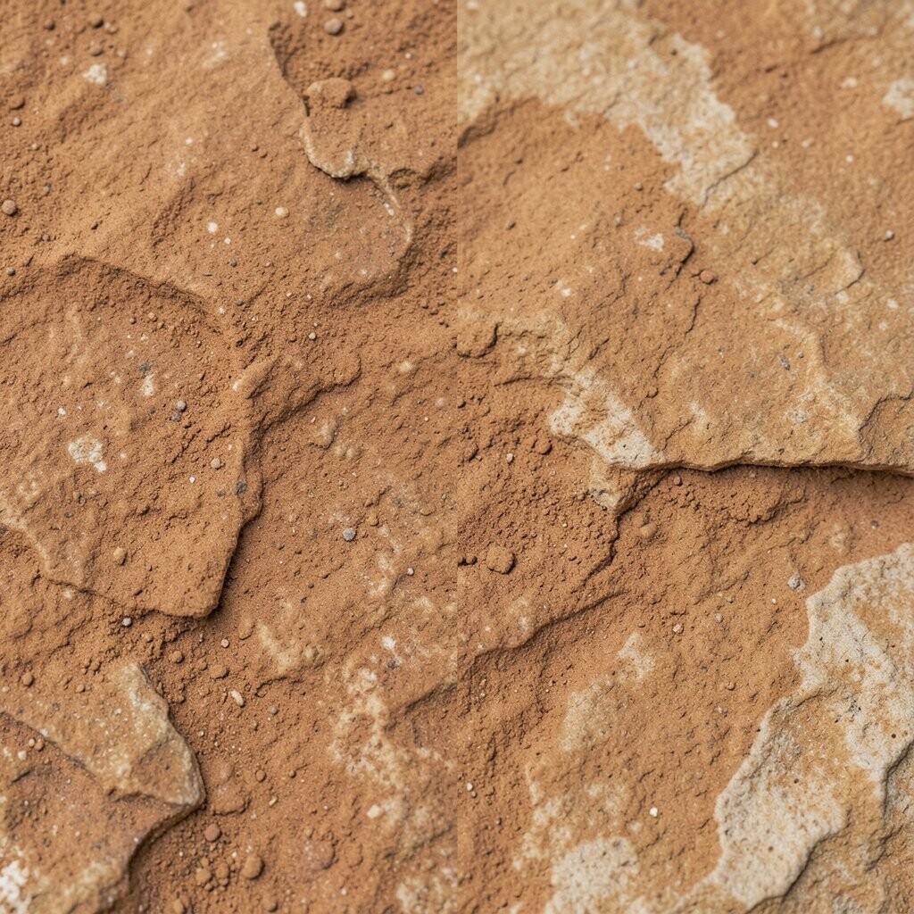
Burnt sienna has a warm, earthy red tone that feels bold but still natural. Soft stone adds a pale, calm look that helps the room stay open and balanced.
This mix works well in rooms where you want a little drama without using dark colors. It can make a plain space feel more finished and can look nice with wood, linen, and simple metal accents.
If you want more impact, add burnt sienna in a large chair, blanket, or wall panel. If you want a lighter look, use soft stone as the main color and keep the red-brown as a small accent, which is easier on the wallet too.
13. Desert Beige and Palm Green

Desert beige feels dry, warm, and sunlit, much like sand or stone in a quiet place. Palm green adds a lively plant note that keeps the space from feeling flat.
This color pairing works well for homes that want a calm, clean look with a touch of life. It is also a nice match for woven decor, light wood, and simple shapes that feel easy to live with.
You can use more beige if you want the room to stay soft, or more green if you want it to feel fresher. The look is easy to change over time, and it can fit many budgets because both colors are common in rugs, paint, and decor.
14. Walnut Brown and Fern Green
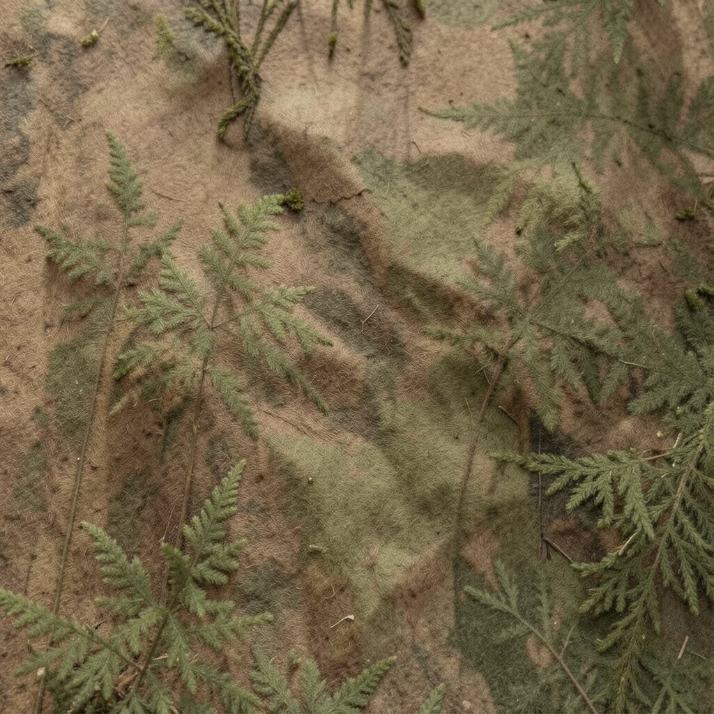
Walnut brown has a rich wood tone that gives a room a steady base. Fern green adds a leafy feel that makes the space seem fresh and calm.
This scheme is a strong choice for people who like classic rooms with a natural touch. It works well in spaces with real wood, soft lighting, and a few simple plants.
For a more personal style, use walnut in the larger items and fern green in details like cushions, books, or a chair. It is a practical choice too, since deep brown and green can hide small marks better than pale colors.
15. Toasted Oat and Deep Earth Red
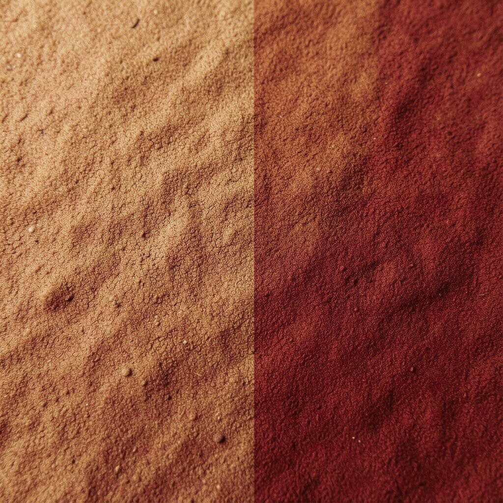
Toasted oat has a light, warm look that feels soft and easy to live with. Deep earth red gives the scheme a grounded color that feels strong without being loud.
This pairing is useful when you want a room to feel warm but not too dark or too plain. It works well in family rooms, bedrooms, and even small spaces because the light base helps the room stay open.
You can make the room feel more modern with clean lines or more homey with textured fabric and wood pieces. It is also a good option for people who want to try earthy colors without spending a lot, since one accent color can do most of the work.