
Vintage mosaic tiles can bring old charm to many rooms in a simple way. The right color mix can help a space feel calm, warm, or full of life.
1. Soft Mint and Cream

Soft mint and cream make a light and easy color pair that feels fresh but still old-school. The pale green tone gives a calm look, while cream keeps the design soft and easy on the eyes.
This palette works well in kitchens, small baths, and laundry rooms because it helps spaces feel open. It is also a good low-cost choice since both colors are easy to find in many tile lines.
If you want a gentle retro feel, try adding small patterned accents in white grout or with a few mixed glass pieces. This mix fits many styles, so it is simple to make it your own.
2. Dusty Rose and Warm White

Dusty rose and warm white bring a sweet, old-movie look without feeling too bright. The muted pink adds charm, and the warm white keeps the whole surface soft and neat.
This palette can help a room feel cozy and calm, which is nice for a bath wall or vanity top. It is also easy to match with brass, wood, or simple black hardware.
Many people like this look because it feels both classic and current. You can use more rose for a stronger vintage style or keep it light for a quiet look that still stands out.
3. Teal and Pale Yellow

Teal and pale yellow make a cheerful pair that brings back a mid-century feel. The teal gives depth, while the pale yellow adds a sunny touch that keeps the design from feeling too dark.
This color mix can make a backsplash or shower wall feel lively and clean. It also works well in homes that need a bit more color without using very bold shades.
To keep costs in check, you can use teal tiles as the main color and add yellow in small bands or accents. That small change can make the whole design feel more personal and less plain.
4. Olive Green and Buttermilk
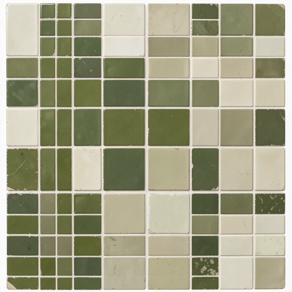
Olive green and buttermilk create a soft nature look with a vintage edge. The olive tone feels rich but calm, and the buttermilk shade adds a creamy base that keeps things light.
This palette fits well in kitchens and mudrooms where you want a warm, lived-in feel. It also hides light marks better than very pale tiles, which can help with daily use.
If you like a quiet retro style, this mix is a smart choice because it feels old and new at the same time. Add wood shelves or simple metal trim to make the colors stand out in a neat way.
5. Powder Blue and White

Powder blue and white give a clean, airy look that feels like a classic bath from past years. The soft blue adds a cool note, while white keeps the palette crisp and simple.
This is a strong pick for a room that needs to feel bright and open. It can also help make small areas seem a little larger, which is useful in older homes.
You can make this palette more unique by using tiny mosaic pieces in both matte and glossy finishes. That small mix adds texture without making the space feel busy.
6. Rust and Sand

Rust and sand make a warm pair that feels earthy and old-fashioned in a good way. Rust adds deep color and sand keeps the look soft, so the wall or floor does not feel too heavy.
This palette is nice for entry spaces, fireplace surrounds, and kitchen backsplashes. It can also help hide wear, which makes it a practical choice for busy homes.
For a low-cost update, use rust as the main shade and bring in sand as the tile border or grout match. That mix gives you a rich look without needing a large amount of accent tile.
7. Black, White, and Pale Gray

Black, white, and pale gray create a classic mosaic style that never feels too far from retro design. The contrast gives the pattern a sharp look, while gray softens the jump between dark and light.
This palette is a good fit for floors, shower walls, and kitchen backsplashes. It can help a room look tidy and clear, and it also works with many kinds of decor.
If you want the design to feel less strict, use more gray and a bit less black. That small change can make the pattern easier to live with while still keeping the old-style mood.
8. Coral and Seafoam

Coral and seafoam bring a fun beachy look that feels like a throwback to past decades. Coral adds a lively pop, and seafoam keeps the palette soft and easy to enjoy.
This mix works well in bathrooms and sunrooms where a light, happy feel is welcome. It can also help a plain room feel more finished without using very bold color.
To make the palette feel more personal, use seafoam for most of the tile and coral as small accent pieces. That approach keeps the room balanced and makes the color story feel thoughtful.
9. Burgundy and Buttercream

Burgundy and buttercream give a rich but gentle style that feels old-fashioned in a warm way. Burgundy adds depth and a little drama, while buttercream keeps the look smooth and soft.
This palette is nice for a wall panel, powder room, or small hearth area. It can help a space feel more dressed up while still staying easy to live with.
If you want a more modern feel, use simple shapes in the mosaic and keep the layout neat. That choice can help the colors shine without making the design feel too busy or costly.
10. Sage and Ivory

Sage and ivory make a calm pair that fits many vintage-inspired rooms. Sage has a soft green-gray look, and ivory adds a warm light base that feels easy and clean.
This palette is a good choice for people who want a peaceful style with some old charm. It works well in kitchens, baths, and even around a small vanity mirror.
Many new tile trends use soft natural colors like these because they feel easy to keep for a long time. You can add small handmade-looking tiles to give the design a more personal touch.
11. Mustard and Dove Gray

Mustard and dove gray create a bold but balanced retro look. The mustard shade gives energy and warmth, while dove gray keeps the palette calm and neat.
This mix can help a space feel more stylish without using very bright colors. It is a nice choice for accent walls, backsplash strips, or a small bathroom floor.
If you want to save money, use mustard in small spots and let gray do most of the work. That way the design still feels special, but you do not need a large amount of bright tile.
12. Plum and Pink Beige

Plum and pink beige make a soft romantic pair with a clear vintage feel. Plum gives depth and a rich look, while pink beige keeps the palette warm and easy to use.
This color mix works well in vanity areas, shower niches, and decorative borders. It can help a room feel special without needing a lot of extra decor.
To make this palette fit your own taste, use plum in small mosaic clusters or a border line. That lets you control how strong the color feels while still keeping the retro mood.
13. Cobalt and White

Cobalt and white give a bright, clean style that recalls old pool tile and classic diner looks. The cobalt color brings strong energy, while white keeps the pattern sharp and clear.
This palette is good for backsplashes, shower walls, and small accent areas that need a bit more life. It can also help a simple room feel more fresh and full of shape.
If you want a lower-cost way to use this look, choose cobalt tiles only in a few key spots and use white around them. That balance keeps the design bold without needing a full wall of bright tile.
14. Peach and Tan

Peach and tan create a soft warm palette that feels friendly and easy to enjoy. Peach adds a light vintage glow, and tan gives the design a steady base that works in many rooms.
This mix can help older spaces feel less cold and more welcoming. It is also a simple way to bring color into a room without going too far from neutral.
You can make the palette more unique by choosing mixed shades of peach instead of one flat tone. That small detail gives the mosaic more depth and helps it feel less plain.
15. Forest Green and Ivory

Forest green and ivory bring a deep classic look that feels grounded and timeless. The forest green adds strong color, while ivory softens the overall feel and keeps it from looking too dark.
This palette is useful for kitchens, hallways, and bath walls where you want a rich look with vintage style. It can also help tie in wood, stone, or old brass pieces.
For a more current look, use clean lines and simple mosaic shapes rather than heavy patterns. That keeps the color pair in focus and makes the space feel neat and calm.
16. Apricot and Gray Blue

Apricot and gray blue make a friendly mix that feels both old and fresh. Apricot adds a soft warm glow, and gray blue adds a cool note that keeps the colors balanced.
This palette is a smart pick for people who want something different from the usual retro colors. It can help a room feel cheerful without becoming too bright or too sweet.
Try using apricot in small accent tiles and gray blue as the main field color for a more balanced look. This approach works well for many budgets and can be easy to change later if your style shifts.