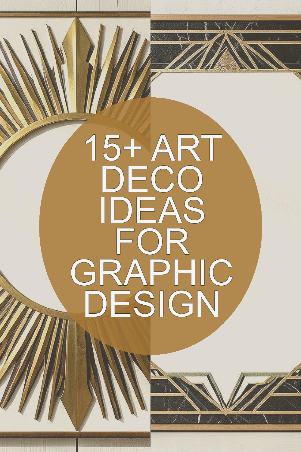
Art Deco style has a clean look with bold lines and rich shapes. It can help your design feel neat, stylish, and easy to remember.
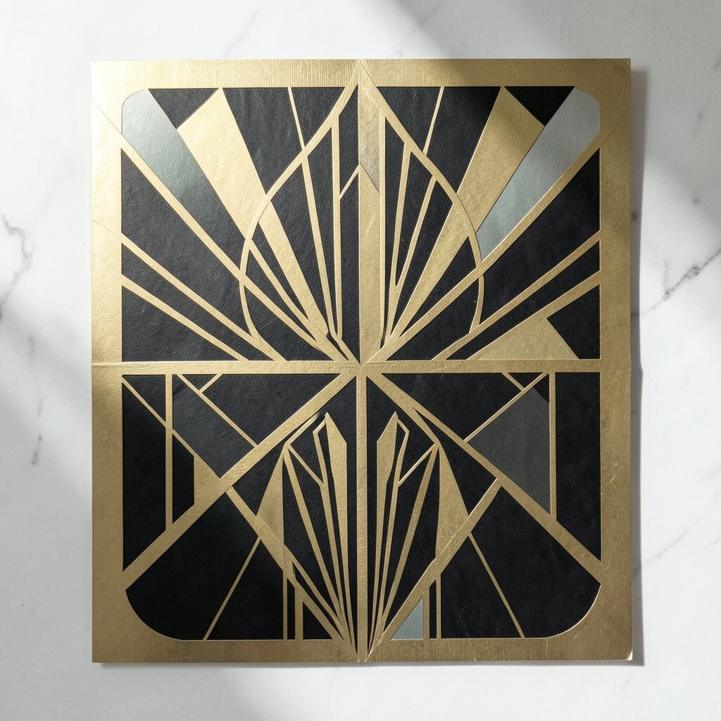
1. Sunburst Frames

Sunburst frames use rays that spread out from a center point. They often look like a rising sun, and they can make a logo, poster, or card feel bright and full of life.
This style works well when you want a clear focus spot in your design. It can hold text, a brand mark, or a photo, and it gives the whole piece a strong shape without much extra work.
You can keep the rays thin for a light feel or make them thick for a bolder look. This is a low-cost idea too, since you can build it with simple lines and shapes in most design tools.
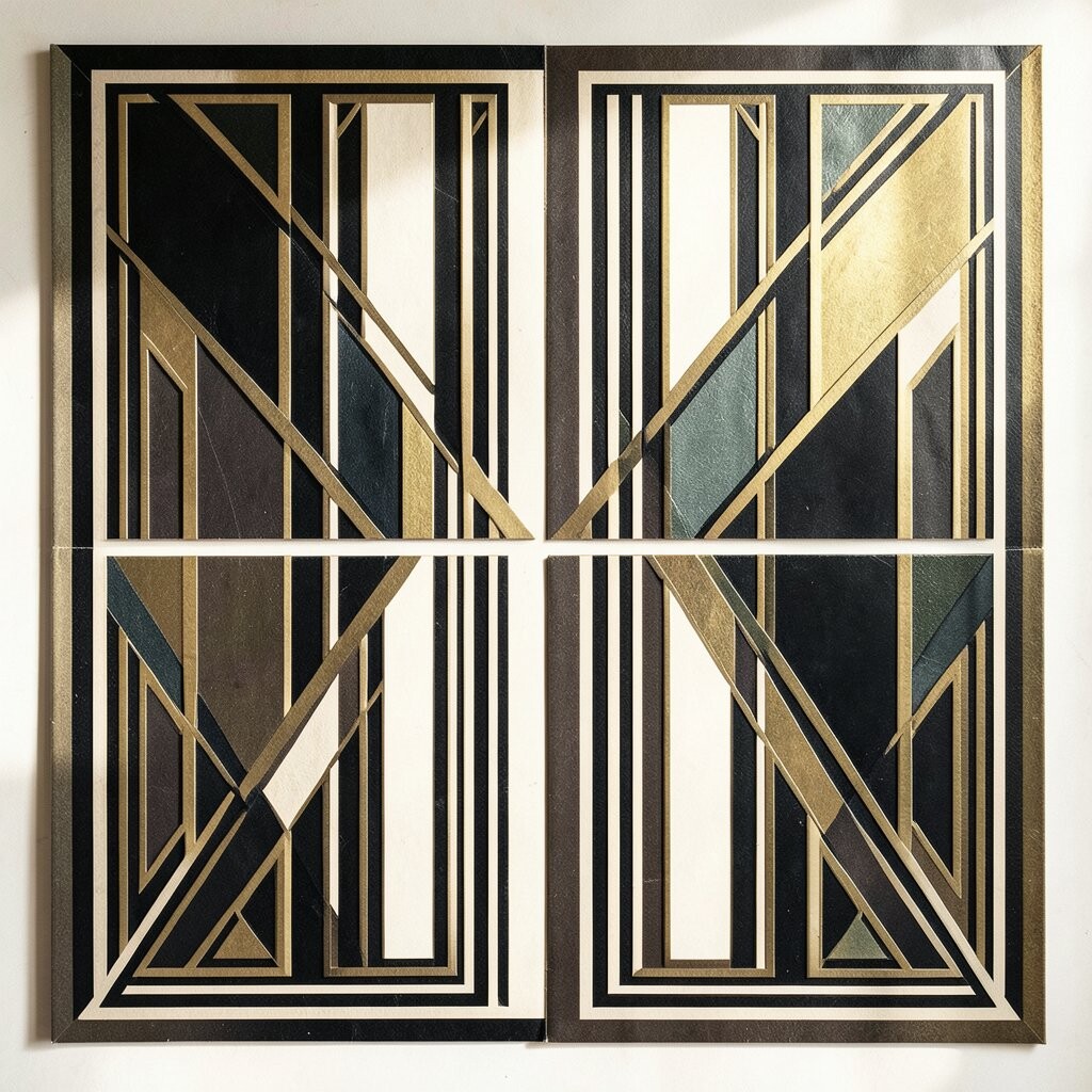
2. Geometric Borders
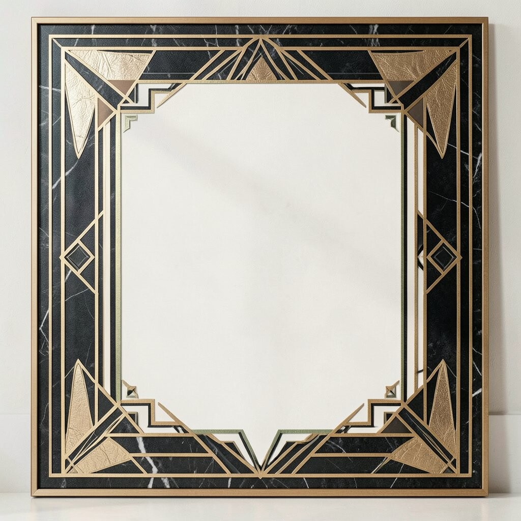
Geometric borders use repeated shapes like steps, zigzags, and blocks. They give a design a steady frame and help guide the eye across the page.
These borders are useful for posters, menus, book covers, and social posts. They can make plain content feel more polished, and they work well with both dark and light color sets.
Try using a border around only part of the page if you want a softer look. You can also make it more personal by matching the shape style to your brand, like sharp corners for a modern feel or soft curves for a calmer one.
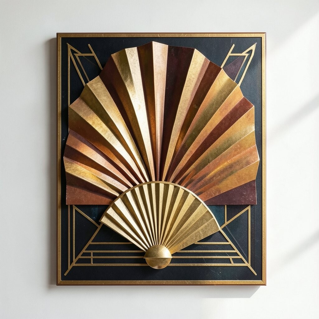
3. Fan Motif Details
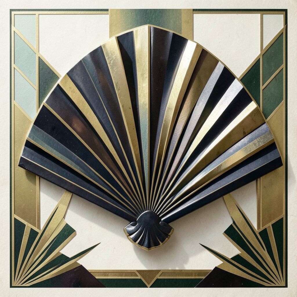
Fan motifs are one of the most known Art Deco ideas. They look like open fans or shell shapes, and they often add a smooth, fancy touch to a layout.
This pattern can help fill empty space in a way that still feels neat. It is a good choice for wedding cards, event invites, labels, and cover art because it adds style without making the page feel too busy.
You can place fan shapes behind a title or use them as small corner marks. Many designers like this idea because it feels classic, and it does not cost much to use in digital work or print work.
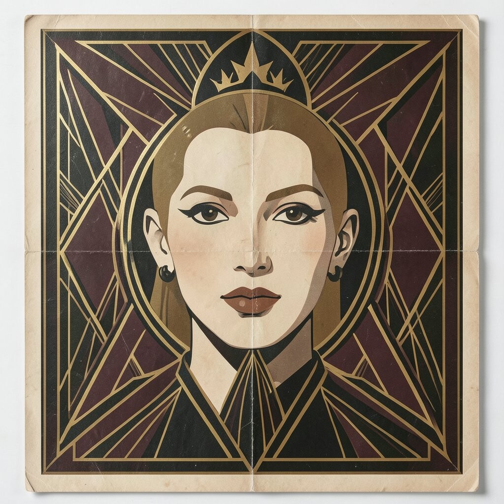
4. Gold And Black Color Sets
Gold and black is a classic Art Deco mix. The dark base gives strong contrast, while gold adds a rich and clean shine that stands out fast.
This color set works well for brands that want a polished look. It can make a flyer, package, or website header feel more serious and well planned, even when the layout is simple.
You do not need real gold foil to get the look. A warm yellow or soft metallic tone can work fine, which helps keep costs lower and makes the style easy to use on screens and paper.
5. Tall Lettering Layouts
Tall lettering fits Art Deco very well because it feels neat and strong. Letters with long lines and even spacing can make words look calm and balanced.
This style is useful for posters, logos, and signs where you want the text to stand out. It can also help small words feel more important, since the shape of the letters adds a lot of visual weight.
Try using tall lettering with extra space between letters for a clean look. If you want a more personal feel, pair it with a custom wordmark or a hand-made detail so it does not seem too plain.
6. Step Pattern Shapes
Step patterns use shapes that move up and down like stairs. They are simple, but they give a design a strong rhythm and a clear Art Deco feel.
These shapes can help lead the eye through a page in a smooth way. They work well in headers, borders, icons, and background blocks, especially when you want structure without too much detail.
You can keep the steps small for a light touch or make them large for a bold effect. This is also a good budget-friendly choice because it only needs basic shape tools and a bit of care with spacing.
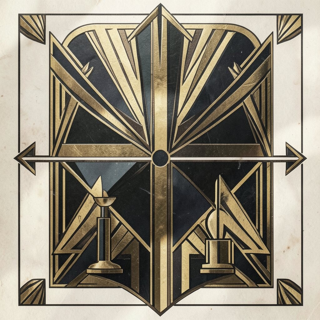
7. Mirror Symmetry
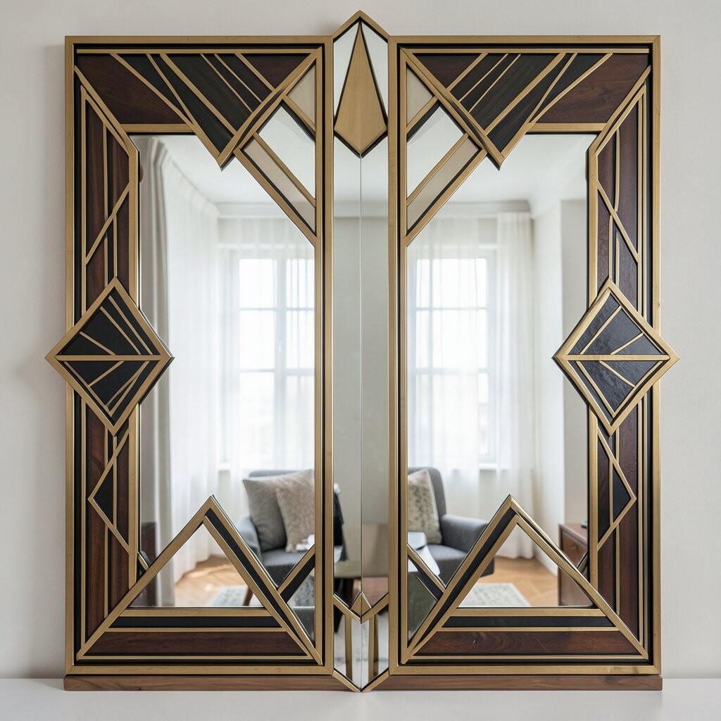
Mirror symmetry means both sides of a design feel the same or very close. Art Deco often uses this because it gives a clean, calm, and planned look.
This idea helps your work feel stable and easy to read. It can also make logos and posters seem more formal, which is useful for brands, events, and editorial pages.
Try placing matching shapes on each side of a center line. You can still add a small personal touch with one detail in the middle, like a name, symbol, or date.
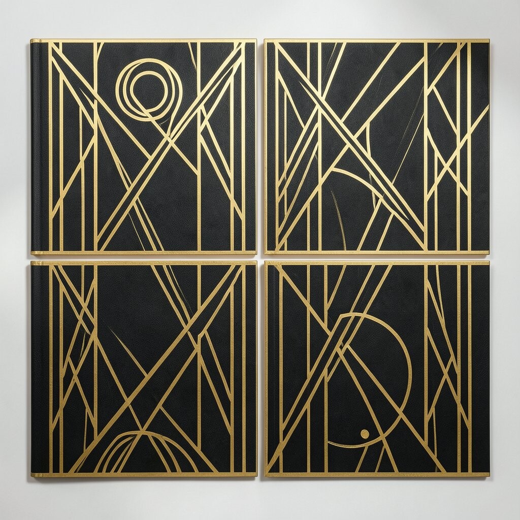
8. Bold Line Art
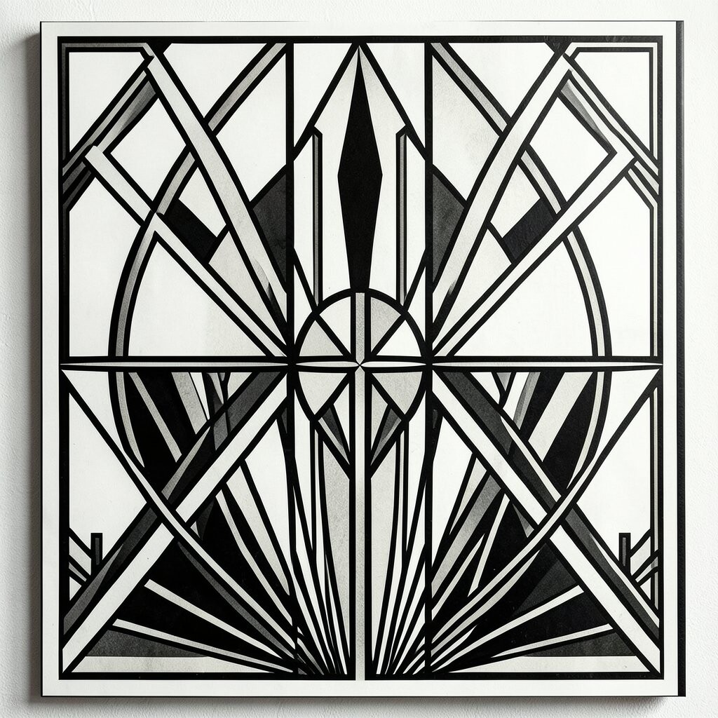
Bold line art uses thick, simple lines to form shapes and scenes. It looks crisp and direct, and it can make Art Deco art feel fresh without losing its old charm.
This style is good for illustrations, posters, and packaging because it stays clear at many sizes. It also prints well, which can help when you need a clean result on a low budget.
Use line art with a few shapes instead of too many small parts. That keeps the design easy to read and gives you room to add color, texture, or text later if needed.
9. Fan And Sun Mix
Mixing fan shapes with sunburst lines can create a rich Art Deco look. The fan gives softness, while the rays add energy and direction.
This mix works well when you want a design that feels lively but still neat. It can make a poster headline, album cover, or brand card stand out in a simple way.
You can make the fan small and the rays large, or switch it around for a different feel. If you want a more personal style, use your own color set so the design matches your brand or event.
10. Jewel Tone Palettes
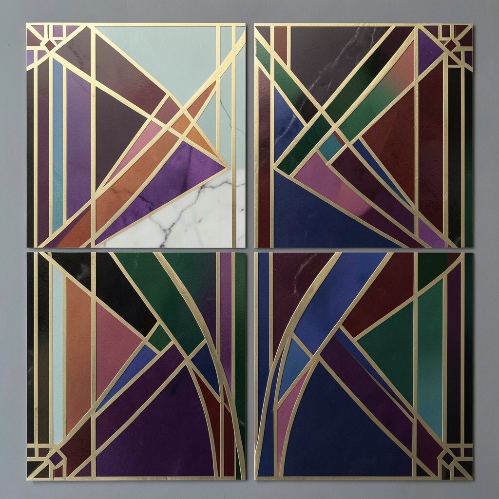
Jewel tones use deep colors like emerald, sapphire, ruby, and amethyst. These shades fit Art Deco well because they feel rich, full, and balanced.
This kind of palette can give your work a warm and stylish mood. It helps a design feel more layered, even when the layout uses only a few shapes and simple text.
Try pairing one jewel color with cream, black, or gold for a neat result. This can also be a smart cost choice, since strong color alone can carry the style without needing lots of extra graphics.
11. Tiered Shapes

Tiered shapes stack in levels, often with a wide base and smaller top parts. They bring to mind towers, stages, and old city buildings, which fits Art Deco very well.
These shapes are useful for posters, labels, and ad layouts because they create a clear path for the eye. They also help content feel organized, which is great when you have text, icons, and images on one page.
You can make the tiers sharp and strict or soften them a little for a friendlier look. A tiered shape can also be adjusted to fit your message, which makes it easy to use in personal work.
12. Metallic Accent Lines

Metallic accent lines add a small shine that can make a design feel special. Even a thin line in gold, silver, or bronze can give a simple layout more depth.
These accents work well around titles, borders, and icons. They are a nice way to get the Art Deco look without filling the whole page with heavy detail.
If you are printing, you can use a flat color that looks metallic instead of real foil to keep costs down. On screen, a soft shine effect can work too, as long as it stays clean and easy to read.
13. Deco Pattern Tiles
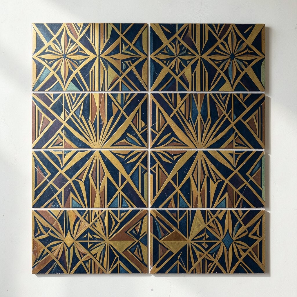
Pattern tiles repeat the same shape across a space in a neat way. Art Deco patterns often use fans, diamonds, arcs, and stepped forms to make the page feel full but controlled.
This is a good choice for backgrounds, wraps, and packaging because it adds style without needing a big image. It can also help small products feel more finished and more careful.
You can keep the tile small for a quiet look or use a larger repeat for more impact. Many designers like this idea because it is easy to change for different colors, seasons, or brand needs.
14. Arch Shapes
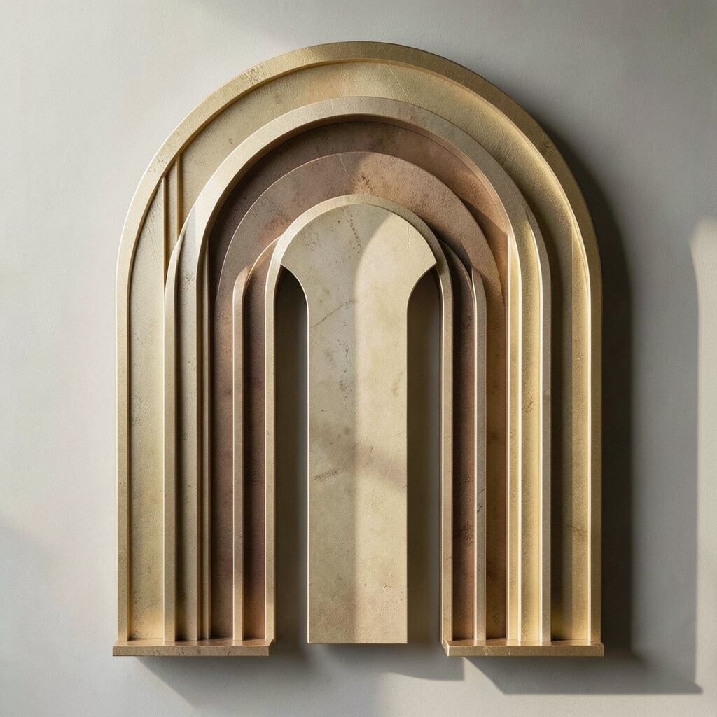
Arch shapes bring in smooth curves that still feel strong and ordered. They are a nice match for Art Deco because they balance softness with structure.
These shapes can frame text, hold photos, or act as a window into another part of the design. They are useful for posters, menus, websites, and event graphics where you want a clear center point.
Try using one large arch or a set of smaller ones in a row. You can make the arches feel more personal by changing the width, color, or line weight to fit your project.
15. Deco Icons
Deco icons are small symbols made with clean lines and simple shapes. They often show things like stars, fans, towers, and rays in a neat Art Deco way.
These icons help a design feel more complete and more tied together. They are great for menus, guides, labels, and social posts because they add meaning without taking up much room.
You can make your own icon set to match your brand, which gives your work a custom feel. This is also a low-cost idea, since small icons are easy to build and reuse across many projects.
16. Classic Poster Layouts
Classic poster layouts use a strong center, clear blocks of text, and bold shapes around the edges. They often feel formal, but they can still be warm and easy to read when the spacing is done well.
This layout style works for music shows, theater ads, product promos, and wall art. It gives you room to mix type, pattern, and image in a way that feels balanced and tidy.
Try keeping the main text large and the extra details smaller so the message stays clear. You can also make the layout more personal by using colors, symbols, or type styles that match the mood of your project.