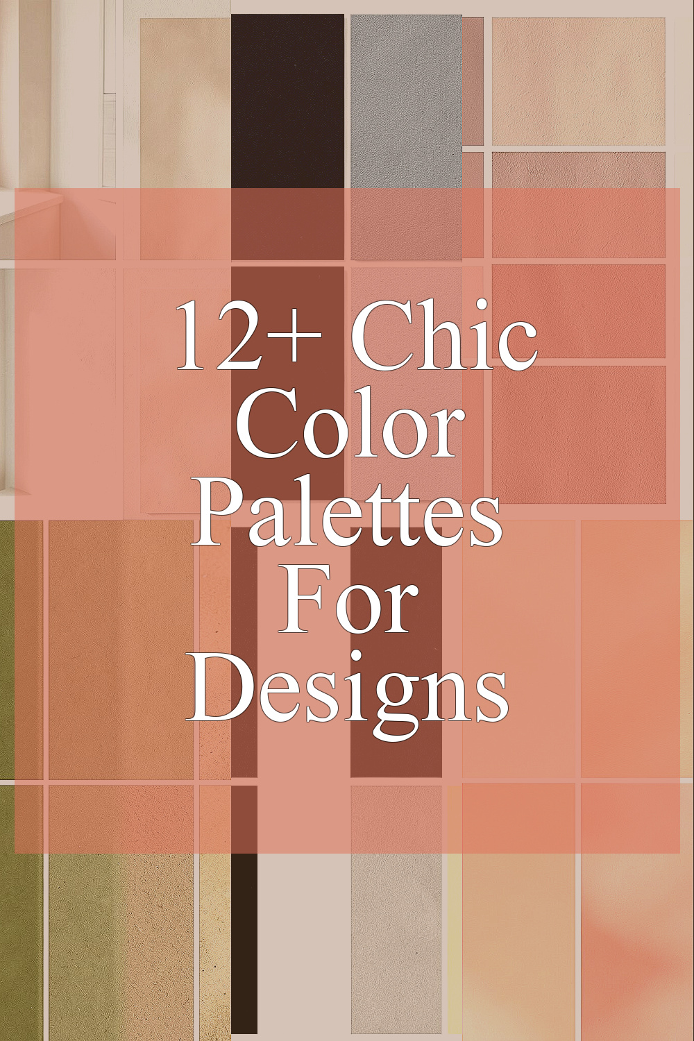
Color can change how a design feels at once. The right mix can help a page, room, or brand look clean and easy to use.
1. Soft Beige and Warm White
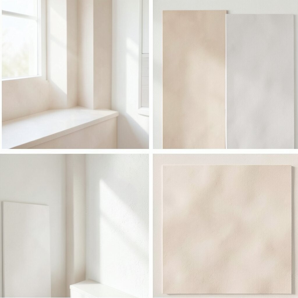
Soft beige and warm white make a calm and clean look. This palette feels light, open, and easy on the eyes.
It works well for home pages, print pieces, and room decor because it does not fight for attention. You can use it when you want a quiet style that still feels neat and cared for.
This mix is often low cost because it uses common colors and simple materials. Add small bits of wood, linen, or cream tones to make it feel more personal and less flat.
2. Deep Navy and Soft Gray
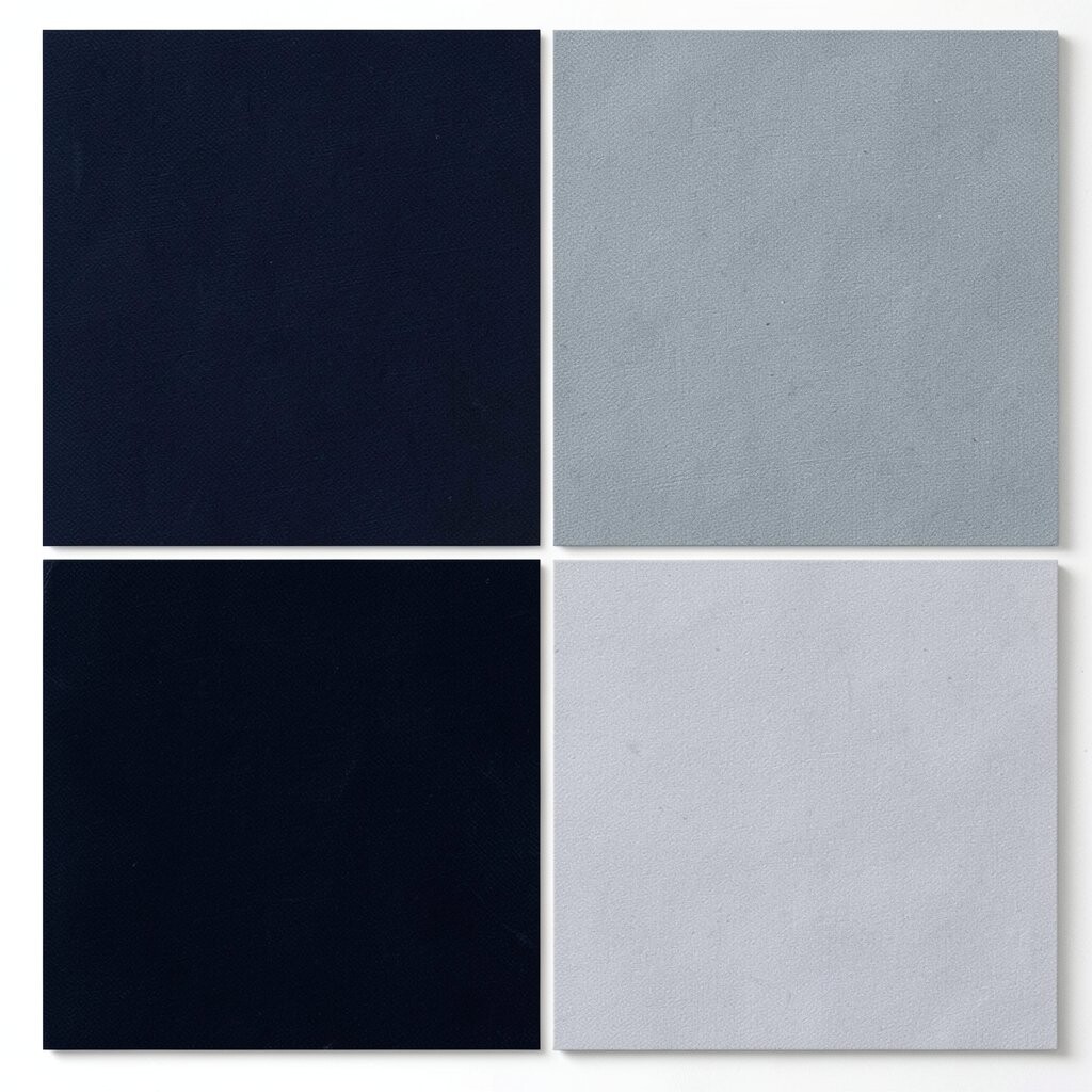
Deep navy with soft gray gives a smart and steady feel. The dark blue adds weight, while the gray keeps things soft and balanced.
This palette is a good pick for business cards, websites, and office spaces. It helps text stand out and makes a design feel more serious without looking stiff.
Many people use this pair because it fits both old and new styles. If you want a fresh look, try adding a small bit of white or silver for a clean edge.
3. Dusty Rose and Cream
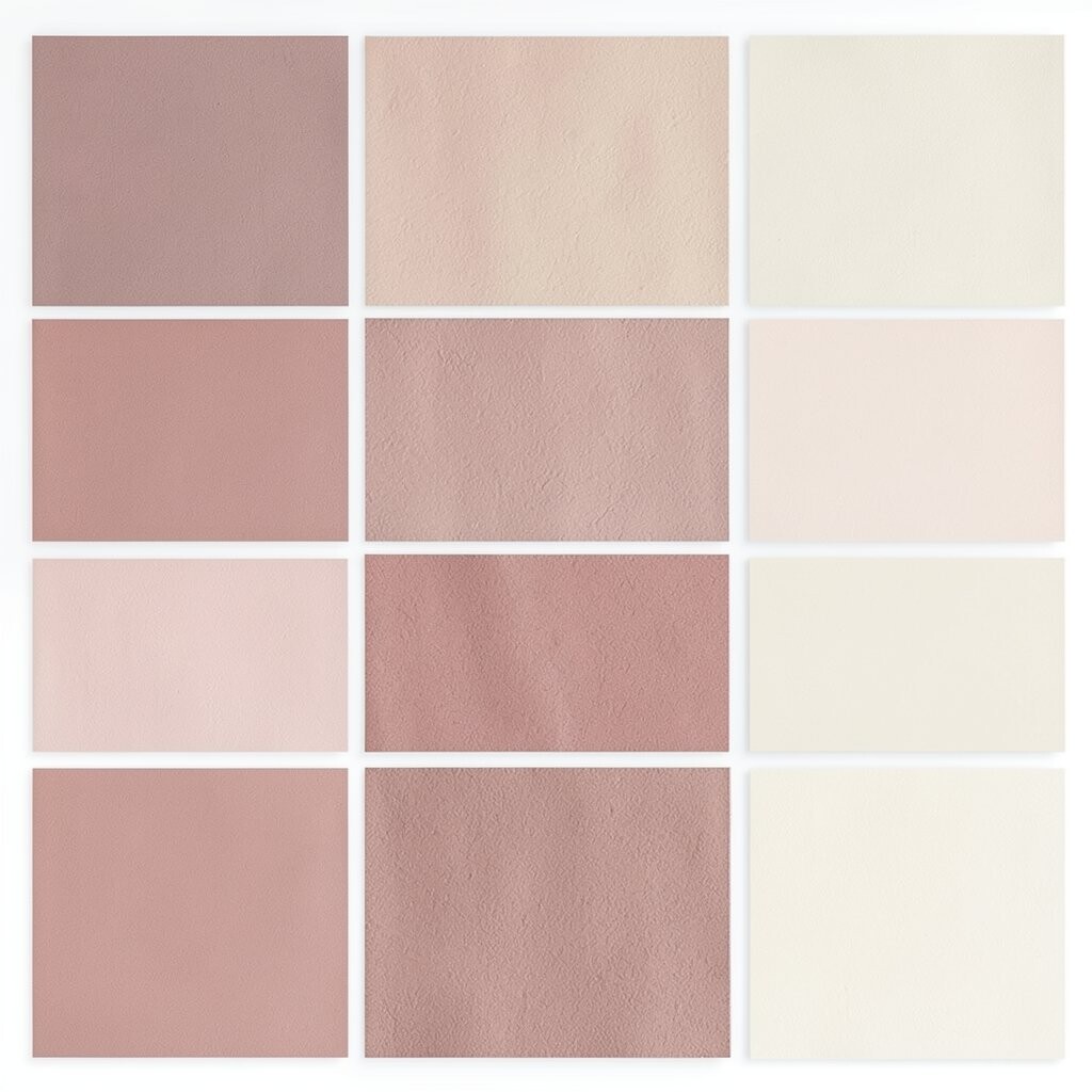
Dusty rose and cream make a gentle and warm palette. The rose adds a soft color note, and the cream keeps it light and easy to read.
This set works well for wedding pages, beauty brands, and cozy room accents. It feels friendly and soft, which can help a design seem more open and kind.
You can keep costs low by using this palette with simple paper, fabric, or digital layouts. For a more personal feel, add gold text or a small floral shape in one corner.
4. Olive Green and Sand
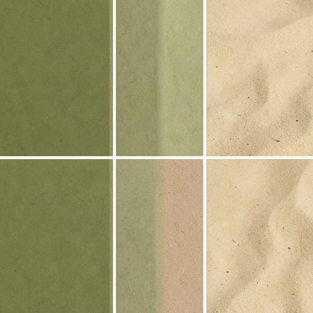
Olive green and sand bring a natural and calm look. The green feels grounded, and the sand tone makes the whole palette feel warm and easy.
This is a strong choice for eco brands, menus, and outdoor themes. It can help a design feel honest and simple, which many people like right now.
Try this palette with matte paper, clay pots, or plain web backgrounds. It is also easy to match with other earth tones, so you can make it fit your own style.
5. Black, White, and One Bright Accent
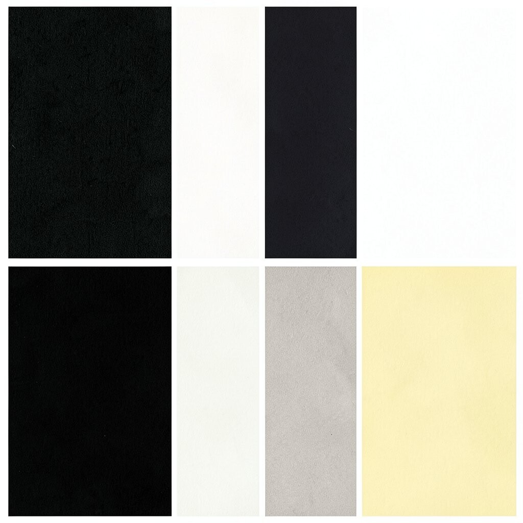
Black and white give a sharp and clean base. A bright accent like red, blue, or yellow adds a small burst of life and draws the eye fast.
This style is popular because it is simple and bold at the same time. It works well for ads, posters, logos, and modern rooms where you want a clear focus.
The cost can stay low since black and white are easy to use in most formats. To make it feel more like your own, pick one accent color that fits your mood or brand story.
6. Peach and Pale Coral
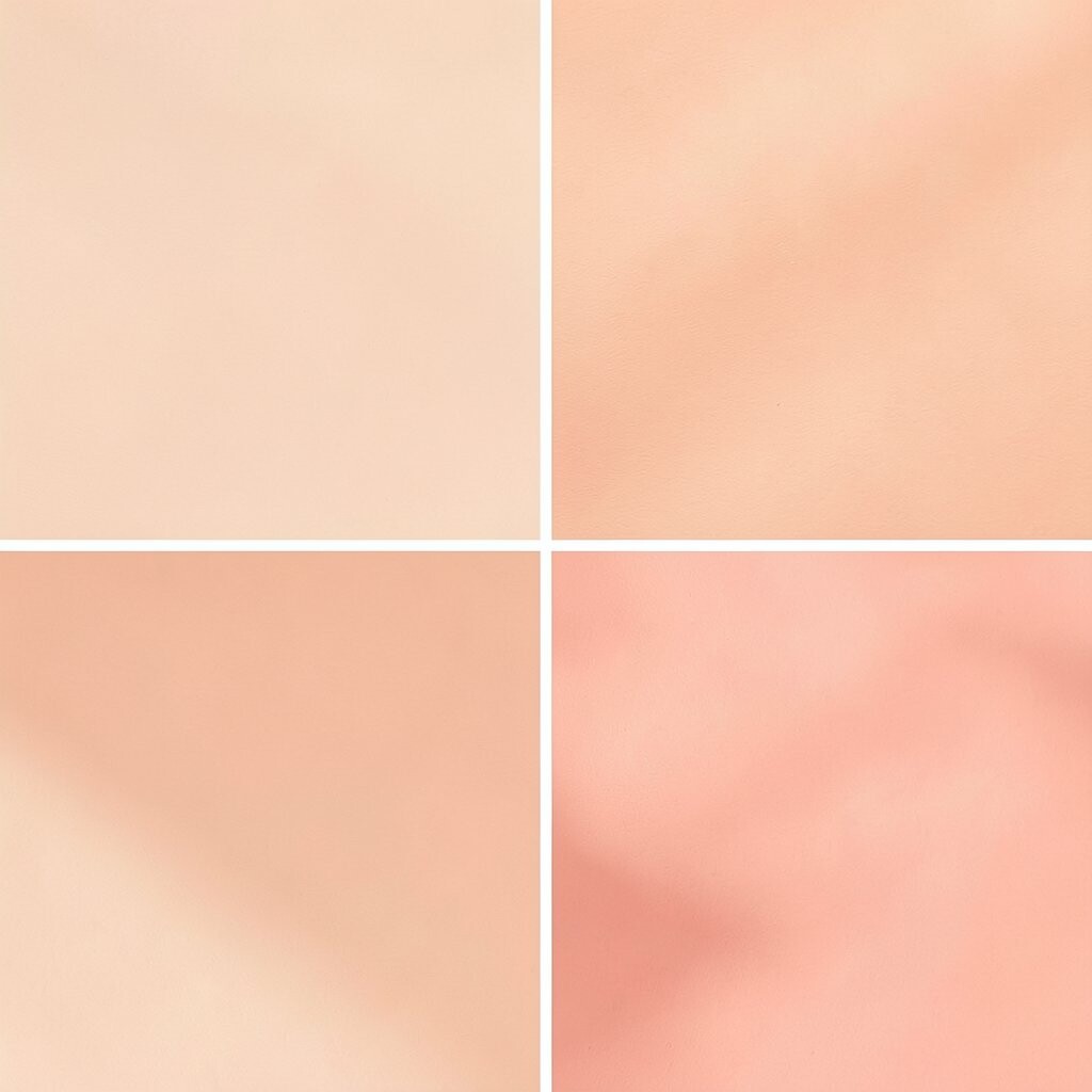
Peach and pale coral make a soft and sunny look. These colors feel light, warm, and easy to use in many kinds of designs.
This palette can help a page or space feel friendly right away. It is a good fit for food pages, kids’ items, and relaxed social posts.
Because the colors are close in tone, they work well without much effort. Add white space, light beige, or simple line art if you want a calmer and more modern feel.
7. Forest Green and Gold
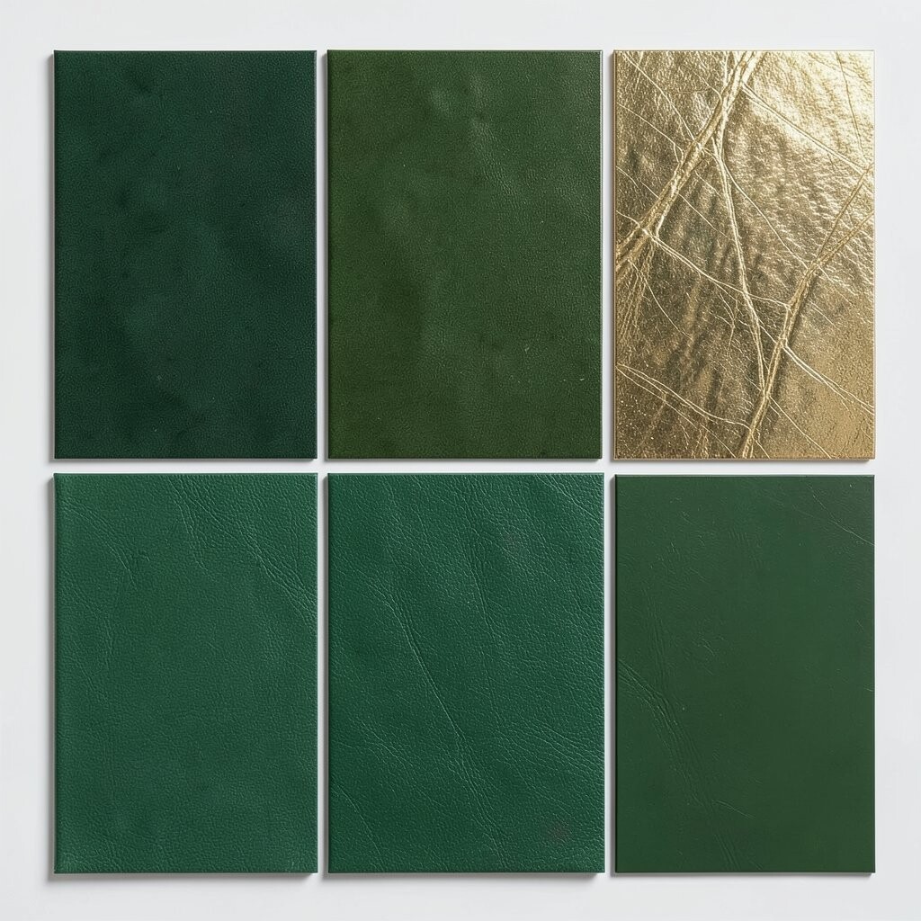
Forest green and gold create a rich and classic look. The green feels deep and natural, while the gold adds a touch of shine and care.
This palette works well for labels, invitations, and elegant room details. It can make a design feel special without needing a lot of extra parts.
People often use this mix for fall themes and formal events, so it feels current and timeless at once. If you want to keep costs down, use gold as a small accent instead of a full background.
8. Sky Blue and Soft Cloud White

Sky blue and soft cloud white give a fresh and open feel. The blue looks clear and light, and the white keeps everything airy.
This palette is great for travel sites, health pages, and clean product layouts. It can help text and images feel easy to scan, which is useful for busy readers.
You can make it more personal by adding a tiny bit of gray, teal, or pale yellow. That small change can help the palette match a brand, mood, or season without losing its calm look.
9. Plum and Mauve
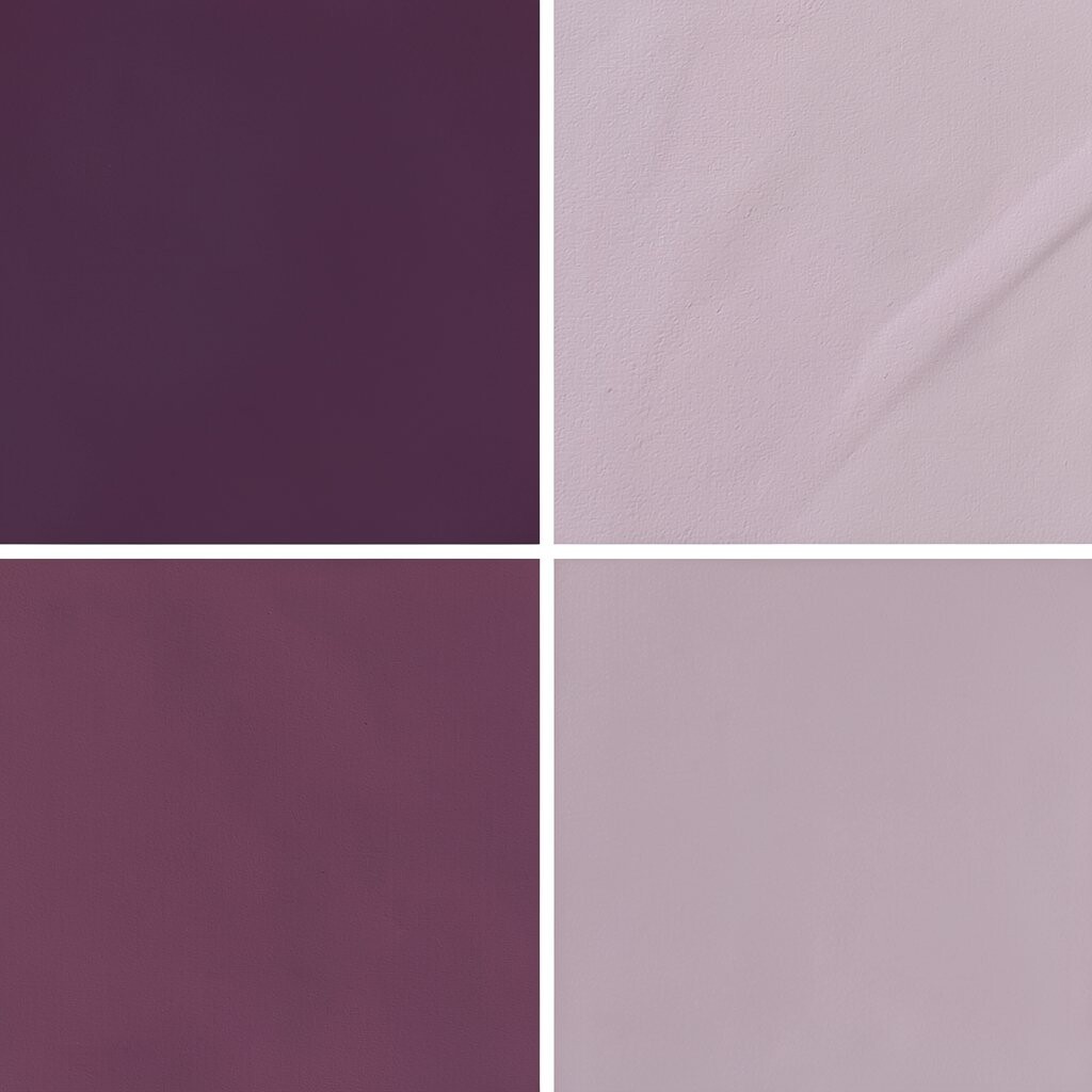
Plum and mauve make a soft but rich color set. Plum adds depth, and mauve keeps the look gentle and smooth.
This palette is nice for fashion pages, beauty packaging, and art prints. It feels a little more unique than plain pink or purple, so it can help a design stand out.
Use it with simple shapes and clean text for a neat result. If you want a lower-cost option, try it in digital work first before using it on more costly print items.
10. Teal and Warm Tan
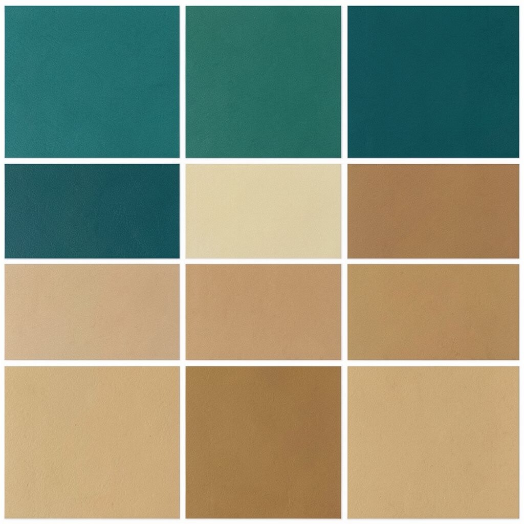
Teal and warm tan make a balanced and easygoing pair. The teal feels cool and fresh, while the tan adds a soft, grounded note.
This mix works well for cafes, blogs, and home goods because it feels both modern and relaxed. It can help a design look current without feeling too loud or busy.
Many people like this palette because it works in both small and large spaces. You can make it more personal by adding a dark brown line, a plant photo, or a woven texture.
11. Charcoal and Blush
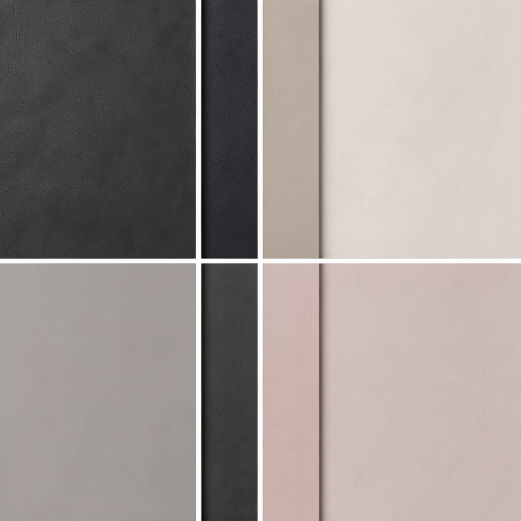
Charcoal and blush give a nice mix of strong and soft. The charcoal sets a firm base, and the blush brings in a warm and gentle touch.
This palette is useful for brand work, social posts, and room accents where you want both style and ease. It can help a design feel modern while still staying soft enough for daily use.
It is also a good choice if you want a chic look without using bright colors. Keep the blush light and the charcoal deep to make the two colors work well together.
12. Mustard and Slate Blue
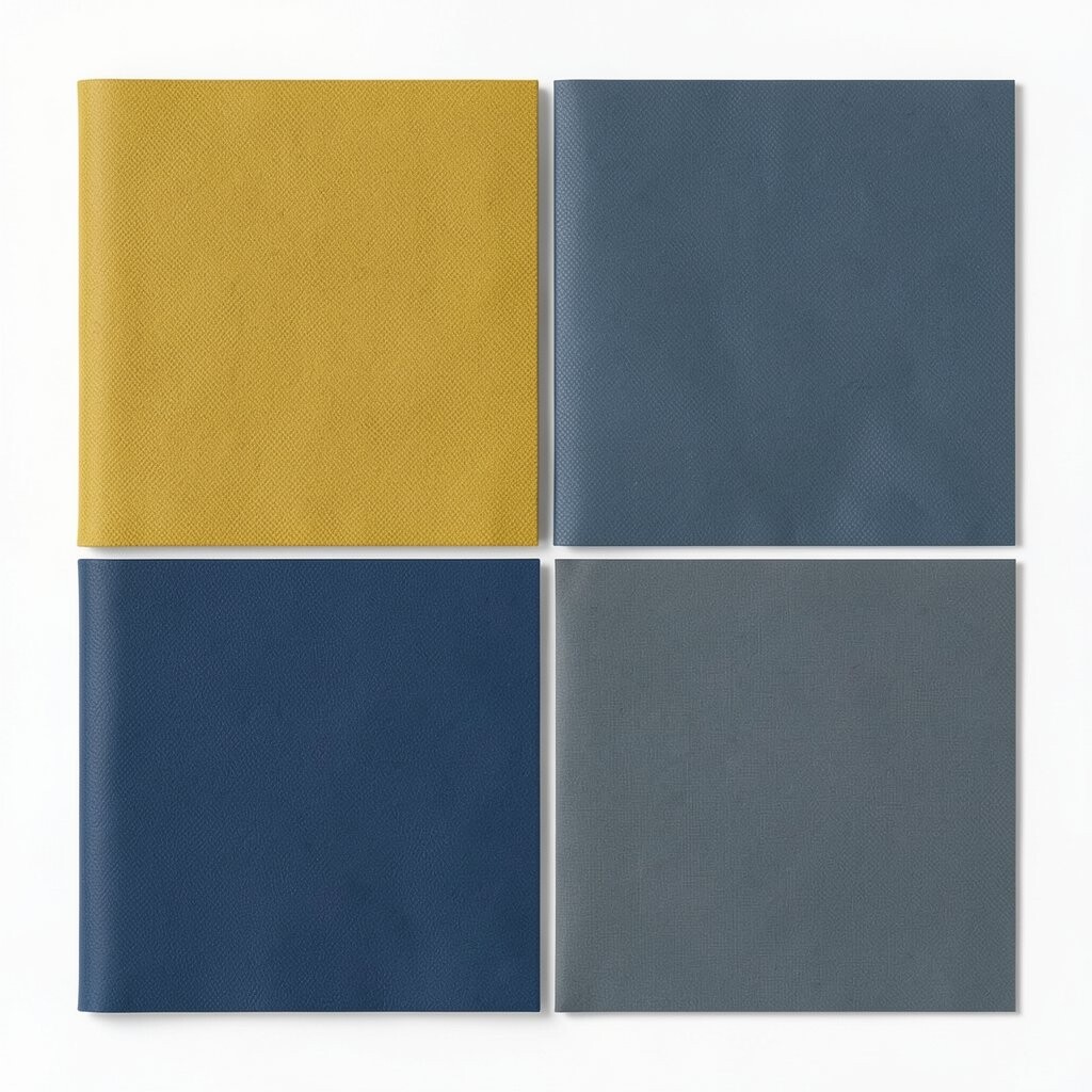
Mustard and slate blue make a bold and smart pair. The mustard feels warm and lively, and the slate blue keeps the whole look steady.
This palette is a nice fit for posters, packaging, and creative websites. It feels a bit different from common color sets, which can help a design look fresh and memorable.
It can also work well with current style trends that use old-style colors in new ways. If you want a lower-cost setup, use the colors in small parts instead of full coverage.
13. Ivory, Sage, and Soft Brown
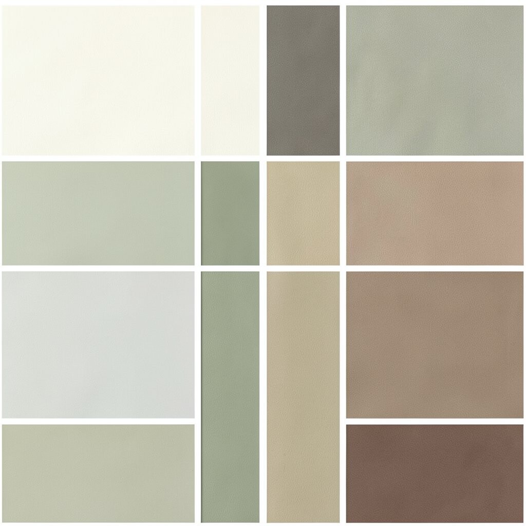
Ivory, sage, and soft brown make a calm and natural palette. The ivory keeps things light, the sage adds a soft green note, and the brown gives warmth.
This set is good for simple brands, home decor, and pages that need a quiet and clean look. It feels easy to live with, which makes it useful for both digital and printed designs.
You can make this palette your own by changing the shade of sage or brown a little. It often costs less to use because the colors work well with plain materials, simple photos, and soft backgrounds.