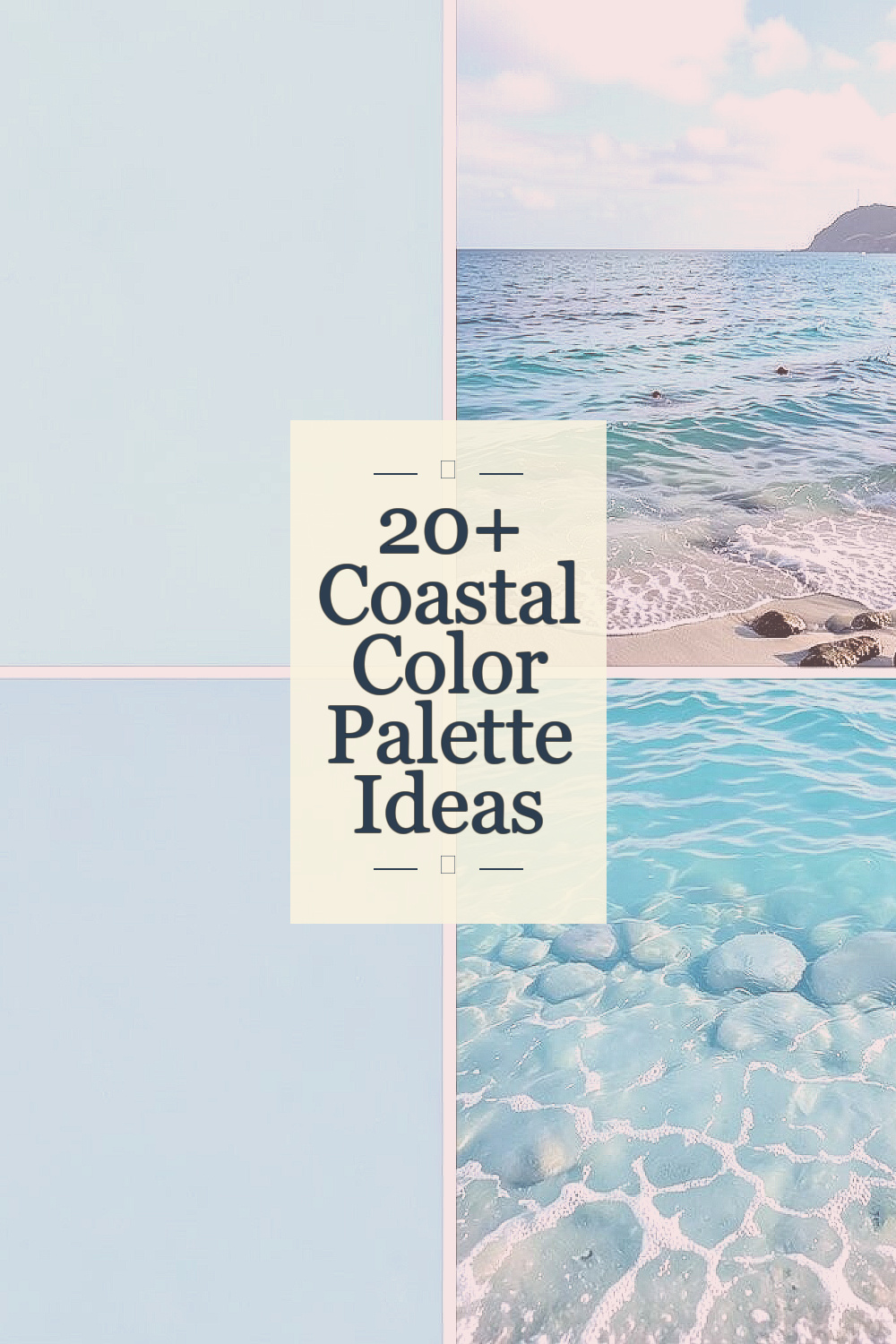
Coastal colors can make a home feel light and calm without much effort. These shades work well in many rooms and can fit both new and old decor.
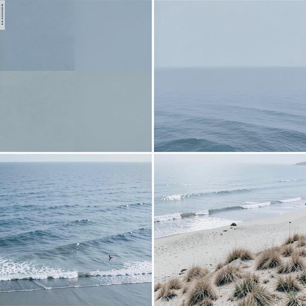
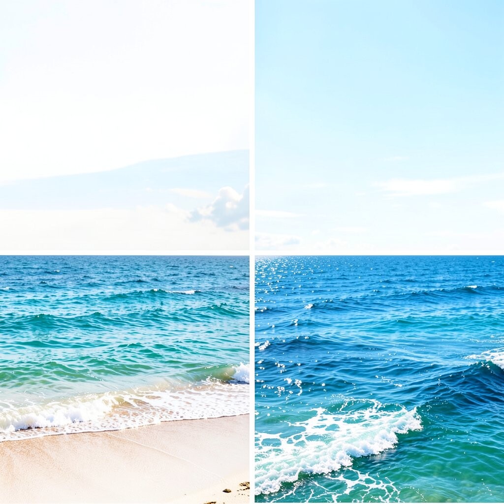
1. Soft Sea Glass Blue
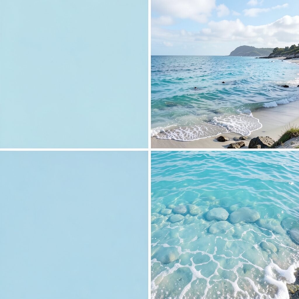
Soft sea glass blue feels light, clean, and easy on the eyes. It looks a bit like smooth beach glass found near the shore.
This shade works well in bedrooms, baths, and quiet living rooms. It can make a small room feel more open and can help bring a calm mood to the space.
You can pair it with white trim, pale wood, or light gray fabric. If you want a low-cost update, use this color on one wall or on a small piece of furniture first.
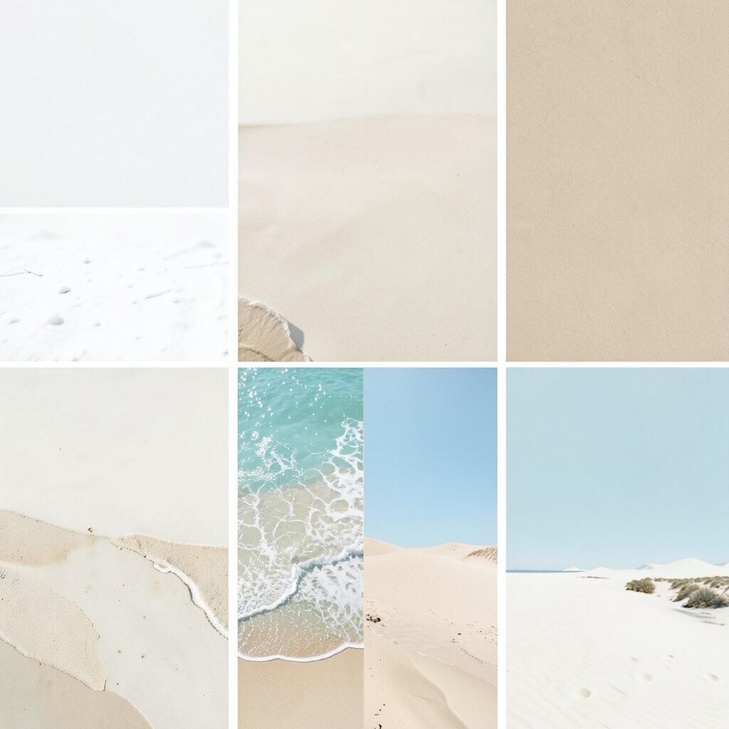
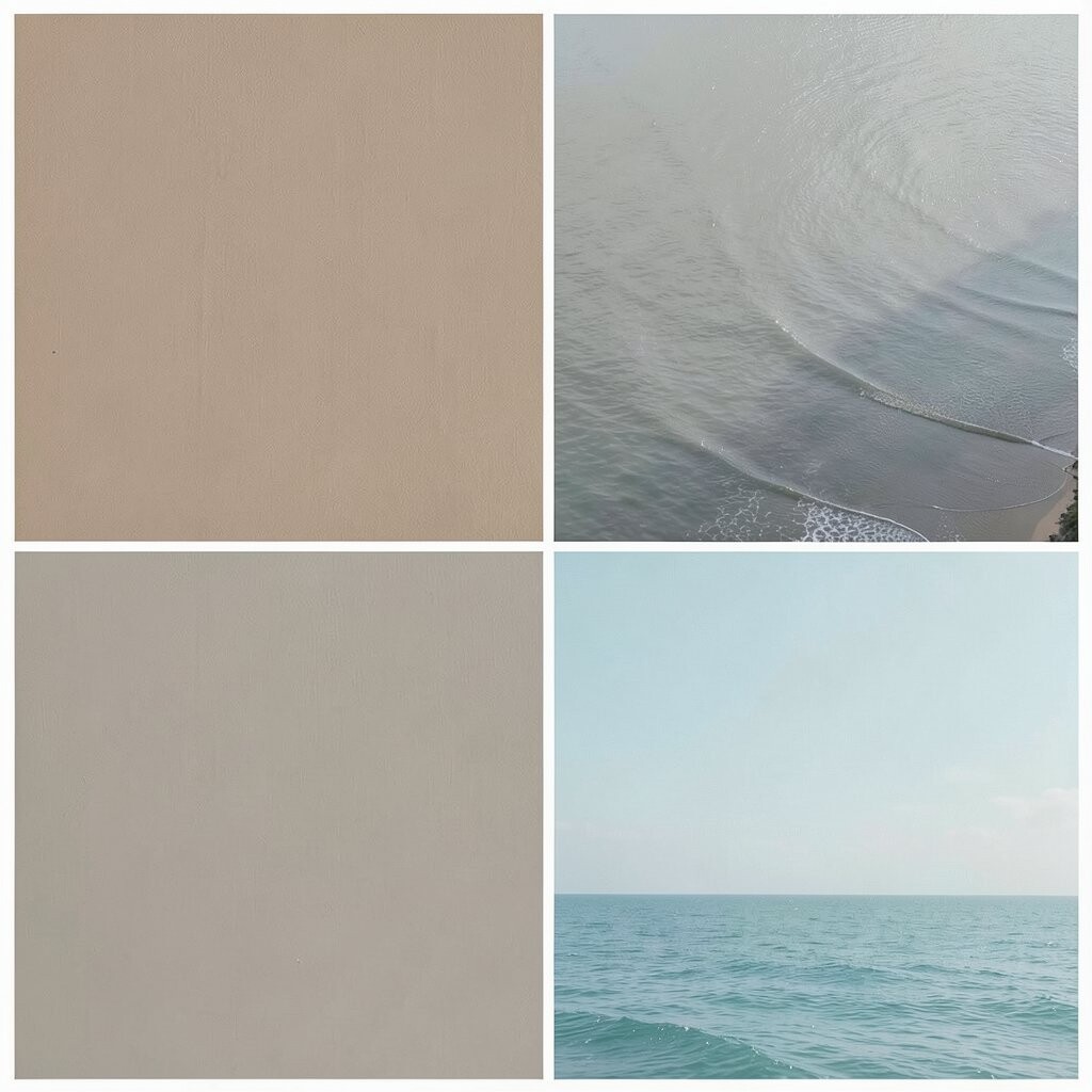
2. Sandy Beige and White
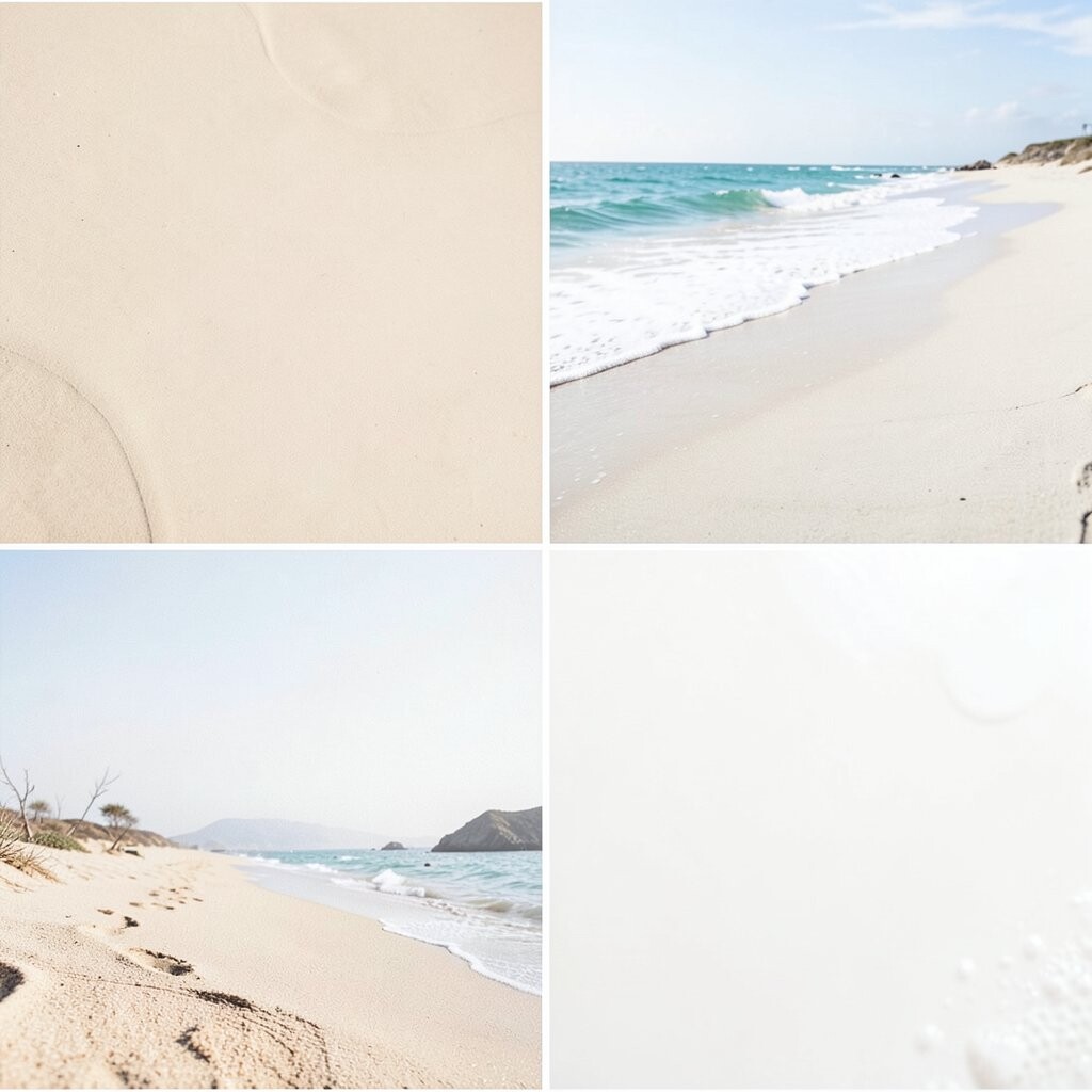
Sandy beige and white make a room feel warm and simple. The mix is soft, easy to live with, and never feels too busy.
This palette is a good choice if you want a clean look that still feels cozy. It works well in family rooms, kitchens, and halls because it matches many styles.
Try woven rugs, linen curtains, or light wood tables to build the look. This idea is also budget-friendly since both colors are common and easy to find.
3. Pale Aqua and Driftwood
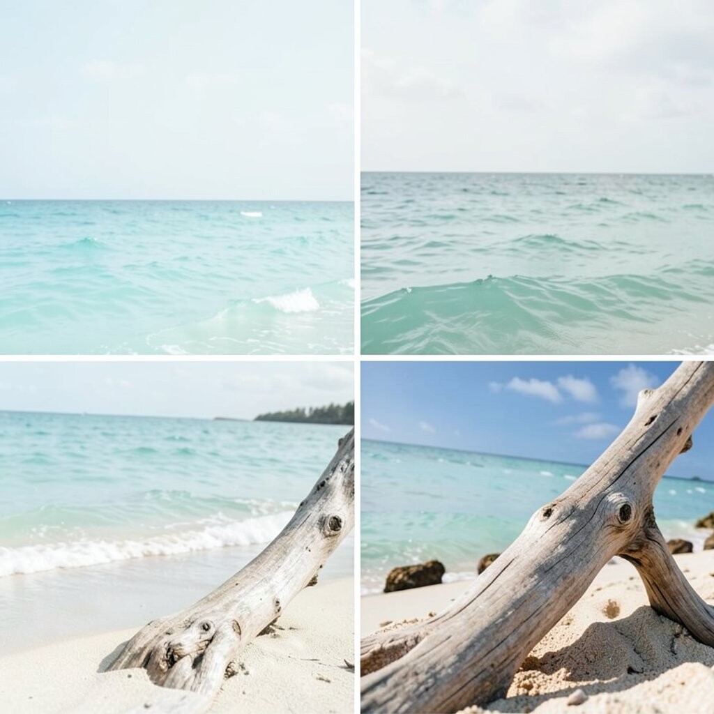
Pale aqua brings a fresh water look, while driftwood adds a soft gray-brown tone. Together they give a room a gentle beach feel without looking too themed.
This mix is useful in rooms that need a calm touch, like a guest room or reading corner. The soft colors can also help older furniture look more current.
Use driftwood tones in shelves, frames, or side tables, and add pale aqua in pillows or wall paint. Many people like this style now because it feels simple and relaxed.
4. Misty Gray and Shell Pink
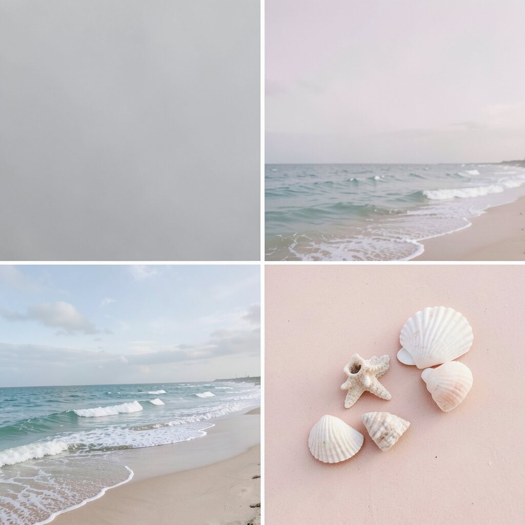
Misty gray and shell pink make a soft and pretty pair. The gray keeps things steady, while the pink adds a warm touch.
This palette works well in nurseries, bedrooms, and small sitting areas. It can make a space feel calm without looking plain.
For a personal touch, use more pink if you want a warmer look, or more gray if you want it quieter. You can keep costs low by using this color mix in pillows, art, and bedding instead of repainting the whole room.
5. Deep Navy and Crisp White

Deep navy and crisp white give a room a clear, sharp look. The dark blue adds depth, and the white keeps it bright.
This is a strong choice for kitchens, baths, and living rooms with lots of light. It can make a room feel neat and well put together.
Many people use this palette in a more modern way now by adding simple shapes and clean lines. You can try navy on cabinets or a rug, then use white walls to keep the space open.
6. Coral and Warm Sand
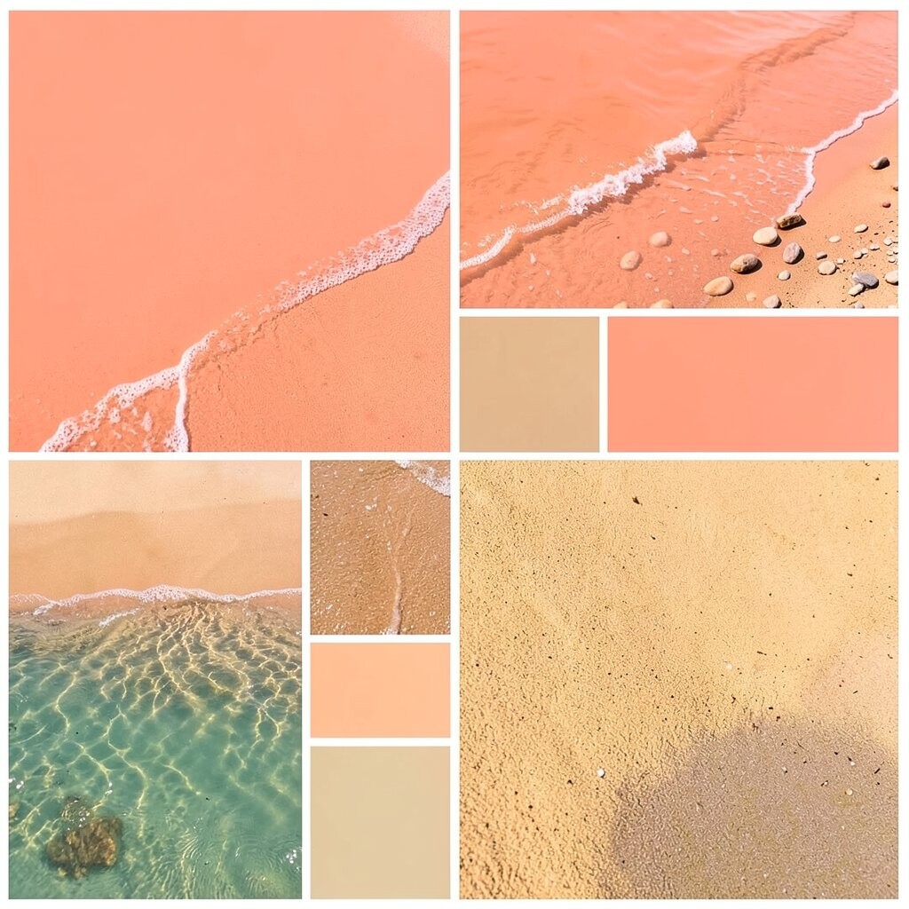
Coral and warm sand bring a sunny, easy feel to a home. Coral adds life, while sand keeps the look soft and grounded.
This pair works well in rooms that need more energy, like a breakfast nook or a play space. It can also help a plain room feel more cheerful without a full redesign.
Use coral in small parts if you want a low-cost change, such as throw pillows, lamps, or wall art. Warm sand can go on the walls or larger items, which helps the room feel balanced.
7. Fog Blue and Pale Oak
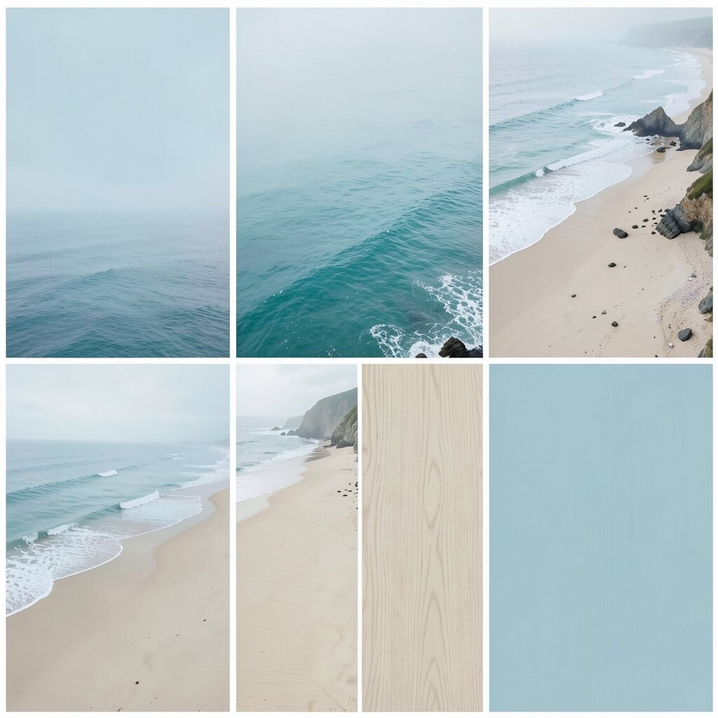
Fog blue has a cool, quiet look that feels smooth and easy. Pale oak adds a light wood tone that keeps the room from feeling cold.
This palette is a nice fit for homes that use simple furniture and soft fabrics. It can help a room look calm, neat, and a little more polished.
Try this mix in a bedroom, office, or entry space for a clean coastal look. If you want a fresh trend idea, use matte paint and natural wood pieces instead of shiny finishes.
8. Seafoam Green and Cream
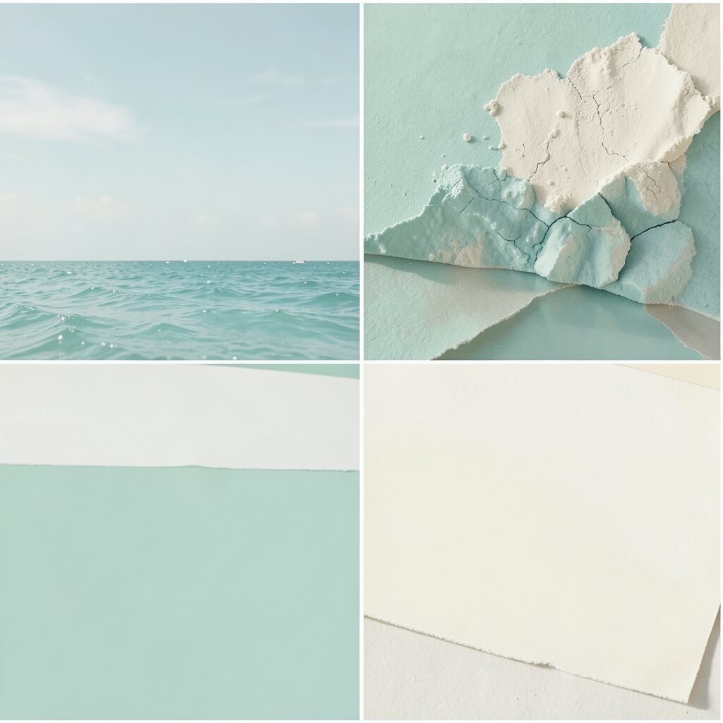
Seafoam green has a fresh plant-like feel, and cream adds a soft, warm base. The pair looks gentle and easy to live with.
This palette works well in rooms that get a lot of sun because the colors stay light and airy. It can help a space feel restful without looking flat.
You can make the look more personal by adding woven baskets, soft blankets, or glass decor. This is also a smart cost choice because cream paint and seafoam accents can be used in small steps.
9. Slate Blue and Pale Gray
Slate blue and pale gray make a cool, steady pair. The blue gives depth, and the gray keeps the room soft and simple.
This palette is good for spaces where you want a calm mood, such as a study or bedroom. It can also help darker rooms feel more balanced.
Use pale gray on walls and bring in slate blue through chairs, pillows, or curtains. This look is popular in many homes now because it feels neat and easy to match with other colors.
10. White, Tan, and Light Blue
White, tan, and light blue make a classic coastal mix. White keeps the room bright, tan adds warmth, and light blue gives it a sea-like feel.
This palette works in almost any room and is easy to build over time. It is a good choice if you want a home that feels clean but not cold.
Try this mix with simple stripes, cotton fabrics, and light wood floors. You can also keep costs down by using white paint as the base and adding the other colors in small decor pieces.
11. Turquoise and Whitewashed Wood
Turquoise gives a room a lively water feel, while whitewashed wood keeps it soft and light. The mix feels fresh and a little playful.
This palette is a nice fit for sunrooms, bathrooms, and casual living areas. It can make old wood pieces look new again without a full replacement.
Use turquoise in art, stools, or a single accent chair to avoid making the room feel too bold. Whitewashed wood is also a good trend choice because it works with both beach style and simple modern rooms.
12. Pebble Gray and Mist White
Pebble gray and mist white create a soft, quiet room with a clean look. The colors are close in tone, so the space feels smooth and easy.
This palette is useful if you want a calm home that still has some depth. It works well in rooms with lots of texture, such as knit blankets, linen curtains, or stone decor.
Because these shades are light and common, they are often easy on the budget. You can make the room feel more personal by adding one or two stronger accent colors in small items.
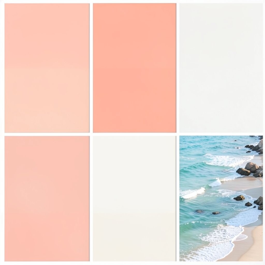
13. Sunset Peach and Soft Ivory
Sunset peach adds a warm glow, and soft ivory keeps it gentle. The look feels bright, but not too loud.
This palette is good for dining rooms, sitting areas, and bedrooms that need a warm touch. It can make a space feel friendly and welcoming.
Try peach in pillows, wall art, or a painted chair if you want a low-cost test. Many people like this mix now because it feels softer than bright orange and easier to use in daily life.
14. Ocean Teal and Warm White
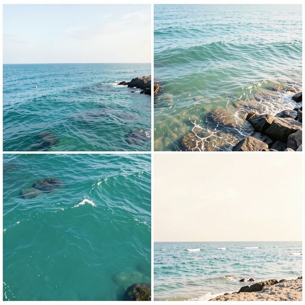
Ocean teal has a rich sea look, while warm white adds a soft glow. The pair feels fresh and a little deeper than pale blue mixes.
This palette works well in rooms that need more color but still should feel calm. It can also help a plain room stand out in a simple way.
Use warm white on walls or trim and add teal in rugs, pillows, or a painted cabinet. If you want a more personal look, mix in brass, rope, or rattan details for a coastal feel.
15. Cloud Blue and Natural Linen
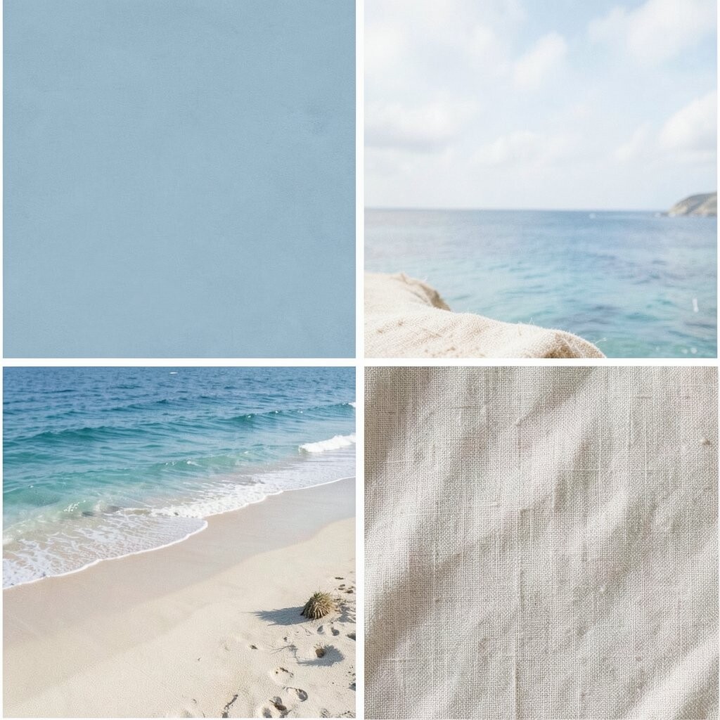
Cloud blue is light and airy, and natural linen adds a soft beige tone. Together they make a room feel easy, fresh, and relaxed.
This palette is a strong choice for bedrooms and family rooms because it feels quiet without looking dull. It also works well with simple shapes and plain furniture.
Natural linen items are easy to find in many price ranges, so this look can fit a small budget. Add cloud blue in a few places if you want the room to feel a little cooler and more open.
16. Moss Green and Pale Sand

Moss green brings in a soft earth feel, and pale sand keeps it light. The mix feels close to nature and still fits a coastal home.
This palette is good for people who want something calm but not too blue. It can make a room feel grounded and restful.
Try moss green in plants, pillows, or a chair, and use pale sand on walls or larger pieces. This is a smart way to follow a nature trend without spending a lot on new furniture.
17. Powder Blue and Driftwood Brown
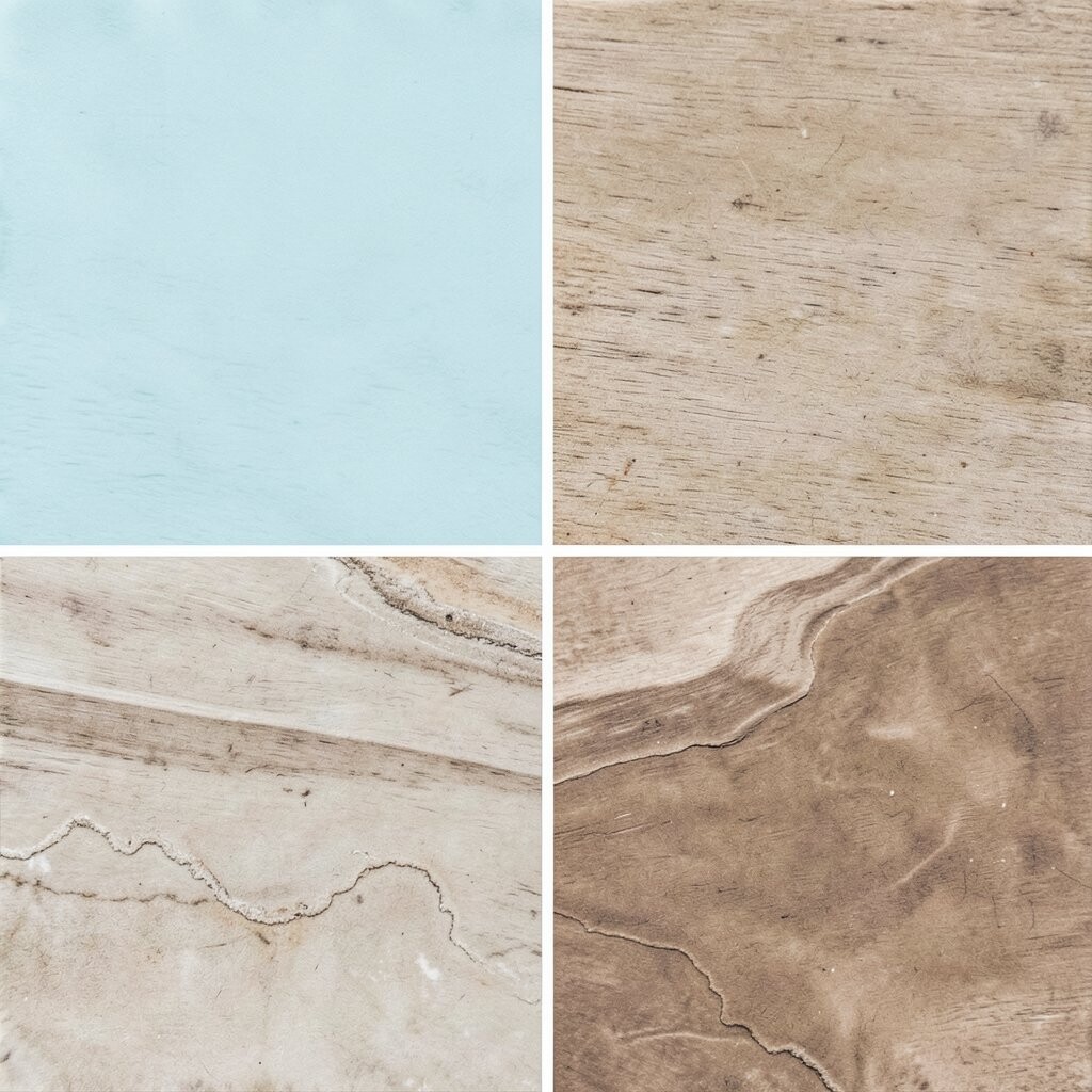
Powder blue feels soft and open, while driftwood brown adds a worn, beachy base. The colors work well together because one is light and one is steady.
This palette is nice for rooms that need a soft color without losing warmth. It can help a home feel lived in and calm at the same time.
Use powder blue in bedding or curtains and driftwood brown in tables, frames, or shelves. You can also mix in small white items to keep the room from feeling too heavy.
18. Bright White and Sea Blue
Bright white and sea blue make a fresh, clean pair that feels like open sky and water. The white keeps the room crisp, while the blue adds color and life.
This palette is great for kitchens, baths, and small rooms that need more light. It can make a space feel bigger and easier to keep neat.
For a simple update, paint the walls white and use sea blue in towels, dishes, or a backsplash. This look stays popular because it is easy to use and easy to change later.
19. Warm Taupe and Aqua Gray
Warm taupe gives a soft earth tone, and aqua gray adds a cool coastal note. The mix feels quiet, smooth, and a little more modern.
This palette works well in homes that use mixed wood tones or simple fabric choices. It can help tie different items together so the room feels planned.
Try this pair in a living room or office if you want a calm look that is not too bright. It can also be a good cost choice because both colors work well with many items you may already have.
20. Light Coral and Chalk White
Light coral adds a soft warm touch, and chalk white keeps the room bright and open. The pair feels gentle and easy to use in many spaces.
This palette is a good choice for people who want color but do not want a bold look. It works well in guest rooms, craft spaces, and small sitting areas.
You can make the room feel more personal by adding handmade art, soft rugs, or simple ceramic pieces. Light coral is also a nice trend color because it feels warm without being too strong.
21. Mist Blue, Cream, and Pale Wood
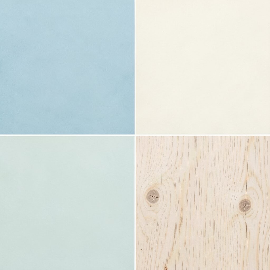
Mist blue gives the room a soft sky feel, cream keeps it warm, and pale wood adds a natural touch. Together they make a peaceful coastal palette that feels light and balanced.
This mix works in many home styles, from simple and modern to more classic rooms. It can help a space feel calm, neat, and easy to enjoy every day.
Use mist blue for walls or fabric, cream for larger pieces, and pale wood for tables or floors. If you want a low-cost way to try the look, start with pillow covers, a throw, and one painted item.