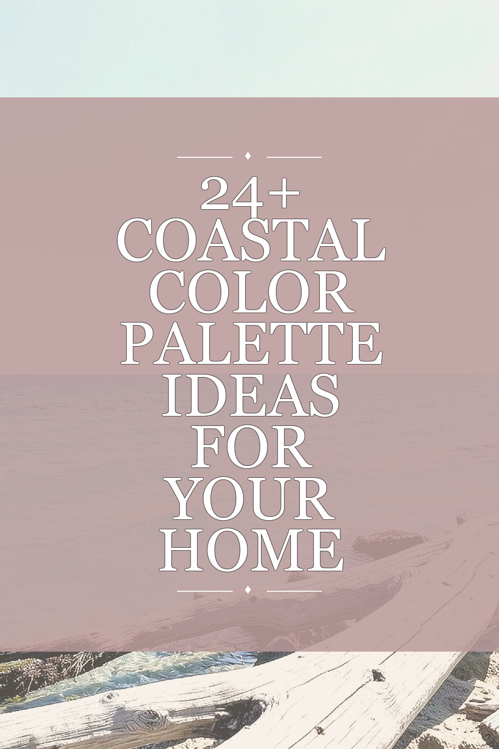
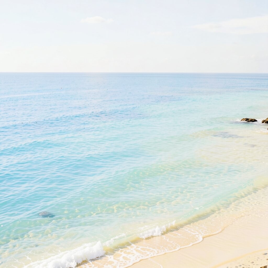
Coastal colors can make a home feel calm, fresh, and easy to live in. These ideas use soft shades, clean lines, and simple accents that work in many rooms.
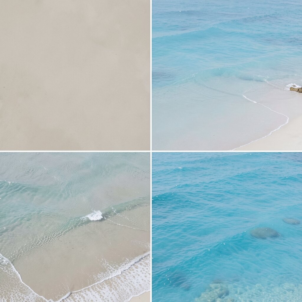
1. Soft Sand and White
Soft sand and white make a room feel light and open. This mix works well in living rooms, bedrooms, and halls where you want a calm look.
The colors are easy to match with wood, wicker, and simple cloth. They also cost less to use because many paint brands carry these shades at low prices.
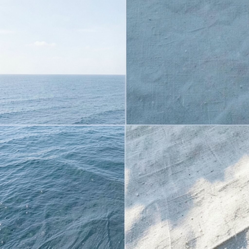
2. Pale Blue and Driftwood
Pale blue with driftwood gives a quiet beach feel without looking too themed. The soft blue adds cool color while the wood tone adds warmth and balance.
This palette is good for people who want a calm room that still has some life. You can use it with old wood tables, light rugs, and plain white trim.
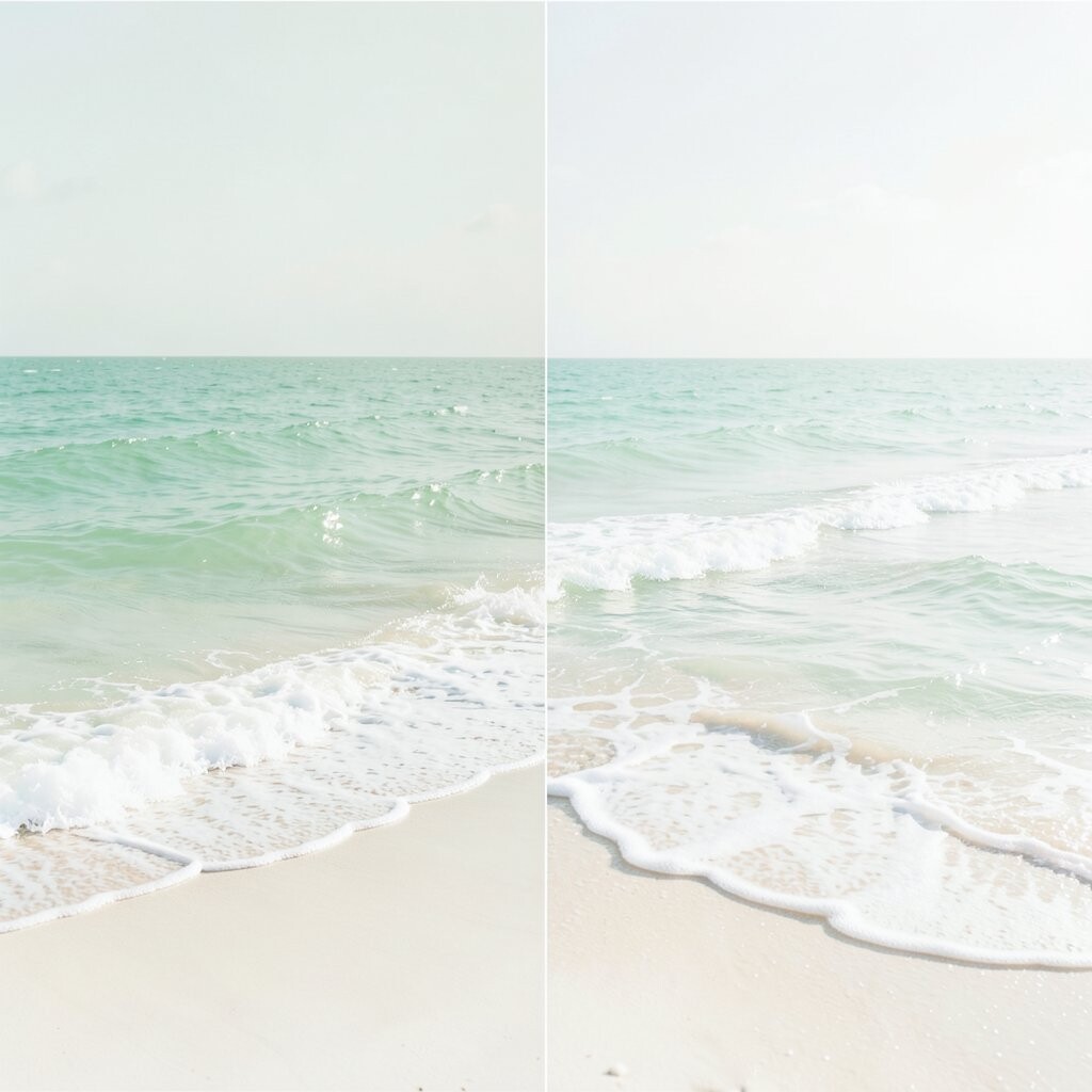
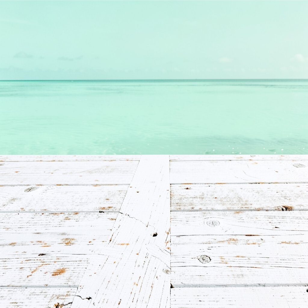
3. Seafoam and Cream
Seafoam and cream make a space feel clean and soft. The green-blue shade brings a fresh look, while cream keeps the room from feeling too cold.
This style fits bathrooms, kitchens, and small sitting areas. It is also a good choice if you want a coastal look that feels a little more modern than plain blue.
4. Navy and Crisp White

Navy and crisp white give a sharp, classic look. The dark blue adds depth, and the white keeps the space bright and neat.
This palette works well in rooms with strong natural light. It can also help make simple furniture look more polished without spending much on decor.
5. Mist Gray and Aqua

Mist gray and aqua create a cool and easy mix. The gray tone feels calm, and the aqua adds a small splash of color that feels fresh.
This is a good pick for people who want a soft coastal style that is not too bright. It works well with glass, silver frames, and plain cotton fabric.
6. Warm Beige and Blue Stripe

Warm beige and blue stripe bring in a beach house feel that is simple and friendly. Beige keeps the room grounded, while blue stripe adds a bit of motion and charm.
This look is easy to use with pillows, curtains, or a rug. It is also a smart choice if you want to change the room later, since stripes can fit many styles.
7. Pale Green and White
Pale green and white make a room feel fresh and easy on the eyes. The green shade can remind you of sea glass or soft plants near the shore.
This palette is nice for kitchens, laundry rooms, and guest rooms. It is simple to paint and often works well with low-cost decor from home stores.
8. Sky Blue and Light Oak

Sky blue and light oak give a clean and airy look. The blue brings in a soft ocean feel, and the oak adds a natural touch that keeps the space warm.
This pair is good for homes that use a lot of simple wood furniture. It also fits well with current trends that focus on natural materials and easy color mixes.
9. White, Tan, and Shell Pink
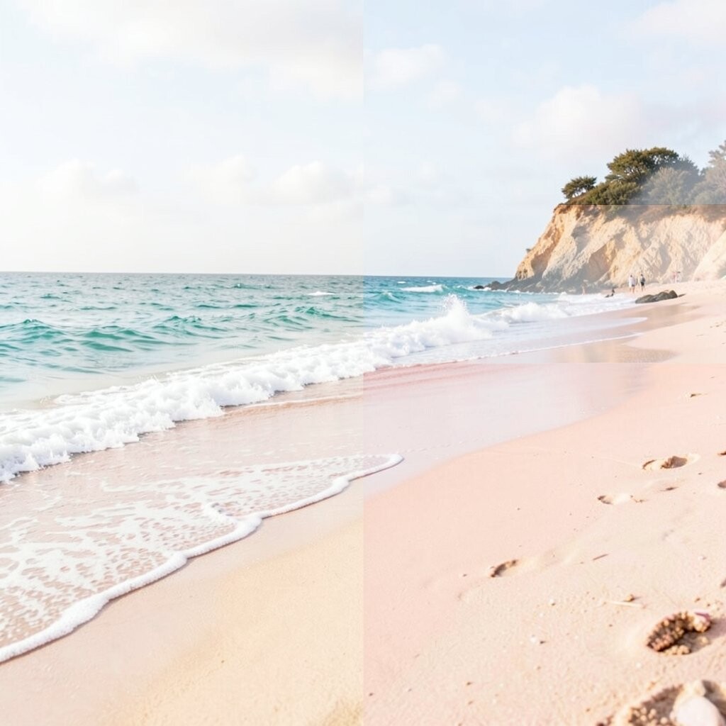
White, tan, and shell pink make a room feel soft and calm with a gentle touch of color. The pink is light enough to stay subtle, so the space still feels grown-up.
This palette works well in bedrooms and reading corners. You can use it in small amounts if you want to keep costs down and still get a coastal feel.
10. Blue Gray and Sandstone

Blue gray and sandstone make a balanced palette that feels steady and quiet. The blue gray gives a cool look, while sandstone adds a warm, soft base.
This mix fits homes that want a more muted coastal style. It is also helpful in rooms with less light, since the warm tone can keep the space from feeling flat.
11. Aqua and Bright White
Aqua and bright white make a room feel fresh and lively. The white gives a clean base, and the aqua adds a clear color that stands out in a simple way.
This palette is great for bathrooms, sunrooms, and poolside spaces. It can be done on a small budget with paint, towels, and a few easy decor pieces.
12. Pebble Gray and Sea Glass

Pebble gray and sea glass create a soft, calm room with a beach look. The gray feels steady, and the sea glass shade adds a light green-blue note.
This mix works well when you want color but do not want a bold result. It is also easy to personalize with framed art, woven baskets, or plain linen covers.
13. Cream and Ocean Blue
Cream and ocean blue bring a classic coastal feel that works in many homes. The cream keeps the room soft, while ocean blue gives it a clear and rich center.
This palette is nice for people who want a style that feels both calm and neat. It can fit older homes and newer homes alike, and it often looks good with brass or black details.
14. Soft Taupe and Cool Blue
Soft taupe and cool blue make a room feel easy and balanced. Taupe gives a warm base, and the cool blue adds a clean beach note.
This is a good choice for shared spaces like family rooms. It works well with simple art, cotton throws, and low-cost furniture in light wood.
15. White and Coral Accent

White and coral accent create a bright coastal look with a bit of cheer. The white keeps things open, while coral adds a warm pop that feels fresh.
This palette is easy to use in small ways, like pillows, lamps, or wall art. It is a nice pick if you want a trend that feels current but still simple.
16. Slate Blue and Linen
Slate blue and linen make a room feel calm and a little more refined. The slate blue has more depth than pale blue, and the linen shade keeps it soft.
This mix works well in bedrooms and home offices. It can help a room feel neat and restful, which is useful if you want a quiet place to work or sleep.
17. Mint and Whitewashed Wood
Mint and whitewashed wood give a light and breezy look. Mint brings in a soft green tone, and the wood finish adds texture without making the room feel heavy.
This palette is good for kitchens, porches, and light-filled rooms. It also fits well with simple handmade items, which can help keep the cost low.
18. Blue and Green Mix

Blue and green mix brings in a natural coastal feel that reminds people of water and shore plants. The shades can be soft or a little deeper, depending on the look you want.
This palette is unique because it gives more color than a plain blue room. You can make it your own by choosing one shade to lead and using the other as a small accent.
19. White, Gray, and Teal
White, gray, and teal make a clean room with a bit of color and depth. The white brightens the space, the gray keeps it calm, and the teal adds a bold but still easy touch.
This look works well in modern homes that still want a beach feel. It is also a smart way to use color in a room without making it feel busy.
20. Beige and Soft Turquoise

Beige and soft turquoise create a warm and fresh balance. Beige gives a calm base, and soft turquoise adds a color that feels like shallow water.
This palette is nice for living rooms and guest rooms. It can also make older furniture look new again when you pair it with light fabrics and simple art.
21. Cloud White and Blue Mist

Cloud white and blue mist make a room feel open and easy. The white keeps the space bright, and the blue mist adds a quiet coastal note.
This palette is a good fit for small rooms because it can help the space feel larger. It is also easy to use with low-cost decor since both shades work with many styles.
22. Driftwood Brown and Pale Aqua

Driftwood brown and pale aqua bring together wood warmth and soft water color. The brown adds an earthy feel, while the aqua keeps the room light.
This mix is a strong choice for people who like natural textures. It works well with rope details, woven chairs, and simple shelves made from wood.
23. Soft Blue and Pale Yellow
Soft blue and pale yellow make a room feel sunny and calm at the same time. The blue keeps the look coastal, and the yellow adds a gentle glow.
This palette is nice for kitchens, breakfast areas, and kids’ rooms. It can feel cheerful without being loud, and it is easy to add with paint or small decor items.
24. Charcoal and Seafoam
Charcoal and seafoam give a modern coastal look with strong contrast. The dark charcoal makes the seafoam stand out, which can make the room feel fresh and clean.
This palette is a good option if you want something less soft and more bold. It works well with metal lamps, simple frames, and smooth fabric in light colors.
25. Ivory and Deep Blue
Ivory and deep blue make a classic coastal palette that feels calm and rich. The ivory keeps the room warm, while the deep blue adds a strong sea-like tone.
This mix is a good finish for homes that want a steady look that will not go out of style fast. It can be made personal with art, pillows, and rugs that match your own taste and budget.