Coastal color schemes can make a home feel calm and easy to live in. They often use soft shades that work well with light, wood, and simple decor.
1. Soft Sand and White
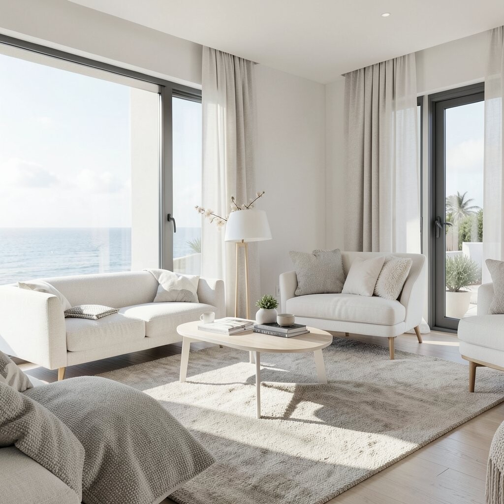
Soft sand and white is a clean mix that feels open and calm. The look comes from warm beige walls, white trim, and light fabrics that keep a room bright.
This palette is easy to use in living rooms, bedrooms, and small spaces. It can also help a room feel larger, which is a nice benefit if your space does not get much light.
What makes it unique is how simple it is, yet it still feels fresh. You can add texture with linen, woven baskets, and pale wood so the room does not feel flat.
2. Sea Glass Blue and Pale Gray

Sea glass blue and pale gray gives a room a cool, soft look. The blue has a washed feel, while the gray keeps things steady and calm.
This palette works well for people who want color but not too much of it. It is a good choice for bathrooms, guest rooms, and home offices because it feels neat and easy to sit with.
To make it your own, try darker blue pillows, brushed metal lamps, or clear glass decor. This look is often low cost because you can use paint and a few small items instead of buying a lot of new furniture.
3. Driftwood Brown and Misty Blue

Driftwood brown and misty blue brings in a beach feel without looking too themed. The brown adds warmth, and the blue adds a soft air that feels easy on the eyes.
This mix is useful in family rooms and dining spaces where you want comfort. It also hides wear better than very light colors, which can help in busy homes.
The style feels a bit more current when you use clean lines and plain fabrics. A simple way to try it is with a blue rug, wood tables, and tan curtains that match the driftwood look.
4. White Foam and Deep Navy

White foam and deep navy makes a bold but still classic pair. The white keeps the room bright, while navy adds depth and a strong frame.
This palette works well in modern homes that need a sharp look. It can make built-ins, cabinets, and accent walls stand out in a clean way.
Many people like this mix because it feels rich without needing many colors. If you want a lower cost update, paint one wall navy and use white bedding or white chairs to balance it.
5. Pale Coral and Warm Beige
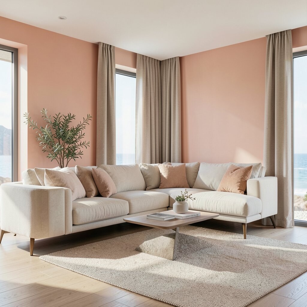
Pale coral and warm beige gives a room a soft glow. The coral brings a light touch of color, and the beige keeps it calm and easy to live with.
This palette is nice for bedrooms, reading corners, and sitting rooms. It can make a space feel friendly and warm without becoming too bright.
It is also a good choice if you want a more personal look. Try coral art, beige rugs, and a few soft pink or peach items to make the room feel like your own.
6. Aqua and Crisp White
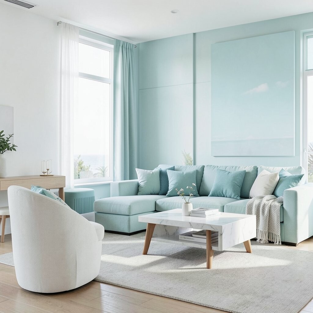
Aqua and crisp white feels fresh and clear. The aqua adds a clean water-like note, and the white keeps the room open and simple.
This palette is a strong pick for kitchens, baths, and sunrooms. It works well with shiny surfaces, light tile, and plain cabinets.
One reason people like it is that it feels bright even in small rooms. If you want to keep costs down, use aqua pillows, towels, or dishes before you paint larger areas.
7. Pebble Gray and Soft Teal

Pebble gray and soft teal makes a room feel steady with a small touch of color. The gray is quiet and easy to match, while the teal adds a bit of life.
This palette fits modern interiors because it is simple but not plain. It works well in living rooms, entryways, and work spaces where you want calm focus.
To make it feel more special, mix in black frames, light oak, or stone decor. The look is flexible, so you can make it more warm or more cool based on the items you choose.
8. Shell Pink and White Oak
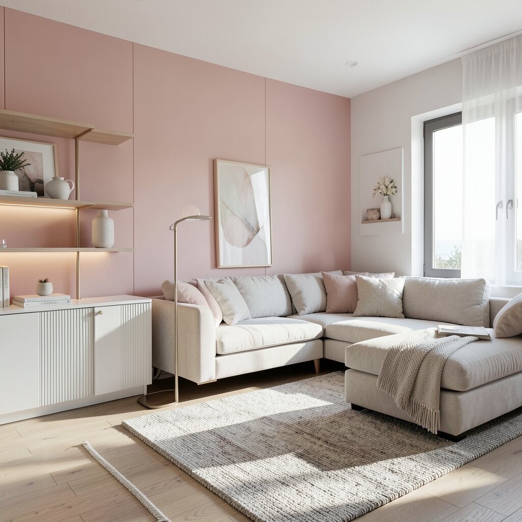
Shell pink and white oak feels soft, clean, and very easy to use. The pink is light and quiet, and the oak adds a natural wood note that keeps the room grounded.
This palette is good for people who want a gentle style that still feels modern. It can work in bedrooms, nurseries, and small sitting areas where comfort matters.
The mix is unique because it avoids the heavy look that some pink rooms can have. Try matte paint, simple wood furniture, and plain white bedding to keep the room fresh and balanced.
9. Storm Blue and Chalk White

Storm blue and chalk white gives a room a cool, clean edge. The blue feels deep and calm, while the chalk white softens the look and keeps it bright.
This palette is helpful in rooms that need a bit more shape and contrast. It can make wall art, shelves, and fabric details stand out without much effort.
It is a good trend for modern homes because it feels neat and strong at the same time. If you want a lower cost update, use storm blue on a few pillows or a chair cover first.
10. Seafoam Green and Natural Linen

Seafoam green and natural linen feels light and easy. The green has a soft water look, and the linen brings in a warm, plain base.
This palette works well in spaces where you want rest and comfort. It is a nice fit for bedrooms, bathrooms, and small lounge areas.
It also gives you room to add personal touches without making the room feel busy. You can use wicker, clay pots, or simple framed prints to give the space more depth.
11. Tan, Blue, and Soft Black
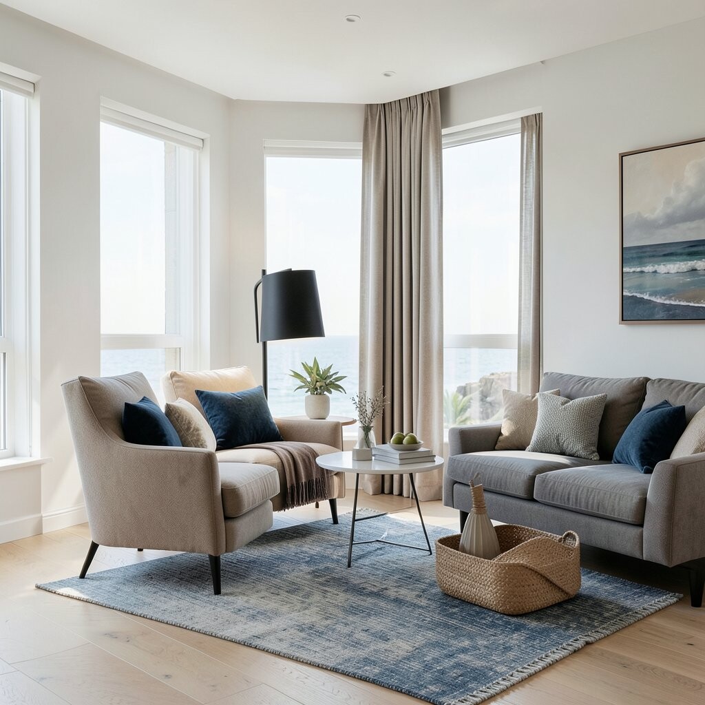
Tan, blue, and soft black is a modern mix with more contrast. Tan keeps it warm, blue adds a coastal note, and soft black gives the room a clean edge.
This palette is useful if you want a look that feels a little more grown-up. It works well in open-plan rooms, where you need colors that can tie different areas together.
People often like this style because it feels current and easy to keep neat. A simple way to use it is with tan walls, blue art, and black lamps or table legs.
12. Mist White and Pale Sage

Mist white and pale sage creates a quiet and fresh feel. The white gives the room light, and the sage adds a soft plant-like tone that stays calm.
This palette is a good match for modern homes that use simple shapes and clean lines. It can help a room feel restful, which is useful in bedrooms and home offices.
It is also easy to make your own with art, plants, and light wood pieces. The cost can stay low if you start with paint and add a few green or white items over time.
13. Blue Gray and Warm Sandstone

Blue gray and warm sandstone gives a room a balanced coastal look. The blue gray feels cool and smooth, while the sandstone adds a soft earthy base.
This palette is a smart pick for people who want color that still feels easy. It works in kitchens, living rooms, and hallways because it blends well with many finishes.
The style stands out because it feels calm but not too plain. You can make it more personal with woven rugs, ceramic vases, and art that has sea or sky tones.
14. Bright White and Light Aqua
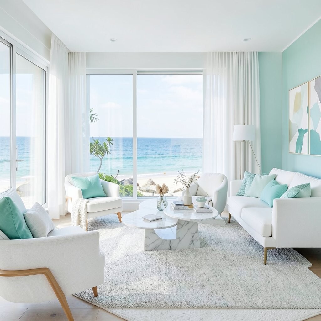
Bright white and light aqua is a fresh, simple palette that feels open right away. The white keeps the room clean, and the aqua adds a light beach note without taking over.
This mix is great for modern spaces that need a happy, airy look. It works well in bathrooms, laundry rooms, and small apartments where light colors can help the space feel bigger.
It is also one of the easiest palettes to try on a small budget. Start with towels, pillows, or a rug, then add paint if you want the look to go further.