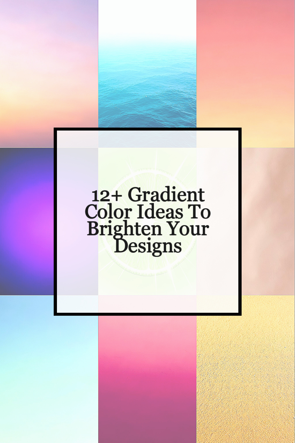
Gradient colors can give your work a fresh look with very little effort. They can help a design feel soft, bold, calm, or modern in a way that plain color often cannot.
1. Soft Sunrise Blend

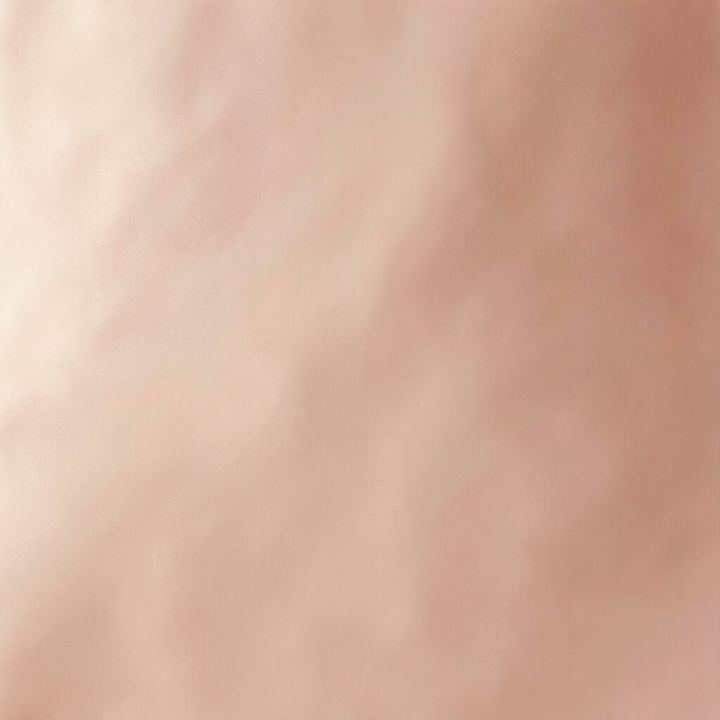
A soft sunrise blend uses pale pink, warm peach, and light gold. It looks smooth and gentle, like early morning light on a wall or screen.
This style works well for social posts, app screens, and simple brand art. It is easy to use because the colors flow well together and do not feel too loud.
One good thing about this blend is that it can make a design feel warm without looking heavy. If you want a low-cost way to add color, this is a smart choice since you can make it with basic tools in most design apps.
2. Cool Ocean Fade

A cool ocean fade uses light blue, sea green, and a bit of deep teal. It can look calm and clean, much like water on a clear day.
This look is good for health pages, travel art, and tech layouts. It gives a fresh feel and can help text and icons stand out when used with care.
You can make it your own by shifting the blue more toward green or more toward gray. Many people like this trend because it feels modern and easy to match with white or dark text, and it does not need costly images to work well.
3. Sunset Coral Shift
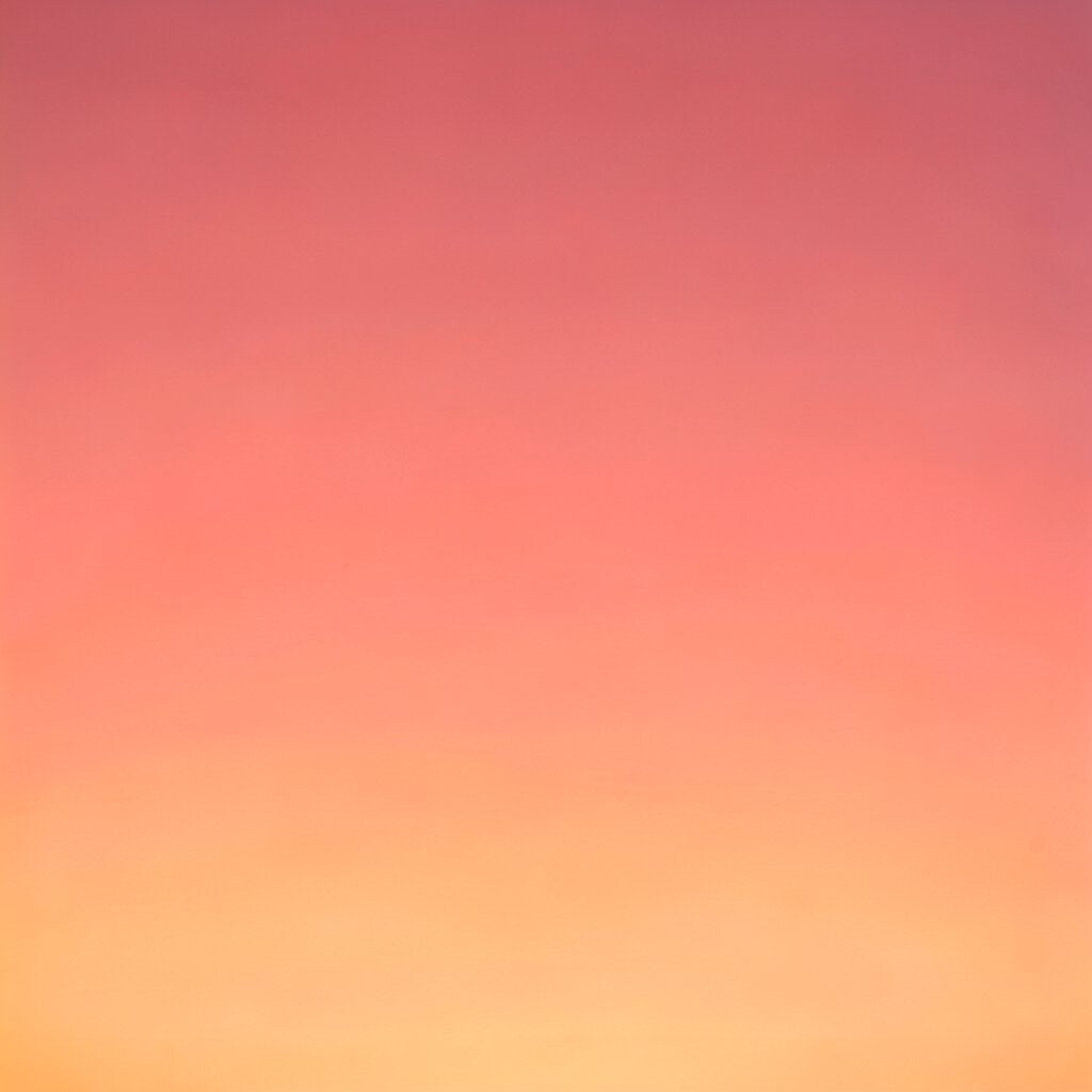
A sunset coral shift moves from coral to orange and then to soft red. It has a warm, bright look that can catch the eye fast.
This kind of gradient is useful for buttons, banners, and event art. It can add energy to a page without needing a lot of extra detail.
If you want it to feel less strong, use more pink and less red. If you want a bolder look, add a deeper orange at one end, and you can still keep the cost low because the effect comes from color choice, not from extra assets.
4. Purple Night Glow
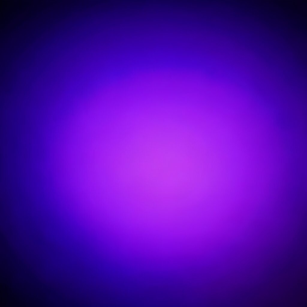
Purple night glow mixes violet, indigo, and dark blue. It often feels rich and smooth, like a sky after sunset.
This style is popular in music art, game screens, and poster design. It can help a layout feel modern and a little special, while still being easy to read if the text color is chosen well.
You can make this gradient more personal by adding a small touch of pink or a hint of black. It is a good pick when you want a stylish look on a small budget, since simple color fades can do a lot on their own.
5. Fresh Lime Burst
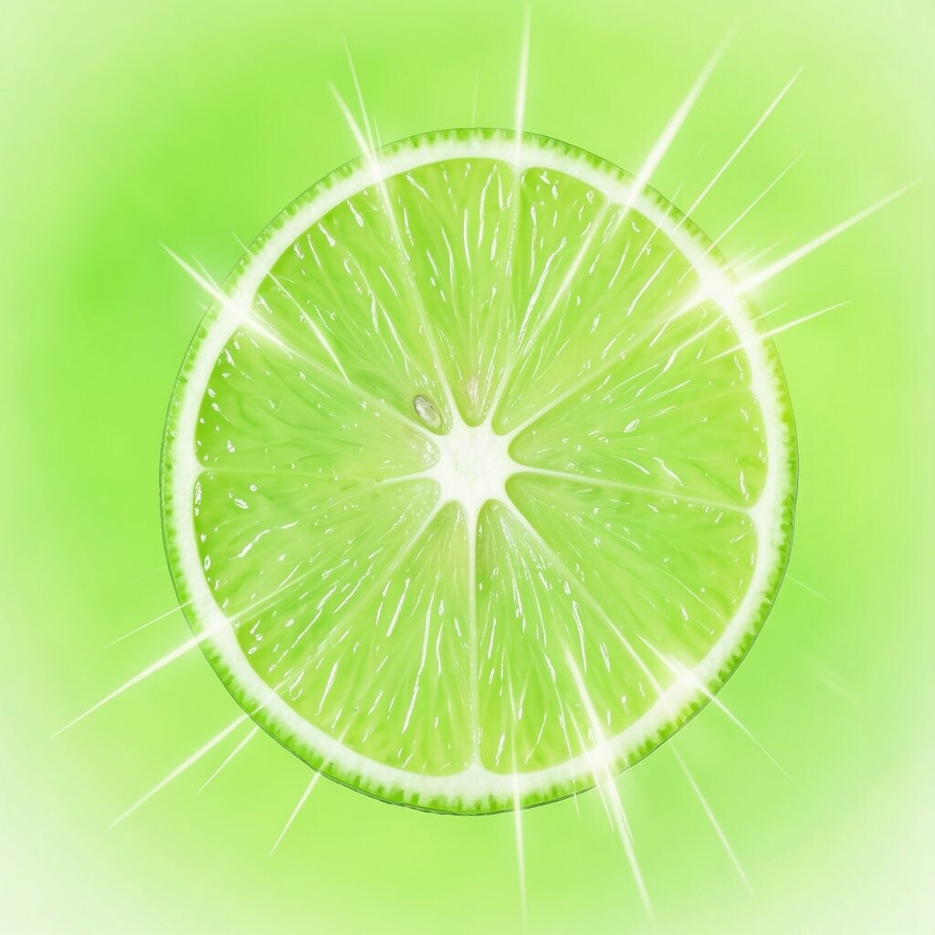
Fresh lime burst uses lime green, soft yellow, and a bit of mint. It looks bright and lively, with a clean feel that can wake up a page.
This gradient works well for fitness art, youth brands, and modern web parts. It can make a design feel active and friendly without needing complex shapes.
To keep it useful, use it in small areas like headers or callout boxes. It is easy to tweak for your own style, and it often costs nothing more than time in a design app.
6. Rose Gold Drift
Rose gold drift blends blush pink, soft copper, and light beige. It has a smooth and polished look that feels warm but not too bright.
This style is often used for beauty brands, wedding cards, and clean product pages. It adds a soft shine that can make simple layouts feel more cared for.
You can make it more personal by setting the copper tone warmer or cooler. Many designers like it because it feels current and can work with low-cost mockups, icons, or flat backgrounds.
7. Mint to Sky Fade

Mint to sky fade moves from pale mint into light blue. It gives a fresh and airy look that can feel open and easy on the eyes.
This gradient is a good fit for wellness sites, kids’ pages, and calm app screens. It can help a design feel light and neat, which is useful when you want a simple mood.
Try using it with rounded shapes or soft shadows for a gentle style. It is also a budget-friendly choice because you can get a clean result without paying for extra art or photos.
8. Bold Berry Mix
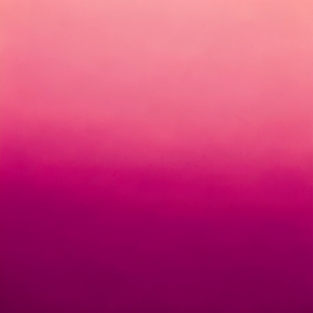
Bold berry mix uses deep berry, plum, and a touch of magenta. It has a rich look that feels strong and full of color.
This style is useful for fashion ads, event flyers, and dark themes. It can help text pop when used with white or pale type, and it gives a page a clear sense of focus.
If you want it to feel less heavy, add a little pink or soften the dark end. It is a nice trend for people who want a strong look on a small budget, since the gradient itself does most of the work.
9. Golden Sand Wash
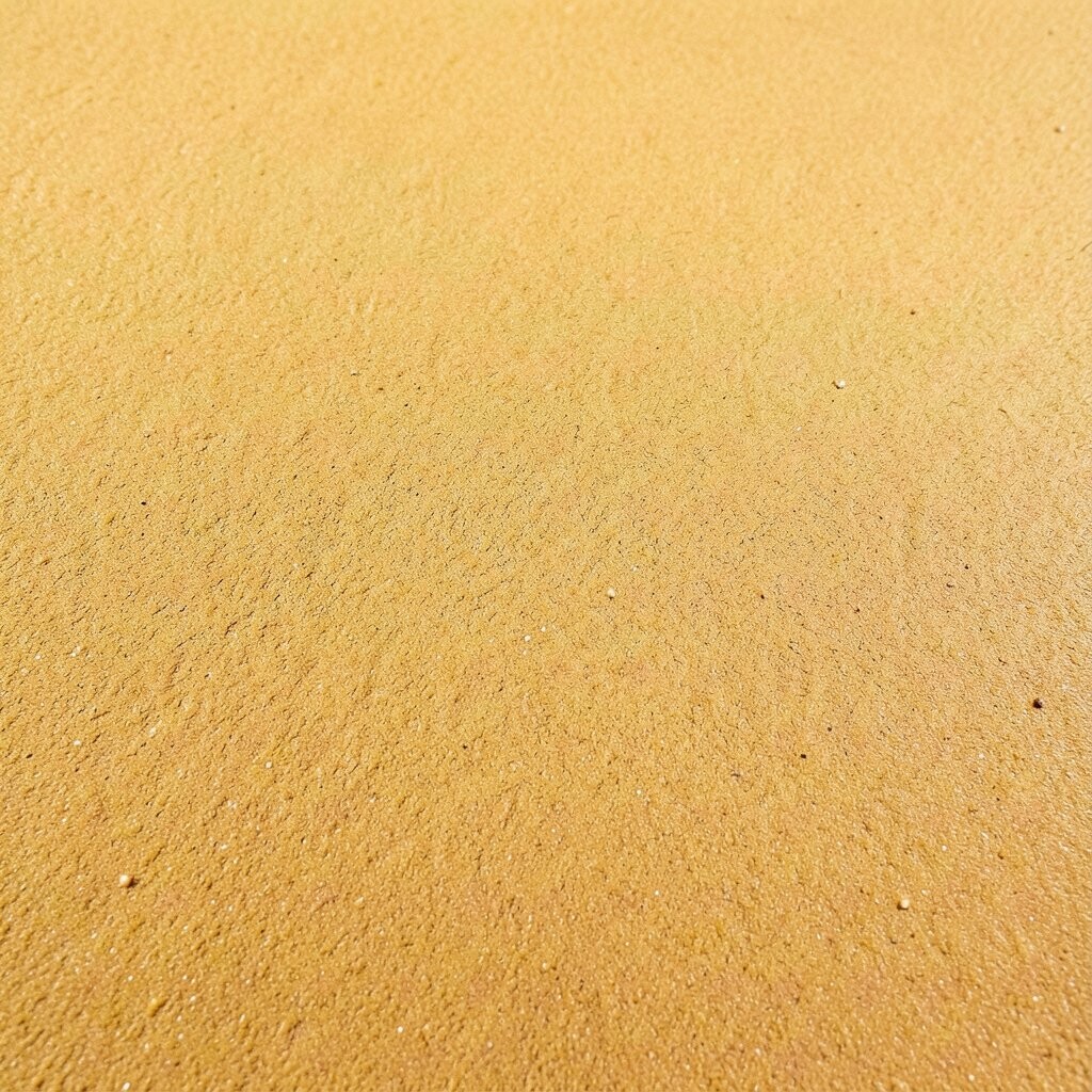
Golden sand wash blends soft tan, warm beige, and light gold. It looks calm and natural, like sun on sand or paper in warm light.
This gradient can fit home decor pages, wellness brands, and simple product shots. It gives a quiet look that feels easy to use in many kinds of layouts.
You can pair it with thin lines, simple icons, or serif text for a soft style. It is also a low-cost way to make a design feel more finished, since it works well even with basic content.
10. Neon Party Fade
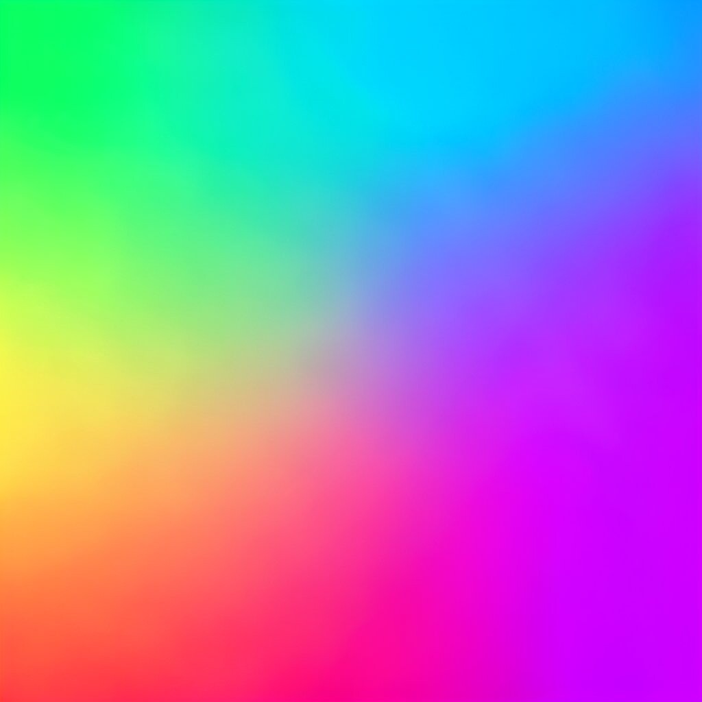
Neon party fade mixes bright pink, electric blue, and vivid purple. It has a loud and fun look that stands out right away.
This gradient is a good match for music posters, gaming art, and social media promos. It can make a page feel lively and current, especially when used with dark backgrounds.
To make it fit your own taste, lower the brightness a little or add more space around the colors. It is a trend that can look high-impact without a high cost, since color alone can carry the style.
11. Earthy Moss Flow
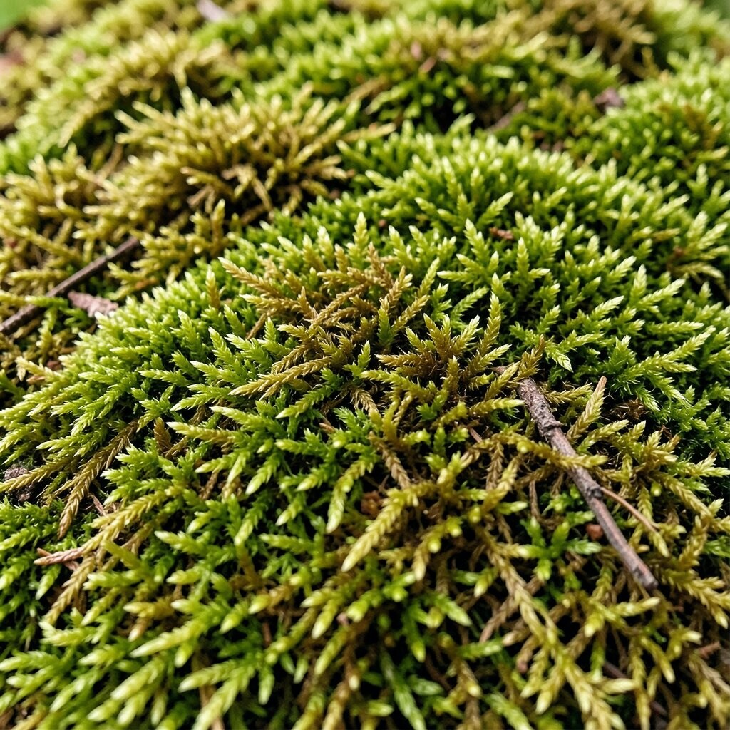
Earthy moss flow uses moss green, olive, and soft brown. It feels grounded and natural, with a look that is calm and steady.
This style works well for outdoor brands, garden pages, and eco-friendly layouts. It can help a design feel honest and simple, which many people like for slow and natural themes.
You can make it more personal by adding a lighter green or a warm sand tone. It is a smart option when you want a natural look without buying custom art, so the cost stays low.
12. Ice Blue Spark
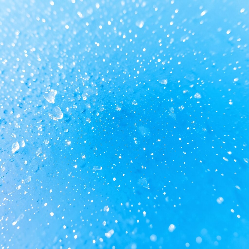
Ice blue spark blends pale blue, white, and a hint of silver gray. It looks crisp and clear, almost like frost on glass.
This gradient is useful for tech pages, winter themes, and clean product shots. It can make a layout feel neat and open, which helps when you want a fresh and simple mood.
Try using it with lots of space and clean fonts for the best effect. It is easy to adjust for your brand, and it often works well in low-cost design work because it needs only a few colors to look good.
13. Warm Peach to Plum

Warm peach to plum starts with soft peach and moves into deep plum. It has a nice mix of light and dark, so it can feel friendly and rich at the same time.
This gradient is helpful for headers, cards, and hero sections. It gives a design more depth than a flat color, while still staying smooth and easy to read.
You can make it feel more like your own by changing the peach to coral or the plum to berry. It fits many current design trends, and it is a practical choice when you want a strong look without spending much money.