Neutral colors can make a room feel calm and easy to use. They also give you a simple base that works with many styles and budgets.
1. Soft White and Warm Beige

Soft white and warm beige make a room feel clean, light, and easy on the eyes. This pair works well in living rooms, bedrooms, and small spaces that need a more open look.
The look is simple, but it does not feel plain when you use a mix of fabrics and finishes. Try a matte wall, a soft rug, and a woven chair to add quiet detail.
This palette is a good pick if you want low cost updates. Paint, slipcovers, and basic decor in these shades are easy to find and often fit many budgets.
2. Greige and Cream

Greige mixes gray and beige, so it feels soft but not cold. Cream adds a light touch that keeps the room warm and calm.
This palette is nice for people who want a modern look without sharp contrast. It works well with wood, stone, and simple metal pieces.
You can make it more personal by adding books, baskets, or art with small hints of color. Many home stores use these shades in current trends, so it is easy to find matching items.
3. Sand and Stone

Sand and stone shades bring in a natural feel that is easy to live with. The colors look like beach sand, pale rock, and dry earth, which can help a room feel steady.
This palette is a good choice for homes that use a lot of plants or natural light. It works in rooms where you want a quiet background for daily life.
Cost can stay low if you use simple paint and a few key decor pieces. Try linen curtains, ceramic vases, and a soft throw to give the room more texture.
4. Taupe and Off-White

Taupe and off-white make a space feel soft, neat, and balanced. Taupe adds depth, while off-white keeps the room bright and open.
This mix fits many room types, from a home office to a bedroom. It also helps furniture stand out in a gentle way, which is useful if you already own a lot of pieces.
If you want a more personal look, add warm wood, black frames, or a few green plants. These shades are also easy to match, so they can help keep shopping simple and low stress.
5. Warm Gray and Ivory

Warm gray and ivory create a calm look that feels clean but not stark. The gray gives a soft base, and the ivory keeps things light.
This palette works well in rooms with cool morning light or mixed lighting. It can help a room feel neat without looking too bright or too dark.
It is a smart choice if you want a style that lasts through changing trends. You can use low-cost items like pillow covers, lamps, and painted frames to build the look.
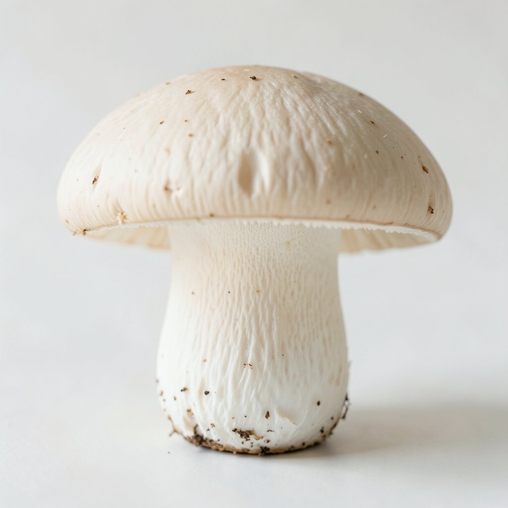
6. Mushroom and Linen

Mushroom is a soft brown-gray shade that feels rich but still quiet. Linen adds a light, airy note that keeps the room from feeling heavy.
This palette has become more common in current home trends because it feels calm and grown-up. It works well in bedrooms, sitting rooms, and reading corners.
To make it feel more like your own space, mix in smooth wood, soft wool, or clay pieces. These colors are easy to use in both low-cost and higher-end rooms, which makes them very flexible.
7. Pale Gray and Soft Peach Beige

Pale gray and soft peach beige give a room a gentle, warm feel. The gray keeps the palette calm, while the peach beige adds a soft glow.
This mix is a good fit for spaces that need a little warmth without strong color. It can make a room feel friendly and quiet at the same time.
Try this palette in a nursery, bedroom, or a small sitting area. You can keep costs down with simple paint and a few fabric items in matching shades.
8. Oatmeal and Dove Gray

Oatmeal and dove gray make a room feel soft, tidy, and easy to rest in. Oatmeal brings in a warm note, and dove gray adds a calm, smooth look.
This palette is great for people who want a space that feels clear but not cold. It also works well with both light wood and dark wood, so it is easy to use in many homes.
If you want more interest, add a knit blanket, a glass lamp, or a simple patterned pillow. These items can be found at many price points, so the look is easy to build over time.
9. Putty and White Oak

Putty is a soft, muted shade that sits between beige and gray. White oak adds a light wood tone that makes the whole room feel warm and natural.
This palette is a strong choice for a calm space because it feels plain in a good way. It lets shapes, textures, and light do most of the work.
You can personalize it with books, clay pots, or woven trays. It also fits well with the trend of simple homes that use fewer colors and more natural materials.
10. Light Mocha and Bone

Light mocha and bone create a soft look with a little more depth than plain beige. The mocha shade gives the room a grounded feel, while bone keeps it bright.
This palette works well in family rooms and bedrooms where you want comfort and ease. It can also help older furniture look better by giving it a calm backdrop.
For a low-cost update, paint one wall, add new pillow covers, or switch to warmer light bulbs. Small changes can make this palette feel fresh without much effort.
11. Ash Gray and Sand Beige

Ash gray and sand beige give a room a cool-warm balance that feels steady and soft. The gray is quiet and smooth, while the sand beige adds a natural, relaxed touch.
This palette is useful if you want a room that feels calm in both summer and winter. It works well with simple lines, open shelves, and soft fabric pieces.
Many people like this look because it fits modern homes without feeling too sharp. You can add your own style with art, plants, or a rug that has a small pattern.
12. Chalk White and Warm Camel

Chalk white and warm camel make a space feel clean, cozy, and easy to live in. Chalk white keeps the room bright, while camel adds a soft, rich note.
This palette is a nice choice for rooms that need a little more warmth than plain white. It can also make wood floors and natural fiber rugs look even better.
If you want to keep costs low, use white paint and add camel through pillows, throws, or a chair cover. This makes it easy to change the look later if your taste shifts.
13. Pebble and Soft Taupe

Pebble and soft taupe create a calm, stone-like look that feels quiet and steady. These shades are close enough to blend well, but they still give a room some depth.
This palette works well in rooms where you want less visual noise. It can help make a busy home feel more settled and easier to enjoy.
Try adding simple metal accents or a few dark details to keep the room from feeling flat. The palette is also easy to shop for because many basic home items already come in these shades.
14. Creamy Beige and Dusty Gray

Creamy beige and dusty gray make a room feel soft, calm, and a little more layered. The beige adds warmth, and the dusty gray keeps the look cool and balanced.
This mix is good for people who want a neutral room that still has some style. It works well in homes that use both classic and modern pieces.
You can make it feel more personal with framed photos, ceramic bowls, or a simple striped pillow. These colors are also easy to use in trend-based rooms without making the space feel too busy.
15. Ecru and Warm Stone

Ecru and warm stone give a room a soft, earth-like feel that is calm and easy to enjoy. Ecru is light and smooth, while warm stone adds a deeper, grounded tone.
This palette is a good match for natural light and simple decor. It can help a room feel peaceful without needing many items or bold shapes.
For a personal touch, add handmade pottery, soft wood, or a textured lamp shade. The look can be done on a modest budget if you focus on a few key pieces instead of many small ones.
16. Pale Mushroom and Soft Ivory
Pale mushroom and soft ivory make a space feel quiet, warm, and well balanced. The mushroom shade adds a gentle depth, and the ivory keeps the room light.
This palette is a strong fit for calm bedrooms, reading spots, and living rooms. It gives you a soft base that works with many styles, from simple and modern to more classic looks.
You can make the room feel more like yours with a few personal items, such as art, books, or a favorite chair. It is also a trend-friendly choice because it stays close to nature and works with many low-cost home items.