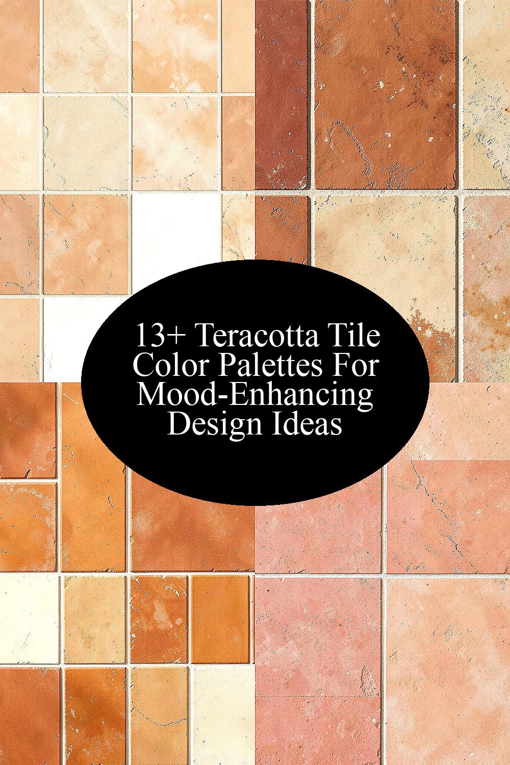
Terracotta tile colors can make a room feel warm and calm. The right mix can help a space feel more lived in and easy to use.
1. Soft Clay and Warm White

Soft clay with warm white gives a room a clean but cozy look. The tile keeps its earth feel, while the white helps the space look open and bright.
This palette works well in small rooms, kitchens, and baths because it does not feel heavy. It is also a good choice if you want a simple style that still feels personal.
For cost, this is often an easy place to start since both shades are common and easy to match with paint and wood. A small rug, light curtains, or plain shelves can help tie the look together without much effort.
2. Rust Red and Sand Beige
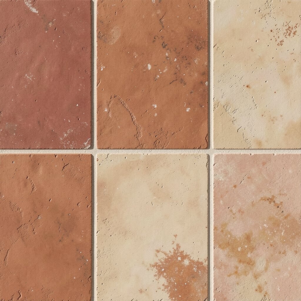
Rust red and sand beige make a space feel warm and steady. The red adds life, and the beige softens it so the room does not feel too strong.
This mix is nice for floors, backsplashes, or wall accents in rooms that need a bit more color. It can help make a plain room feel more welcoming in a simple way.
Many people like this palette because it fits both old and new homes. It also works well with low-cost decor like woven baskets, plain lamps, and light wood tables.
3. Burnt Orange and Cream

Burnt orange and cream create a bright but calm feel. The orange brings a rich tile look, while cream keeps the room soft and easy on the eyes.
This palette is a good pick for people who want mood-friendly color without going too bold. It can work in entryways, dining rooms, and even a sunny bedroom.
If you want a more custom look, try adding a few dark metal pieces or natural wood chairs. This mix is also part of a wider trend that uses warm, earth-based colors in simple home spaces.
4. Dusty Rose and Clay

Dusty rose and clay give terracotta a softer side. The rose tone adds a gentle touch, and the clay shade keeps the look grounded and natural.
This palette can help a room feel calm and warm at the same time. It is a nice fit for bedrooms, reading corners, or any space where you want a quiet feel.
One good tip is to keep the rest of the room simple so the colors can stand out. Pale bedding, light wood, and a few small plants can make the look feel balanced and easy to live with.
5. Olive Green and Terracotta

Olive green and terracotta make a strong earth-tone pair. The green adds depth, and the tile color gives the room a warm, grounded base.
This mix is great for people who want a natural style that still feels fresh. It can work in kitchens, patios, and living rooms where you want color that feels calm, not loud.
It is easy to personalize this palette with different shades of green, from soft sage to deep olive. The cost can stay low if you use the colors in small spots like pillows, planters, or one painted wall.
6. Deep Brown and Tan
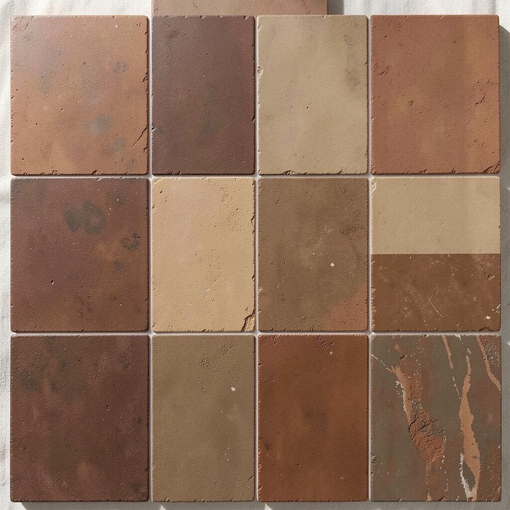
Deep brown and tan make terracotta feel rich and steady. The brown adds weight, while the tan keeps things light enough for daily use.
This palette is a smart choice for rooms that need a warm and classic look. It works well with leather, wood, and simple fabric pieces, so it can fit many home styles.
If you want a more modern feel, use clean lines and keep decor simple. This color pair is also useful when you want a room to feel calm without using bright shades.
7. Peach and Pale Stone
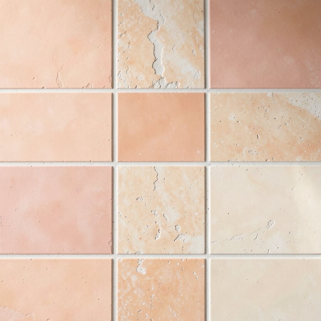
Peach and pale stone give terracotta a soft, sunny feel. The peach adds warmth, and the stone color helps the space stay quiet and open.
This palette is a nice option for small spaces because it feels light and easy. It can help a room feel more relaxed without taking away the natural tile look.
A simple way to use this mix is with light curtains, pale wood, and a few clay pots. It is also a good budget choice since you can make the look with paint and a few small items.
8. Charcoal and Terracotta
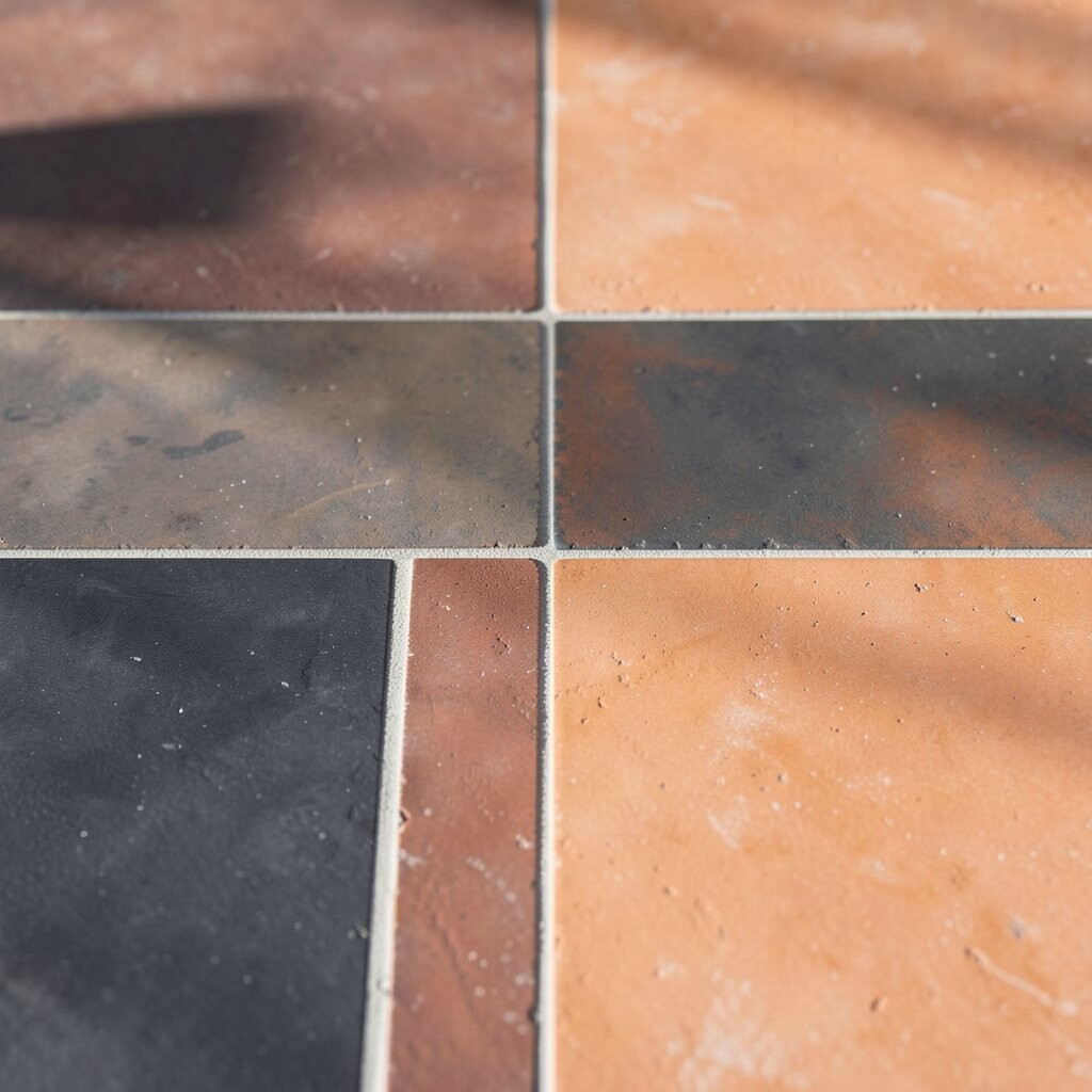
Charcoal and terracotta create a strong contrast that still feels warm. The dark shade makes the tile color stand out, while the terracotta keeps the room from feeling cold.
This palette works well in modern homes and can make a space feel neat and clear. It is a good choice for kitchens, baths, and living rooms that need a bit more edge.
To keep it from feeling too dark, add light walls or pale fabric pieces. Many people use this mix in current design trends because it feels simple, clean, and easy to style.
9. Sage Green and Warm Gray

Sage green and warm gray make a quiet and easy palette. The sage gives a soft natural note, and the gray helps the terracotta fit into a calm room.
This is a good choice if you want color but do not want a loud look. It can help a bedroom, bath, or office feel more settled and comfortable.
You can make this palette your own by changing the shade of gray or adding small brass parts. It is also a good low-cost style because both colors pair well with many common home pieces.
10. Mustard and Brick

Mustard and brick make a warm, bold pair that still feels easy to use. The mustard adds a cheerful note, and the brick tone keeps the look close to the earth.
This palette can help a room feel lively without using bright neon shades. It works well in dining areas, kitchens, and creative spaces where a warm mood matters.
If you want to soften the look, add cream or light wood pieces. This mix also fits well with the current trend of using rich, warm tones that feel more personal than plain white rooms.
11. Blue Gray and Terracotta

Blue gray and terracotta make a nice balance between cool and warm. The blue gray feels calm, and the tile color adds a friendly earth tone that keeps the room from feeling flat.
This palette is useful in rooms where you want a bit of calm but still want warmth. It can work in bathrooms, bedrooms, and even small entry spaces.
For a personal touch, try adding woven baskets, plain ceramics, or soft linen fabric. The cost can stay fair because blue gray paint and simple decor pieces are often easy to find.
12. Ivory and Cocoa

Ivory and cocoa give terracotta a soft, classic look. The ivory keeps the room bright, while the cocoa shade adds depth and helps the tile stand out.
This palette is a good fit for homes that want warmth without too much color. It can make a room feel neat, calm, and easy to use every day.
One tip is to use texture so the room does not feel too plain. A woven mat, a thick throw, or a wood table can add interest without raising the cost too much.
13. Blush and Natural Oak
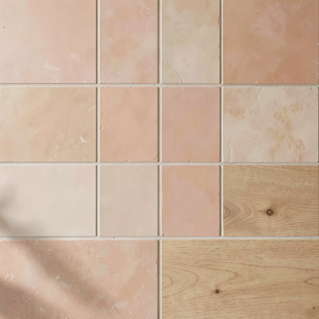
Blush and natural oak make a light, warm palette that feels friendly and current. The blush adds a soft color note, and the oak brings in a natural wood look that fits terracotta well.
This mix is great for people who want a gentle room with a bit of style. It can work in bedrooms, sitting rooms, and even a small bathroom with good light.
This palette is easy to personalize with art, pillows, and simple decor in soft tones. It is also a popular trend because it feels calm, warm, and easy to live with.
14. White, Black, and Terracotta

White, black, and terracotta make a clean and balanced palette. The white opens the room, the black adds sharp lines, and the terracotta keeps the whole space warm.
This look is useful if you want a style that feels both simple and modern. It can work in kitchens, baths, and living rooms where you want strong shape without too much color.
You can keep costs down by using this palette in small ways, like trim, frames, or a few tile accents. It is a flexible choice that lets you change the mood later with easy decor swaps.