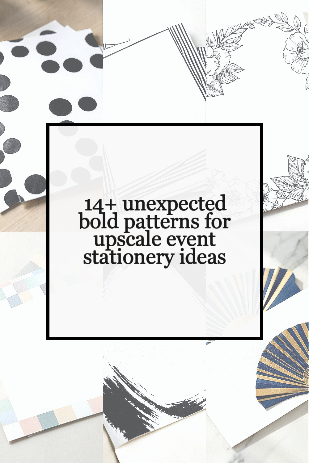
Bold patterns can give event stationery a fresh look without making it hard to read. They can also help cards, menus, and signs feel more like part of the event plan.
1. Oversized Polka Dot Prints

Oversized polka dots can make save-the-dates, invitations, and menu cards feel lively and easy to spot. The look works well when the dots are spaced out on a clean background, so the page still feels neat.
This pattern is a good fit for both casual and upscale events because it feels fun but still put together. You can use black and white for a sharp look, or try soft gold, navy, or blush for a more polished feel.
One nice thing about this style is that it can be made with simple print methods, which can help keep costs down. If you want a more personal touch, you can match the dot size and color to the event theme, like large gold dots for a gala or soft gray dots for a wedding brunch.
2. Thin Stripe Layers

Thin stripes can make stationery look clean, modern, and smart. When the lines are close together, they give a neat texture that feels stylish without being too loud.
This pattern works well on place cards, thank-you notes, and table signs because it adds detail without making the text hard to read. A soft stripe in one color can look calm, while mixed stripe widths can give the design more energy.
Many event planners like stripes because they are easy to pair with other design parts, such as monograms or wax seals. They can also be a lower-cost option since the pattern is simple, yet it still gives a high-end feel when printed on thick paper.
3. Large Floral Line Art

Large floral line art can bring a bold but light look to event stationery. The flowers feel graceful and open, and the plain line style keeps the design from feeling too busy.
This choice is nice for weddings, showers, and spring events, but it can also work for brand events if the flowers are drawn in a sharper style. You can make the flowers the main focus on the cover and keep the rest of the card simple for balance.
It is easy to make this look feel personal by using flowers that mean something to the host or couple. Some people also like line art because it can be printed in one color, which may help with budget control while still looking polished.
4. Checkerboard with Soft Colors

A checkerboard pattern can feel fresh and bold when it uses soft colors instead of harsh ones. The blocks create a clear visual rhythm, which makes the stationery stand out right away.
This style can work well for modern parties, fashion events, and art-themed gatherings. If the colors are muted, like cream and sage or dusty blue and white, the design can still feel upscale and calm.
Checkerboard prints also give room for creative layout choices, such as placing the event name in the center or running the pattern only on the border. That makes it easy to keep the cost fair while still getting a strong look.
5. Abstract Brush Strokes

Abstract brush strokes can add movement and depth to cards, signs, and envelopes. The paint-like shapes feel loose and modern, which can be a nice change from more common formal patterns.
This look works best when the strokes are used with a clear layout and plenty of white space. It helps the text stay easy to read while the pattern adds a rich, custom feel.
You can use one bold stroke behind a name or place a few soft strokes around the edges of the page. Since the design can be made with digital art, it may be a smart choice for events that want a custom look without a very high print cost.
6. Art Deco Fan Shapes

Art Deco fan shapes can make stationery feel sleek and fancy without seeming old-fashioned. The repeated arcs and sharp lines give a strong pattern that feels neat and planned.
This style is a good match for black, gold, silver, and deep jewel tones, which are still popular in upscale event design. It can work well for gala invitations, formal dinners, and milestone parties where the host wants a clean but bold look.
One helpful tip is to keep the fan shapes near the edges or at the top of the page so the main text has room to breathe. That balance makes the design look rich and can help avoid extra print costs from using too much ink across the whole card.
7. Animal Print in Small Doses

Animal print can feel stylish and unexpected when used in small, careful ways. A small leopard, zebra, or snakeskin pattern can add edge without taking over the whole piece.
This is a strong choice for fashion events, cocktail parties, and brand launches because it gives the stationery a modern feel. The key is to keep the print soft in color or use it as a border, accent strip, or envelope liner.
If you want the look to feel upscale, pair the print with plain type and thick paper. This helps the pattern feel planned and not random, and it can also let you use less of the print to keep costs in check.
8. Bold Plaid with Clean Layouts

Bold plaid can make event stationery feel warm, classic, and a little unexpected. When the lines are crisp and the colors are chosen with care, the pattern can look polished instead of casual.
This style works well for fall events, winter parties, and formal gatherings with a cozy feel. A dark plaid with cream text can look rich, while a lighter plaid can feel softer and more open.
To keep the design upscale, use the plaid in one area and leave the rest of the card simple. That mix of pattern and plain space helps the message stand out and can also make printing easier and less costly.
9. Overscale Geometric Blocks
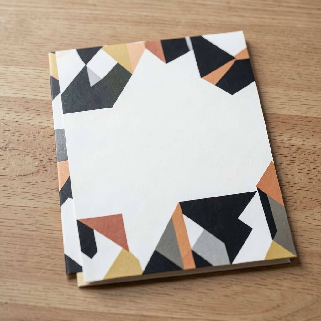
Overscale geometric blocks can give stationery a strong, modern look. Big shapes such as squares, circles, and triangles can make the page feel bold and easy to remember.
This pattern is useful for event pieces that need to stand out fast, like welcome signs, program covers, and menu cards. The shapes can be arranged in a neat grid or set at angles for a more active feel.
Many event teams like this trend because it can be made in just a few colors and still look rich. It also works well with personal touches, like using the event colors in the blocks or adding a custom monogram inside one shape.
10. Marble Swirls with Deep Color

Marble swirls can add a smooth, rich look to stationery when they use deep color and clear contrast. The flowing lines give the page a natural pattern that feels calm but still bold.
This style is often used for formal events because it looks polished on invitations, escort cards, and thank-you notes. Dark green, navy, black, and burgundy can make the marble effect feel more upscale.
It can also be a smart choice for events that want a lot of style without a lot of extra parts. A marble background can do much of the visual work on its own, which may help keep the design simple and the print cost more manageable.
11. Repeated Monogram Pattern

A repeated monogram pattern can make stationery feel personal and high-end at the same time. The same initials used again and again create a strong visual rhythm that feels custom made.
This pattern works well for weddings, anniversary events, and private dinners where the host wants a personal mark across the paper goods. It can be used softly in the background or in a stronger repeat for a more bold look.
One of the best parts of this style is that it feels special even when the rest of the design stays simple. Since the monogram is the main feature, the stationery can still be cost-friendly while looking carefully planned.
12. Tropical Leaves in Dark Tones
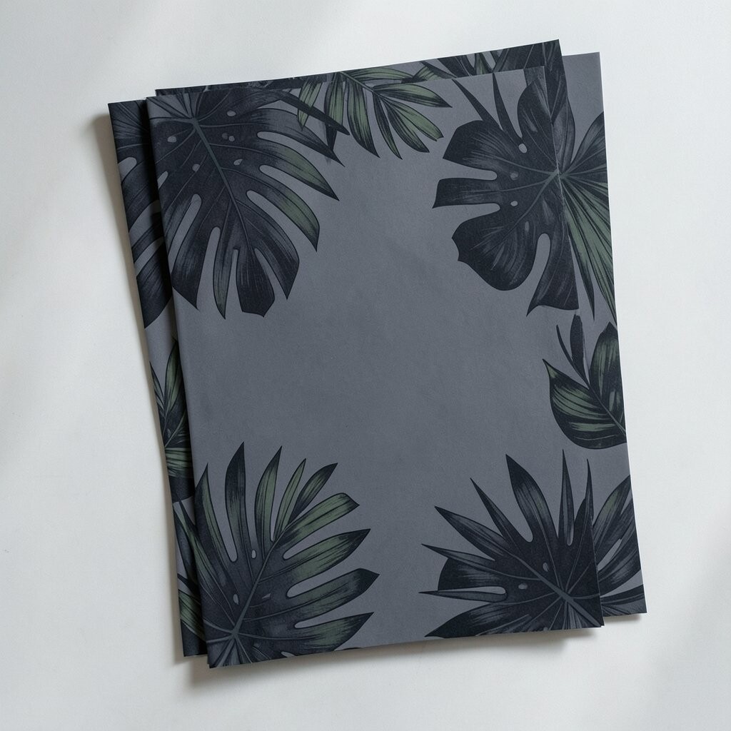
Tropical leaves do not have to look bright or beachy. When they are shown in dark green, charcoal, or deep blue, they can feel rich and fit well with upscale events.
This pattern can work for summer galas, garden dinners, and evening parties where the host wants a fresh but grown-up style. Large leaves can frame the text well and give the page a bold shape.
You can make the look more personal by using leaves that match the venue or season. The design also pairs well with simple gold text or plain white type, which keeps it readable and stylish.
13. Houndstooth with Fine Detail
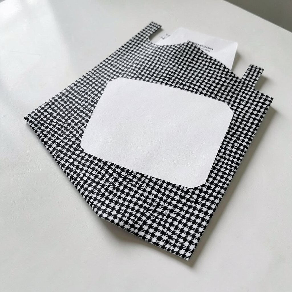
Houndstooth can bring a sharp, smart feel to event stationery. The small broken checks create a strong pattern that looks neat from far away and even more interesting up close.
This style is a good fit for formal dinners, winter events, and fashion-linked gatherings. Black and white is the classic choice, but deep red, forest green, or navy can make it feel more current.
Because the pattern already has so much detail, it works best when used on one part of the stationery, like a border or back panel. That keeps the layout clear and can help lower print costs by using the pattern in a smaller area.
14. Wave Lines with Metallic Touches

Wave lines can make stationery feel smooth, modern, and a little playful. When the lines curve across the page, they add motion without making the design hard to read.
This pattern is a nice choice for ocean events, evening receptions, and brand parties that want a fresh look. A metallic touch in gold, silver, or copper can give the waves more shine and make the stationery feel more upscale.
It is also easy to make this style fit different event themes by changing the line thickness or color. Since the design can stay simple, it may work well for hosts who want a stylish result without a large budget.
15. Mixed Pattern Borders
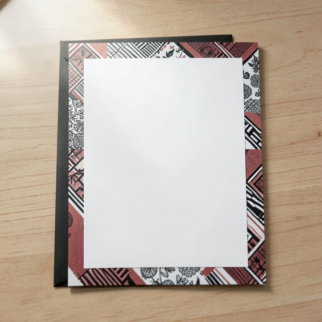
Mixed pattern borders can make stationery feel rich and custom without covering the whole page. A border can use dots, stripes, florals, or shapes in a small band around the edge while the center stays calm.
This idea is helpful because it lets you combine more than one bold look in a controlled way. It can also make items like menus, programs, and place cards feel tied together, which is useful for a full event set.
To keep the design balanced, choose one main color group and repeat it across all pieces. That makes the set feel planned and can help control costs, since you do not need a full-page pattern on every item.