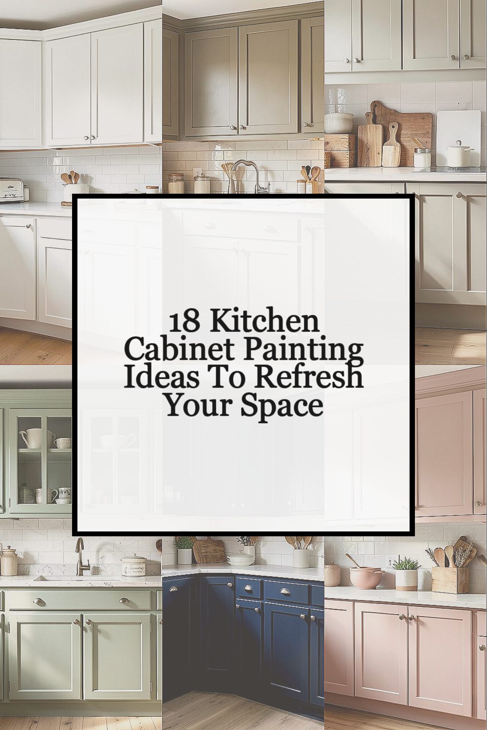
You can make your kitchen feel brand new with a brush, a roller, and a little courage. A fresh cabinet color changes the whole mood in a way you can see every day.
Pick a style that matches your life, your light, and your taste. Then use smart prep and simple painting choices so the results look smooth and stay strong.
-
1. Crisp White Cabinets With Soft Matte Finish
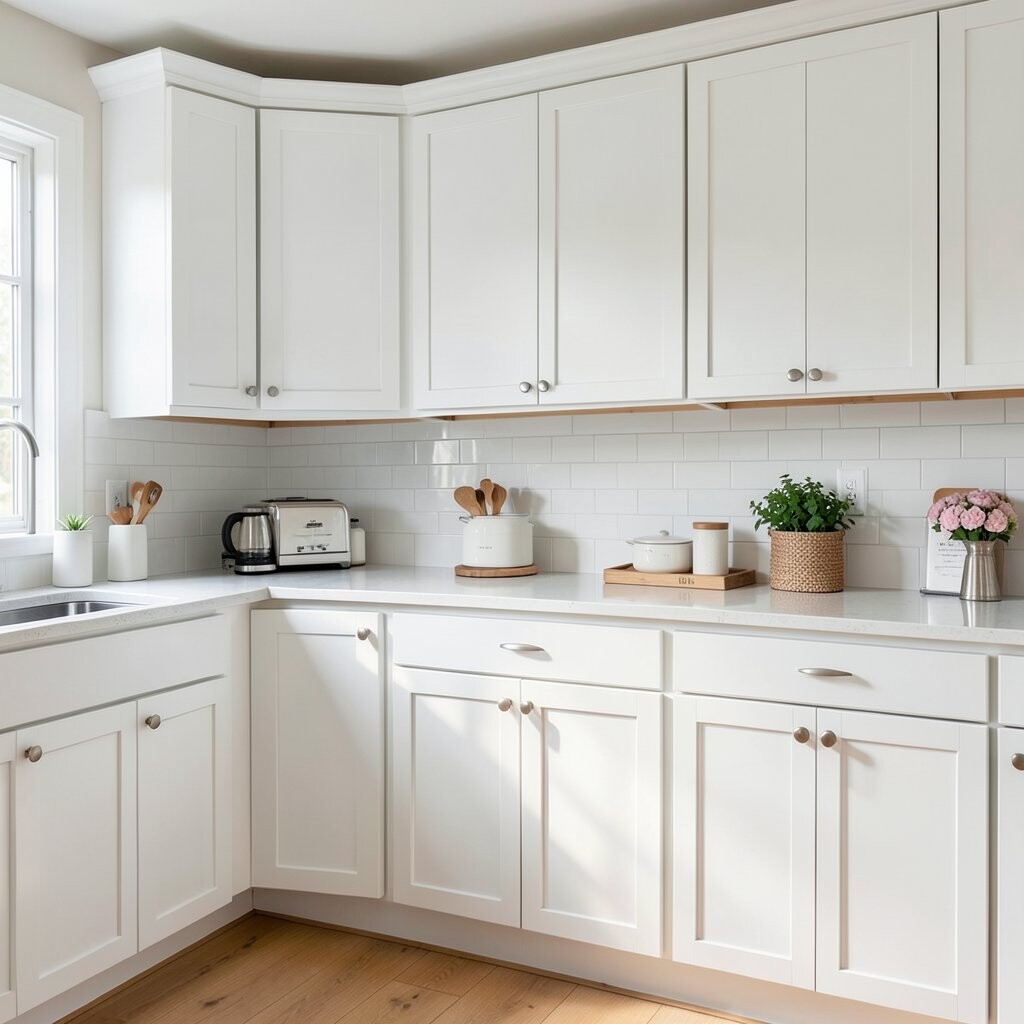
Crisp White Cabinets With Soft Matte Finish Bright cabinets can make your kitchen look clean, calm, and airy. The matte look hides tiny flaws and makes the doors feel smooth and modern.
To get a crisp result, clean the cabinets well and sand lightly so paint sticks. Use a primer made for cabinets, then choose an enamel or cabinet paint that levels nicely. If you want extra protection, finish with a clear topcoat that matches your sheen.
Benefits are big: white helps small kitchens feel larger and it goes with almost any backsplash. It also makes your countertops and hardware stand out. This idea is unique because you can keep it classic, yet still feel current with a soft matte texture.
For personalization, try slightly warmer white if your kitchen gets cool light. If you love contrast, pair white cabinets with black hinges or brushed brass pulls. Costs can stay reasonable because white can hide uneven color from old wood, but quality paint and primer will still matter for lasting coverage.
Current trend notes: many people now choose matte or satin over glossy so the space looks cozy instead of shiny. Go for a gentle sheen and you will feel right on style.
-
2. Warm Greige Cabinets for a “Never-Too-Much” Look
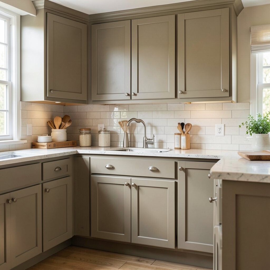
Warm Greige Cabinets for a “Never-Too-Much” Look Greige sits between gray and beige, so it feels balanced and welcoming. Your kitchen will look styled without looking loud.
For best results, test a sample in the actual room at morning and evening light. Greige colors can shift, so pick one that looks flattering when you cook and when you relax. Sand, prime, and paint in thin coats so you avoid drips and streaks.
Uniqueness comes from greige’s ability to match both wood tones and cooler metals. It also makes tile, grout, and stone patterns look smoother and more intentional. If you like earthy style, add natural textures like rattan placemats or a woven runner.
Personalization ideas are easy: choose a greige that leans more beige for a cozy feel or more gray for a modern mood. You can also paint the inside shelves for a tidy surprise when you open the cabinet doors. Cost-wise, greige paint is usually priced the same as other popular colors, but make sure you buy enough to avoid color mismatch between batches.
Trend check: warm neutrals are staying strong because they work with open shelving, mixed metals, and lots of handmade decor.
-
3. Two-Tone Cabinets: Bottom Color, Top Neutral
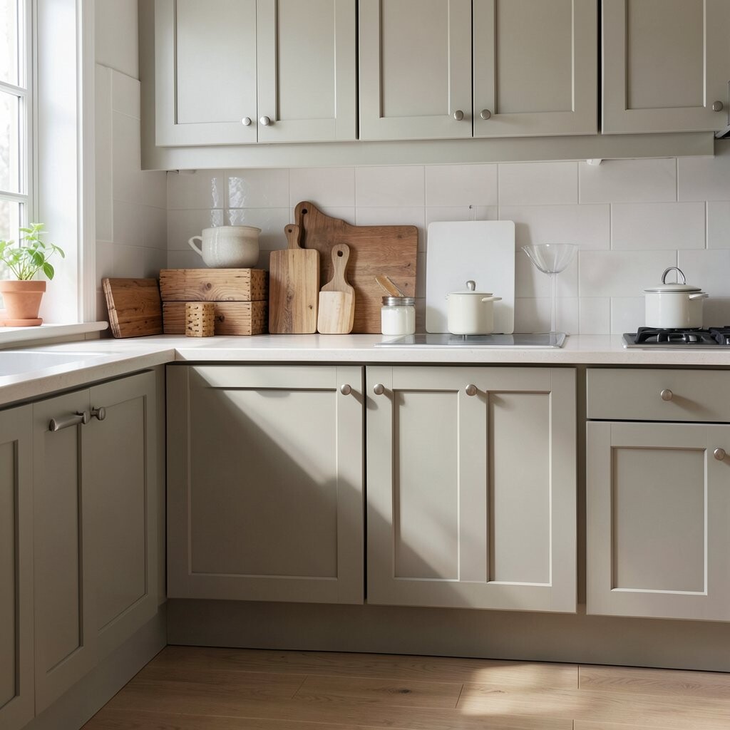
Two-Tone Cabinets: Bottom Color, Top Neutral Two-tone cabinets create instant style because the eye has a clear design path. You get depth without needing complicated work.
Try painting the upper cabinets a light neutral and the lower cabinets a richer color like navy, sage, or cocoa. This trick helps the room feel grounded while keeping the top area bright. Use painter’s tape carefully and remove it at the right time so edges stay crisp.
Benefits include better visual balance, especially if your kitchen has colorful tile. It can also hide wear on high-touch areas by choosing a shade that forgives scuffs. The uniqueness comes from customizing the “frame” of your cabinets with a color story you control.
For personalization, match the lower cabinet color to your kitchen accents like a rug or curtain pattern. If you want to go subtle, pick two tones that are close in warmth so everything feels calm. Cost considerations: two-tone work may use more tape and paint, but you can still keep it budget-friendly by using one accent color.
Current trend: mixed cabinet color sets look popular in both modern and farmhouse styles, and they pair well with updated lighting.
-
4. Sage Green Cabinets With Vintage-Soft Vibes

Sage Green Cabinets With Vintage-Soft Vibes Sage green brings a gentle, garden-like feeling into your kitchen. It looks great with wood floors, white counters, and natural stone.
Paint can look calming and timeless when you choose a shade with gray undertones. Prime well, then use a semi-gloss or satin finish for surfaces that get frequent cleaning. For a vintage touch, lightly distress the edges with fine sandpaper after the paint fully cures.
Benefits include a refreshing color that still feels relaxed. This idea is unique because it balances softness and structure, especially when paired with simple shaker doors. Add brass knobs or knobs in a warm metal to make the green feel even richer.
Cost note: distressing can stretch your budget because you may only distress the most visible edges. If you want to spend less, choose a mid-range paint brand but prioritize primer quality and good sanding.
Trend note: earthy green tones are showing up a lot in kitchens, and sage is a favorite because it feels lived-in and friendly.
-
5. Classic Navy Cabinets for a Bold Kitchen Mood

Classic Navy Cabinets for a Bold Kitchen Mood Navy cabinets feel dramatic and grown-up, even in a small kitchen. They make your lighting look warmer and your hardware look sharper.
For visual success, choose a navy that is not too black. A slightly blue navy usually looks richer under everyday light. You will also want a good primer and a paint with strong coverage, since deep colors can need extra coats.
Uniqueness comes from how navy plays well with many styles: it can feel modern with clean lines or cozy with farmhouse details. It also hides dirt better than lighter colors, which is a real-life benefit. Personalize by adding gold or brushed nickel hardware, and consider painting the inside of drawers for a matching pop.
Cost considerations: deeper pigments can be thicker and may require more paint, so buy extra to avoid running short. If you are on a tighter budget, keep the navy for lower cabinets or an accent run.
-
6. Soft Blush Cabinets for a Gentle, Romantic Touch
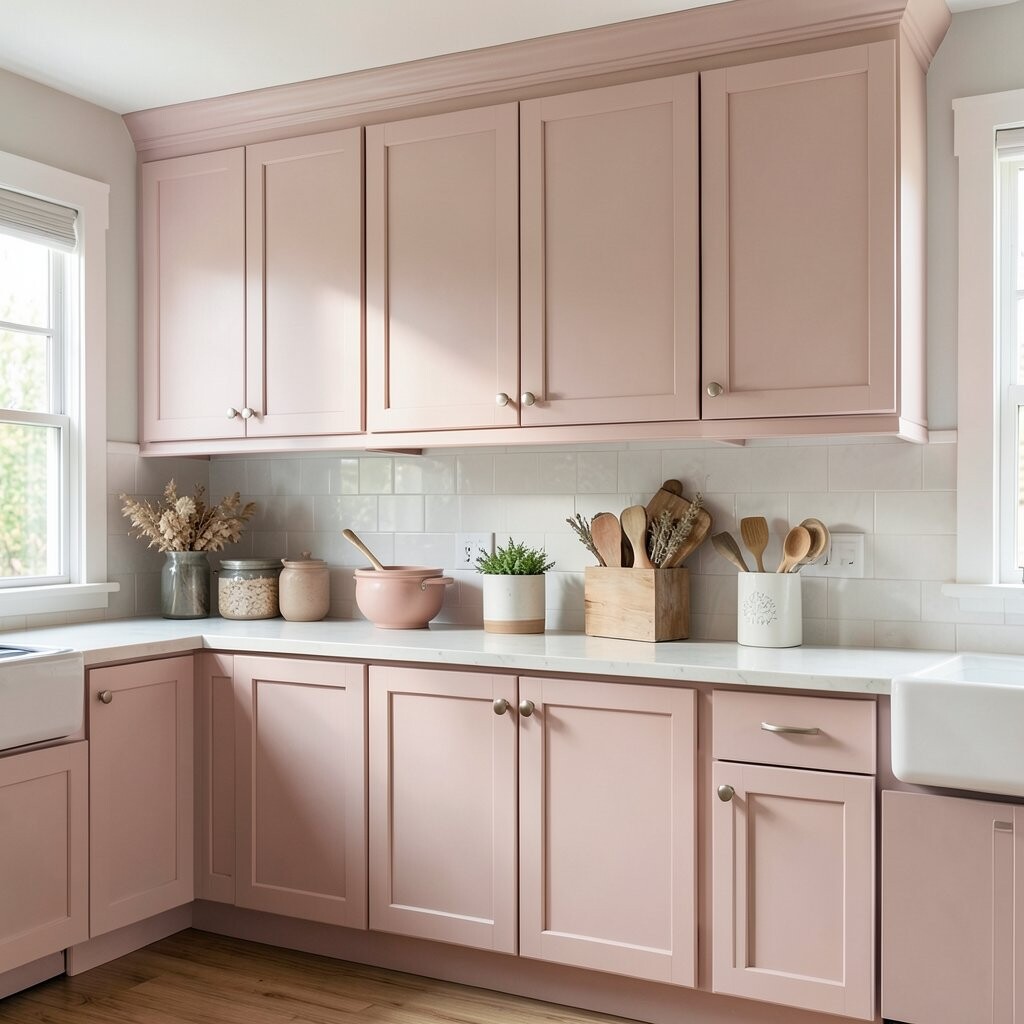
Soft Blush Cabinets for a Gentle, Romantic Touch Blush cabinets add warmth without making your kitchen feel heavy. The color feels sweet, but it can still look grown-up when you pair it with neutral counters.
Start by choosing a blush that has a hint of beige or taupe, because it will stay more timeless. Sand, prime, and use smooth roller techniques to keep the finish even. If you love a cozy look, combine blush with warm white walls and light wood shelves.
Benefits include an inviting vibe that makes the room feel like a treat. This idea is unique because blush can work in both cottage and modern kitchens when you pick the right shade. Personalize with matte hardware in rose gold tones or use clean white subway tile to keep it fresh.
Cost-wise, blush may show streaks if your prep is rushed, so spend time sanding and priming. A quality brush for corners helps a lot and can save you from redoing work later. Current trend: soft pink and dusty rose are popping up in decor, and painted cabinetry is a bold way to wear the trend.
-
7. Matte Black Cabinets for Sleek, Modern Contrast
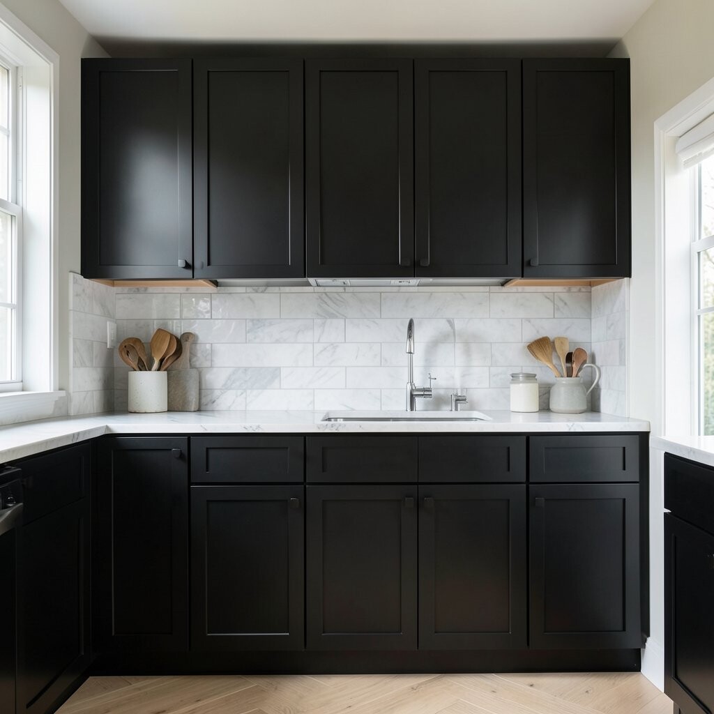
Matte Black Cabinets for Sleek, Modern Contrast Matte black cabinets look sharp and stylish, like a design magazine cover. They also add contrast that makes backsplashes and countertops look more dramatic.
To make black look smooth, you need patience. Clean and de-gloss the surface, prime thoroughly, and apply paint in thin coats so you avoid thick patches. Choose a matte finish and pair it with high-quality hardware so everything feels intentional.
Benefits: black hides stains better than you might expect when you use the right finish. It also makes a kitchen feel more anchored, especially if you have light floors and bright lighting. This idea is unique because matte black can feel either bold or cozy depending on your textures.
Personalization ideas include using warmer black for a softer look or a cool black for a crisp style. Add wood shelves, open racks, or a warm brass faucet to balance the dark color. Cost considerations: black paint can be pricey and may require several coats, so budget for paint plus primer.
-
8. Classic Light Wood Stain Look Without the Full Replacement

Classic Light Wood Stain Look Without the Full Replacement If you love wood tones, you can paint cabinets to mimic stain and wood grain. This approach gives warmth while still giving you a clean, updated surface.
Use a wood-grain style technique or a tinted glaze over a base coat to create depth. The trick is to keep your strokes consistent and follow the grain direction so it looks natural. Make sure you seal properly so your finished surface stays washable.
Benefits include a cozy look and a strong style connection to many kitchen themes. This idea is unique because you are not stuck with one flat color; you create movement like real wood. Personalize by choosing lighter oak tones for airy vibes or deeper walnut tones for a richer feel.
Cost note: a faux-stain technique can cost more in supplies, but you save money versus replacing cabinets. You may also need practice on one door first, which is a smart way to protect your main work.
-
9. Bright White With Color-Blocked Drawer Fronts

Bright White With Color-Blocked Drawer Fronts Most of the cabinets can be bright white while a few drawers pop with color. This color-block idea is playful and feels tailored to your routine.
Pick one accent color like teal, coral, or deep green and apply it to drawers only. That way, you get a fun design moment without overwhelming the whole kitchen. Keep the rest clean and light so your counters and backsplash remain the main background.
Benefits include easier maintenance because the white areas hide fewer stains than you think, and the accents add joy without lots of repainting. This idea is unique because it treats the cabinet doors like a canvas. Personalize by matching the accent drawers to kitchen items you already love, like canisters or dish towels.
Cost considerations: you may use less paint since the accent is smaller. Still, plan for careful taping, because sharp lines are what make color-block work look professional. Trend angle: playful design details are popular, and color-blocking is a way to add personality without major renovation.
Tip: use the same sheen on all painted surfaces so the accents do not look dull next to glossy areas.
-
10. Coastal Blue Cabinets With Breezy, Light Energy
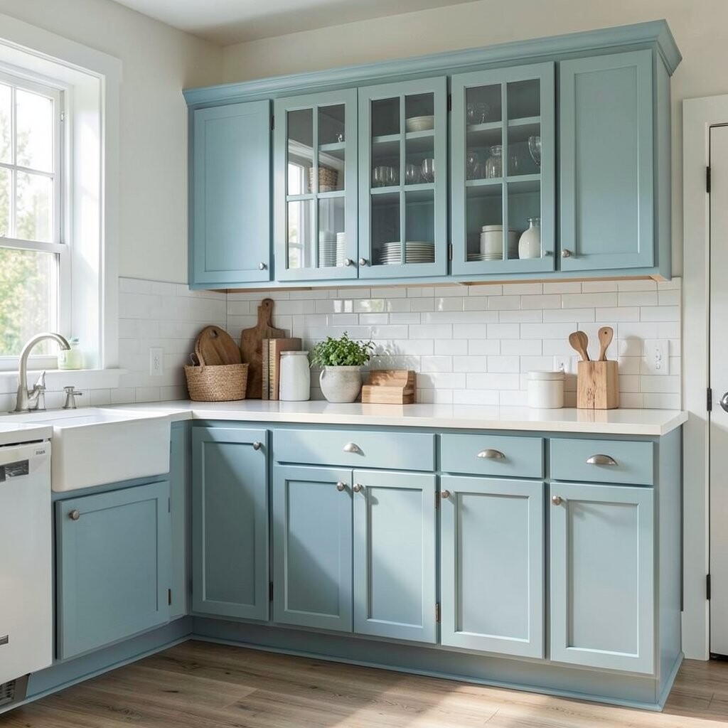
Coastal Blue Cabinets With Breezy, Light Energy Coastal blue cabinets bring the feeling of open air into your home. The color looks refreshing and pairs beautifully with white, beige, and light gray.
Choose a blue that feels like sea glass or a soft sky, not an overly dark shade. Prime and paint with steady strokes, and consider a satin finish to make cleaning easy. Add lightweight textures like linen curtains or a rope basket for a matching coastal vibe.
Benefits include a bright mood and a soothing look that never feels harsh. This idea is unique because coastal colors often look better with natural materials rather than heavy patterns. Personalize by choosing light hardware in brushed nickel or aged bronze.
Cost considerations: blues can sometimes be tricky, so buy enough paint for full coverage and keep track of the total coats needed. If you want to spend less, do a partial cabinet plan like repainting only the visible lower run first.
Trend note: light blues are returning, especially in kitchens that use warm wood and airy window styles.
-
11. Chalky White Cabinets With Shaker Charm
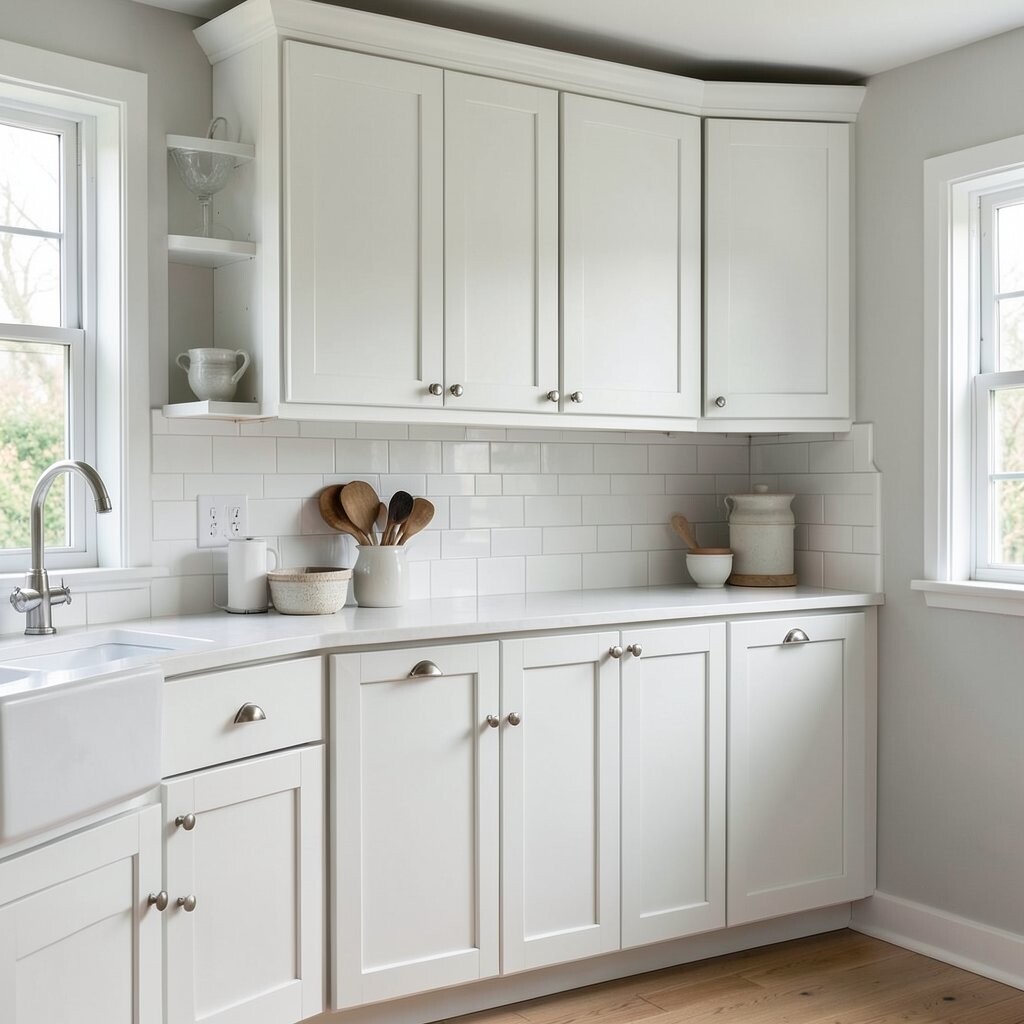
Chalky White Cabinets With Shaker Charm Chalky white cabinets can look soft and timeless, especially with classic shaker doors. The finish feels cozy and vintage, like a well-loved piece of furniture.
To get that look, you will want a paint that dries with a smooth, velvety feel. Sanding matters because it creates a surface where paint grips evenly. Consider adding a topcoat that fits your paint type, so the chalky look stays more washable.
Benefits include a friendly look that hides everyday wear when you choose the right shade. This idea is unique because the “chalk” vibe can still look neat if you use good technique. Personalize by using simple ceramic knobs in white or subtle patterns.
Cost note: some chalk-style paints may cost more upfront, but you can save time and effort since you may need less sanding. Still, do not skip prep, because skipped steps show later.
-
12. Color-Drip Style Cabinet Details for a Fun, Artist Look
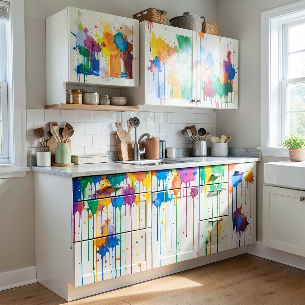
Color-Drip Style Cabinet Details for a Fun, Artist Look If you love art and playful design, try a color-drip effect on cabinet bottoms or corners. It gives your kitchen a creative signature without repainting the whole door.
Pick two colors: a base like white or light gray, then a drip color like bright yellow, teal, or even burgundy. Use painter’s tape to mask clean lines and test your drip placement on scrap cardboard. Seal the finish so the drip edges are protected and easy to wipe.
Benefits include a one-of-a-kind look that feels like you. This idea is unique because it turns plain cabinet fronts into a design feature. Personalize the drip pattern by making it subtle on upper cabinets and stronger on lower ones for a balanced feel.
Cost considerations: you can control cost by limiting the drip color to one accent stripe. Trend note: creative painting effects are showing up more in kitchens because homeowners want spaces that reflect hobbies and personality.
Tip: keep drips consistent in width so your cabinets look intentional rather than messy.
-
13. Moody Charcoal Cabinets With Warm Lighting

Moody Charcoal Cabinets With Warm Lighting Charcoal cabinets add depth and drama without going fully black. They look modern and feel cozy when you add warm lighting above the sink or around the ceiling.
For a rich charcoal look, choose a color that is slightly softer than pure black. Prime well, then paint with a smooth roller and brush for edges. A satin finish is great for day-to-day cleaning and gives just enough shine to look polished.
Benefits include hiding scuffs and fingerprints better than lighter shades. This idea is unique because charcoal works with both cool and warm countertops, which makes it flexible. Personalize by mixing metals: try black pulls with brushed nickel faucets for a layered look.
Cost note: deep colors can require extra coats, so plan your budget for paint plus primer. If you want to keep costs lower, use charcoal only on the main cabinet run and leave the pantry door a neutral.
-
14. Olive Green Cabinets for a Cozy, Modern Farm Feel

Olive Green Cabinets for a Cozy, Modern Farm Feel Olive green feels grounded and comforting, like a kitchen that welcomes you in. It pairs well with light stone, warm wood, and natural woven decor.
To avoid a dated look, choose an olive shade that is not too dull. Sand and prime, then use a durable finish so your cabinets can handle daily cooking. If you like farmhouse style, pair olive cabinets with white countertops and simple hardware.
Benefits include a color that feels alive but still easy to decorate around. This idea is unique because olive can look both vintage and clean depending on the finish. Personalize with linen shades, open shelving, and a backsplash in cream or soft terracotta.
Cost considerations: if you paint all cabinets olive, you may use more paint, but the result can be a high-impact upgrade. To save money, you can paint only doors and fronts while keeping the box color for a few extra months.
-
15. Soft Cream Cabinets With Glass-Front Upper Doors
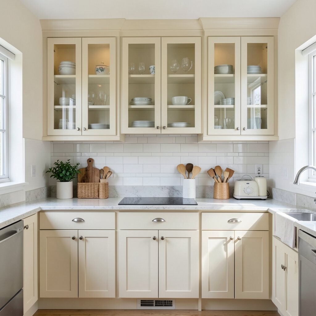
Soft Cream Cabinets With Glass-Front Upper Doors Cream cabinets feel warm and bright, and glass-front doors add charm. The combination makes your kitchen look open and lightly decorated.
Paint the solid door sections in a creamy color while keeping the glass area clean. If you can, add shelf liners in a subtle pattern to make the inside look neat. For best durability, use a cabinet paint system designed for frequent wiping.
Benefits include a pleasant backdrop for dishes, mugs, and pretty pantry jars. This idea is unique because it blends painted color with a see-through display. Personalize by using matching painted frames around the glass so everything looks like one intentional style.
Cost note: glass-front hardware and liners may cost extra, but you can keep the overall budget by painting existing frames instead of replacing cabinets. Trend note: “display kitchens” are popular, and glass accents make everyday items feel like decor.
-
16. High-Gloss Color Pop Cabinets for a Clean, Sleek Look

High-Gloss Color Pop Cabinets for a Clean, Sleek Look High-gloss cabinets can look like smooth lacquer and instantly feel upscale. If your kitchen gets lots of natural light, gloss can make colors look bold and bright.
Use a paint made for cabinetry with a gloss finish, and apply it carefully to avoid visible roller lines. Thin coats are key, because heavy coats can turn uneven as they dry. A strong topcoat helps the surface stay easy to wipe down.
Benefits include a smooth feel and good wipe-clean performance for cooking messes. This idea is unique because gloss changes how color reflects light, giving your space a polished, showroom look. Personalize by choosing jewel tones like emerald or cobalt for a dramatic moment.
Cost considerations: high-gloss systems can cost more, but you may get great results in fewer coats if the paint coverage is strong. Trend note: glossy accents are back in smaller doses, and full-gloss cabinets are a bold move that feels fresh when done carefully.
Tip: keep a microfiber cloth nearby for quick daily cleaning without leaving dust marks.
-
17. Two-Tone Upper Cabinets for a Subtle “Gallery” Effect
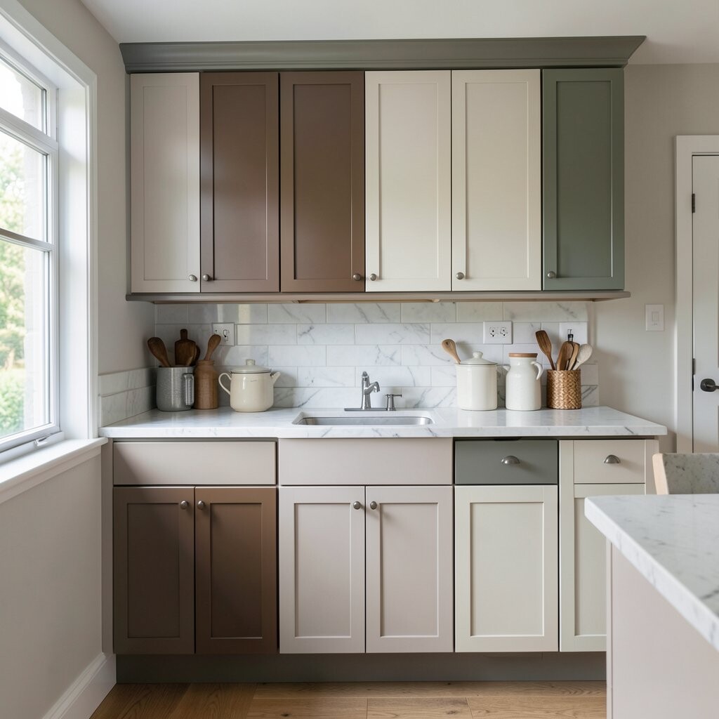
Two-Tone Upper Cabinets for a Subtle “Gallery” Effect This idea gives you a gallery-like look without needing bright or loud colors. Keep the lower cabinets simple, then add a second color to the upper cabinets or interior trim.
Try painting the upper cabinet boxes one color and the doors another, or add a different shade only to the inner panels. This creates depth and makes the room feel thoughtfully designed. Use painter’s tape and a steady hand, then check your edges under light at different angles.
Benefits include visual interest that stays calm, which is perfect if you do not want a loud makeover. This idea is unique because it makes the kitchen feel layered even when colors are close. Personalize by matching the second color to a backsplash tile color, like warm gray, soft blue, or muted green.
Cost considerations: you will likely use more paint than a single-color job, but you might use less overall because you are splitting the work across sections. Trend angle: layered color is trending in a “quiet luxury” style, where design feels rich but not flashy.
-
18. Fresh White With Color-Coordinated Hardware and Hinges
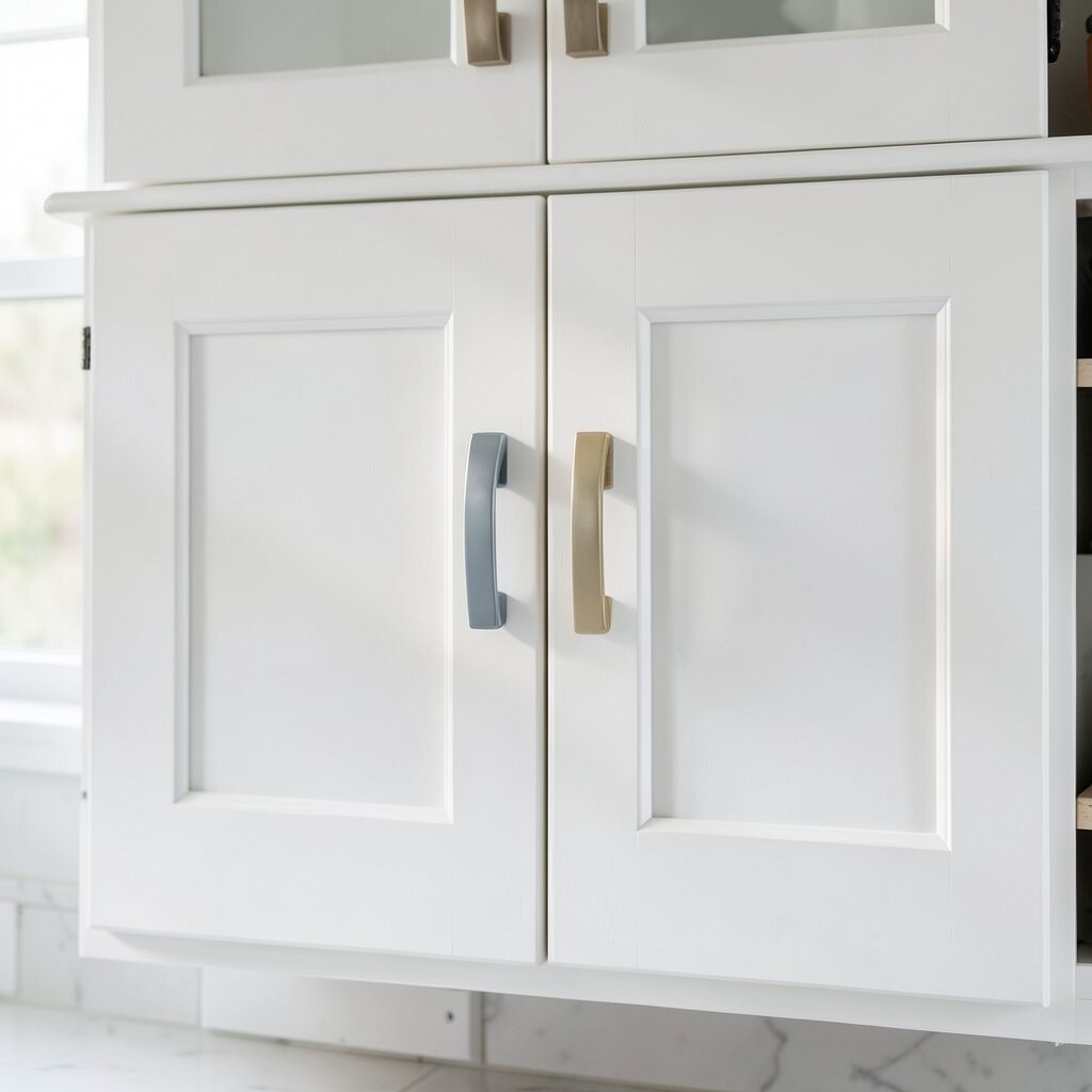
Fresh White With Color-Coordinated Hardware and Hinges Sometimes the biggest cabinet upgrade is pairing new paint with hardware that fits the vibe. White cabinets plus coordinated pulls and hinges can look crisp and complete.
Start by painting your cabinets in a clean base, then choose hardware in a finish you love. Brushed brass, matte black, and satin nickel all create different moods, even with the same cabinet color. Plan hardware changes early so you can adjust spacing and avoid holes that do not match your layout.
Benefits: new hardware improves function and makes opening cabinets feel smoother. This idea is unique because it focuses on the small details that most people overlook. Personalize by matching hardware to your faucet, light fixtures, or even your outlet covers for a cohesive look.
Cost considerations can be flexible because hardware ranges from budget-friendly to premium. If you want to save money, upgrade only the most visible pulls first and finish the rest later. Trend note: matching metals are less strict than before, and many homeowners mix finishes intentionally as long as they share a similar warmth.
Tip: keep a small level and measuring tape when installing pulls so everything lines up nicely door to door.