Cabinet color is the mood board of your whole kitchen.
Pick it wrong and the room can feel off, even when everything else looks right.
-
1. Skipping real lighting tests
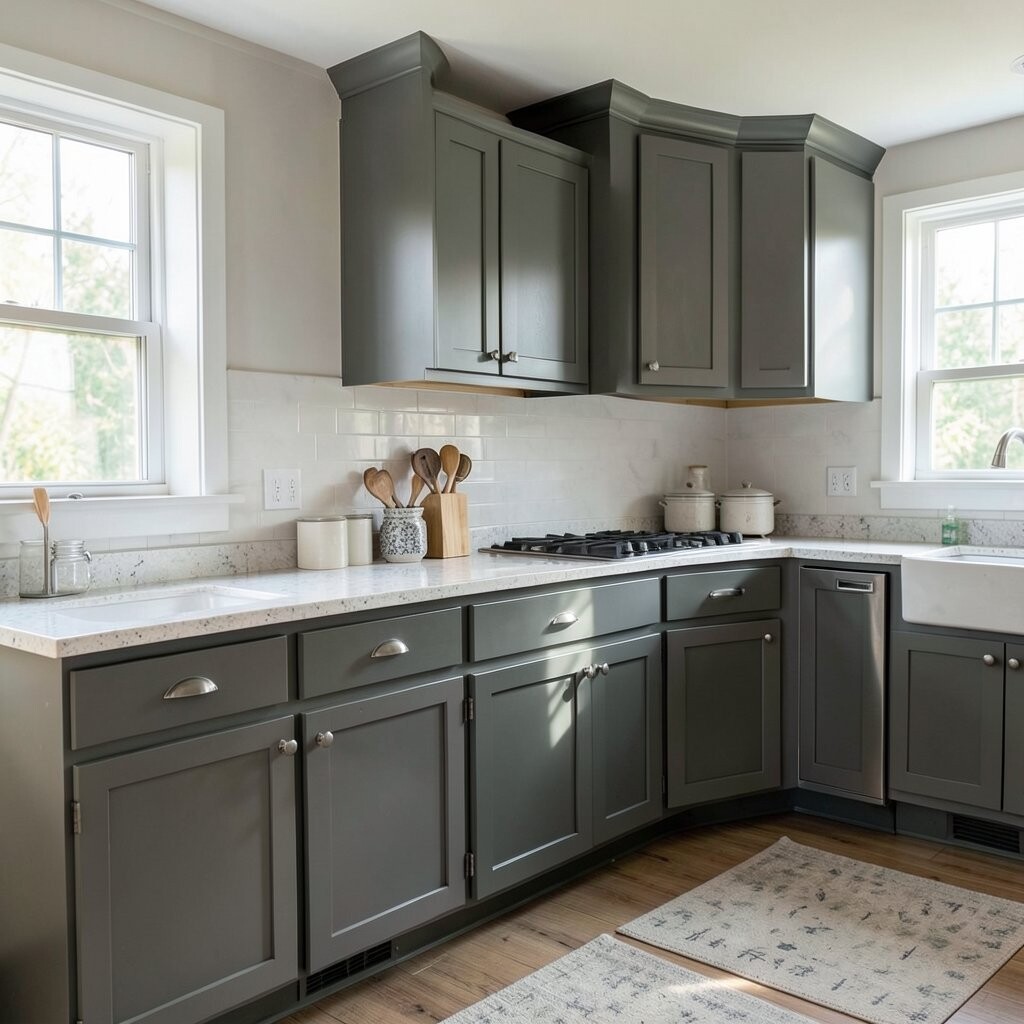
Skipping real lighting tests Cabinet colors can look totally different in morning light and at night. One shade might glow warm by a window, but turn flat under bright ceiling bulbs.
Before you commit, tape paint samples to several cabinet doors and watch them across the day. Try viewing them at the same times you actually use your kitchen, like breakfast and dinner.
For added accuracy, compare how your cabinets look near counters, floors, and backsplashes. This helps you choose a color that stays attractive from every angle, not just in one perfect moment.
That simple testing step saves money because you avoid repainting and redoing costly hardware finishes. It also helps you keep a consistent look that feels intentional and custom.
-
2. Choosing a color that fights your countertop
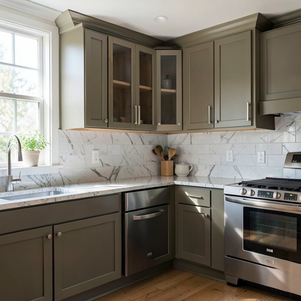
Choosing a color that fights your countertop Your countertop has a voice, even when it feels “neutral.” If the cabinet color is too cool while your stone reads warm, the kitchen can look mismatched.
Look for harmony, not copy-paste. For example, creamy cabinets usually pair well with beige or light travertine tones, while crisp whites often work with cooler stone colors.
Try a quick test by placing a sample card next to the countertop edge and then stepping back. If your eye keeps jumping between surfaces, that color clash is a sign to adjust.
When the pairing is right, the whole space feels calmer and more expensive. You also get the benefit of easier decorating, because walls, rugs, and decor won’t keep looking “wrong.”
If you want personalization, pick cabinet undertones that echo one shade found in your stone veining. It’s a small choice that makes the design feel like it was made for your home.
-
3. Ignoring your backsplash and wall color
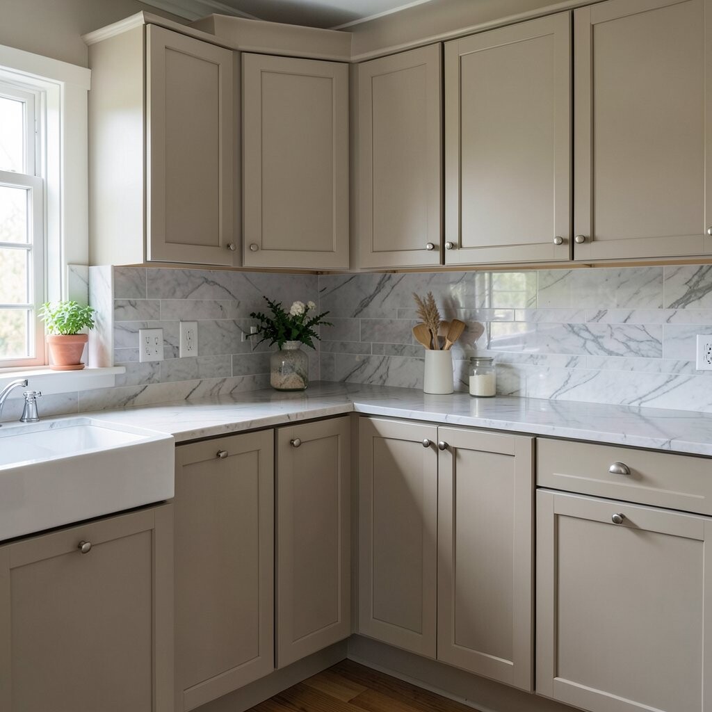
Ignoring your backsplash and wall color Many people fall in love with a cabinet color and forget the backsplash is part of the plan. Tiles, glass, and grout all change how the cabinet color reads.
If your backsplash has strong movement, choose cabinet colors that support it instead of competing with it. A busy backsplash often looks best with softer cabinet tones that let the tile shine.
Also check your wall color, even if you think it’s “just white.” Warm wall paint can make cool cabinets look slightly gray, while cool walls can make warm cabinets look too yellow.
To keep things unique, repeat one small color from the backsplash, like a hint of sage or a touch of taupe. This creates a neat design thread that feels thoughtful, not accidental.
Budget-wise, aligning cabinets with your existing backsplash can prevent costly changes. And if you plan to update later, choosing a flexible cabinet color now keeps future upgrades easier.
-
4. Forgetting about finishes and sheen
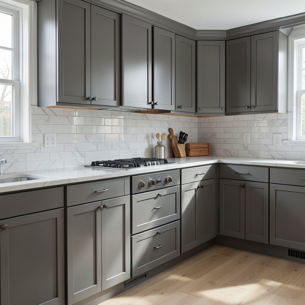
Forgetting about finishes and sheen Matte, satin, and semi-gloss finishes don’t just change shine. They change how light bounces off your cabinets, which affects the final color mood.
A matte cabinet may hide small flaws and feel cozy, while a satin finish often looks clean and bright. If you choose a deep color like navy or charcoal, the sheen can make it look either rich or harsh.
Pick finish based on daily life, too. If your kitchen gets heavy use, satin or semi-gloss can be easier to wipe clean than very flat paint.
You get a big benefit when the sheen matches your lifestyle. Plus, you’ll spend less time scrubbing, and the cabinets will stay looking fresh longer.
-
5. Going too trendy without a long-term plan
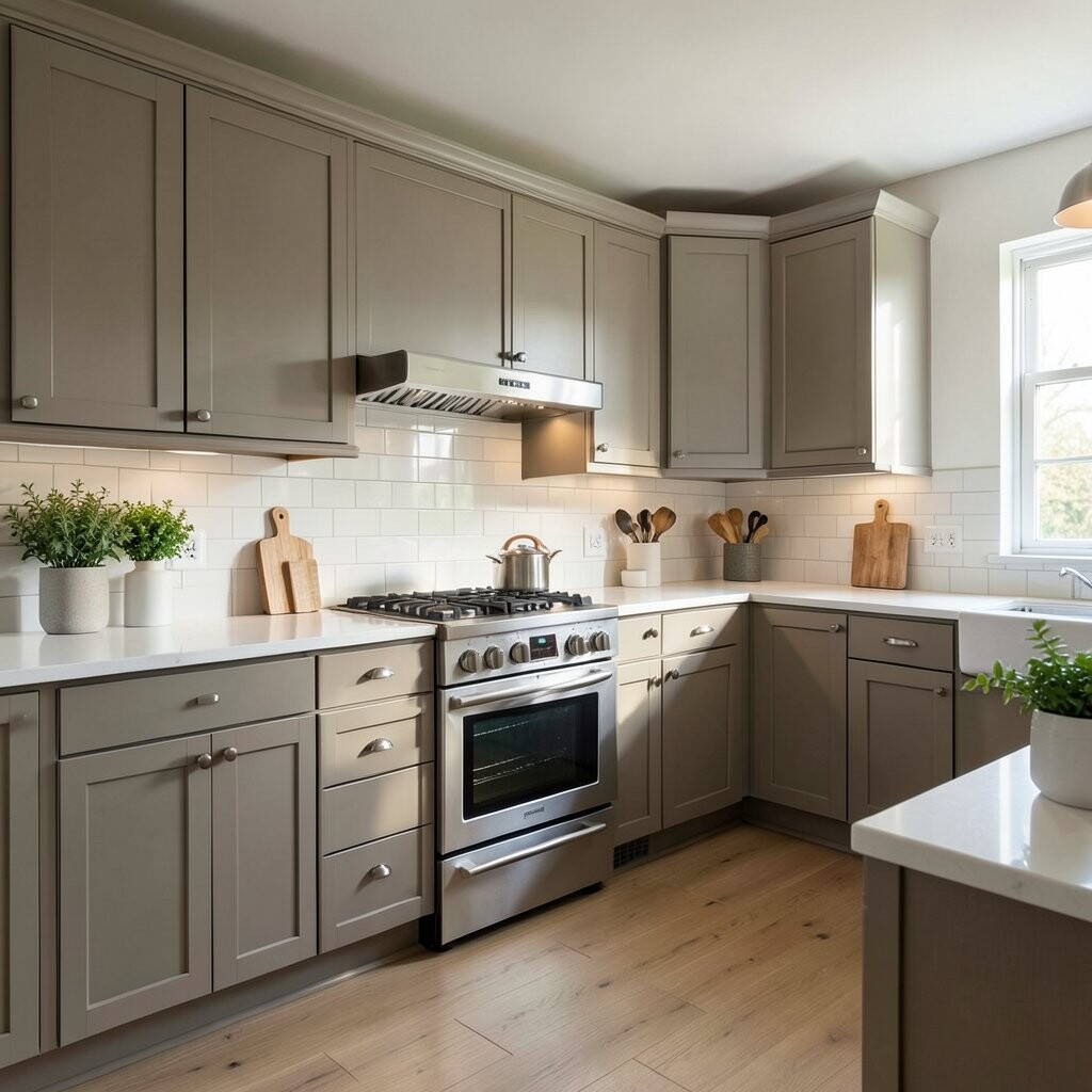
Going too trendy without a long-term plan Trends can be fun, and some colors are truly stunning. Still, if a shade is only popular for a short time, it can feel dated sooner than you want.
Choose a color that fits your style now and still feels right later. Think about classic undertones, gentle warmth, and timeless neutrals that won’t clash with new decor.
For something unique, blend trend and calm by using a popular color only in accents. Examples include painting the island a slightly different shade or adding colored doors to open shelving.
Another cost-friendly trick is to pick a color you can easily refresh in the future. If you plan ahead, you can repaint or re-stain without starting from zero.
Current trends often include warm whites, soft greige, and earthy greens, but your job is to choose the undertone. Look for a color that looks flattering in your home, not just in a showroom photo.
-
6. Choosing a sample that is not the real paint
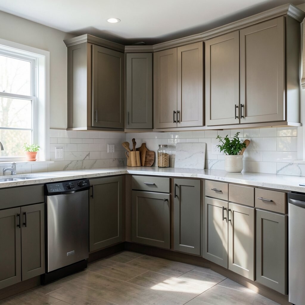
Choosing a sample that is not the real paint Small sample chips can be misleading because they cover only a tiny area. They may look lighter, darker, or more saturated than they will on full cabinet doors.
Use actual paint swatches or, better yet, get a proper sample coating. Many stores will offer larger samples so you can see how the color behaves in your kitchen.
Apply your sample to a surface that matches your cabinet material as closely as possible. This matters because wood tone and prep work can shift the final result.
When you choose with accurate samples, you get fewer surprises and less stress. You also protect your budget by reducing the chances of repainting after the cabinet color “settles.”
-
7. Forgetting about undertones (warm vs. cool)
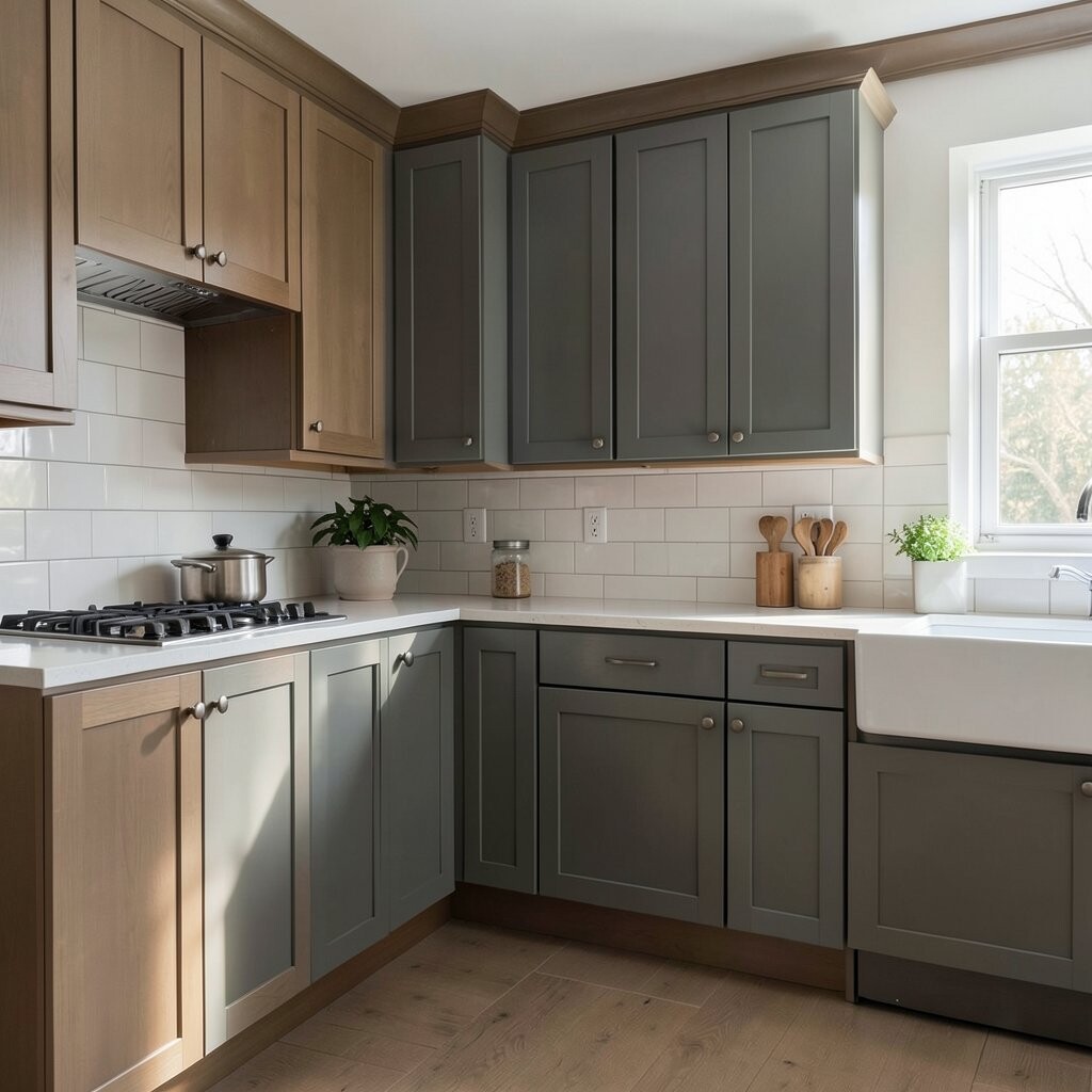
Forgetting about undertones (warm vs. cool) Undertones are the secret sauce behind cabinet colors. A “white” can be creamy, icy, or even slightly pink, and each one changes the whole kitchen feel.
If your floors are warm, cool cabinets can make the room feel tense. On the other hand, warm cabinets can feel perfect when paired with honey wood or golden light fixtures.
Try this tip: hold a white paper next to your sample. Then compare it to the cabinet color under the same lighting so you can spot undertones more easily.
Personalization gets easier once you understand undertones. You can pick a color that complements your metals, like brushed nickel or oil-rubbed bronze, without fighting the rest of your decor.
For cost considerations, undertone mistakes can lead to early regret. Fixing color later can be expensive, so it’s worth checking undertones before you order paint or finish.
-
8. Underestimating how color affects space
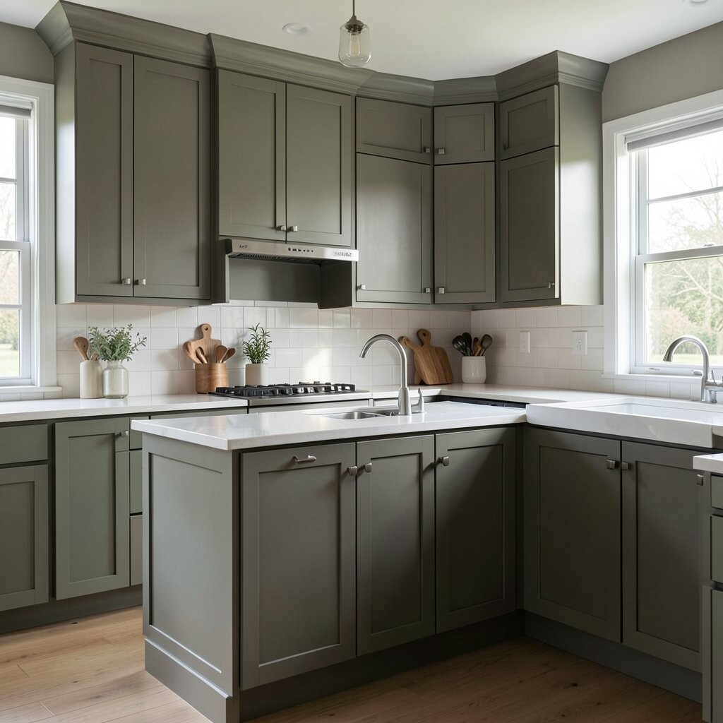
Underestimating how color affects space Color is not just decoration; it changes how big or small your kitchen feels. Dark cabinets can look gorgeous, but they can also make a small kitchen feel closed in.
Light cabinet colors often make the room feel airy and open. If you love darker shades, you can still get that drama by painting only the island or using them on lower cabinets.
Think about your kitchen layout, too. If the room has limited natural light, heavy colors may feel heavy unless balanced with bright lighting and reflective surfaces.
To make it irresistible, pair darker cabinets with warm lighting and clean-lined hardware. That combo keeps the space from feeling gloomy while still feeling bold.
Budget-wise, changing cabinet color can be a big project, so choose a shade that supports your home’s size and layout. When the color works with the space, you’ll enjoy it every day without wishing it were different.
-
9. Not planning for stain, wear, and cleaning
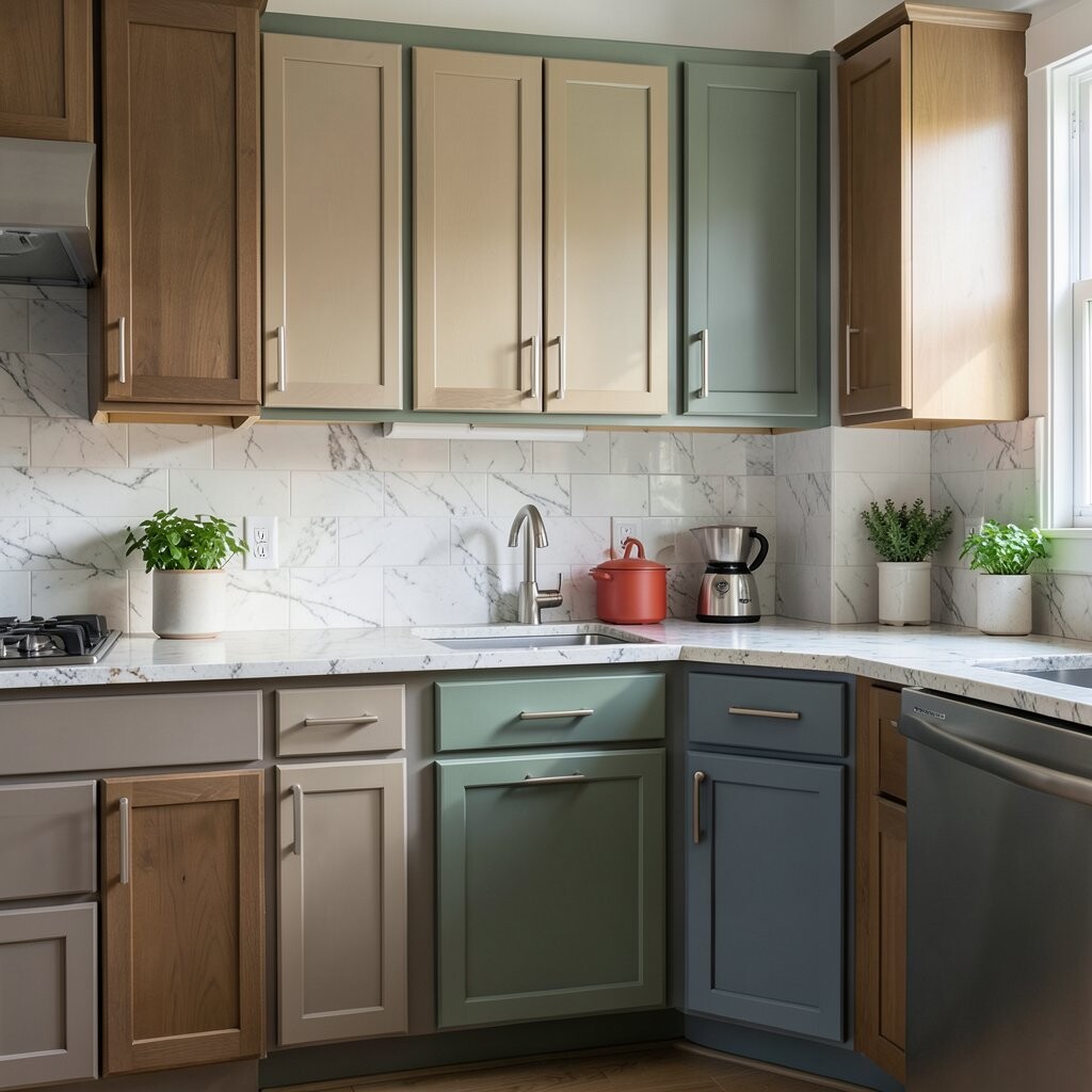
Not planning for stain, wear, and cleaning Kitchens are busy places, and cabinets take the hits. Hands, cooking splashes, and daily wiping all matter when choosing color.
Light colors can show smudges, while very dark colors can show dust and water marks. The “best looking” shade might not be the easiest to maintain.
Ask yourself how you live, not how you want to live. If you cook often, choose a finish that wipes well and a color that hides normal mess.
That practical choice becomes a benefit right away. You get cabinets that still look good after real life, which is the whole point.
-
10. Ignoring your hardware and metal accents
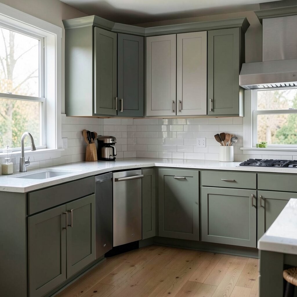
Ignoring your hardware and metal accents Cabinet color and hardware finish work like a team. If you pick a great cabinet shade but the pulls clash, the whole look can feel “off.”
Brushed nickel, chrome, matte black, and brass each change how a cabinet color looks. For example, matte black hardware can make warm colors feel bold, while brushed nickel can make cool colors feel crisp.
Bring your hardware samples when you test paint. This helps you see if the color and metal match in your lighting.
For uniqueness, you can mix metals carefully, like using one finish on the island and another on the perimeter. Just keep it balanced so it feels designed, not accidental.
Cost is part of the decision, too. If you already have hardware you love, pick a cabinet color that makes it look intentional instead of outdated.
-
11. Choosing colors that don’t match your style story
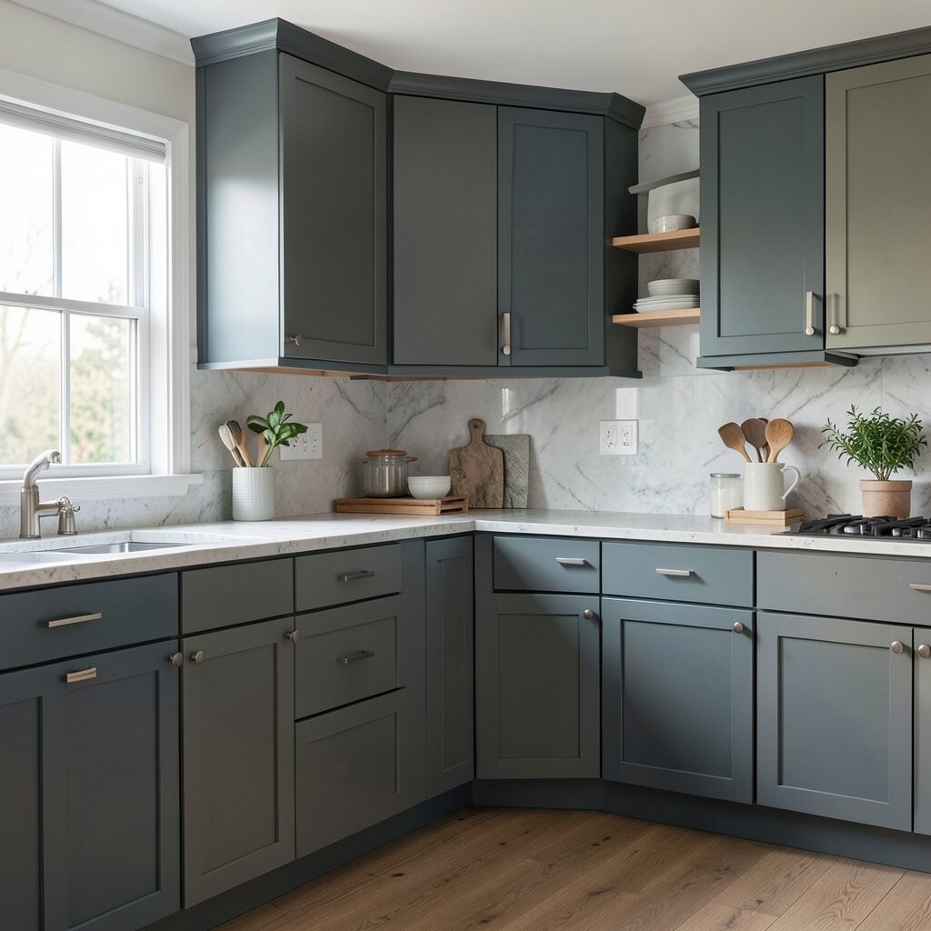
Choosing colors that don’t match your style story Your cabinet color should match the rest of your home’s style. If your living room is modern and clean, a super rustic cabinet shade can feel like it arrived from another universe.
Take a look at your floors, trim, and even your light fixtures. Do you lean toward simple shapes, or do you love ornate details and warm wood tones?
Try to build a “style story” where each choice supports the others. That’s how you get a kitchen that looks cohesive and custom.
-
12. Forgetting about the prep work and color accuracy
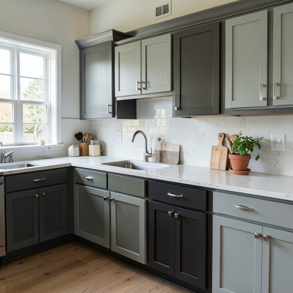
Forgetting about the prep work and color accuracy If the prep is rushed, color can look uneven or patchy. Cabinets need proper cleaning, sanding, and priming so the final color stays true.
Even the best paint can’t fully fix poor surface prep. When your cabinets are not ready, you might notice blotches or a weird sheen that ruins the look you wanted.
Make a plan for the whole process, including drying time and curing time. Patience here pays off because the final color becomes more stable as it cures.
For uniqueness, you can adjust the look with techniques like glazes or gentle distressing, but only if you prep correctly. When done well, those details can make your cabinets feel one-of-a-kind.
Cost considerations matter again, because mistakes in prep can lead to more materials and extra labor. A careful start helps you avoid wasting paint and helps the result look smooth and professional.
As a tip, take progress photos while the paint dries. Lighting changes as paint cures, and photos help you see whether the undertone matches your vision.