
Alaska has many kinds of land, from cold coastlines to wide tundra and dark forests. These color sets can help you make art that feels calm, clean, and tied to real places.
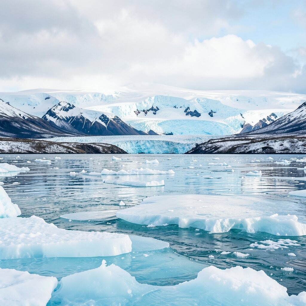
1. Glacier Blue and Snow White

This palette uses soft glacier blue, bright snow white, and a touch of pale gray. It gives your work a clean look that feels cool and open.
You can use it for ice fields, winter skies, and far mountain views. It works well in watercolor, acrylic, and digital art because the colors stay simple and easy to mix.
This set is nice if you want a quiet scene with a lot of light space. It also costs little to use since you only need a few paints or digital swatches.
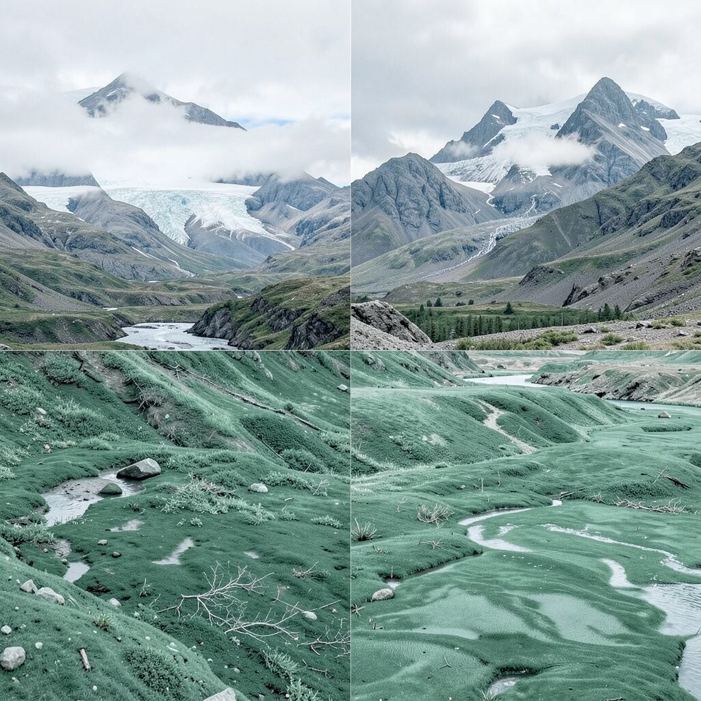
2. Spruce Green and Moss
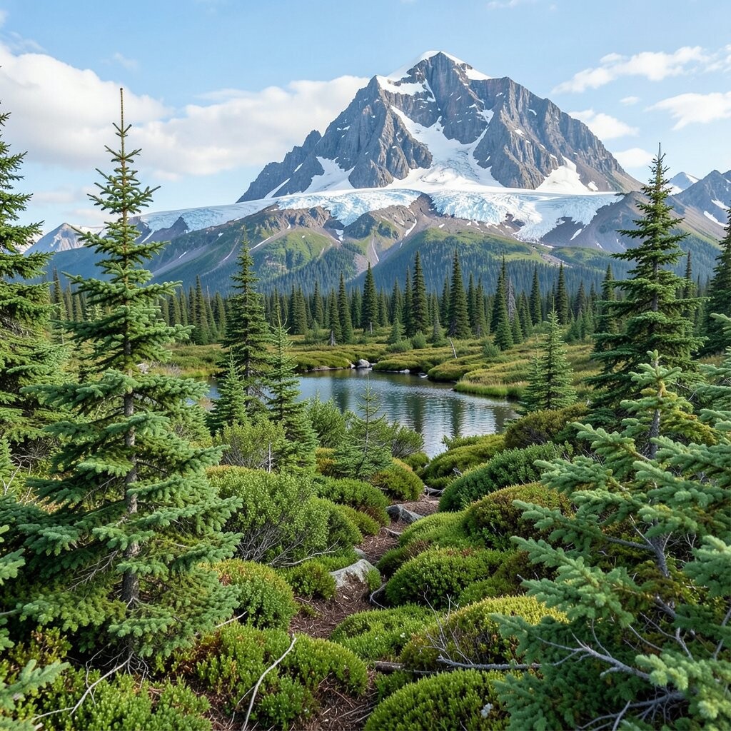
Deep spruce green and soft moss green make a strong forest palette. Add a small bit of bark brown to keep the scene grounded.
This set fits thick woods, wet ground, and shaded trails. It helps you show depth without using too many colors.
Many artists like this kind of palette because it feels natural and easy to use. It is also a good choice if you want art that looks calm but not plain.
3. Midnight Navy and Aurora Mint

Midnight navy gives a dark sky feel, while aurora mint adds a cool glow. A little silver gray can help the colors sit together in a smooth way.
This palette works well for night scenes, northern lights, and cold water. The mix of dark and light makes your art stand out fast.
If you want a modern look, this set can help a lot. It is a strong trend for posters, prints, and social media art.
4. Salmon Pink and Driftwood Tan
Salmon pink and driftwood tan make a warm and soft land palette. You can add a bit of muted cream to keep the colors light.
This set is good for beach rocks, sunset clouds, and old wood near the shore. It gives your work a gentle feel that still looks real.
It is also useful if you want something that is not too cold. The cost stays low because the palette uses easy shades that many paint sets already have.
5. Slate Gray and River Ice
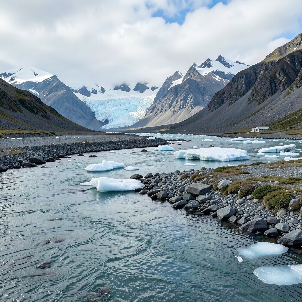
Slate gray and river ice blue give a cool, rough look. A small amount of white can make the ice color feel brighter and fresher.
This palette fits rocky coasts, frozen streams, and cloudy days. It can help you show hard surfaces and cold air without much effort.
Artists often use this kind of set when they want simple shapes and a clean mood. It also works well in ink wash and mixed media pieces.
6. Tundra Gold and Pale Sage

Tundra gold brings in dry grass color, and pale sage adds a soft plant tone. Together they make a light and open palette.
This set works well for flat land, small plants, and late summer fields. It can make a scene feel wide and quiet at the same time.
If you like warm earth tones, this is a good one to try. It is also easy to match with tan paper or rough canvas for a more hand-made look.
7. Sea Foam and Deep Teal

Sea foam and deep teal make a strong water palette. A bit of cool white can help the foam look fresh and bright.
This set is great for bays, tide pools, and moving water near the coast. It gives your art a clean look that feels alive but not too busy.
Many people like teal tones right now because they feel fresh and modern. If you want a personal touch, you can make the teal darker or lighter based on the kind of water you paint.
8. Pine Bark and Fog Gray

Pine bark brown and fog gray give a muted forest look. The mix feels soft, steady, and easy on the eyes.
This palette works well for tree trunks, cloudy hills, and wet ground after rain. It can help you show rough texture without using bright colors.
It is a useful choice for artists who want a low-cost set with many uses. You can also add a tiny bit of green if you want the scene to feel more alive.
9. Iceberg Blue and Soft Lavender

Iceberg blue and soft lavender make a cool and gentle color pair. A little white helps both shades stay light and airy.
This palette is nice for dawn skies, far ice, and mist over water. It gives your work a calm feel that is easy to look at for a long time.
If you want a softer style, this set is a good fit. It also works well for art prints, cards, and small home decor pieces.
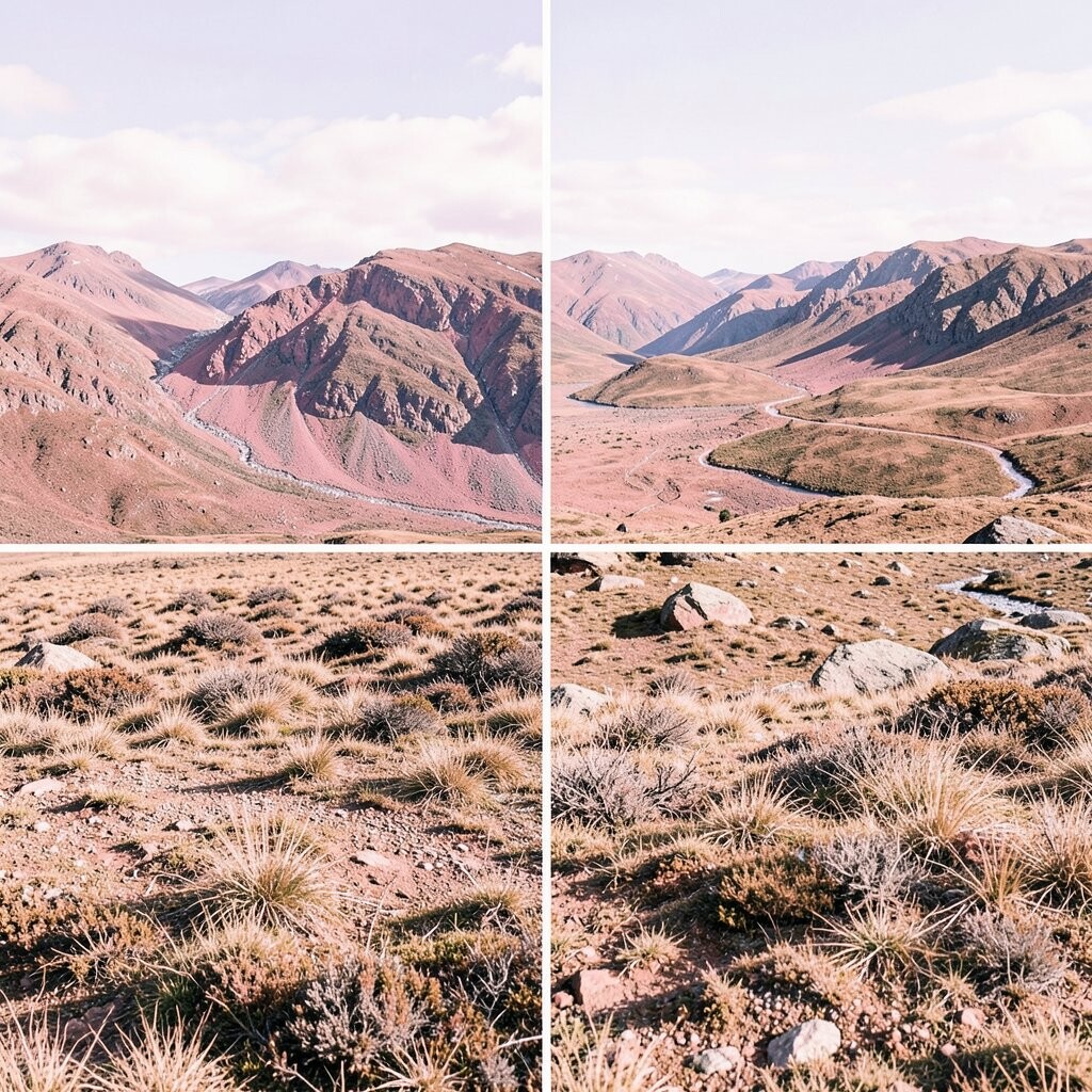
10. Rust Red and Stone Beige
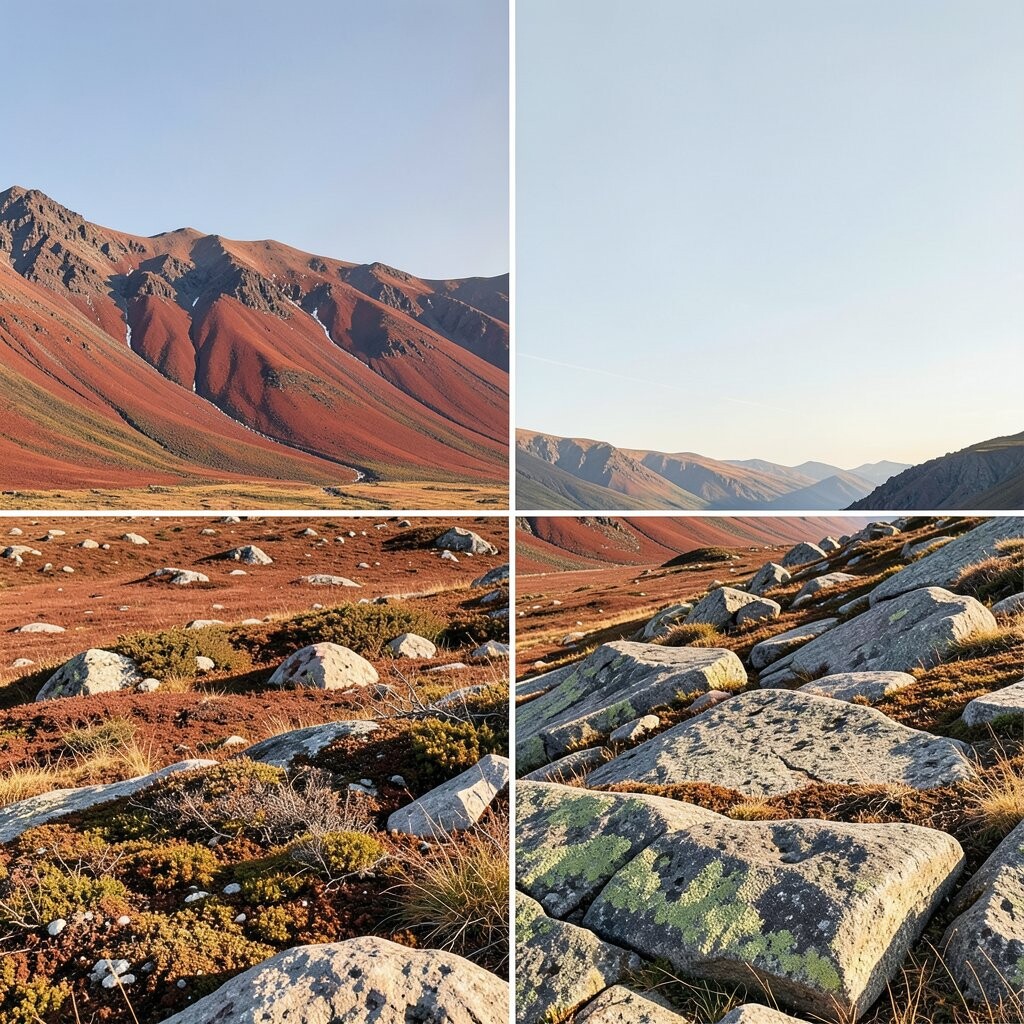
Rust red and stone beige create a dry land look with a warm edge. Add a bit of dark brown if you want more weight in the shadows.
This palette suits canyon walls, old cliffs, and worn trails. It can help your art feel strong and simple at the same time.
It is a good choice for people who like earth colors and plain shapes. The colors are easy to find, so the cost stays fair for most art supplies.
11. Cloud White and Arctic Blue
Cloud white and arctic blue make a bright winter set. The colors feel cool, clean, and open, with a soft sky look.
This palette is useful for snow fields, frozen lakes, and pale daylight. It helps you make space in the scene without filling every part with color.
Many artists use this kind of set for simple, modern art. If you want to make it more personal, you can add a small touch of gray or mint.
12. Cedar Brown and Fern Green

Cedar brown and fern green give a rich plant and wood feel. A little warm tan can help the colors sit in a more natural way.
This palette works well for forest floors, tree roots, and thick brush. It gives your art a grounded look that feels close to the land.
It is also a smart pick if you want a palette that can do many jobs. You can use it in landscape scenes, nature studies, and even pattern work.
13. Slate Blue and Wild Berry

Slate blue and wild berry make an unusual but useful mix. The blue keeps the set cool, while the berry color adds a small pop.
This palette fits twilight skies, mountain shadows, and flowers near rocky ground. It gives your art a fresh look that feels a little different from common nature sets.
That mix is a good way to make your work stand out without using bright neon colors. It also matches a trend for muted color sets with one strong accent.
14. Sand Gray and Kelp Green
Sand gray and kelp green make a shore-based palette with a soft, wet feel. A bit of off-white can help the scene feel lighter.
This set is nice for beaches, tide lines, and sea plants. It can show both land and water in one simple group of colors.
If you paint from photos, this palette is easy to match. It also helps keep costs down because the shades are common in many basic paint kits.
15. Plum Shadow and Frost Pink

Plum shadow and frost pink give a cool evening feel with a soft edge. The dark plum adds depth, and the pink adds light.
This palette works well for sunset clouds, icy hills, and far ridges. It can make a scene feel calm and a little more personal.
Artists often like this kind of set for prints and phone wallpapers. You can also use it to make a winter scene feel less plain.
16. Birch White and Lake Green

Birch white and lake green create a fresh and clean land-water mix. A small amount of muted brown can help tie the colors together.
This palette fits pale tree bark, clear lakes, and open summer views. It gives your art a light feel that still has enough color to stay interesting.
It is a simple set that works for many styles, from loose sketches to neat finished pieces. If you want a palette that feels easy and current, this is a good one to use.