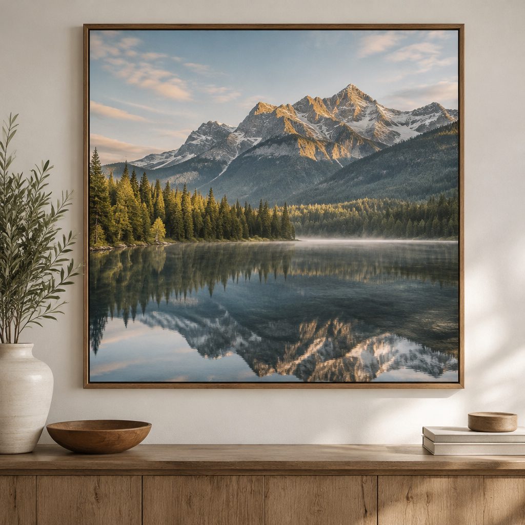
Soft wall art can change how a room feels in minutes. The right piece can make your space look styled, not staged.
1. Oversized Botanical Prints With Green Pops
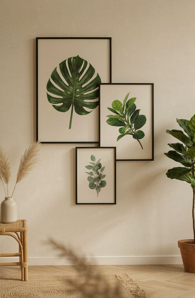
Think of big leaves, gentle gradients, and fresh green that feels like daylight. Botanical prints instantly make walls feel calm and alive. Choose a print where the greens and whites match your sofa or curtains, so it looks intentional.
Go for a size that fills most of the wall above a couch or bed. It gives balance and makes the room feel more designed. For a simple update, add a slim frame in black, natural wood, or matte white so the colors stand out.
2. Gallery Wall With Mixed Photo and Art Frames
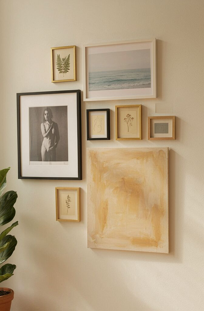
A gallery wall turns a plain area into a story you can see every day. It’s a friendly way to show family photos, travel pictures, and small artworks together. The variety in sizes creates rhythm and keeps the eye moving.
Start by laying frames on the floor or using paper templates on the wall. Keep the same color of frame finish to look neat, even when the images vary. Aim for a consistent spacing so everything feels level and tidy.
For cost control, mix one or two pricier prints with many affordable prints from thrift stores or online shops. Try adding one “anchor” piece in a larger size to guide the layout. Personalize it with a theme like “summer memories” or “book quotes,” then swap photos seasonally.
3. Textured Canvas Wall Art in Neutral Tones
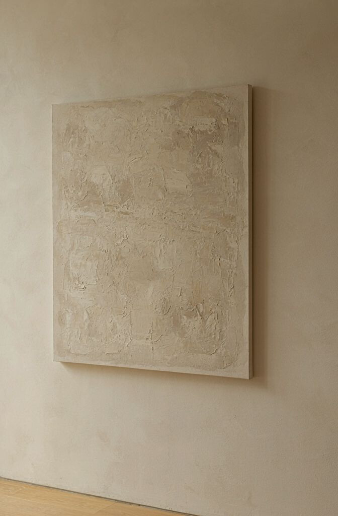
Textured art adds depth, even when the colors are quiet. A canvas with raised paint or layered material can make a simple wall feel rich. Neutral tones like beige, cream, taupe, and warm gray pair easily with almost any decor.
Look for pieces that catch light from different angles, especially in rooms with natural windows. That glow effect makes the artwork feel more expensive and thoughtful. If your space already has patterns, texture helps balance things out.
Hang it slightly above eye level for a clean look, and keep the frame simple or skip the frame if the canvas is finished. If you want a focal point, place the canvas behind a reading chair or accent table. Personalize by choosing texture that matches your style—soft brush strokes for cozy spaces or bold geometric ridges for modern rooms.
When budgeting, consider smaller textured canvases grouped together. They can give the same depth effect without the bigger price tag. Check for easy-care finishes so dust wipes off without ruining the surface.
4. Minimal Line Art of Abstract City Scenes
Line art is perfect when you want style without visual clutter. A simple city skyline or abstract street scene can make a wall feel modern and airy. Use a limited color palette to keep the look calm.
Frame line art with thin black or light wood for a clean, contemporary vibe. Place it in hallways, bathrooms, or a home office where small details matter. To personalize, choose locations that feel meaningful, like your hometown or a place you hope to visit.
5. Warm Glow Framed Prints With Color-Block Shapes
Color-block prints bring instant energy and a fun pop of personality. When the shapes use warm hues like terracotta, mustard, peach, or coral, the room feels inviting. This type of art also works great if your furniture is mostly solid and neutral.
Pick one dominant color from your decor and repeat it in the artwork. That tiny link helps the whole room feel cohesive. Keep the print style bold, but not too busy, so it doesn’t overwhelm the space.
For practical placement, try one large framed piece above a console or use two matching prints on either side of a mirror. You can even DIY by printing shapes and mounting them on cardstock. If you’re cost-conscious, choose a smaller size and upgrade the frame instead of the art.
6. Floating Shelves With Curated Small Art Pieces
Floating shelves can double as display surfaces for art you can rearrange. Instead of one fixed image, you get layers, texture, and personality that change over time. This is especially great for living rooms where you want the wall to feel “alive.”
Style the shelves with one larger framed print, plus smaller pieces like mini canvases, postcards, or wall prints in easel frames. Leave a little empty space so the arrangement looks intentional. Keep colors balanced by repeating one metal tone, like brushed brass, silver, or black.
Choose shelf depth based on what you’ll place there, since shallow shelves work best for flats. For personalization, swap one item each month, like a seasonal print or a souvenir photo. When budgeting, consider thrifted frames with new mats to look fresh without spending much.
Current trends lean toward mixed displays and “collected over time” looks. That means you don’t need everything to match perfectly, as long as the overall vibe stays consistent. Aim for a cohesive palette and you’ll get that styled feel quickly.
7. Sunburst Mirrors With Soft Golden Rim Detailing
A sunburst mirror brightens your space by bouncing light around the room. The rays add a playful shape that feels both vintage and modern. If your wall looks dim, a reflective art piece can make it feel brighter instantly.
Hang it near a window or across from a light source so it catches the glow. Choose a size that fits the wall without overpowering everything else. A soft gold rim can look warm and welcoming, especially in neutral rooms.
To make it feel intentional, pair the mirror with artwork that uses similar warm tones. For a personalization idea, place tiny framed photos or postcards around the mirror, but keep the look open. Cost varies widely, so compare sizes and materials, and consider a smaller mirror with a nicer frame if you’re on a budget.
8. Watercolor Washes in Coastal Colors
Watercolor wall art feels light, dreamy, and relaxing. Think blues, seafoam greens, and sandy beige, blended like a gentle breeze. It’s a great choice for bedrooms and bathrooms because it softens hard edges.
Look for prints that have lots of negative space, since that airy look helps smaller rooms feel bigger. Frame with white or pale wood to keep the colors feeling fresh. If you have coastal decor, this style matches naturally without needing extra accessories.
Personalize by choosing artwork with shapes that resemble waves, shells, or clouds. You can also match one color from your bedding or towels to keep everything connected. When budgeting, many watercolor prints are available as high-quality reproductions, so you can get the look without the original price.
One current trend is pairing watercolor art with simple, modern frames and warm lighting. That combo makes the wall art look cozy and updated. Keep the rest of the wall fairly simple so the colors stay the star.
9. Framed Fabric Art or Embroidered Wall Panels
Fabric art brings softness and a handmade feel to your walls. An embroidered panel or woven textile can add warmth that prints can’t always match. It’s also a great option if you love cozy styles like farmhouse, boho, or Scandinavian.
For the best look, frame fabric with a simple backing and stretch it so it stays smooth. If you want a more casual style, display the textile like a tapestry using a rod and clips. Either way, choose colors that repeat in your cushions, rugs, or curtains.
To personalize, pick fabric patterns that match your personality—stars, florals, geometric lines, or meaningful symbols. If you sew, you can DIY small panels and switch them out seasonally. For cost, look for affordable vintage textiles or shop for art panels made for wall display.
Trends are leaning toward tactile materials, since they look great in modern homes. Pair fabric art with textured elements like jute baskets or knit throws for a full look. This is a smart way to brighten a space without adding visual noise.
10. Chalkboard-Style Quotes for a Creative Touch
Chalkboard-style wall art makes your walls feel playful and personal. A quote can act like a daily reminder, and the dark background adds strong visual contrast. Choose a quote that fits your mood, like “Keep going” or “Home is here.”
To make it look polished, use a printed chalkboard effect in a clean frame rather than messy hand lettering. Hang it where you’ll actually read it, like near a desk, kitchen, or entryway. Personalize by changing the quote to match holidays or goals.
For practical tips, avoid placing it in areas with direct glare if you want the text to stay easy to read. Keep the rest of the wall simple so the message stands out. Cost can be budget-friendly because many chalkboard quote prints are affordable, especially in standard sizes.
11. Large Geometric Posters in Black and White
Geometric posters instantly give a room a crisp, modern edge. Black and white designs look bold, clean, and easy to pair with colorful furniture. The sharp shapes can make a wall feel structured without being heavy.
Choose a print with strong lines and a balanced layout, then frame it in a simple matte frame. If your space is already colorful, black and white helps it breathe. If your room is neutral, add one accent color in a pillow or plant to connect with the artwork.
Personalization is easy here: swap prints until you find the pattern that matches your vibe. Try vintage-inspired geometric styles for a retro feel or modern grid designs for a sleek look. To manage cost, look for poster prints with thick paper and upgrade to a nicer frame for a “gallery” look.
A current trend is mixing geometric prints with soft textiles like knits and boucle. That contrast feels cozy and modern at the same time. Hang one large piece as the anchor, then keep the rest of the decor lighter so the shapes stand out.
12. Iridescent Abstract Prints That Change With Light
Iridescent abstract art can make your wall feel like it’s glowing. The color shifts add a little magic that plain art can’t offer. It’s a great choice for living rooms because it draws attention without needing extra clutter.
Look for prints that include subtle rainbow tones or metallic accents. Place the artwork where you get natural light during the day so the effect feels alive. If you have metallic decor, match the artwork’s shimmer with a similar metal in your lamp or hardware.
Personalize by choosing an abstract piece that mirrors your mood—calm swirls for relaxing spaces or bold strokes for energetic rooms. Budget-wise, consider poster prints with iridescent effects rather than original artworks. A sturdy frame with UV-protective glass can help preserve the finish.
13. Vintage Map Prints With Warm Aged Paper
Vintage map wall art adds charm and a sense of history to your home. Old streets, coastal lines, and antique fonts create visual interest even when you’re not staring at it. It’s also a smart way to brighten a wall with warm paper tones.
Hang a large map print in a hallway or home office for an easy focal point. Choose a map that matches your story, like where you grew up or where you want to travel next. For a cohesive look, frame the map with a medium brown wood or black frame depending on your furniture.
To personalize, cover part of the wall with one map and add small framed travel photos nearby. You can also add a tiny label style or mark routes with removable stickers. Cost is usually reasonable because many high-quality map prints are affordable, especially in standard sizes.
Trends show people mixing vintage maps with modern frames for contrast. That “old meets new” look feels fresh and stylish. Keep the color palette warm so the map doesn’t clash with cooler decor.
14. Floating Shadow Box With Dried Flowers or Pressed Leaves
A shadow box with dried flowers turns wall art into a small keepsake. It feels nature-inspired and special, like you captured a moment and framed it. The textures of leaves and petals add depth that looks great close up.
Choose preserved elements that match your color scheme, such as white and beige blooms for a calm room. Arrange them with negative space so the display doesn’t become crowded. Seal and protect the materials so they stay cleaner longer.
15. Patterned Wallpaper Accent Art Panels
Using patterned wallpaper as wall art is a clever trick that makes even a plain wall feel styled. You can create panels by framing wallpaper samples or mounting them in matching borders. This works especially well in small spaces like laundry rooms, entry nooks, or reading corners.
Pick a wallpaper pattern that feels like “one look” instead of random clutter, such as florals, stripes, or subtle geometric designs. Then frame it with simple trim to make it look intentional. For personalization, choose a pattern that matches your favorite fabric, like a curtain or throw blanket.
If you’re concerned about cost, wallpaper sample books are often cheaper than buying full rolls. Current trends include mixing bold wallpaper with minimalist frames to keep the style modern. Make sure the colors coordinate with your existing decor so the accent feels like it belongs.
16. Colorful Architectural Sketch Prints
Architectural sketch prints bring a creative, artsy vibe to your home. Drawings of buildings, stairs, and rooftops feel detailed and interesting without needing loud colors. They also pair well with both modern and traditional decor styles.
Choose sketches that use a palette you already have, like muted browns, dusty blues, or soft reds. Frame them with crisp white mats to make the lines pop. This is especially effective in offices where you want a focused, calm look.
Personalize by selecting sketches of places you’ve visited or admired in magazines. You can also mix one sketch print with one abstract piece so the wall feels balanced. Cost varies, so check for affordable high-quality digital prints, then invest in a frame you love.
As a practical tip, hang architectural art at a height that centers the main building drawing. Keep nearby items simple so the lines remain easy to see. Trends now favor “paper texture” looks, so choose prints that feel like watercolor paper or vintage drawing stock.
17. Ceramic Tile Wall Art With Handcrafted Patterns
Ceramic tile wall art brings a durable, artistic feel to your space. With handcrafted patterns and glossy finishes, tiles can look vibrant and unique. They also work beautifully in kitchens, bathrooms, and entryways because they’re easy to wipe.
Pick tile art that includes your favorite colors, or choose neutral tiles with one accent shade. Arrange tiles in a grid or single centerpiece depending on the wall size. For practical installation, check whether the pieces come as a ready-to-hang panel or require mounting.
Personalize by selecting motifs that match your style, like Moroccan-inspired patterns or minimalist geometric designs. For cost considerations, smaller tile sets often cost less and still make a big impact. If you’re going budget-friendly, choose a single statement panel instead of covering a whole wall.
18. Oversized Typography Prints for a Bold Focal Wall
Typography prints make a statement even if you love simple decor. The big letters create structure, and the message adds personality to your home. Choose words that feel uplifting, calm, or motivating so the art matches your daily life.
Pick a font style that fits your room, like clean sans-serif for modern spaces or vintage serif for cozy rooms. Frame the print with a black, white, or natural wood border to keep it from looking too busy. To personalize, choose a line that reflects your family, like a first-name initial plus a warm phrase.
For cost, large prints can be affordable as posters, and you can upgrade by using thicker paper and a nicer frame. A current trend is mixing typography with one simple visual element, like a small line drawing or a solid-color block. Keep the rest of the wall light so the text remains the star.
19. Night Sky Prints With Stars, Nebulas, and Deep Blues
Night sky wall art instantly brings wonder and depth to your room. Deep blues, star speckles, and soft nebula gradients feel calming and dramatic at the same time. It’s a great choice for bedrooms, nurseries, and reading spaces where you want a soothing vibe.
Choose prints with a gentle gradient rather than harsh colors so they feel relaxing. Frame with dark or muted colors to make the stars look sharper. Personalize by selecting a style that matches your taste, like realistic space photos or more dreamy illustrated skies.
Budget-wise, look for high-quality reproductions that keep the star detail crisp. If you want a premium touch, use a glass frame that reduces glare from nearby lights. Keep the lighting in the room warm and soft so the artwork feels cozy instead of stark.
This style is trending because people want “moody calm” spaces that still feel bright. Pair the print with light-colored bedding or a pale rug to balance the dark tones. That contrast helps the artwork brighten the room rather than darken it.