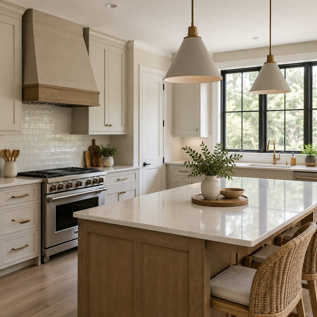
Warm neutral kitchens feel calm the moment you walk in. With the right choices, they also stay stylish for years.
1. Creamy Beige Cabinets With Soft Matte Hardware
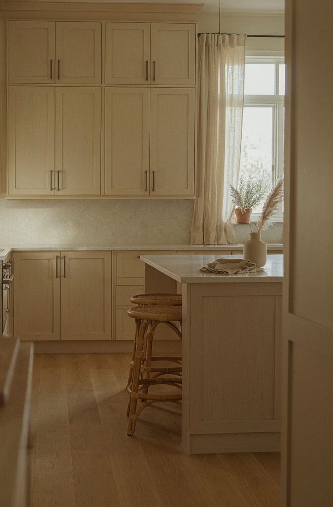
Beige cabinets can look cozy without feeling dull. Pair them with matte brass or brushed nickel pulls to keep everything warm.
Choose a creamy undertone instead of gray-beige so light stays flattering. Use a soft-matte finish to hide small smudges and fingerprints. Consider adding a gentle glaze or toner if you want depth without going overly dramatic.
2. Warm White Countertops With Gentle Veining
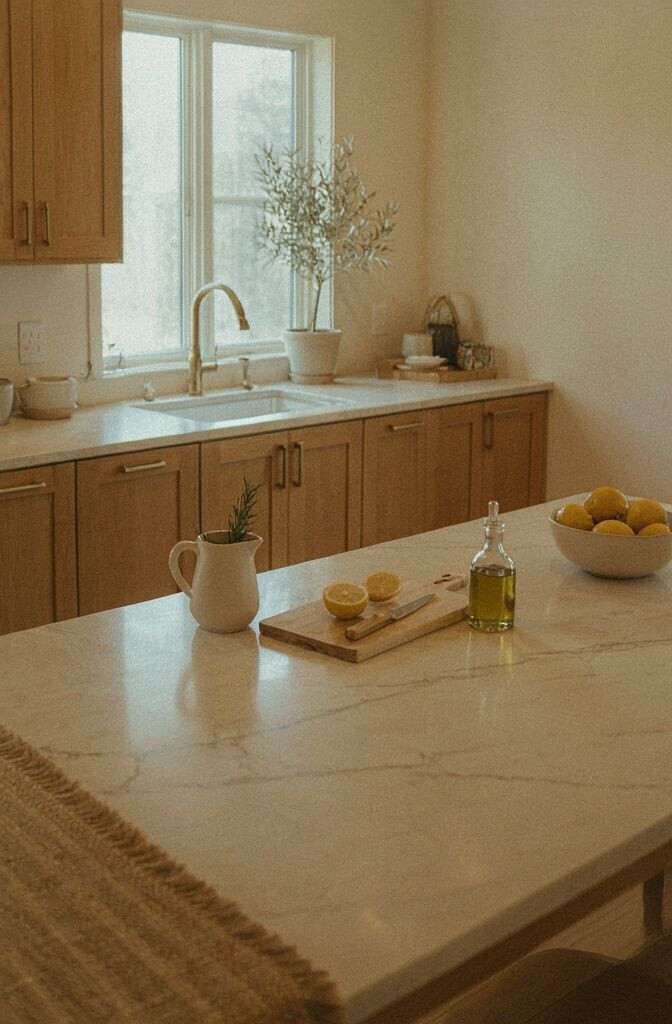
Warm white countertops make a kitchen feel brighter and cleaner. Look for stone or laminate that has subtle tan, honey, or cream veining.
This choice works with wood floors, light walls, and even darker appliances. For practical durability, seal natural stone or choose a heat-resistant surface finish. If you want a budget-friendly option, premium-look quartz laminates can mimic the veining well.
Keep edges simple and slightly rounded for a softer feel. Match the countertop undertones to cabinet color, so nothing looks mismatched. Test samples in daylight and at night so the veining reads the way you expect.
3. Honey-Toned Hardwood Floors That Still Feel Modern
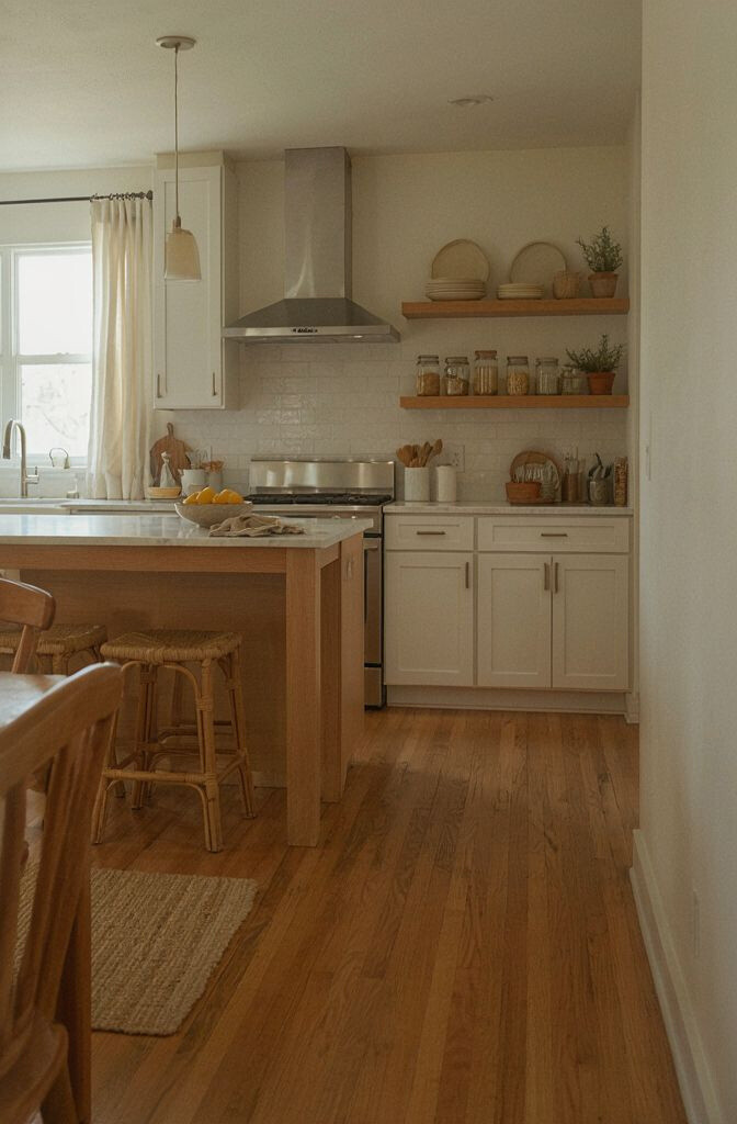
Honey hardwood adds warmth underfoot and makes neutrals feel intentional. It also brings out the color in cream cabinets and caramel accents.
Pick planks with a natural grain so the floor looks lived-in, not flat. If you worry about scratches, consider a wire-brushed texture or a protective topcoat. Keep a runner near the sink to reduce wear and add comfort.
For personalization, coordinate your rug with your cabinet hardware finish. If your kitchen gets lots of sunlight, choose a slightly lighter tone to avoid over-darkening. Regular sweeping and gentle cleaners will help your floor keep that fresh glow.
Cost can range widely depending on species and installation. Refinish existing floors if you already have wood, since that can save a lot. Even vinyl planks with realistic grain can bring the warm-neutral vibe without the heavy budget.
4. Taupe and Sand Backsplash in a Simple Pattern
A taupe-and-sand backsplash gives you a calm backdrop for everyday cooking. Use a simple pattern like a staggered tile or small-format subway for a clean rhythm.
Warm neutrals look best when the backsplash has slight variation rather than a flat single tone. Keep grout in an off-white or warm light beige so it feels softer than bright white. This makes the whole kitchen look cohesive even as you change decor.
5. Matte Stone-Look Wall Paint for a “Tucked-In” Feel
Paint can do a lot of heavy lifting when you want warm neutrality. A stone-look color sits between beige and soft gray, but it should still read warm in your lighting.
Choose paint with a low-sheen finish like eggshell for walls that look smooth but not shiny. Try samples on the wall opposite the window so you see how shadows shift. If your kitchen has warm bulbs, prioritize paint that doesn’t turn peachy.
For practicality, a washable paint helps with splatters and steam near the stove. Pair it with white trim or cream trim so the edges feel crisp. This color strategy makes it easy to swap accessories without repainting.
6. Buttery Oak Shelving With Open Storage
Open shelving can make a warm neutral kitchen feel airy and inviting. Buttery oak shelves look especially good when you keep lines simple and styling intentional.
Display everyday items like ceramic canisters, matching mugs, or neatly folded dish towels. Use a matching shelf bracket finish to tie everything together visually. For uniqueness, mix one or two taller pieces like vases or a narrow plant for vertical interest.
To keep the look tidy, store less-used cookware in cabinets and leave only what you enjoy seeing. Add a small tray for oils and spices so the counter stays uncluttered. If you want a softer effect, use warm-white backing behind the shelves rather than stark white.
7. Integrated Lighting With Warm 2700K Bulbs
Good lighting makes warm neutrals look rich instead of flat. Choose 2700K bulbs for a gentle golden tone.
Under-cabinet lights help your backsplash and countertops look even more inviting. Consider installing a dimmer so you can shift the mood from bright cooking to cozy evenings. If you already have fixtures, swap bulbs first before buying new hardware.
To personalize, add one statement light over the sink or island, like a linen shade pendant or a simple seeded glass fixture. Keep finishes consistent with your faucets and pulls. Lighting is one of the best upgrades for making a kitchen feel custom without changing everything.
8. Soft Gray-Tan Island With a Cream Surround
An island in a soft gray-tan can anchor the room while still staying neutral. Keep the surrounding cabinets lighter so the island feels grounded, not heavy.
Try a warm taupe paint on the island and a cream or oatmeal tone on the perimeter cabinetry. Use matching countertop overhangs so the island looks integrated, even if the colors differ. For practicality, choose a finish that wipes clean and resists scuffs where people rest their hands.
9. Stove Area Styling With Neutral Tile and Minimal Trim
Your stove area is where the kitchen shows its personality every day. A warm-neutral tile around the range can make cooking feel calmer and more curated.
Keep the surround simple with a thin trim or a clean border so the tile remains the focus. Choose tan, cream, or oatmeal tones with subtle texture so it doesn’t look too flat. If you prefer a more modern look, use a linear tile pattern and skip extra decorative medallions.
Add practicality by matching the tile grout color to your countertops or backsplash. This keeps splatters less noticeable, especially around high-heat cooking. Use a heat-resistant backsplash guard or a protective finish for easy wipe-downs.
For personalization, hang a utensil rail in warm metal and choose tools that match in tone. Keep cords and small devices tucked away on a nearby pullout shelf. A well-styled stove zone makes the whole kitchen feel more intentional.
10. Warm Neutral Window Treatments That Hold Color
Window treatments add the final layer of comfort in a warm neutral kitchen. Choose fabrics that bring softness, like linen blends or light-weave cotton.
Try neutral shades such as oat, sand, or warm taupe, and keep patterns subtle. Thermal or blackout liners can help with temperature control and reduce glare on counters. If privacy matters, sheer panels paired with blinds can give you flexibility without blocking the warm mood.
To personalize, add a tieback in the same metal finish as your hardware. Install a simple rod in brushed brass or matte black, depending on your style. Even small changes here can make a kitchen feel finished and more “you.”
11. Layered Neutrals With Beige Walls and Cream Trim
Layered neutrals make a kitchen look designed rather than randomly matched. Beige walls and cream trim create a gentle contrast that still feels soft.
Choose a trim color that’s not too stark so the kitchen stays warm. Consider painting the ceiling in the same family but a shade lighter for a cohesive glow. This approach also makes small kitchens feel taller and brighter.
For personalization, add warmth through accessories in camel, caramel, or light cognac. Keep your metal finishes consistent across faucet, cabinet hardware, and lighting. This makes the whole palette look deliberate even when you mix textures.
12. Textured Neutral Backsplash With Small-Format Tiles
Texture is a secret weapon in warm neutral design. Small-format tiles with a subtle surface—like matte micro tiles—add depth without loud colors.
Pick tones like cream, warm beige, or very light taupe so the texture still reads cozy. Use unsealed or lightly textured materials if you’re okay with gentle maintenance. For easy cleaning, choose tiles designed for kitchen splashes and wipe them routinely.
If you want a unique twist, combine two complementary neutrals in a thin band near the counter. Keep the rest minimal so the pattern stays elegant. This is a great way to get high-end character without going bold on color.
13. Brass Faucet and Sink Fixtures for a Golden Accent
Warm brass fixtures bring instant glow to a neutral kitchen. Even simple silhouettes can look luxe when the finish is consistent.
Match the faucet to cabinet hardware so everything feels coordinated. Choose a gooseneck faucet for a classic look or a sleek straight spout for modern simplicity. Consider a single-handle model for easier control during busy meal prep.
14. Corner Nook With a Light Bench and Neutral Cushion
A small breakfast nook can make a kitchen feel welcoming. Try a built-in bench or a freestanding bench in light wood, then add neutral cushions and throw pillows.
Use performance fabric if you want durability against spills and frequent cleaning. Add a simple rug in warm beige or soft taupe to define the space. For personalization, place a tray with salt, oil, or a small vase so the nook looks styled even on quiet days.
If you’re working with a smaller space, choose a bench with storage to keep extra linens and tableware tucked away. This keeps the visual calm that warm neutrals are known for. Small details like a bench back or wall trim can also make the nook look custom.
15. Warm Neutral Countertop Accessories That Actually Get Used
The best warm neutral kitchens don’t just look good, they work every day. Choose countertop accessories in tones like cream, sand, and light wood.
Use matching canisters for coffee, flour, and sugar so your shelves and counters stay organized. Add a neutral utensil crock and a soap dispenser in the same finish family as your sink hardware. This gives a clean look while keeping things within reach.
For personalization, swap seasonal items like a fall ceramic bowl or a spring greenery vase without changing your core palette. Keep a paper towel holder and cutting board in complementary shades. When accessories blend with the room, even busy kitchens look calmer.
16. Caramel Leather or Woven Texture Bar Stools
Bar stools are a simple way to add warmth and comfort. Caramel leather or woven neutral textures look especially good with cream cabinets and light counters.
Pick stools with curved backs or cushioned seats so they feel inviting during long breakfasts. If you want a softer look, choose a straw-like weave or a boucle-style fabric in warm beige. For practical tips, use stain-resistant covers or choose materials that wipe clean.
Match stool legs to your metal finishes, whether that’s brass, black, or brushed nickel. This creates a tidy visual thread across the room. If budget is a concern, look for gently used stools or prioritize updating the seat cushions first.
17. Blended Neutral Storage With Soft-Close Drawers
Warm neutrals shine when your storage feels thoughtful and easy to use. Soft-close drawers keep everything smooth, even when you’re rushing.
Plan for everyday zones like spices, oils, baking tools, and cutting tools so counters can stay clear. Add pullout shelves or dividers so you’re not digging behind pots. This makes the kitchen feel more functional, which is a big part of comfort.
For cost considerations, consider updating hardware and adding organizers first, since that often delivers a “new kitchen” feel without full renovation. If you’re updating cabinets, choose warm-toned interiors or matching liners to maintain the cozy neutral look. Small upgrades like lazy Susans and under-sink pullouts can make a huge difference.
18. Warm Neutral Art and Ceramics With Slight Color Variation
Art and ceramics bring personality to a warm neutral kitchen. Choose pieces in cream, sand, and warm clay tones, then add a hint of deeper caramel or olive for interest.
Try a framed print with soft shapes, or hang a couple of smaller pieces instead of one large statement. Group ceramics on open shelves so you can switch them out seasonally without repainting. This is also a fun personalization approach because you can keep building a collection over time.
For practical tips, place heavier items lower so shelves feel stable. Mix glossy and matte textures so the surfaces catch light in different ways. When your kitchen palette is neutral, even one colorful pottery piece can look intentional and beautiful.