Bright cabinets can make a kitchen feel bigger and friendlier. The right color also helps your everyday cooking feel more fun.
Cabinet color sets the mood before you even step inside the room. Below are tasty ideas you can match to your style, your light, and your budget.
-
1. Soft White with Warm Undertones
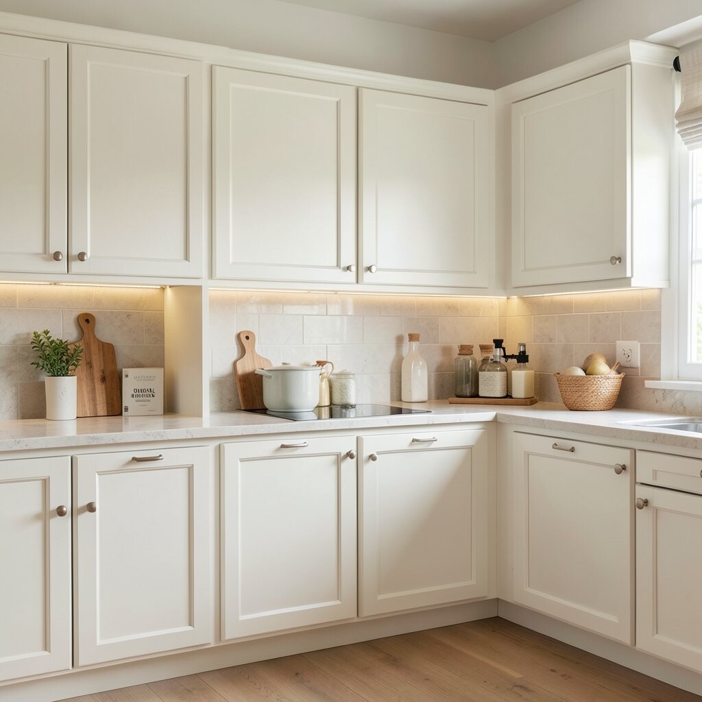
Soft White with Warm Undertones Soft white cabinets look clean and calm, like fresh paper with a cozy glow. They bounce light around, so your kitchen feels brighter even on cloudy days.
This color is great for small spaces because it keeps the walls from feeling crowded. Choose a warm undertone if your lighting looks a little yellow, so everything matches nicely. If you want it to feel extra tailored, pair it with matte black hardware and simple wood accents.
For cost planning, soft white is a smart pick if you are painting because it can cover many finishes. If you are replacing cabinets, look for pre-primed options to cut down prep time. Personalize it with an enamel-like topcoat for a crisp look that stays easy to wipe.
-
2. Cloudy Gray-White (Greige)
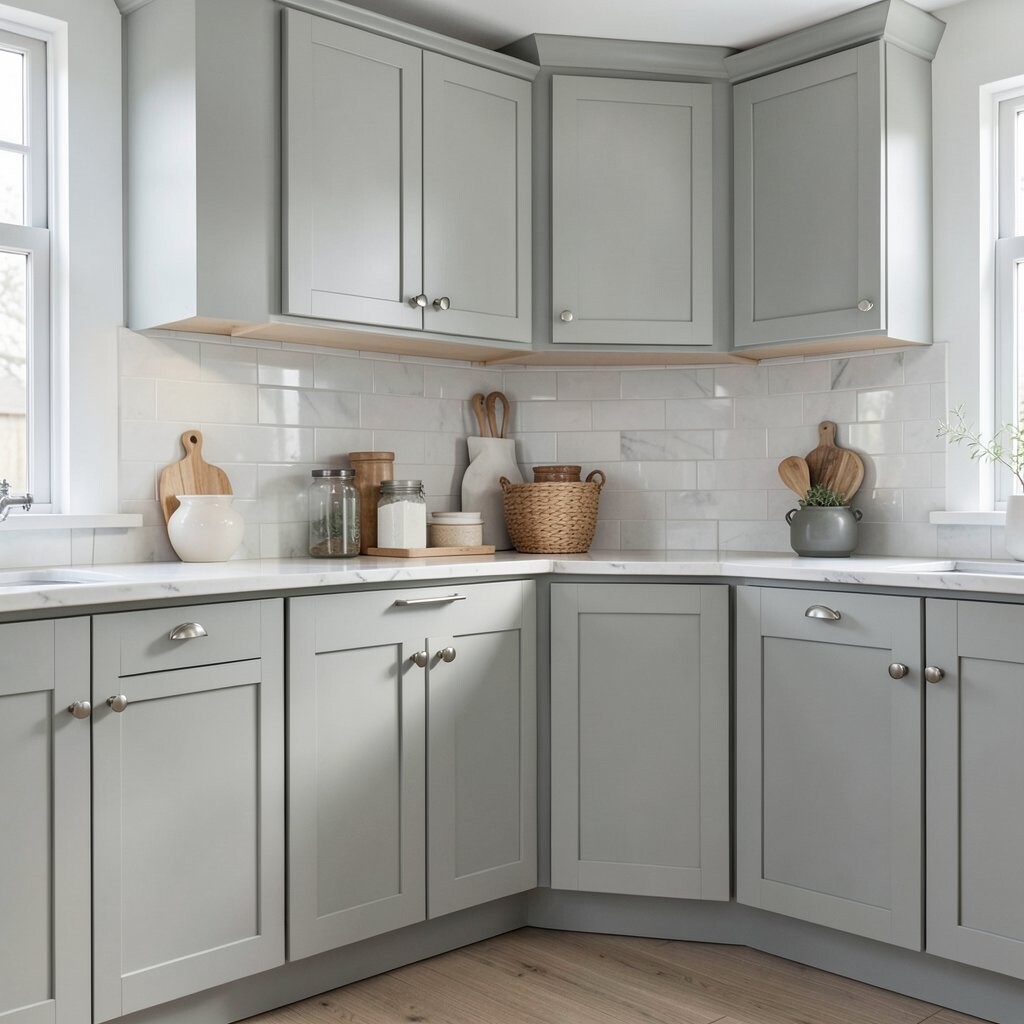
Cloudy Gray-White (Greige) Greige cabinets sit in the sweet spot between beige and gray. They look airy, yet they hide everyday scuffs better than pure white.
You get brightness without the worry that every tiny fingerprint will stand out. This color also looks smooth and modern with stainless steel appliances. Tip: test a sample board in your kitchen, because greige can shift based on sun and bulbs.
Many homeowners like this shade right now because it fits both farmhouse and modern kitchens. If you want extra charm, add warm brass pulls and a light backsplash with subtle texture. Budget-wise, greige paint usually costs about the same as other mid-tone neutrals, but the savings come from fewer repaint touch-ups.
-
3. Butter Yellow
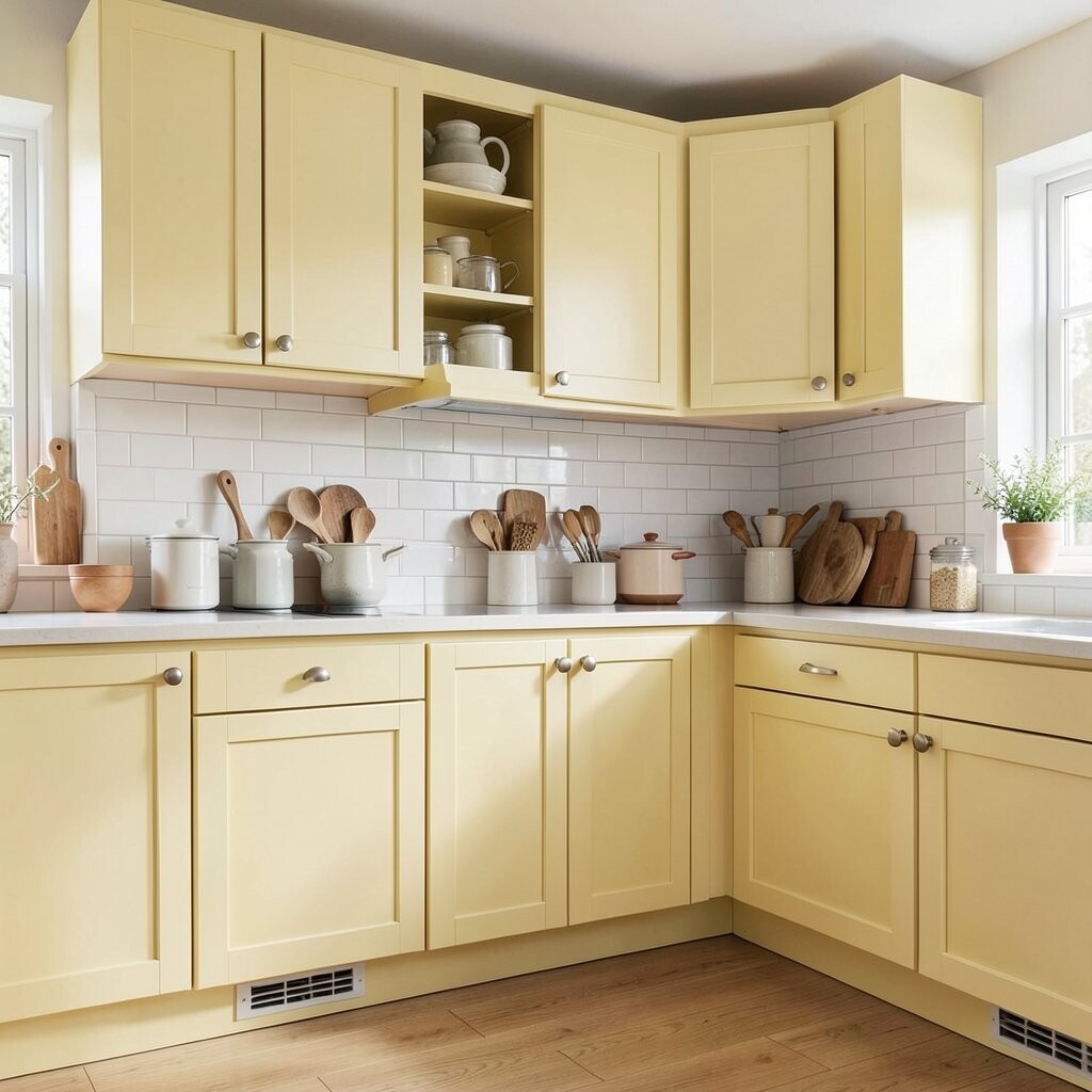
Butter Yellow Butter yellow cabinets bring a sunny smile to your cooking space. The color feels gentle, not loud, and it pairs beautifully with light floors.
When your kitchen has limited natural light, butter yellow helps it feel warmer right away. You can keep the rest of the room simple so the cabinets stay the star. Try a matte finish for a soft, smooth look that hides minor scratches.
This shade is unique because it reads cheerful while still feeling classic. It also matches current trends like sunny accents and playful neutrals. To personalize, add white or cream countertops and use darker hardware to give contrast.
For cost considerations, painting is often the most budget-friendly way to try a bold color. If you are buying new cabinets, compare price tiers for “paint-ready” doors, because it can reduce labor costs. Use a primer made for your cabinet material so the yellow stays even and true.
-
4. Pale Sage Green

Pale Sage Green Pale sage green feels calm and fresh, like a garden herb on a bright morning. It adds color without overpowering your counters or walls.
Because sage is soft, it works with many backsplash styles, from subway tile to stone-look patterns. It also makes wood tones feel richer, which is great if you have oak or walnut floors. Tip: choose a slightly muted sage if you want a more timeless, less trendy look.
For uniqueness, sage cabinets can blend nature and modern style at the same time. This color also fits popular trends like wellness-inspired spaces and organic textures. If you want a personal touch, add open shelving and display matching bowls in cream or light tan.
Cost-wise, painting sage is similar to other colors, but you may need extra coats for full coverage depending on your current cabinet color. You can lower costs by painting only the boxes first, then doors and drawers after you confirm the shade. If you plan to refinish hardware, consider polishing it for a clean, updated feel.
-
5. Light Sky Blue
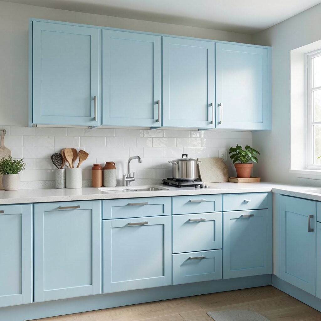
Light Sky Blue Light sky blue cabinets look like daylight captured in wood. They make the room feel lively, crisp, and open.
Blue can brighten the eye, especially when paired with white walls and a light backsplash. You will also get a fun contrast against darker flooring or black fixtures. A helpful tip: use a satin finish so the cabinet surface wipes clean after cooking spills.
This shade feels unique because it turns an ordinary kitchen into a space that feels airy. It is also showing up more often in current design trends, especially in homes that want “soft color” rather than heavy hues. Personalize it with warm white countertops and simple glass-front doors to show pretty dishware.
If you are budget-minded, start with paint before replacing cabinets. Keep an eye on primer quality, because cheap primer can lead to uneven color, especially on darker existing cabinets. Consider swapping only the hardware first if you want a small upgrade while you gather your paint budget.
-
6. Creamy Off-White with a Hint of Beige
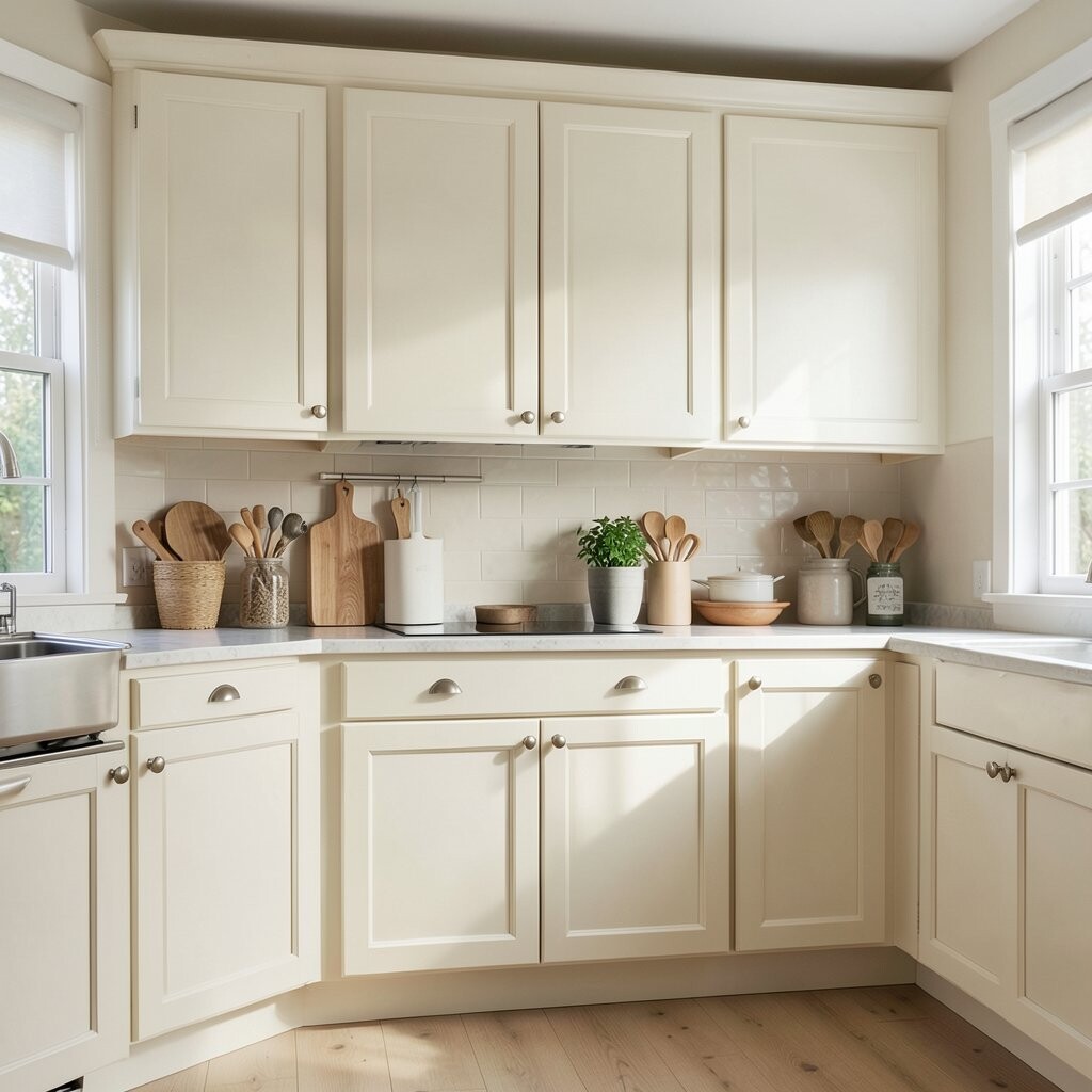
Creamy Off-White with a Hint of Beige Creamy off-white cabinets add warmth without going too yellow. They look rich in sunlight and soft in evening light.
This color helps your kitchen feel cozy and bright at the same time. It also works well with many countertop options, including marble-look and quartz with warm flecks. Tip: choose a creamy shade if your floors have warm undertones.
Off-white with a beige hint feels unique because it can look almost custom, even with simple styling. Many people like it because it stays trendy while avoiding harsh whiteness. To personalize, add crown molding or drawer dividers for a more designed feel.
-
7. Warm Light Tan

Warm Light Tan Warm light tan cabinets create a sunlit look that feels grounded and welcoming. The color pairs nicely with white walls, natural wood, and soft textiles.
Tan can brighten your kitchen by making it feel earthy and smooth, especially if you want something softer than gray. It also hides small marks better than pale whites. If you want a clean look, pick a cabinet paint that resists scuffs and easy staining.
This shade is a nice option for people who want color but still love a neutral home. Current trends are leaning toward “soft earth tones,” and tan fits right in. Personalize it with modern bar pulls in brushed nickel or satin brass.
Cost considerations are usually friendly because tan is a mid-range pigment. Painting can cost less than replacement cabinets, and you can update other things later, like backsplash or lighting. Plan to re-paint doors and drawers carefully, because even coverage makes tan look expensive.
-
8. Soft Rose Pink
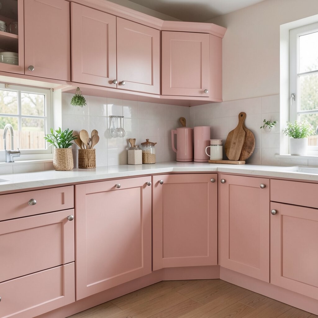
Soft Rose Pink Soft rose pink cabinets add a gentle charm that feels sweet and modern. They bring a pretty glow, especially when you use warm white lighting.
You get a unique personality without turning your kitchen into a “one-note” space. Rose pink also pairs well with light gray counters and white backsplashes. Tip: choose a dusty rose shade if you want it to feel calm, not like a bright accent wall.
This color helps your kitchen look more styled, even with simple decor. It is trending in many homes that want subtle color pops and cozy vibes. For personalization, combine rose cabinets with black hardware and a cream ceramic tile backsplash.
Cost-wise, pink can be a little tricky if you change from a dark color, because you may need more coats. Save money by prepping well and using the right primer for your current finish. If you want less risk, start with repainting just the lowers or an island first.
Another budget tip is to refresh the faucet and lighting to match the rose tone. Those small changes can make the color feel more intentional. A clear, protective topcoat will also help the cabinets stay easy to clean.
-
9. Chalky Light Sage + White Mix

Chalky Light Sage + White Mix A chalky light sage and white mix can make your kitchen feel playful and bright. Using both tones adds depth, so the room looks bigger than it actually is.
Try sage on the lower cabinets and white on uppers, or the other way around. The contrast keeps everything interesting while still feeling fresh. Tip: use a consistent finish level, like matte or satin, so the colors blend smoothly.
This combination is unique because it gives you a custom look without needing fancy patterns. It also matches current trends like two-tone cabinetry and light, airy palettes. Personalize it with a backsplash that has subtle green flecks, like marble-look tile.
Cost considerations depend on whether you paint everything or mix new and painted pieces. If you paint, plan for more time on masking and careful drying. To reduce cost, focus on repainting the most visible cabinet fronts first, then save other areas for later.
-
10. Periwinkle Pastel Blue
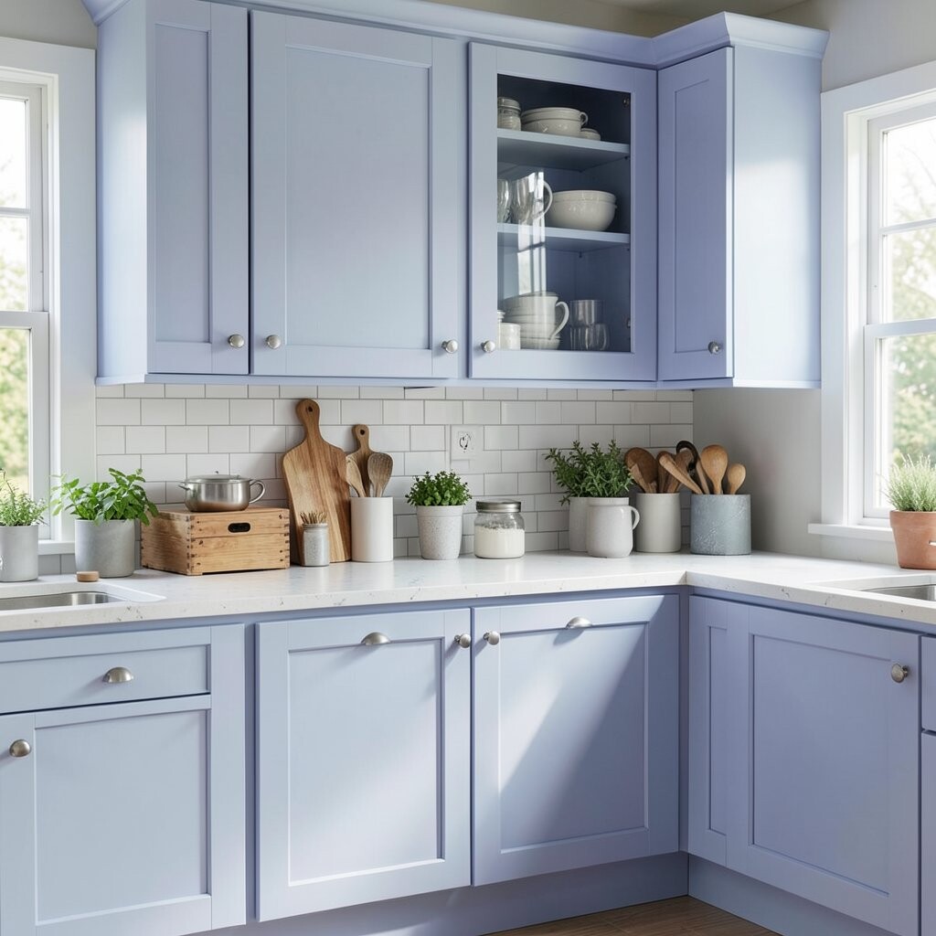
Periwinkle Pastel Blue Periwinkle cabinets are a dreamy pastel that makes your kitchen feel soft and bright. The color looks especially lovely with white countertops and pale floors.
Pastel blues help visually open up the space, which is great for apartments or smaller kitchens. They also work well if you like coastal style or gentle color accents. Tip: pair periwinkle with natural wood shelves for warmth and balance.
This color feels unique because it sits between blue and purple, giving a slightly artistic vibe. It is also showing up more often in trend boards for kitchens that want personality without heavy drama. Personalize with silver hardware and a light, patterned backsplash like small-scale tiles.
When thinking about cost, consider a careful prep routine because pastel colors can show patchy coverage. If your cabinets are already painted, check for peeling first, then sand and prime. Painting is usually cheaper than replacement, and it lets you correct the tone before finishing.
-
11. Glossy White with a High-Shine Finish
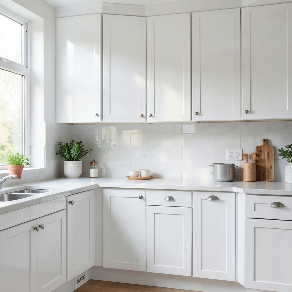
Glossy White with a High-Shine Finish Glossy white cabinets feel like sunlight on glass. They reflect light strongly, so your kitchen looks extra bright.
This is a great choice if you want a clean, modern style and you like a crisp look. Keep in mind that gloss can show fingerprints, so a quick wipe routine helps. Tip: use a soft microfiber cloth for daily cleaning.
For uniqueness, add glass panels on some upper doors to create a bright display. Current trends include bright, sleek kitchens with simple lines and reflective surfaces. Personalize with warm wood bar stools and a light grout backsplash to keep everything cohesive.
Cost considerations include finish and labor, because glossy paint can take extra coats to look even. You can save money by choosing a durable cabinet paint line meant for high-touch areas. If you love the shine but want less hassle, choose satin instead of full gloss.
-
12. Linen White with Texture
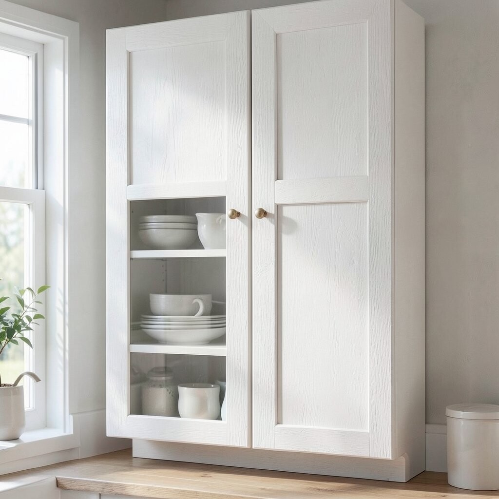
Linen White with Texture Linen white cabinets feel gentle and cozy, especially when the finish has subtle texture. The surface catches light softly instead of reflecting it harshly.
This gives you a bright look that still feels warm and homey. Texture also helps hide small imperfections in the cabinet surface. Tip: ask your painter about paint products made for “textured cabinet” effects for durability.
Texture is a unique touch because it adds depth even with a simple color. It matches current styles like cottage, farmhouse-modern, and warm minimalism. Personalize by adding soft-close hinges and a mix of open shelves and closed cabinets.
-
13. Light Charcoal Gray for a Bright Contrast

Light Charcoal Gray for a Bright Contrast Light charcoal gray cabinets sound dark, but they can still brighten your kitchen. The key is choosing a lighter gray with a soft undertone.
When paired with white walls and a bright backsplash, this color creates a clean contrast that feels modern. It also hides stains and scuffs better than very pale colors. Tip: use matte or eggshell finish to reduce glare while keeping a smooth look.
This option is unique because it brings “grown-up style” without closing in the room. Current trends show more people using calm dark tones to frame light spaces. Personalize with warm lighting, like soft white bulbs, and hardware in brushed nickel.
Cost considerations are similar to other paints, but you may need strong primer for older cabinets. If your existing cabinets are already gray or similar, you can often reduce the number of coats. Plan for touch-ups because darker cabinets can show changes near edges if coverage is uneven.
-
14. Buttercream Yellow with Antique Charm
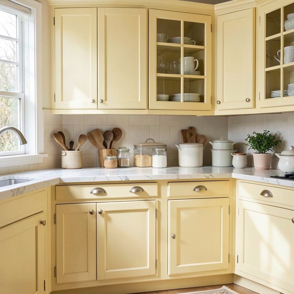
Buttercream Yellow with Antique Charm Buttercream cabinets feel like dessert, sweet and welcoming. The shade brightens your kitchen while still looking rich and soft.
This color helps your room feel friendly, especially when you use warm metals and creamy whites around it. It also goes well with vintage-style hardware like knobs and cup pulls. Tip: match your countertop undertones, so the buttercream doesn’t fight with cool stone.
This cabinet color feels unique because it sits between yellow and warm white. It is also a popular direction in trends for kitchens that want a “soft vintage” vibe. Personalize with subtle glaze for an antique look, but keep the glaze light so it stays bright.
Cost-wise, glazing can add labor time, but you can reduce cost by choosing a lighter glaze and doing it carefully. If you are painting yourself, set aside extra drying time and protect floors well. For budget control, start with your most visible cabinet faces, then finish the rest when you’re ready.
-
15. Pale Cocoa Brown (Mocha)
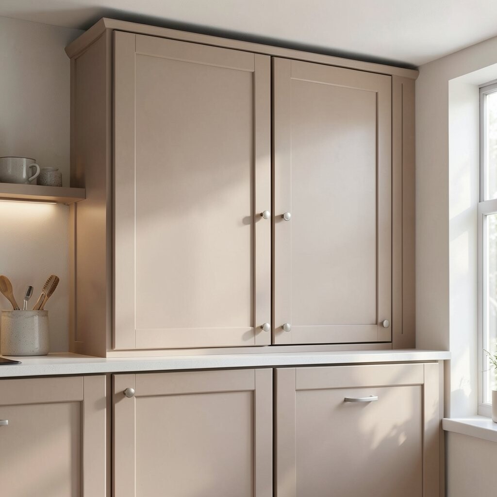
Pale Cocoa Brown (Mocha) Pale cocoa mocha cabinets look warm and inviting, like coffee with cream. They can brighten your space while still giving you a cozy, grounded feeling.
The benefit is that mocha tones add depth without making the kitchen feel heavy. They work especially well if you have natural stone counters or light wood floors. Tip: keep walls and ceilings lighter so the mocha stays “airy,” not gloomy.
This color is unique because it feels warm but not overly orange. It matches current trends that lean toward warm neutrals and coffee-inspired palettes. Personalize with brass hardware and a backsplash with gentle beige veining.
-
16. Soft Mint Green
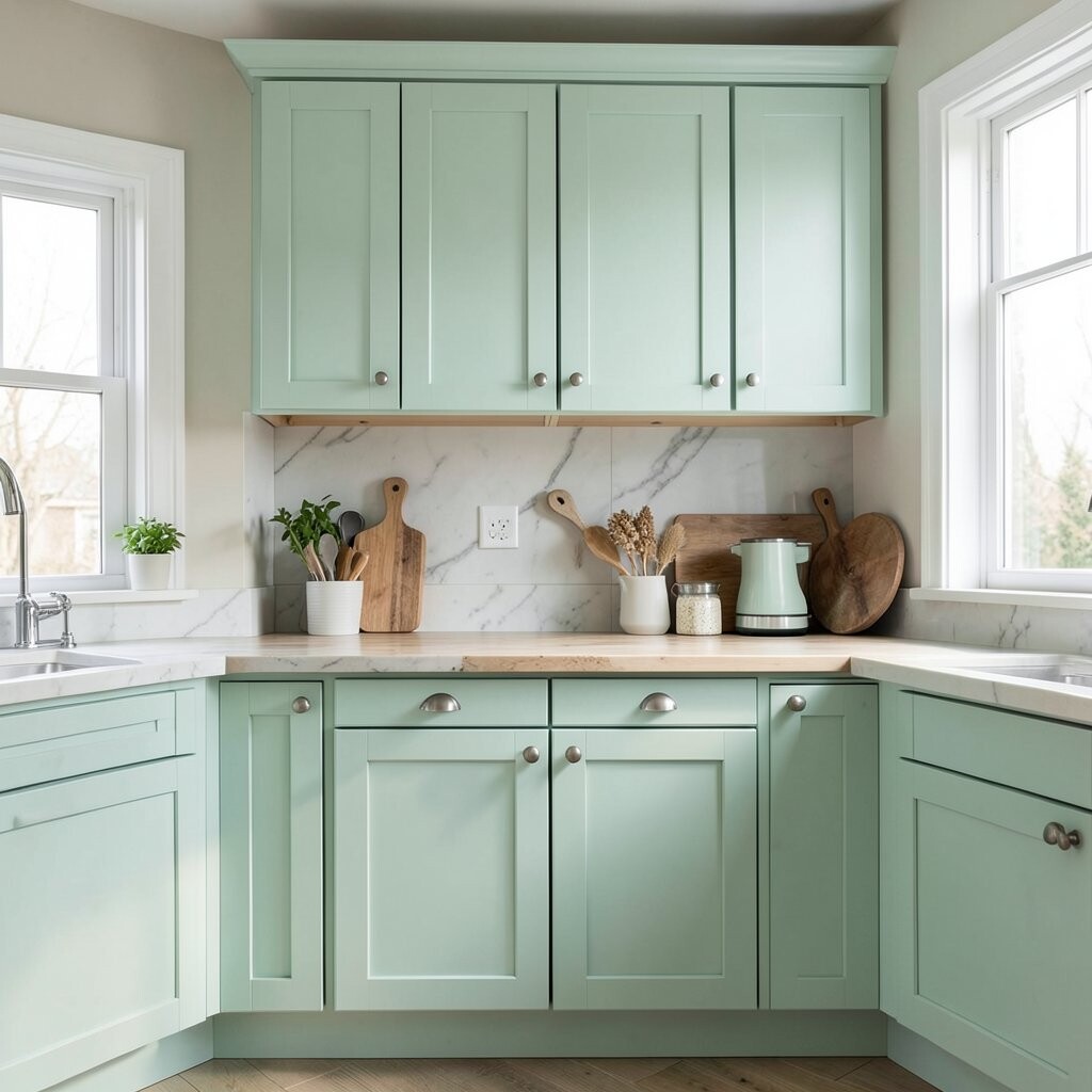
Soft Mint Green Soft mint green cabinets feel fresh like cool air and garden leaves. They add a light pop that makes the whole kitchen seem cleaner and brighter.
Mint works well when you want color but still want your room to feel open. It looks great with white counters and light, simple backsplashes. Tip: choose a slightly gray-green mint if you want it to feel modern and not too retro.
This shade is unique because it feels playful but also calm. It fits trends for “refresh” colors in kitchens and bathrooms, where homeowners want a lighter mood. Personalize with black or dark bronze pulls, plus glass jars for pantry organization.
Cost considerations: mint may need a few coats depending on the base color of your cabinets. Painting is usually cheaper than replacing cabinets, especially if your cabinet structure is solid. If you plan on doing it in stages, paint only one section at first, like the island, so you can judge the tone.
-
17. Seafoam Green with Cool Light

Seafoam Green with Cool Light Seafoam green cabinets bring a calm ocean-like vibe to your kitchen. The color looks bright because it sits in the light green range with lots of airy space.
This is a great benefit if your kitchen feels too warm and you want balance. Seafoam also pairs well with white tile, light gray walls, and natural wood. Tip: use a satin finish to keep cleaning easy and reduce stubborn smudges.
Seafoam feels unique because it can read slightly cool or slightly warm depending on lighting. That flexibility makes it easier to style with many decor colors. Current trends also favor water-inspired tones, especially when paired with simple, tidy layouts.
For personalization, add a soft, light gray countertop and warm brass cabinet pulls. Cost-wise, you can keep spending under control by painting cabinets instead of replacing them. Ask about paint systems meant for cabinets, since kitchen paint handles heat and moisture better than regular wall paint.
-
18. Pale Yellow-White (Vanilla Glow)

Pale Yellow-White (Vanilla Glow) Pale yellow-white cabinets look like vanilla frosting under kitchen light. They brighten the room without making it feel overly colorful.
This shade is a benefit for kitchens that face north or get fewer sun hours. It warms everything up, including white appliances and light countertops. Tip: choose hardware in brushed nickel or warm gold so the tones stay friendly.
Vanilla glow is unique because it gives the energy of yellow with the softness of off-white. It fits trends that highlight cozy “bakery” colors and warm neutrals. Personalize it with a subtle patterned backsplash, like tiny dots or soft stripes.
Cost considerations: lighter colors can sometimes cover faster, which can save time. Still, you will want good primer and a smooth sanding step so the finish looks professional. If your budget is tight, consider painting only the cabinet doors first, then add new hardware after.
-
19. Light Olive Green

Light Olive Green Light olive green cabinets bring a gentle, grown-up color that still feels bright. The shade looks fresh and calm, especially with cream and natural wood around it.
This color is great if you want something different from typical white and gray. Olive tones add interest without looking harsh, and they can hide wear better than very light cabinets. Tip: pair it with a warm white backsplash so the greens stay soft and inviting.
Olive is unique because it adds a “kitchen garden” feeling while staying trendy. Many current styles use earthy tones to balance modern finishes. Personalize with black iron hardware and open shelves filled with olive oil bottles, mugs, or woven baskets.
-
20. Champagne Beige
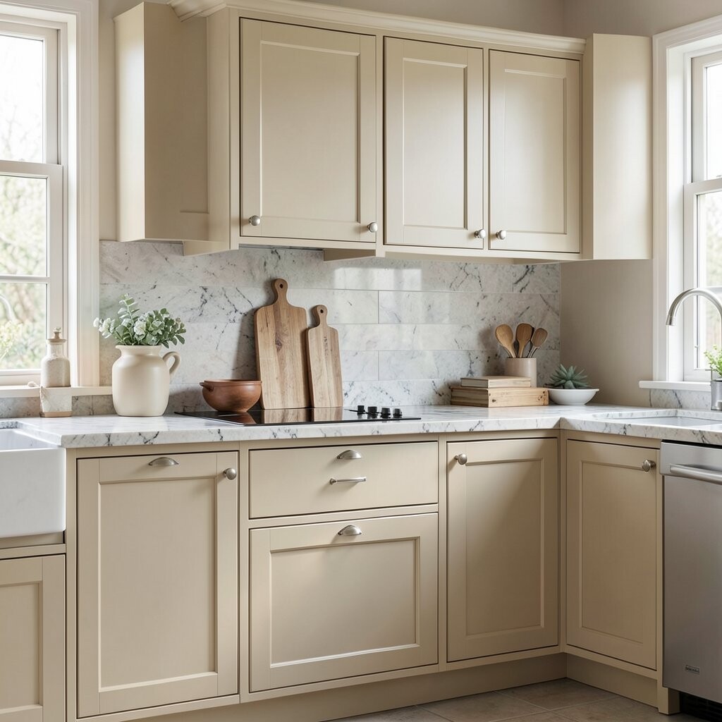
Champagne Beige Champagne beige cabinets look elegant and bright, like a warm sparkle. The soft sparkle effect can make the kitchen feel more upscale without using dark colors.
This benefit is that champagne tones blend with almost everything, including marble, quartz, and wood. They also make lighting look better, which is helpful if your bulbs are cooler. Tip: use a backsplash with creamy whites and soft beige tones to keep the palette smooth.
Champagne is unique because it has a hint of glow, even when you keep the design simple. It matches current trends toward warm neutral sophistication. Personalize by choosing satin brass hardware and adding a light runner rug to soften the kitchen floor.
Cost considerations: if you pick a paint with a slight sheen, it may cost a bit more than flat paint. However, the payoff is a richer look that may need fewer styling upgrades. If you’re painting yourself, allow extra cure time before heavy cleaning, so the finish stays durable.
-
21. Cornflower Blue-Gray

Cornflower Blue-Gray Cornflower blue-gray cabinets give a bright, airy feeling with a calm edge. The color looks crisp and stylish, especially paired with white walls.
Blue-gray helps your kitchen feel modern while still staying light and friendly. It also hides dust better than bright whites because the tone blends small specks. Tip: choose a backsplash that echoes the cool tones, like light porcelain or a simple white tile.
This color is unique because it balances softness and structure, so your kitchen feels designed. Current trends keep showing cool tones paired with warm lighting for a balanced look. Personalize it with matte black hardware and a light wood countertop for warmth.
Cost considerations: cool blues and blue-grays sometimes require more coats for full coverage. Budget wisely by starting with proper primer and planning for drying time. If replacing cabinets is too much right now, repainting just the upper cabinets can still create a big visual change.
-
22. Sunny White with a Slight Yellow Tint

Sunny White with a Slight Yellow Tint Sunny white cabinets make your kitchen feel like it always has good weather. The slight yellow tint keeps it warm, even during darker months.
This color helps you brighten the whole room while keeping the cabinets looking classic. It also makes countertops look cleaner and more vibrant. Tip: pair it with light quartz or marble-look surfaces and choose hardware in warm metals for a cohesive style.
This final idea is unique because it sits between traditional white and soft yellow comfort. It is also aligned with current trends that favor warm, welcoming tones over cold, stark whites. Personalize with colorful dish towels, a light wood cutting board, and small touches that bring the sunny mood to life.
Cost considerations are often great because sunny white is usually a reliable paint choice. If you paint, spend on quality cabinet paint and primer so the finish stays smooth and durable. When you plan hardware, count the number of doors and drawers early, because that small step helps you avoid surprise costs later.