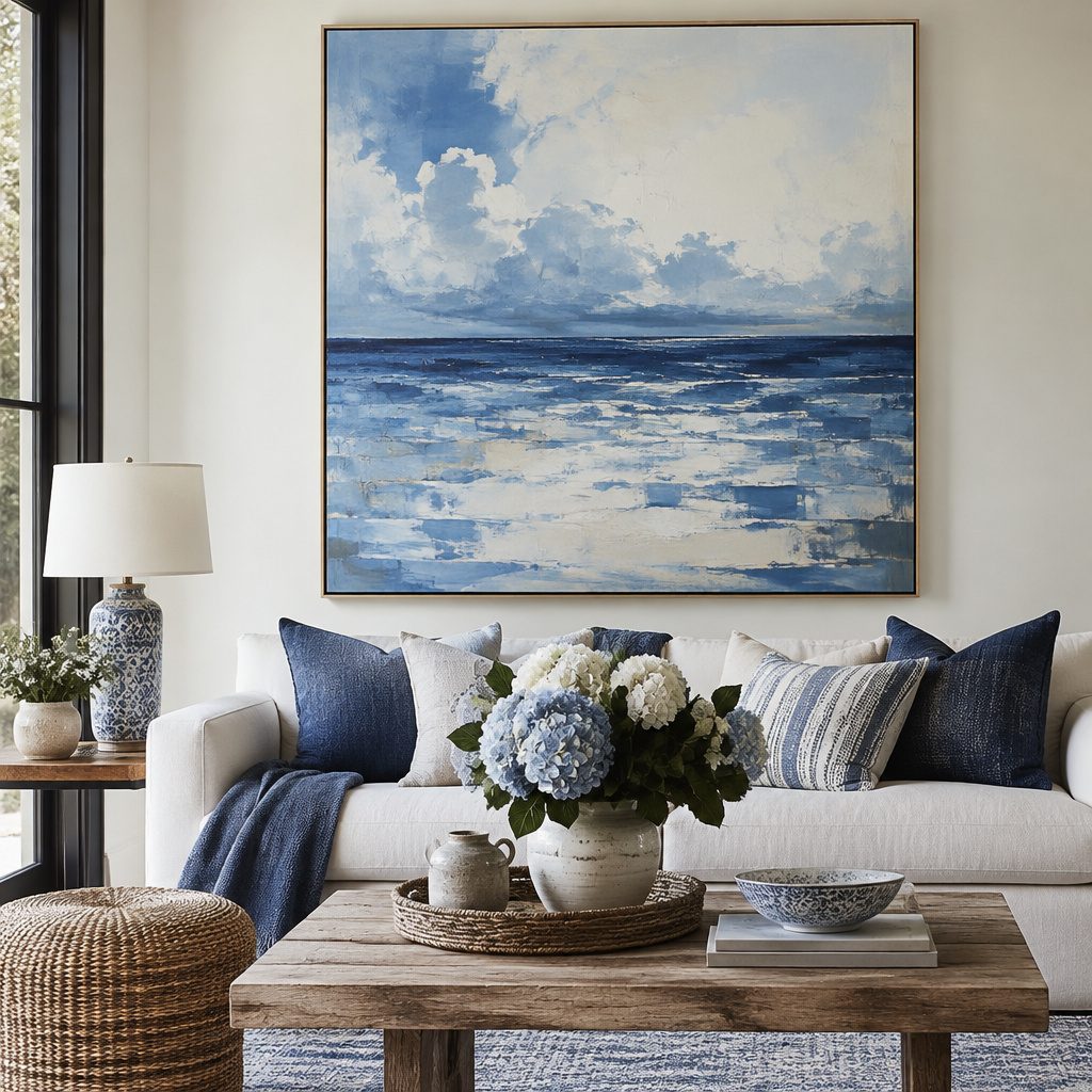
Blue wall art can make a room feel lighter instantly. The right piece can also bring calm, color, and personality to everyday spaces.
1. Ombre Blue Gradient Prints
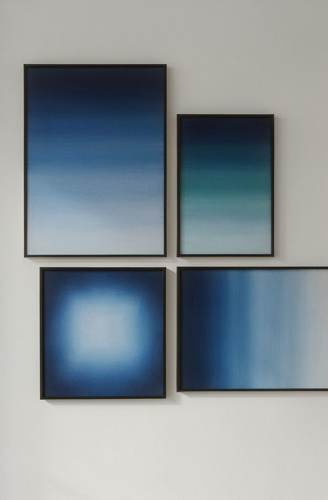
Ombre blue gradient prints fade from deep to airy tones, like a soft sky on your wall. They add visual movement without making the space feel busy. Pair them with clean furniture and warm lighting for a bright, balanced look. Choose a size that matches your wall space so the color shift feels intentional.
They’re unique because the color transitions do the work of both background and statement. That makes them great for first-time art buyers who want a polished effect quickly. To personalize, look for gradients that lean teal for energy or navy for calm.
2. Coastal Seascape Silhouettes
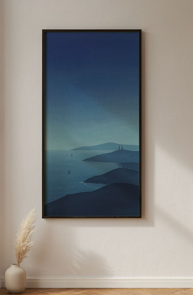
Coastal seascape silhouettes use bold shapes—often in navy, slate, and ocean blue—to suggest waves and distant horizons. Because the scene is simplified, it looks modern and uncluttered. This style brightens a room by adding depth while still feeling airy. It’s also perfect for people who love the ocean but prefer subtle artwork.
Try placing one larger piece above a console table to create an instant focal point. If your room has lots of patterns, choose a silhouette with fewer details so the art stays calm. For practical placement, keep the artwork roughly at eye level and leave a little breathing room around it.
For cost considerations, you can find prints, framed posters, or canvas reproductions at different price points. Trend-wise, minimalist coastal art is staying popular because it blends with many decor styles. Personalize by selecting a color palette that matches your pillow blues or your rug tones.
3. Blue Botanical Line Art
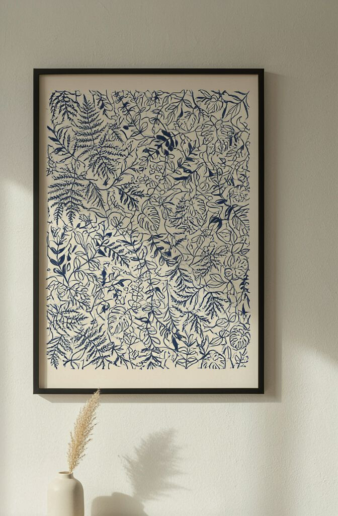
Blue botanical line art uses thin, elegant lines to draw leaves and flowers in shades from powder blue to deep indigo. The airy look brings freshness without overwhelming your walls. It’s especially effective in smaller rooms because the fine lines feel light. You can place it near plants to create a natural “double garden” effect.
What makes it unique is the contrast between the delicate drawing and the strong color tone. Even when the piece is simple, it looks thoughtful and curated. To make it feel practical in daily life, pair it with a reading nook or kitchen corner where you’ll see it often.
For personalization ideas, choose botanical art with specific plant shapes you like—such as eucalyptus, lavender, or palm fronds. If you love a pop of brightness, pick versions that include a few teal accents. For framing, consider a light wood frame to warm up the cool blues.
Cost-wise, line art tends to be budget-friendly because many options are available as prints. Current trends lean toward minimal, ink-style graphics, so this choice is unlikely to feel outdated fast.
4. Framed Blue Geometric Tiles
Framed blue geometric tile art looks like a pattern you’d see on decorative ceramics, but presented as wall-ready design. Clean angles and repeating shapes can make a room feel organized and bright. It’s unique because it adds structure, not just color. You can use it to balance a space with soft fabrics and rounded furniture.
For practical tips, match the frame finish to your hardware, like brushed nickel or matte black. If you want a quick upgrade, choose one statement frame large enough to hold attention. Personalize by picking a shade that echoes your backsplash, curtains, or accent chair.
5. Textured Blue Canvas with Color Blocking
A textured blue canvas with color blocking combines bold rectangles with painterly texture for a lively, modern feel. The layered surfaces catch light and help a wall look more “alive” than flat prints. It brightens your room because blue naturally reads as refreshing and spacious. Choose 2–4 tones so it still feels cohesive.
This artwork is unique because it blends graphic design with a tactile finish. It works well even when you don’t add many other decorations. To keep it practical, place it where it won’t be constantly crowded by shelves or clutter.
If you’re thinking about cost, look for small-to-medium canvases if you want the look without the big price. Current trends favor bold blocks with subtle texture, so this style stays in demand. Personalize by selecting colors that echo your bedding or by mixing a lighter sky blue with one deeper navy block.
6. Watercolor Blue Wash Landscapes
Watercolor blue wash landscapes feel soft and dreamy, like clouds drifting across a horizon. You’ll notice how the gentle washes make the wall feel brighter even in dim corners. They’re unique because the “paint blooms” create natural variation with no two days looking the same. This is a great option if you want art that looks calming rather than loud.
For practical placement, hang the piece where you see it at different times of day, so the blue shifts with light. Pair it with neutral furniture and light curtains to amplify the airy effect. If your room has strong colors, keep the watercolor palette mostly in blues and grays for balance.
Cost considerations vary based on whether you buy original work, prints, or mass-produced watercolor-style canvases. To personalize without overspending, search for open-edition prints with thick paper or canvas texture. Trend-wise, watercolor landscapes remain popular because they fit both modern and cozy home styles.
7. Blue Abstract Sunburst Prints
Blue abstract sunburst prints use radiating lines to pull your eye toward the center, creating instant energy. Even a single piece can make a room feel more cheerful. The look is unique because it mixes motion with color, without needing a realistic subject. This style is especially good for living rooms, entryways, or any area that needs a lift.
To make it practical, center the artwork on a blank wall and keep the rays crisp against your decor. If you have busy patterns elsewhere, choose a print with fewer color tones. Personalize by selecting a sunburst that leans more teal for a playful mood or more indigo for a grounded vibe.
For cost, sunburst designs are commonly available as affordable prints and as higher-end canvases. Current trends show people leaning into bold, geometric wall art, and this is a softer way to do it with blue. Consider matting the print in white or cream so the blue pops and stays bright.
8. Blue and White Patterned Porcelain Frames
Blue and white patterned porcelain style art brings a classic feel with a fresh, crisp color combo. Think of traditional motifs, but arranged like a clean modern graphic on the wall. This brightens rooms because white spaces make blue feel lighter and more open. It also works beautifully with farmhouse, coastal, and modern decor.
What makes it unique is the “heirloom” vibe that still feels current. You can use it to add personality without needing many other accessories. For a practical tip, match the pattern scale to your room size: larger motifs for bigger walls, smaller motifs for cozy spaces.
To personalize, choose motifs that fit your tastes—floral, wave-like, or lattice patterns. Cost considerations are simple because you can find budget-friendly prints that look like porcelain, or you can invest in nicer frames for a gallery feel. A trend that’s strong right now is mixing heritage patterns with minimalist interiors, and this idea fits right in.
Hang it near warm lighting so the white elements look bright and inviting. If you want a “set” look, pair one larger main piece with a smaller matching print.
9. Blue Ombre Photo Collage Frames
Blue ombre photo collage frames combine personal memories with a cohesive color mood. They brighten your room because the palette creates a smooth visual theme across photos. This idea is unique because it turns everyday moments into coordinated wall decor. It also makes your wall feel like yours, not like a showroom.
For practical tips, keep the number of photos limited so the collage stays clean and not cluttered. Choose images with similar lighting, or add a blue-tinted filter for consistency. If you’re making a collage for a hallway, consider a vertical layout that guides the eye down the space.
Cost considerations depend on printing and frame choices, but it can be budget-friendly. You can start with inexpensive frames and upgrade later, or use one matching frame set for a uniform look. Trend-wise, personalized gallery walls are staying popular, especially when they’re color-coordinated.
Personalize further by mixing in one blue abstract photo background or a beach-horizon shot to tie everything together.
10. Stacked Blue Bookshelf Wall Art
Stacked blue bookshelf wall art turns a favorite visual theme—reading and shelving—into a wall-ready design. It adds charm and makes your wall feel lived-in. The look is unique because it brings depth and a playful “scene” without needing real shelves. You can lean into this style in bedrooms, offices, or cozy corners that feel like a retreat.
For practical suggestions, choose art that has enough negative space to avoid feeling cramped. Match the blue shade to your bedding or curtains so the theme doesn’t fight your color scheme. If you don’t want it to look too themed, pick a version with more minimal book shapes and fewer tiny details.
To personalize, incorporate a color gradient across the “books,” such as sky blue to navy, or mirror the colors from your bookshelf. Cost can be reasonable because many options come as prints. Current trends highlight “functional decor” visuals, and bookshelf art fits that vibe while still being playful.
11. Blue Starry Night Accent Prints
Blue starry night accent prints bring a magical sky feel with deep blues and sparkling highlights. They brighten your room by adding contrast—especially if your walls are white, cream, or light gray. The look is unique because it adds depth and a little wonder without requiring a huge mural. It’s a fun option for a bedroom or a creative studio corner.
For practical tips, choose a size that balances the wall, like a medium print centered above a dresser. If you already have many dark elements, go for a lighter blue star map to keep it airy. Personalize by selecting artwork that matches your vibe, from dreamy watercolor stars to crisp, pointillist constellations.
Cost considerations are flexible since starry art appears across price ranges from budget prints to premium canvases. A current trend is using galaxy-inspired art in living rooms, but keeping it refined with limited color palettes. Frame the piece in a matte finish so the “sparkles” don’t glare under bright bulbs.
Pair it with soft textures like knit throws or velvet cushions so the dreamy look feels cozy.
12. Blue Water Ripple Mirrors
Blue water ripple mirrors combine reflection with calming motion, often using a blue-tinted glass or ripple-like frame details. They brighten your room because mirrors bounce light, and blue adds a soothing tone. This idea is unique because it doesn’t just sit on the wall—it actively plays with light and space. It’s a smart choice when you want both art and a functional decor piece.
For practical placement, install the mirror across from a window or near a lamp for the best light boost. If your room is small, choose a vertically oriented shape to make ceilings feel taller. Personalize by matching the mirror frame finish to other metals in the room.
13. Blue Abstract Line Portraits
Blue abstract line portraits use flowing lines to suggest faces, figures, or profiles in shades of blue. The art feels modern and expressive, like a drawing that’s always moving. It brightens your room by adding a cool-toned focal point that stands out against neutral walls. This is a great option when you want character without literal realism.
What makes it unique is the emotion carried by the linework rather than details. It’s easy to live with because it doesn’t demand attention every second, but it still looks stylish. For practical tips, hang it near an area where you gather, like above a sideboard or near a reading chair.
Personalize by selecting a line portrait that fits your decor style—minimal, bold, or more delicate. If you want a bright look, choose lighter blues and thinner lines. Cost-wise, line portrait prints are often affordable, and you can upgrade with a nicer frame for a gallery effect.
14. Blue Weather Map Artwork
Blue weather map artwork turns cartography into decor, featuring symbols like clouds, currents, or simplified forecast lines. It’s surprisingly bright because the theme feels graphic and clean, not cluttered. This idea is unique because it combines information design with art style. It works well in kitchens, home offices, or any space where you enjoy clever visuals.
For practical suggestions, look for art with plenty of white or light background so your wall stays open and airy. Match the print’s blue tone to your existing accents, like dishware or a desk chair. Personalize by choosing a map style that reminds you of a favorite region or trip.
Cost considerations depend on whether it’s a framed print, canvas, or specialty poster, but many versions are budget-friendly. Current trends show people liking “data-inspired” decor, and weather maps fit that modern interest. Consider a black or dark frame if you want the graphics to feel sharper and more high-contrast.
15. Blue Geode Slice Wall Prints
Blue geode slice wall prints show crystal-like sections with sparkling gradients and cut patterns. They brighten a room by reflecting light through layered color effects, even in a flat print. This style is unique because it feels bold, luxe, and artistic at the same time. It’s perfect for living rooms where you want a dramatic accent without building a full mural.
For practical tips, hang it where it catches natural light, like across from a window or near a hallway light. Choose a frame that supports the sparkle, such as silver, black, or a thin wood frame that feels modern. Personalize by selecting a print with your favorite blue range—pale aquas for softness or deep navies for drama.
Cost considerations vary widely, but geode art is available as affordable posters, mid-range framed prints, and higher-end canvas. Trend-wise, mineral-inspired and geode-like visuals remain popular because they give depth and texture. To keep the look cohesive, match one decor item—like a throw pillow or vase—to the lightest blue in the artwork.