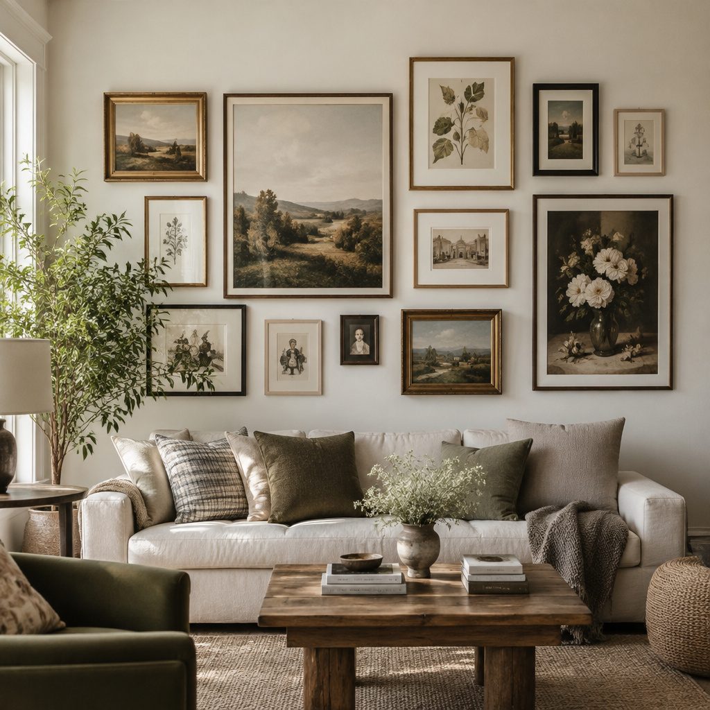
Gallery walls can make a room feel personal fast. The best part is you can build one at your pace with items you already love.
1. The Classic “Mixed Frames” Grid
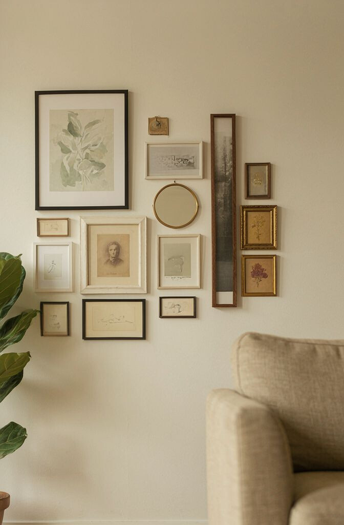
Start with a simple grid that looks neat from every angle. Mix frame colors and widths so the wall feels collected, not cookie-cutter.
Use frames in similar tones to keep the chaos friendly. Think warm wood with soft black and a few brushed gold accents. For spacing, measure about 2 to 3 inches between frames so everything breathes.
2. A Gallery Wall With One Big Anchor Piece
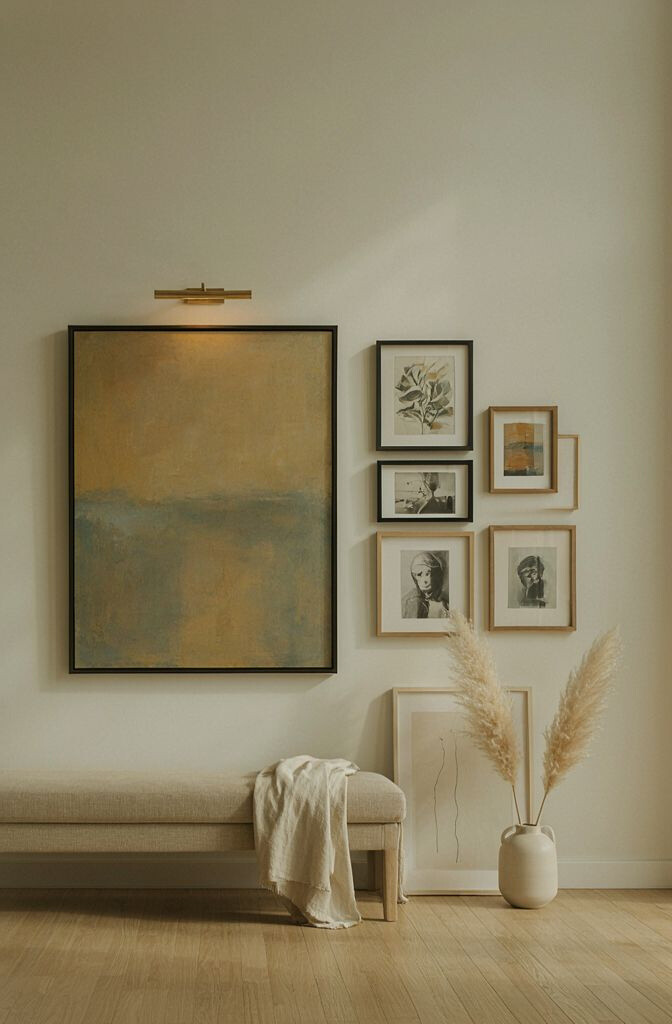
Pick one larger artwork and place it as the visual “anchor.” Then build around it with smaller prints so your eye has a clear starting point.
This design is unique because it gives your wall a center of gravity. It works great over a sofa, console, or bed where you want one statement moment. To nail the balance, put the biggest piece slightly above eye level and keep side pieces symmetrical-ish.
Choose an anchor that has colors already found in the room. If your couch has blue tones, try a print with blue and neutral details. Cost-wise, you can splurge on one statement frame and save by using affordable poster prints for the rest.
3. Black-and-White Photo Storyline
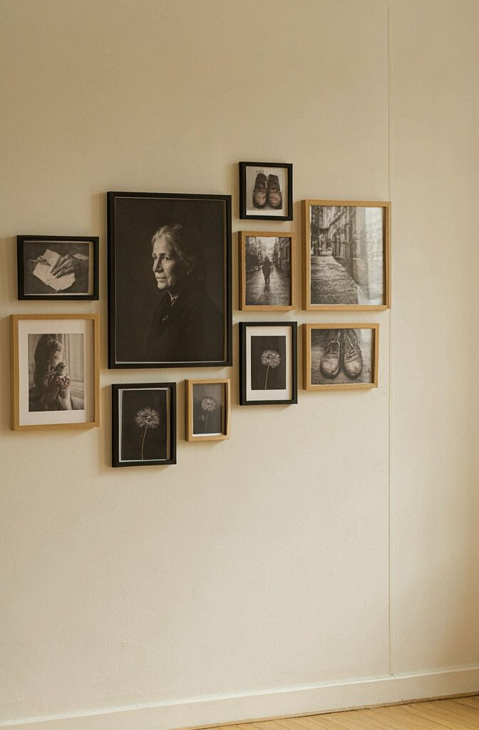
This idea turns memories into a clean, timeless gallery. Use black-and-white photos in matching mat sizes for a calm look.
What makes it special is the “story” feeling—like each frame is a chapter. Arrange chronological images or group by theme, such as travel, family events, or everyday moments. Keep the frames mostly the same color so the photos stay the main character.
To personalize, add one unexpected photo in a different texture like a film-style print. You can also include tiny captions in a small matching font. Trends right now favor minimal borders and consistent matting, so this look stays modern without much effort.
If you’re on a budget, print photos at standard poster sizes and use inexpensive frames. For durability, use matte photo paper and glass-free frames when moisture is a concern. This style also looks great in hallways where you want movement without clutter.
4. The Vertical “Tall and Lean” Layout
Choose a vertical line of frames that runs from near the top of eye level down toward the floor. This layout makes ceilings feel higher and draws the eye upward.
It’s unique because it works even on narrow walls where grids feel too busy. Use frames that share a similar width, then vary the heights for a natural rhythm. As a practical tip, align the top edges first, then adjust spacing so the gaps feel even.
5. Oversized Art With Tiny Supporting Pieces
Go big by mixing one oversized print with several small frames around it. The contrast creates a bold “wow” moment without needing many pieces.
This setup feels unique because it balances drama and detail at the same time. Place small pieces like punctuation marks—slightly angled or staggered—so the wall looks curated. Try keeping the color palette limited to two main tones for a polished look.
For personalization, include one meaningful object photo like a handwritten letter scan or a map page. Cost considerations are easy here because one large piece can be the budget splurge. You can fill the rest with smaller prints from local markets or free downloadable art.
6. The Color-Pop Gallery Wall
Pick a base of neutral frames, then add artwork that uses one bright color as the highlight. Think sunny yellow, teal, coral, or vivid red.
This style is unique because it creates energy without making the room feel chaotic. The secret is repeating the accent color in several frames, so it ties everything together. When you hang the pieces, aim for a mix of orientations—some portrait, some landscape—so the wall feels lively.
To personalize, match the accent color to a pillow, rug stripe, or a small vase on the same wall. Current trends lean toward “color stories” that echo furniture fabrics and modern decor. If you’re careful with spacing, even thrifted frames will look intentional.
Cost-wise, you can find affordable colorful prints and reuse frames by painting them. Use a satin finish paint for a smooth look that still feels affordable. If you want a quick refresh, swap only the prints and keep the frames.
7. A Shelf-Behind-The-Frames Mini Collection
This design mixes art with styling by adding a narrow ledge or floating shelf behind and between frames. It turns your gallery wall into a display zone for small objects.
What makes it unique is the three-dimensional feel. You can tuck in tiny sculptures, books, candles, or framed photos that stand like little props. To keep it tidy, choose items with similar heights and avoid too many busy textures.
For practical tips, anchor the shelf level first, then hang frames so they line up with the shelf edges. Personalize by using labels on small items or showing travel trinkets in matching colors. A good trend to follow is “quiet collecting,” where you display fewer pieces but choose them carefully.
Cost considerations are flexible. You can build with low-cost picture ledges and print artwork cheaply, then invest in a few curated objects. Just make sure heavy items are stable and use proper wall anchors.
8. The Cozy Mix: Prints, Text, and Fabric Art
This gallery wall includes a blend of photo prints and text pieces, plus one framed fabric panel. The mix feels like your home’s personality made visible.
It’s unique because fabric adds softness and warmth that paper can’t always match. Try using fabric art like a small textile square, a stitched patchwork print, or a map fabric. Keep the frame style consistent so the different materials don’t look random.
To personalize, include a quote that matters to you or a word that sets a mood, like “home,” “breathe,” or “remember.” Use a simple grid but vary the artwork sizes slightly for movement. Current trends show more mixed-material walls, especially in living rooms and bedrooms.
Cost-wise, fabric panels can be inexpensive and go far, especially if you repurpose meaningful textiles. Print quotes from a home computer and place them into frames for a budget win. If you want a pro touch, use matting for the paper pieces so they look cohesive next to fabric.
9. The Color-Blocked Gallery Wall
Divide your wall into “zones” using frames that look like blocks. Each zone can have a different color or theme, like plants on one side and cityscapes on the other.
This layout is unique because it uses structure like a collage. Instead of everything matching perfectly, each area has its own vibe while still aligning with the overall grid. A practical tip is to keep the frame widths the same within each zone so edges look crisp.
Personalization is easy here. Use family photos in one zone, meaningful art in another, and a few empty-looking mat frames as visual breathing space. For cost, try printing theme sets from one design style so you can buy or print in bulk.
Trends right now favor bold, organized chaos—where the wall feels intentional but not stiff. If you follow that trend, you’ll get a gallery wall that looks modern and fun.
10. A Monochrome “All Black Frames” Look
Use only black frames for a sleek, modern gallery wall. This choice makes even simple prints look designer.
It’s unique because the frames unify everything, so the content can vary widely. Mix black-and-white photos with a few monochrome illustrations and you’ll get a strong, cohesive look. For practical hanging tips, measure the center line of your layout and keep eye-level around 57 to 60 inches from the floor.
11. The Sunburst Picture Arrangement
Create a sunburst effect by placing frames so they radiate outward from one center point. It instantly feels artistic and playful.
This design is unique because it breaks away from rigid grids while still staying organized. Choose one consistent frame size for most pieces, then use slightly different sizes closer to the center. A practical tip is to mark the center first and tape out lines like spokes so spacing stays even.
To personalize, include one “face” photo in the center for a focal moment. You can also use colorful prints that mimic rays of light. Cost considerations are easier than they seem because you can print affordable poster sets in a similar style.
Current trends love dramatic layouts, especially in entryways and dining spaces. This arrangement reads as bold decor, so even a small wall can feel like a statement.
12. The Soft Pastels and Blush Frames Style
Choose frames and art that lean into pastels and gentle neutrals. Think blush, sage, cream, and pale blue with light matting.
This is unique because it creates a calm, airy gallery vibe. It works beautifully in bedrooms, nurseries, and reading corners where you want the room to feel soothing. For practical tips, keep spacing slightly wider than usual so the wall feels open rather than crowded.
Personalization ideas include adding one vintage-style illustration or a watercolor print that matches your color palette. For cost, look for inexpensive prints and swap them seasonally. This wall can “change” without a major budget because you can update just the artwork.
13. The Minimalist Line Art Collection
Try a series of line art drawings or prints with similar thickness and style. A minimalist gallery wall looks clean and modern.
This layout is unique because the art itself creates the connection, not the frames. Use simple thin frames or even matching white mats to keep everything light. If you want a subtle twist, add one piece with a tiny splash of color as a surprise.
To personalize, select line art that reflects your life, like tools you use, local landmarks, or simple nature shapes. Use a consistent frame orientation so the wall feels orderly. Cost-wise, line art is often available as affordable prints, and you can even commission a set from an artist later.
Current trends show interest in calming decor, and this style fits right in. It also looks great in hallways because it doesn’t overwhelm small spaces.
14. The “Salon Wall” With Overlapping Frames
Go for a salon-style wall where frames overlap slightly and vary in size. This creates a rich, collected look that feels lived-in.
It’s unique because the wall feels like it evolved over time, not like it was installed from a showroom. For practical tips, plan your overlap on the floor first so you don’t guess with measuring tape. Use spacers so frames don’t bump into each other when you hang them.
To personalize, include a few family photos mixed with travel maps and art prints. Cost considerations are great for this style because you can use thrifted frames and repaint them if needed. Keep the frame colors within two or three tones so the overlap still looks cohesive.
15. The Vintage-Inspired Map and Compass Wall
Design a gallery wall around maps, compass images, and travel-themed prints. This theme feels nostalgic and meaningful.
This idea is unique because it turns geography into decor. You can use vintage city maps, old atlas pages, and framed coordinates from places you love. For practical tips, keep the paper tones consistent by using similar mat colors and avoiding overly bright backgrounds.
Personalization ideas include adding a “home base” map near the center and surrounding it with places you visited. Cost considerations are friendly since many map prints are affordable and easy to print. If you want a polished look, use archival-style paper copies or professional printing for smoother color.
Current trends lean into sentimental decor, and maps fit that vibe well. The wall also pairs nicely with wooden furniture and warm lighting.
16. The Summer-Floral Frame Mix
Choose botanical prints, pressed-flower art, or soft floral illustrations for a bright, seasonal gallery wall. It can make even a plain wall feel cheerful.
This design is unique because floral artwork adds a natural texture and gentle color. Keep frame spacing consistent, but vary sizes so the flowers look like they’re blooming across the wall. Personalize by selecting plants that match your decor colors or even real herbs you grow.
17. The Kids’ Art Gallery With Growth Updates
Turn kid-made masterpieces into a gallery by framing selected drawings and projects. Add one small slot for monthly or seasonal updates.
It’s unique because it makes childhood creativity part of your home’s design, not just a drawer item. Practical tips include using clear sleeves or photo-safe protectors if you rotate artwork often. Choose frames that are easy to open, so swapping is quick when new art comes home.
Personalization is built in since each piece is meaningful. Cost considerations are manageable because you don’t need to frame everything—pick a few favorites and rotate. Current trends also favor “family-made” decor, and this wall looks especially warm in kitchens and hallways.
18. The Two-Color “Theme Set” Gallery Wall
Pick two main colors and build every frame and print around them. For example, use navy and cream, or sage and white.
This layout is unique because it creates a strong sense of unity even when the images differ. Try portraits in one style and landscapes in another, as long as the palette stays consistent. A practical tip is to keep frame finishes aligned, such as all wood or all matte metal.
To personalize, choose artwork that includes those colors in small ways, like a plant print with a hint of sage. Cost considerations are lower because you can print fewer variations and reuse mats. This also helps you shop faster, since every find can be checked against the two-color rule.
Trends often highlight coordinated palettes, and this approach makes your wall feel curated. It works well in modern homes, too, because it keeps visual noise low.
19. The Corner Gallery Wall With a “Wrap” Effect
Hang frames on two adjacent walls to create a wraparound gallery effect. Corners are often ignored, but they’re perfect for cozy storytelling.
This is unique because it uses the architecture of the home to add depth. The angle makes the wall feel layered, and it draws visitors inward. For practical tips, keep the frame heights aligned where the walls meet, then gradually step the layout for a natural flow.
20. The Floor-to-Ceiling “Vertical Timeline”
Create a vertical timeline by arranging art from lower to higher levels. The bottom can start with smaller pieces and move to larger pieces higher up.
It’s unique because it guides attention like a narrative climbing upward. Personalization ideas include using milestones, favorite quotes by year, or themed artwork that progresses by season. If your wall is tall, use a mix of frame sizes to avoid a monotone look.
Cost considerations can be balanced by using downloadable prints for most pieces. For one or two expensive frames, choose items that you truly love. Current trends show interest in statement walls, and a timeline layout is a creative way to do it without random clutter.
21. The Seasonal “Swap-Friendly” Gallery Wall
Build your gallery wall with swap-friendly frames so you can change art as seasons and moods shift. Use frames that open from the back and mats that match across prints.
This design is unique because it gives you a long-term system, not a one-time project. Practical tips include labeling your prints by season and keeping a small storage folder for art backups. Personalize by planning themes like autumn leaves, holiday colors, or summer coastal vibes.
Cost considerations are smart here because you can keep frames and replace only the prints. Many people follow current trends by updating decor frequently, and this makes that habit easier. When you switch artwork, pay attention to the overall palette so the gallery still looks cohesive from day one.