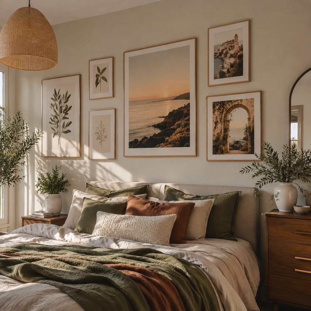
Prints can make a room feel instantly more alive. Picking the right one is like choosing the perfect outfit for your walls.
1. Sunlit Botanical Line Art for Everyday Calm
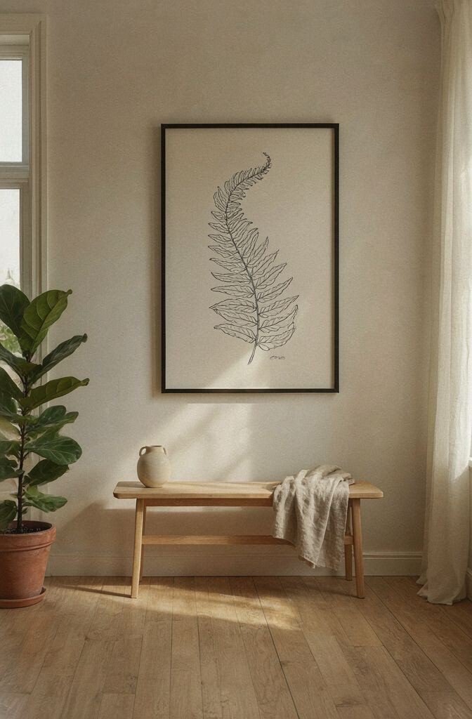
Think of clean leaves and soft stems drawn in gentle lines. It brings a fresh, breezy mood without needing bright colors.
Use it in a kitchen nook, hallway, or a small reading corner where you want quiet energy. Keep the palette muted like sage, cream, or light gray so the print works with many styles. Hang it at eye level and leave a little space around it for an airy look.
2. Bold Citrus Posters That Spark Instant Cheer
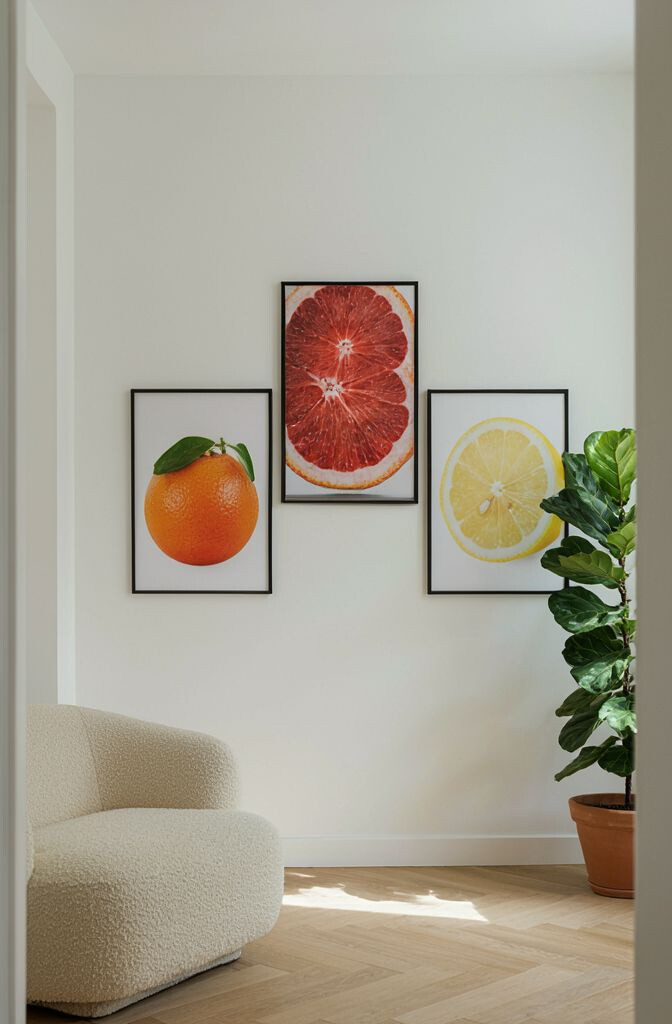
Imagine oranges, lemons, and limes turned into graphic shapes. The colors can bounce light around your room and lift the mood.
This style feels fun and modern, especially in a dining area or home office. Choose one strong print as the hero and pair it with simpler frames. If you want it to feel balanced, match a cushion, mug, or curtain color to the poster’s brightest shade.
For cost control, buy one larger print instead of several small ones. Try a standard frame size you can reuse later if you change your theme. Seasonal tip: swap out accents in yellow or orange during summer for an easy refresh.
3. Gallery Wall With Mixed Photo Prints and Handwritten Notes
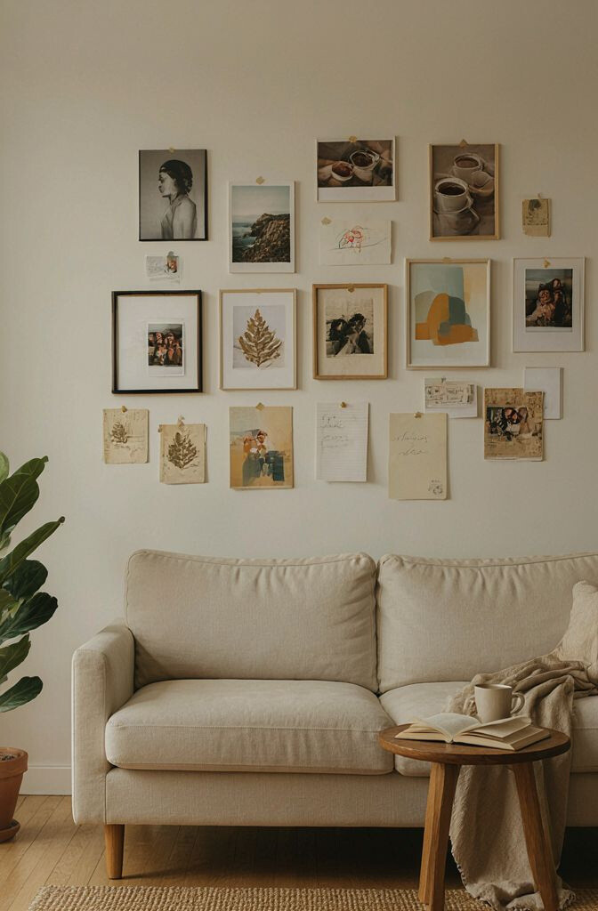
A gallery wall becomes warmer when it includes real memories. Add prints of family trips, cozy moments, or pets alongside small note-style cards.
This works because it mixes personal meaning with visual variety. Use consistent frames so the wall stays neat even when the content differs. Try keeping two or three color tones across the photos to avoid a busy look.
Unique idea: include one print that’s mostly white space with a short handwritten caption. You can print the text on textured paper for a handcrafted feel. Start by laying frames on the floor first, then tape the layout to the wall.
If you want a budget-friendly route, use affordable print services and thrift frames. Go for matte finishes to prevent glare and keep skin tones looking natural. For trend alignment, many homes now mix candid photos with minimal design cards.
4. Black-and-White City Maps for a Stylish Travel Mood
City maps printed in crisp black and white look clean and grown-up. They add story without demanding bold color.
Try a map of a favorite place above a desk or in the entryway. Choose a simple frame and let the lines do the work. This print stays unique because it’s both decorative and meaningful to you.
5. Soft Watercolor Clouds for a Calm Bedroom Layer
Watercolor clouds feel gentle and dreamy, like a light sky at dusk. The blur of color adds softness to your wall.
These prints can make a bedroom feel quieter and more restful. Pair them with light linens and warm neutrals so everything blends. If you like variety, choose one larger piece and two smaller matching prints.
To keep it personal, print a cloud scene that matches your favorite color moments, like peach and lavender. A simple gold or walnut frame can make the colors pop without looking loud. This trend keeps showing up because it’s soothing and works in many interior styles.
6. Geometric Abstract Shapes for a Modern Pop
Geometric prints bring energy with triangles, blocks, and sharp lines. They look especially great in modern spaces.
Use them in a living room, above a console table, or as a focal point on a feature wall. Pick a limited color set so the pattern doesn’t overwhelm the room. If your furniture is neutral, you can go bolder with the print colors.
Make it unique by choosing a print that matches the shape of something else in the room, like a hex side table. For practical styling, keep surrounding decor minimal so the print stays clear. Consider buying a slightly larger size for stronger visual impact.
7. Typography Prints With Motivational Words and Dates
Typography prints turn your walls into a daily reminder. A few strong words can set the tone for the entire room.
Choose quotes that match the space, like “Slow Mornings” for a kitchen or “Create Every Day” for an art corner. Use simple fonts and plenty of white space for a clean look. If you want personalization, add a family date, a hobby, or a place name you love.
Style tip: keep the text print in a matching frame with other art to create a cohesive set. You can also print your words on textured paper for a more premium feel. For cost, look for single-sheet designs that fit standard frames.
8. Cozy Cottage Floral Prints for Warm, Nostalgic Charm
Floral cottage prints feel like fresh flowers in a vase. They add warmth and a gentle sense of nostalgia.
They work beautifully in bedrooms, bathrooms, and reading nooks. Choose florals with soft backgrounds so they don’t feel too busy. To keep the look balanced, combine one floral print with a plain or striped design elsewhere.
Unique angle: look for prints that include tiny bees, butterflies, or vintage labels. Those little details make the artwork feel special up close. If you love DIY, you can frame dried-press flower images too, but keep them protected behind glass.
Budget considerations: thrift vintage prints or search for reproduction posters in bulk sizes. Trends right now favor vintage-inspired florals paired with modern, simple frames. This mix makes the space feel both cozy and current.
9. Monochrome Patterned Wallpaper-Style Prints for Depth
If you want a bold look without heavy color, patterned prints are perfect. Monochrome designs can add depth while staying easy to style.
Use one large patterned print behind a sofa, bed, or dresser. Choose a pattern that has a clear rhythm so the wall doesn’t feel chaotic. Pair it with simple decor in warm wood tones to soften the contrast.
10. Oversized Abstract Waves for a Bathroom Upgrade
Wave prints look great in bathrooms because they echo movement and water. Oversized designs can make the whole space feel larger.
This print can act like a focal point above the towel storage or near the shower door area. Choose colors like seafoam, pale blue, or soft gray to keep it calming. If you have bright tiles, let the print be quieter to avoid color overload.
Practical tip: use moisture-safe framing or place the print away from direct steam. Consider a canvas print for a modern texture that hides minor imperfections. This style is trending because it feels spa-like and easy to refresh with new towels.
11. Vintage Advertisement Prints for Retro Personality
Retro advertisement-style prints add character with playful layouts and vintage typography. They feel like little time capsules on your wall.
They’re unique because they combine design with story. Hang them in a kitchen, bar cart area, or home office to spark conversation. Try choosing prints that share a similar color palette, like cream, red, and dark green.
For practical styling, frame them in matching sizes so the wall looks intentional. If you’re going for a layered look, add one print slightly offset from the others. Budget-friendly option: look for scans of vintage posters and print them yourself at a reliable shop.
Current trends love “nostalgic but clean” decor, so keep the rest of your room simple. Let the vintage print be the bold element while your furniture stays neutral. This balance keeps the retro vibe from feeling cluttered.
12. Minimal Line Portraits for an Artistic Office Feel
Single-line portraits look elegant and creative at the same time. They can add personality without filling every inch with color.
Use one centered portrait above your desk or in a workspace corner. Choose muted ink tones like black, charcoal, or deep blue for a polished feel. If you want to personalize, pick portraits that match your interests, like a favorite musician or a family member.
13. Color-Block Art Prints for a Fun Corner Statement
Color-block prints are bold rectangles that instantly grab attention. They make a space feel upbeat and contemporary.
They’re great for small corners because they create a strong focal point. Choose two or three colors that match items you already own, like pillows, a rug, or a lamp. If your room is neutral, go brighter; if it’s already colorful, choose softer tones.
Make it unique by arranging multiple color-block prints in a grid. You can also mix sizes, like one large block paired with two smaller ones. Practical tip: keep frames consistent so the layout looks designed, not random.
Cost consideration: color-block prints are often affordable and can be printed larger without losing clarity. Look for high-resolution images so edges stay crisp. This trend stays popular because it’s simple to style and easy to change later.
14. Nature Silhouette Prints for Subtle Texture
Silhouette prints show nature shapes like trees, mountains, or birds in dark tones. They look minimal but still add character.
This style works well in living rooms, entryways, and calm bedrooms. Choose silhouettes that match your landscape vibe, like coastal waves or forest scenes. For personalization, select a silhouette of a place that matters to you and frame it in a simple matte black.
15. Patterned Tile-Style Prints for a Mediterranean Touch
Tile-style prints bring that sunny, Mediterranean feeling. They can make a wall look styled and rich, even with simple decor.
Use one framed tile pattern above a console table or on a bathroom wall. Choose colors like terracotta, navy, and cream for a classic look. If your room has busy patterns already, pick a tile print with a limited palette.
Unique idea: pair tile prints with plain ceramics and woven baskets. That combo makes the whole space feel themed without extra effort. For practical styling, hang the print where it catches natural light so the colors glow.
16. Family-Photo Cinematic Prints With Dark Borders
Cinematic photo prints feel like movie stills on your wall. Dark borders add drama and frame your memories nicely.
This approach is unique because it changes how photos feel. Instead of casual snapshots, the wall looks curated and intentional. To keep it cohesive, use a consistent crop style and color tone across all photos.
Cost considerations: many print shops offer bulk discounts for matching sizes. Try printing on thicker paper for better quality without spending too much. Trend-wise, “gallery moments” with consistent frames remain a favorite because they look polished.
17. Inspirational Kids’ Art Prints for a Playful, Personal Wall
Turning children’s artwork into prints makes your wall feel truly personal. It’s playful, meaningful, and always one-of-a-kind.
It also keeps memories alive, especially if the original drawings get lost over time. Use a clean background around the art so the colors stand out. Practical tip: scan or photograph the art in good light, then print it with a slight border.
Personalization idea: add the date, age, or a short caption beneath each piece. This makes the wall feel like a timeline of creativity. If you worry about cost, start with just three prints and expand later.
This trend is growing because people love “lived-in” decor that shows real life. Frames are the flexible part, so you can update prints as your child’s style changes.
18. Metallic Foil-Accent Prints for a Luxe Glow
Metallic foil prints add sparkle without needing much else. Even a small amount of shimmer can brighten a room.
Use these prints in a living room, entryway, or above a console where light hits them. Choose complementary colors like cream with gold, navy with silver, or black with warm rose tones. For practical care, avoid hanging them where direct sun will fade the artwork.
19. Earth-Tone Landscape Prints That Make Rooms Feel Grounded
Earth-tone landscapes bring calm and balance to your space. Think warm hills, soft skies, and natural textures that feel grounded.
They work especially well with wood furniture, beige walls, and cozy textiles. Choose a landscape with colors already present in your decor to make everything feel connected. A unique twist is selecting prints with foggy atmosphere, which adds softness rather than harsh contrast.
Cost tip: landscape prints often look great even at standard sizes, so you can shop efficiently. Search for high-resolution prints that include fine detail in trees or mountains. This style stays current because it pairs well with modern natural interiors.
20. Color Wheel Art Prints for a Creative Classroom Vibe
Color wheel and art-learning prints make creativity feel visible. They’re bright, playful, and surprisingly stylish.
Use them in a home studio, craft room, or play area to keep the space feeling energizing. Choose a print that matches your decor colors so it feels intentional, not random. For personalization, add a frame with a simple “my favorite colors” note or a small calendar card.
21. Minimal Poster Sets for a Quick Swap Refresh
Minimal poster sets are a smart way to brighten your space without committing to one design forever. They let you switch moods season by season.
This approach is unique because it turns wall decor into a flexible habit. Start with a set that shares one color, one font style, or one simple theme like “calm,” “focus,” or “home.” For practical tips, use simple frames and keep sizes consistent for easy swapping.
Cost considerations are friendly because you can buy one set gradually. Watch current trends toward modular and mix-and-match wall art, since it helps you keep things fresh. When you’re ready, add one statement print to anchor the set and tie the look together.