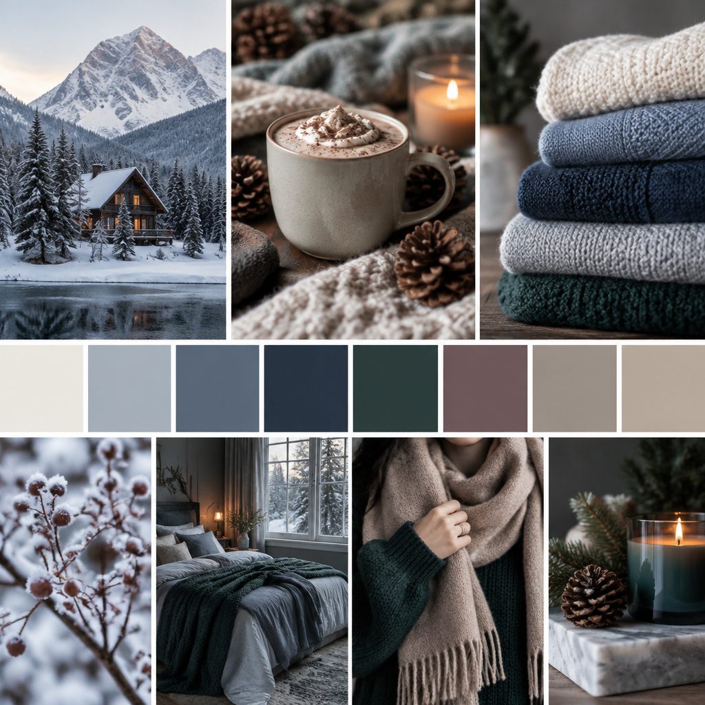
Winter is quietly dramatic, even on a blank page. The right colors can make your work feel cozy, crisp, and confident.
1. Frosted Sky & Snowy White
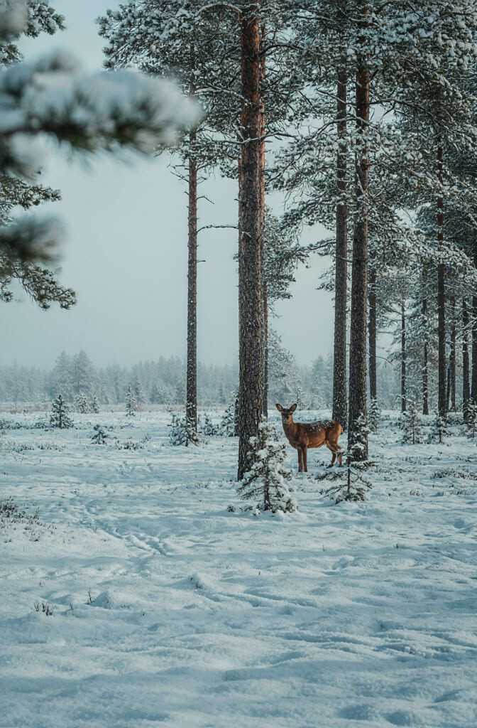
Think of pale blue fading into clean, snowy white. It feels airy, bright, and calm, like morning light on glass.
Use it for backgrounds, headings, and airy product cards. The benefit is that it keeps your layout feeling open and fresh. Pairing these shades also makes it easy to add contrast with darker winter colors later.
2. Pine Evergreen & Warm Cream

Deep evergreen brings a grounded, nature-first mood. Warm cream softens the edges so everything still feels friendly.
This palette is great for branding materials, packaging, and holiday-themed print. It stands out without looking harsh because the cream warms up the green. If you want extra comfort, use cream for large areas and evergreen for key details.
For personalization, try a mottled cream texture behind smooth green shapes. A simple trend to watch is combining dark botanicals with lighter, creamy neutrals for a more modern “winter cozy” look. Budget-wise, you can buy or mix a cream that matches your paper tone to save on custom ink work.
3. Charcoal Night & Icy Silver
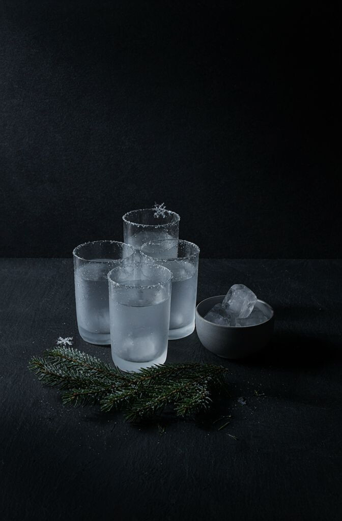
Charcoal creates a bold winter backdrop with a sleek, nighttime mood. Icy silver adds sparkle without needing glitter.
This duo works beautifully for logos, app icons, and poster designs. The benefit is strong contrast, which helps text stay readable. Add silver accents to small elements like dividers, buttons, or highlights.
To make it unique, use a matte charcoal with a metallic-looking silver for depth. Current trends often lean toward “tech winter” palettes that feel futuristic but still seasonal. If cost is a concern, keep silver limited to small areas so printing stays affordable.
Try testing your colors in different lighting, since dark palettes can shift on screens and paper. A quick tip is to choose one near-black for body text so it stays crisp even at small sizes.
4. Rosewood Berry & Soft Linen
Rosewood berry feels like winter berries under a fading sunset. Soft linen keeps the whole palette gentle and wearable.
Use it for invitations, stationery, and lifestyle brand visuals. This combination is unique because it blends seasonal richness with a calm, neutral base. Practical tip: keep berry as the star color and linen for the big blocks so your design breathes.
5. Mountain Teal & Mist Gray
Mountain teal looks cool and strong, like cold air over tall peaks. Mist gray makes it feel light, not heavy.
This palette is excellent for editorial layouts, UI sections, and wallpapers. It gives you a crisp, modern feel while still being soothing. If you want easy readability, reserve teal for headings and use mist gray for supporting text.
To personalize, try a gradient from mist gray into teal for a “fog lifting” effect. A trend right now is pairing muted cool greens and grays for nature-inspired tech aesthetics. For cost, using grays and teals that print well together can reduce the number of ink passes in simple designs.
6. Sleet Blue & Butter Sand
Sleet blue has a slightly gray tint that feels realistic and wintry. Butter sand adds a sunny warmth that balances the cold tones.
This palette is perfect for cozy fashion visuals, winter menus, and home decor mockups. It stands out because it mixes a weathered cool with a smooth, friendly neutral. A practical approach is to use butter sand for large surfaces and sleet blue for typography and shapes.
7. Ice Teal & Snowdrift Pearl
Ice teal feels crisp and clean, like shimmering water under snow. Snowdrift pearl brings a creamy brightness that never feels stark.
This color pair is a strong choice for product labels, skincare branding, and calming wellness sites. The benefit is a balanced glow that still looks winter-appropriate. For practical tips, keep your main background in pearl and use ice teal for icons, borders, and buttons.
To make it unique, add small “frost” speckle patterns in a lighter tint of teal. Current trends favor soft, luminous neutrals paired with cool accents. If you’re working with limited materials, test pearl and teal on the exact paper or fabric you’ll use to avoid surprise dullness.
8. Redwood Clay & Cinder Stone
Redwood clay feels like warm earth warmed by a low winter sun. Cinder stone adds a sturdy, grounded gray that makes the reds look richer.
This palette works well for ceramics, craft branding, and rustic interiors. It’s unique because the red is warm but not loud, and the gray keeps it sophisticated. Practical tip: use cinder stone for text and clay for packaging highlights and callouts.
For personalization, try pairing clay with a slightly darker terracotta for shadows. A trend in winter design is leaning into “warm earth” palettes to counter the season’s chill. Cost-wise, earthy colors often mix well with standard pigments, which can help if you’re DIYing.
You can also use clay tones in small details like stickers or stamp effects for a handmade vibe.
9. Plum Frost & Icicle White
Plum frost brings a deep, elegant cool that feels like velvet in winter. Icicle white keeps it fresh and readable.
This palette is great for invitations, event posters, and any project that wants a classy mood. The benefit is that plum adds personality while icicle white keeps the design crisp. Keep large areas mostly white so plum reads as intentional and not overwhelming.
To make it unique, add a subtle gradient from icicle white to a pale lavender for a softer edge. A current trend is using rich winter jewel tones but giving them plenty of clean negative space. If you’re watching costs, choose a single plum tone and use transparency or lighter tints instead of multiple custom shades.
Try testing your color contrast with actual text sizes, since deep tones can look different on different screens.
10. Glacier Blue & Deep Navy
Glacier blue feels like open sky, bright but not too light. Deep navy adds strength and a classic winter contrast.
This combo is a reliable choice for website sections, app dashboards, and signage. The benefit is clear hierarchy: navy handles the structure while glacier blue creates friendly emphasis. Use navy for navigation and headers, then glacier blue for icons and highlights.
11. Evergreen Mist & Warm Toast
Evergreen mist is a softer, muted green that feels calm and covered. Warm toast adds a cozy, baked-gold touch that feels inviting.
This palette shines in food branding, winter crafts, and community event visuals. It’s unique because the greens feel airy while the gold warms the scene. A practical tip is to keep toast for small accents like seals, button highlights, and underline strokes.
To personalize, combine evergreen mist with a light texture that mimics paper fibers or frosty streaks. Trends often include nature greens paired with warm neutrals to create “seasonal comfort.” For cost, limiting toast to small areas can reduce printing complexity while still giving a premium feel.
12. Slate Green & Snow Mint
Slate green gives a moody, slightly desaturated winter vibe. Snow mint adds a gentle, lively lift.
This palette is a strong option for sustainability brands and eco-friendly packaging. The benefit is that it feels natural and modern, not overly festive. Practical tip: use slate green for headings and borders, and snow mint for secondary surfaces.
To make it unique, try a two-tone pattern where mint forms highlights and slate creates the structure. A current trend is refreshing winter visuals with softer greens rather than only blues or grays. Budget-wise, muted colors can be forgiving, which helps if you’re matching existing brand assets.
If you’re designing for print, test on matte paper first because gloss can make mint look too bright.
13. Cinnamon Smoke & Winter Fog
Cinnamon smoke feels like cozy spice, softened by cooler air. Winter fog is a pale gray that smooths the whole palette.
This color set works beautifully for typography-heavy designs and cozy-themed campaigns. The benefit is strong warmth with a calm neutral anchor. Try using fog as your background and cinnamon smoke for key messages and decorative shapes.
To personalize, use a slightly darker cinnamon for shadows and a lighter tint for gradients. A trend right now is mixing spicy warm tones with cool grays for a balanced, modern winter look. If you’re mindful of cost, keep to fewer shades and let spacing do the work.
You can also add thin line art in fog to make layouts feel airy without adding extra colors.
14. Red Morrow & Pale Steel
Red morrow brings a bold, winter-ready pop that feels warm and energetic. Pale steel adds a crisp, cool contrast that keeps it from feeling too loud.
This palette is ideal for posters, seasonal sales banners, and product callouts. The benefit is instant attention: the red captures the eye while pale steel keeps the overall design clean. Practical tip: reserve red for short text, icons, or small blocks, and use pale steel for the majority of the background.
15. Winter Ochre & Cloud Navy
Winter ochre looks like softened sunlight after a snowfall. Cloud navy provides a deep, soothing base that feels elegant and calm.
This combination is unique because it blends a muted golden warmth with a cool, grounded blue. It works well for brand systems, stationery, and even presentation slides. Practical tip: use cloud navy for headers and borders, then let winter ochre highlight key details and charts.
To personalize, consider a subtle ombré from cloud navy into a lighter steel tone, then add ochre accents on top. A current trend is using muted “antique” golds with cool blues for a vintage-modern winter feel. For cost considerations, limit the golden hue to fewer elements so your design stays striking without requiring many complex color layers.