Soft color can slow your thoughts down in the best way.
These calming combinations will help your home feel quieter and more you.
-
1. Cloud White + Cool Gray + Warm Linen
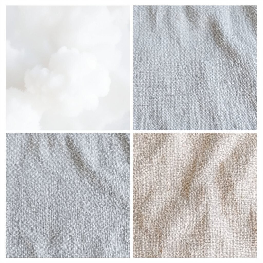
Cloud White + Cool Gray + Warm Linen Picture airy cloud white walls with gentle cool gray accents in shelves and frames.
Add warm linen curtains or bedding so everything feels cozy instead of cold.This scheme benefits your space by making it look brighter and more open, even in smaller rooms.
Gray adds calm structure, while linen adds comfort you can feel every day.
It is unique because the warmth lives in the fabric, not the wall color. -
2. Sage Green + Mist Beige + Soft Off-White
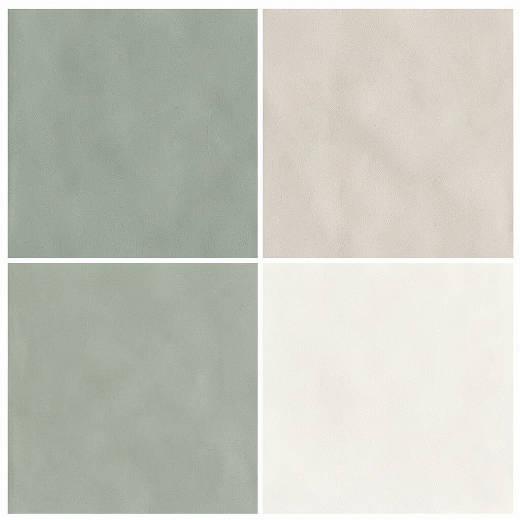
Sage Green + Mist Beige + Soft Off-White Imagine sage green paint paired with mist beige trim and a soft off-white ceiling.
The result looks like sunlight filtered through leaves.This combination helps you relax because green is naturally soothing.
It is great for bedrooms, reading corners, and bathrooms that need a gentle “reset.”
You can personalize it by choosing sage that leans more blue or more yellow.Keep costs in mind by focusing your budget on one hero area, like a feature wall or a large area rug.
If you want an easy upgrade, swap cabinet hardware or add a simple green throw pillow set. -
3. Dusty Rose + Sand + Charcoal Whisper
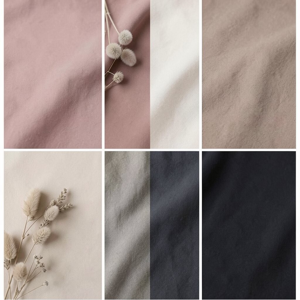
Dusty Rose + Sand + Charcoal Whisper Think of dusty rose walls with sand flooring tones and a charcoal “whisper” in small details.
The room will feel tender, like a warm breeze without being loud.This scheme benefits you by giving softness without losing balance, because charcoal keeps it grounded.
It feels unique because rose can read calm when it is muted, not bright.Try personalization by mixing rose textiles with slightly different sand shades, like oatmeal and taupe.
For trend energy, pair dusty rose with minimal lines in modern furniture and matte finishes.
If you are cost-conscious, start with paint samples and update accessories first.A budget tip: choose washable fabric covers for chairs or a duvet set before committing to bigger purchases.
Add one small charcoal item, like a lamp base, to make the colors feel intentionally styled. -
4. Seafoam + Light Gray + Whitewashed Wood
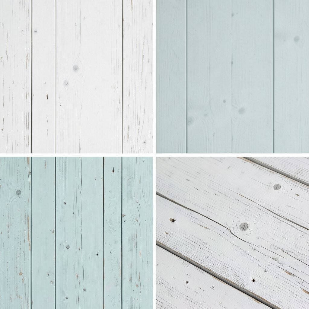
Seafoam + Light Gray + Whitewashed Wood Visualize seafoam walls beside light gray textiles and whitewashed wood furniture.
It feels like coastal calm, even if you live far from the ocean.
This scheme benefits you by making daily life feel lighter and breezier.Personalize it by choosing seafoam that is more green or more blue, then repeat that tone in smaller accents.
Keep it budget-friendly by painting just one area, like a shelf backdrop, and leaving larger items for later. -
5. Periwinkle + Pale Cream + Soft Brass
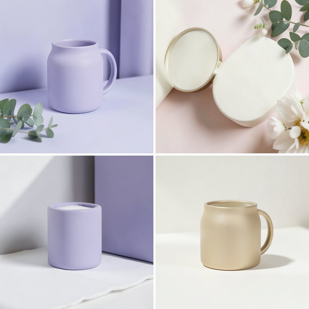
Periwinkle + Pale Cream + Soft Brass Imagine periwinkle as a gentle wall color, then balance it with pale cream trim.
Add soft brass in picture frames or cabinet handles for a warm glow.
The space will look dreamy, like a clear sky in a quiet room.This pairing benefits your home by creating a calm mood with just enough shine.
It is unique because cool blue and creamy warmth work together without turning the room icy.For personalization, match brass tones across three places only, so it feels collected, not scattered.
A cost consideration: if you cannot swap all hardware, repaint one lamp base or use brass-toned trays. -
6. Butter Yellow + Linen White + Toasted Umber
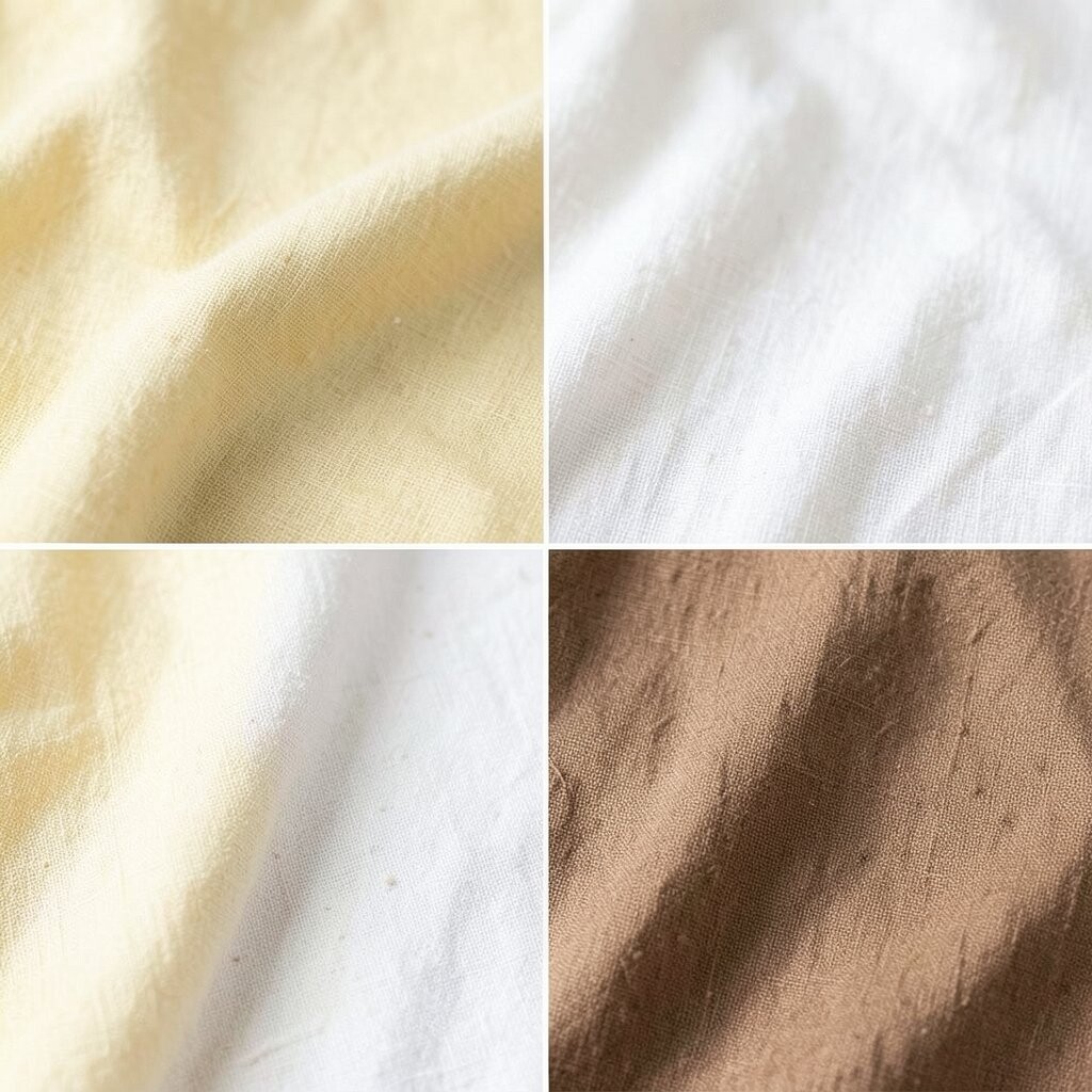
Butter Yellow + Linen White + Toasted Umber Picture butter yellow accents that look like morning light, paired with linen white linens.
Add toasted umber wood or woven baskets for depth.This scheme benefits you by lifting your mood without using harsh bright colors.
It is unique because the yellow stays soft when it is buttery, not neon.
Personalize it by choosing butter tones that match your existing flooring, especially if you have warm wood. -
7. Lavender Gray + Cloud White + Slate Lines
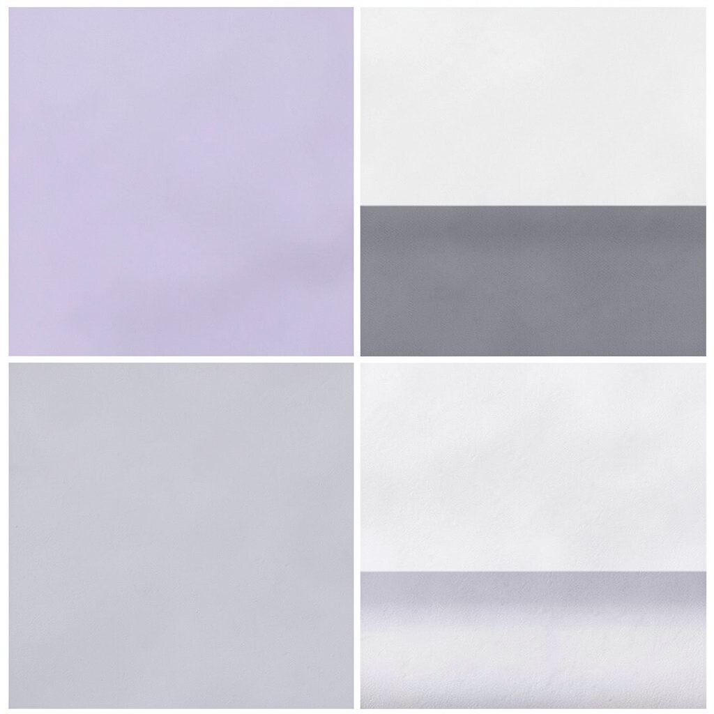
Lavender Gray + Cloud White + Slate Lines Think of a gentle lavender gray background with cloud white baseboards.
Add slate lines in a rug pattern or framed prints.This scheme benefits your space by creating a restful vibe while still looking designed.
It is unique because lavender gray can feel both modern and cozy.
Try personalization by using one bolder slate accent, like a single chair or a bold artwork frame.For a trend-friendly look, choose textured fabrics like bouclé, knit throws, or linen-blend curtains.
Budget-wise, start with removable items: pillow covers, peel-and-stick wall art, and a patterned runner. -
8. Charcoal Green + Warm Cream + Olive Leaf Prints

Charcoal Green + Warm Cream + Olive Leaf Prints Imagine charcoal green walls that look deep but calming, paired with warm cream furniture legs.
Finish with olive leaf prints on cushions or framed botanical art.This scheme benefits you by making a room feel safe and grounded, like being inside a book.
It is unique because the green is dark enough to feel rich, but the cream keeps it soft.Personalize it by repeating leaf patterns in two or three places only, such as pillows, a tray, and one wall print.
If cost is a factor, buy one statement artwork first, then build the rest around it.A simple tip: choose matte paint for walls so it absorbs light and feels extra calm.
Swap in olive-toned accessories for an instant update without major work. -
9. Pale Cyan + Oyster + Soft Walnut

Pale Cyan + Oyster + Soft Walnut Visualize pale cyan walls with oyster curtains and soft walnut furniture.
The mood feels fresh, like clean linens after a breeze.
This scheme benefits your space by adding gentle color without overwhelming the room.Personalize it by varying cyan intensity, from very light on walls to slightly deeper tones in throw pillows.
Keep costs reasonable by adding one new fabric set and reusing your existing frames with matching mats. -
10. Soft White + Taupe + Gentle Black Accents
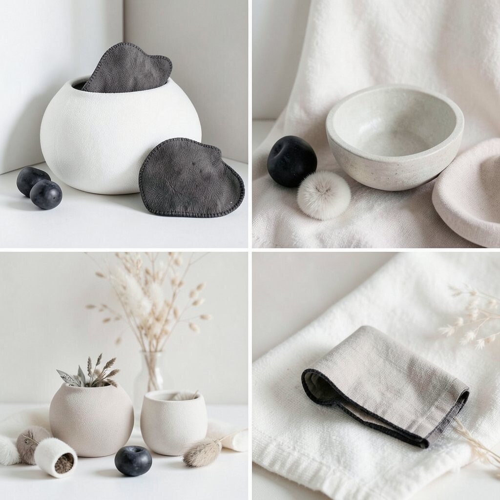
Soft White + Taupe + Gentle Black Accents Picture soft white walls with taupe sofas and rugs.
Add small gentle black accents in thin frames, candle holders, or a light fixture.
The whole room will feel tidy and calm, like everything has its own place.This scheme benefits your home by staying timeless and easy to update over time.
It is unique because it feels “quiet modern” without turning into a cold showroom.Personalize it by mixing taupe textures: boucle, smooth leather, and woven baskets.
For cost considerations, you can repaint a wall or two, but you might also save money by changing pillow covers and art prints first. -
11. Warm Apricot + Creamy Beige + Dark Espresso
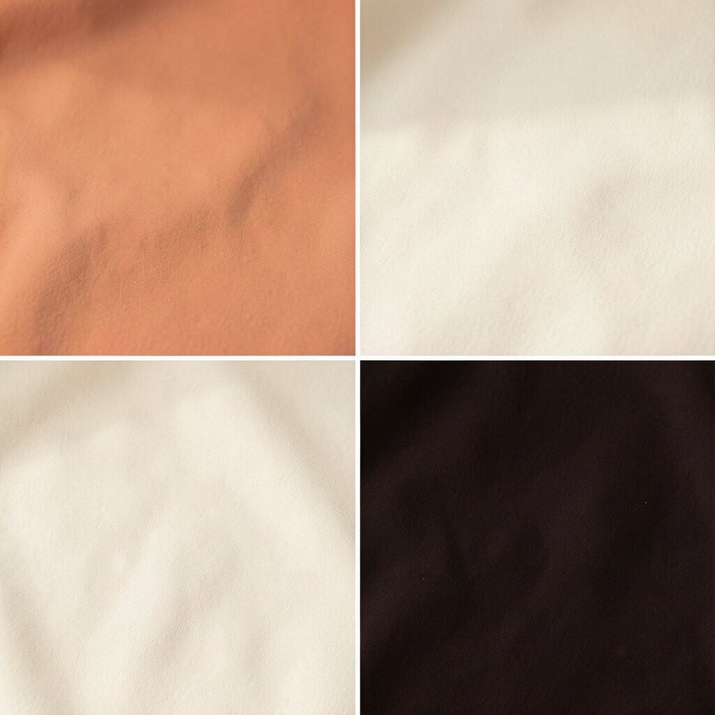
Warm Apricot + Creamy Beige + Dark Espresso Imagine warm apricot on a focal wall, balanced with creamy beige everywhere else.
Let dark espresso appear in wood details, like a side table or open shelving.This scheme benefits you by adding a calm glow that feels welcoming, not overpowering.
It is unique because apricot can read relaxing when it is muted and paired with creamy neutrals.
Personalize it by adding apricot in small items like a vase, a blanket, or framed prints. -
12. Cool Sand + Powder Blue + Soft Gray Stone
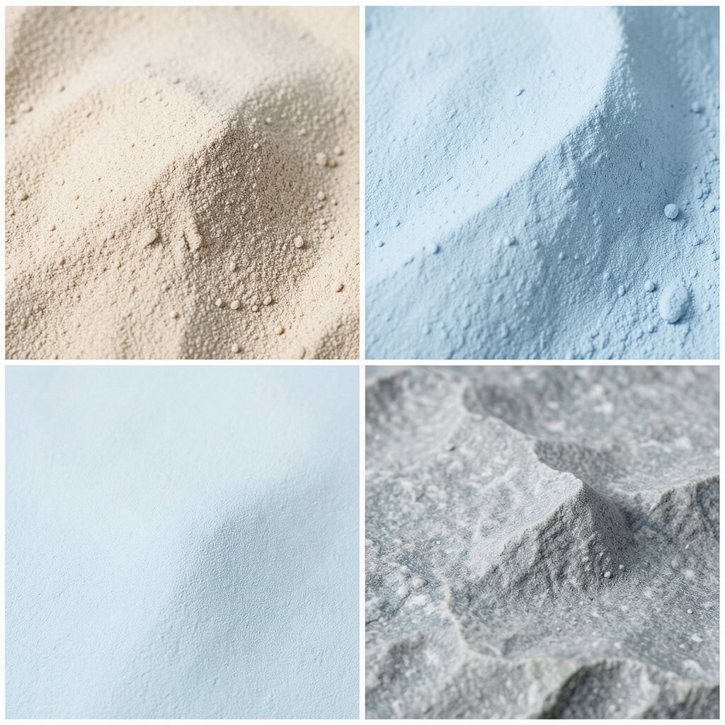
Cool Sand + Powder Blue + Soft Gray Stone Think of cool sand floors or rugs, with powder blue walls in small or medium doses.
Add soft gray stone in countertop tones or decorative trays.This scheme benefits your space by creating a soothing “spa-like” feel.
It is unique because powder blue can feel gentle when paired with sandy grounding.
Try personalization with blue only in textiles so it is easy to switch later.A current trend is mixing soft color with stone-like textures, so look for ceramic vases, matte finishes, and subtly patterned tiles.
Cost-wise, buy a rug or curtains with the powder blue already blended in, so you do not need to repaint big areas. -
13. Mint Cream + Light Sage + Woven Natural Fiber
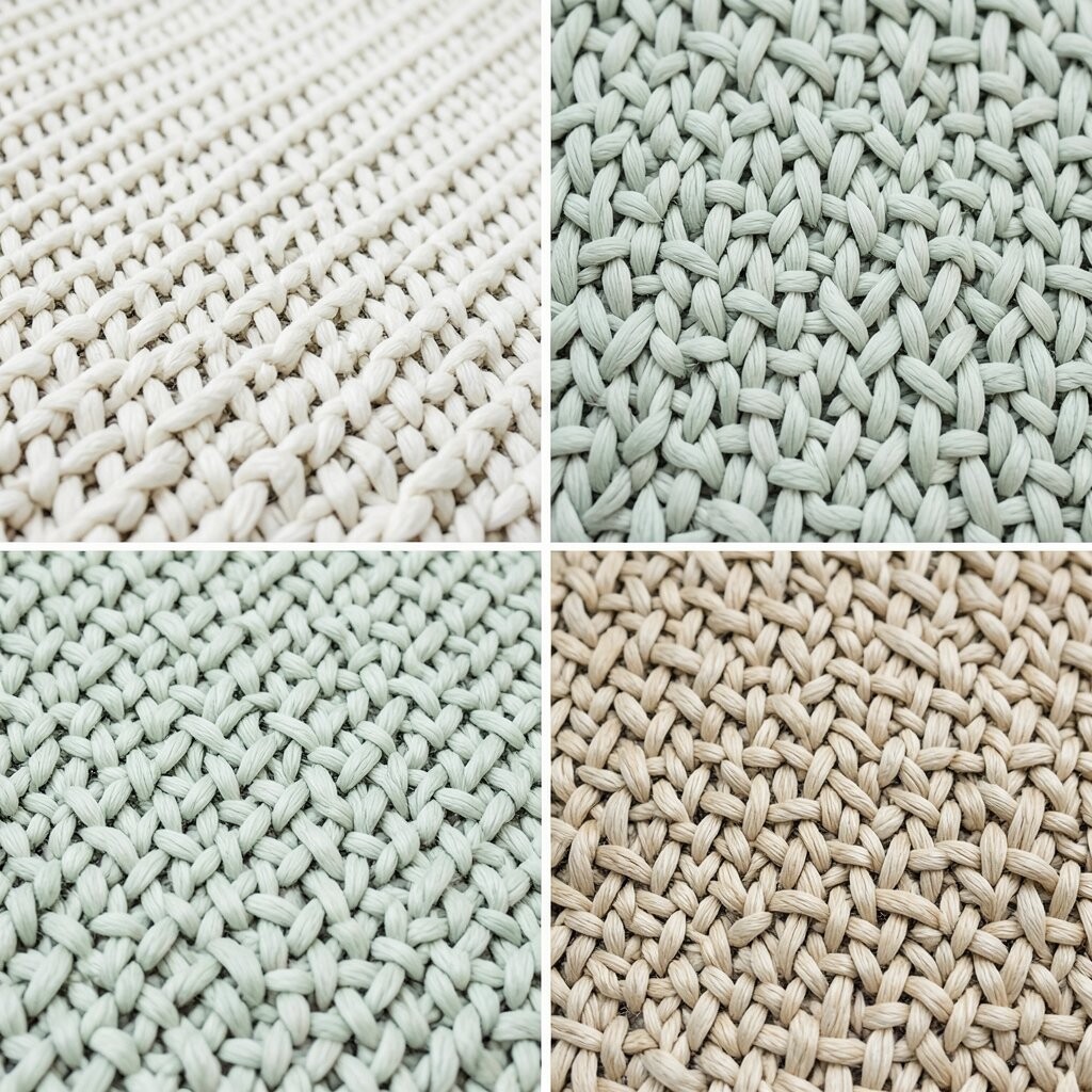
Mint Cream + Light Sage + Woven Natural Fiber Picture mint cream walls with light sage accents in cushions and blinds.
Add woven natural fiber baskets to bring in texture and breath.This scheme benefits your space because it looks airy and feels gentle to the eye.
It is unique because mint cream and sage create a calm green layer, not a loud statement.Personalize it by choosing basket colors that match your flooring, like tan, light brown, or pale gray.
If you want to save money, focus on texture: a few baskets, a layered rug, and linen-like curtains can do a lot.For added trend energy, mix matte ceramics with woven items and keep everything in warm natural tones.
Add one mint-colored candle or small wall art piece to tie it together. -
14. Blush Pink + Soft Taupe + Natural Linen Texture
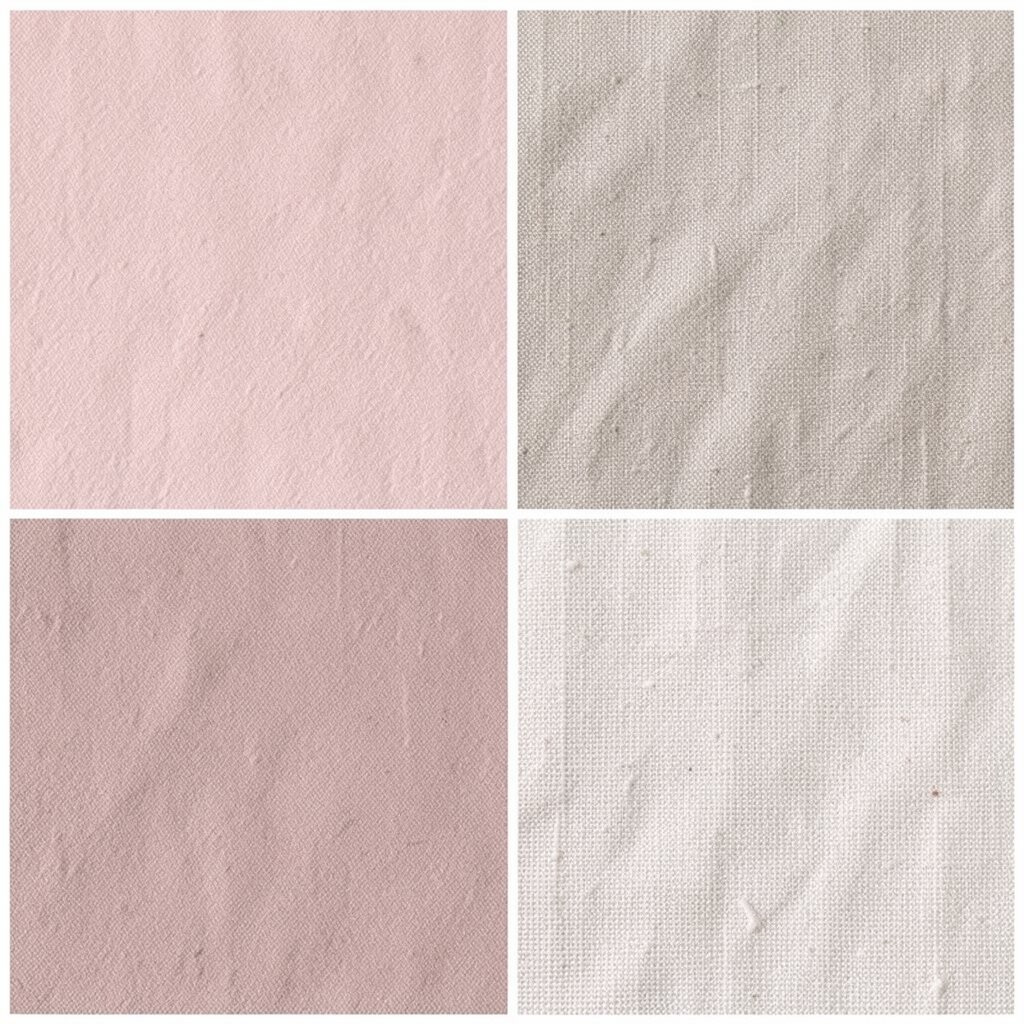
Blush Pink + Soft Taupe + Natural Linen Texture Imagine blush pink pillows on a soft taupe sofa, with natural linen curtains floating in the background.
The room will feel sweet, calm, and easy to live in.
This scheme benefits you by adding warmth through color without using bright red energy.Personalize it by using blush in multiple shades, like dusty blush and lighter rose-beige, so it feels layered.
Keep costs in mind by upgrading one textile set at a time, such as curtains or duvet covers. -
15. Sky Blue + Chalk White + Driftwood Tan
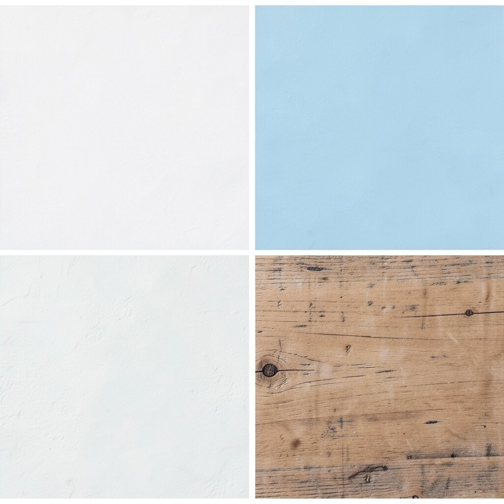
Sky Blue + Chalk White + Driftwood Tan Visualize sky blue accents with chalk white walls and driftwood tan furniture.
It feels peaceful, like sitting near a window with soft light.
This scheme benefits your space by making it feel airy and gently optimistic.It is unique because it balances blue with “weathered” tan tones instead of stark gray.
Personalize by choosing sky blue that matches your mood: deeper for cozy rooms, lighter for open spaces.For cost considerations, try a peel-and-stick wallpaper stripe or a removable wall decal first.
Then decide if you want to commit to a full paint job later. -
16. Warm Charcoal + Creamy Ivory + Soft Copper
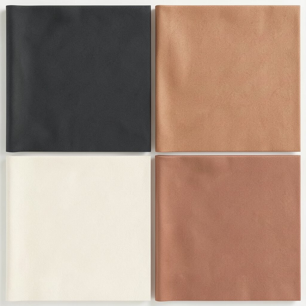
Warm Charcoal + Creamy Ivory + Soft Copper Picture warm charcoal painted cabinetry or a feature wall, paired with creamy ivory shelves.
Add soft copper in a couple of art pieces or a kitchen utensil holder.This scheme benefits your space by creating a stylish, calm contrast.
It is unique because copper adds warmth while staying subtle, especially with matte or brushed finishes.
Personalize it by choosing copper accents that match your existing metal finishes, like faucets or light switches. -
17. Olive Brown + Oat Milk + Quiet Cream
Olive Brown + Oat Milk + Quiet Cream Imagine olive brown as a warm earthy tone, paired with oat milk cream and quiet cream whites.
The room feels grounded, like natural earth after a gentle rain.This scheme benefits you by reducing visual stress, since it uses calm, blended neutrals.
It is unique because olive brown gives depth without going fully dark.
Personalize by adding small green touches through plants, frames, and textured throws.A current trend is bringing the outdoors in, so this palette pairs beautifully with live greenery.
Cost-wise, plants and plant-friendly containers are often cheaper than big furniture changes. -
18. Pale Lilac + Soft Gray + Natural Off-White Panels
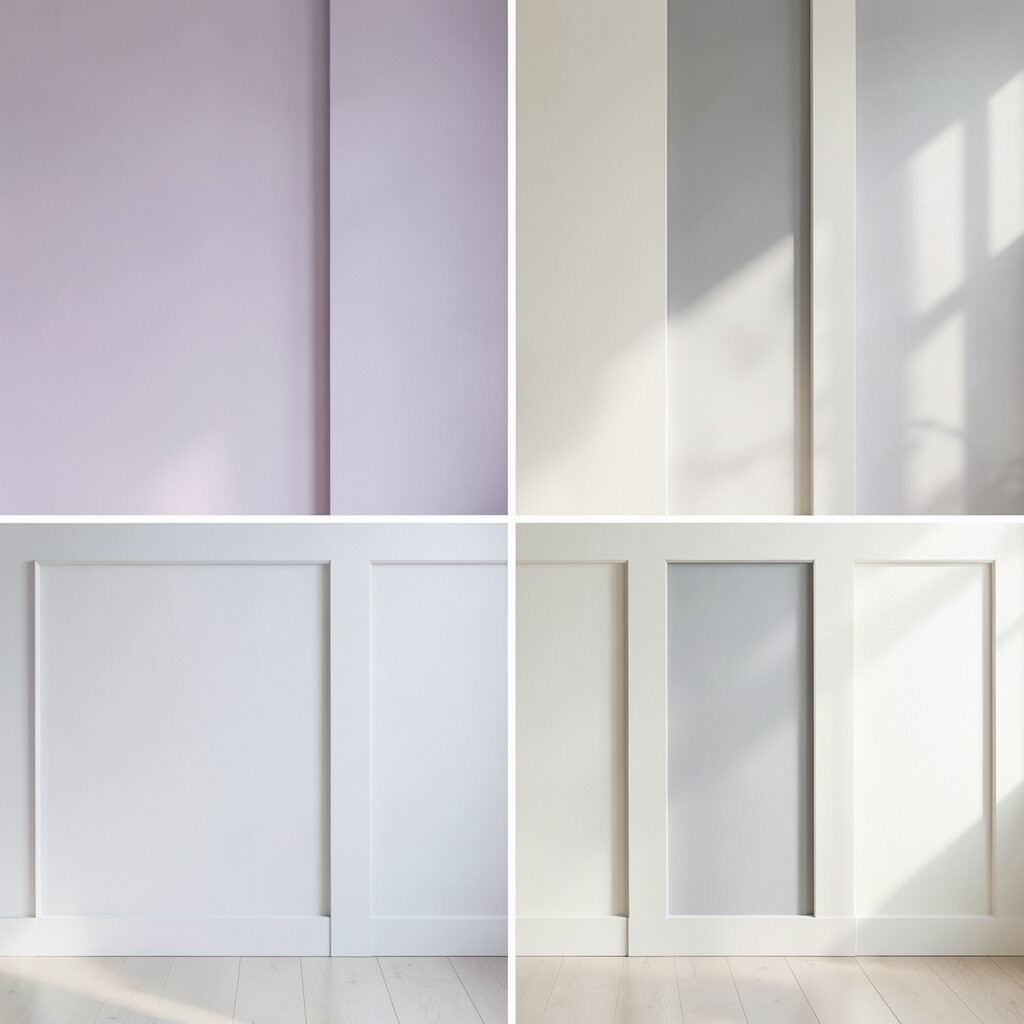
Pale Lilac + Soft Gray + Natural Off-White Panels Visualize pale lilac on walls or headboards, then soften it with soft gray upholstery.
Finish with natural off-white panels like carved screens or linen-backed curtains.This scheme benefits your space by adding a calm color whisper that feels special.
It is unique because lilac stays gentle when it is pale and paired with neutral grays.Personalize it by selecting lilac tones that match your light, like cool lilac for north-facing rooms and warmer lilac for south-facing rooms.
If you are watching your budget, use lilac through removable items such as pillow covers and framed prints.For a modern touch, look for matte finishes, simple geometry art, and sleek lamps in off-white or light gray.
Add texture with a knitted throw so the palette feels inviting, not flat. -
19. Monochrome Sand + Beige Linen + Light Terracotta
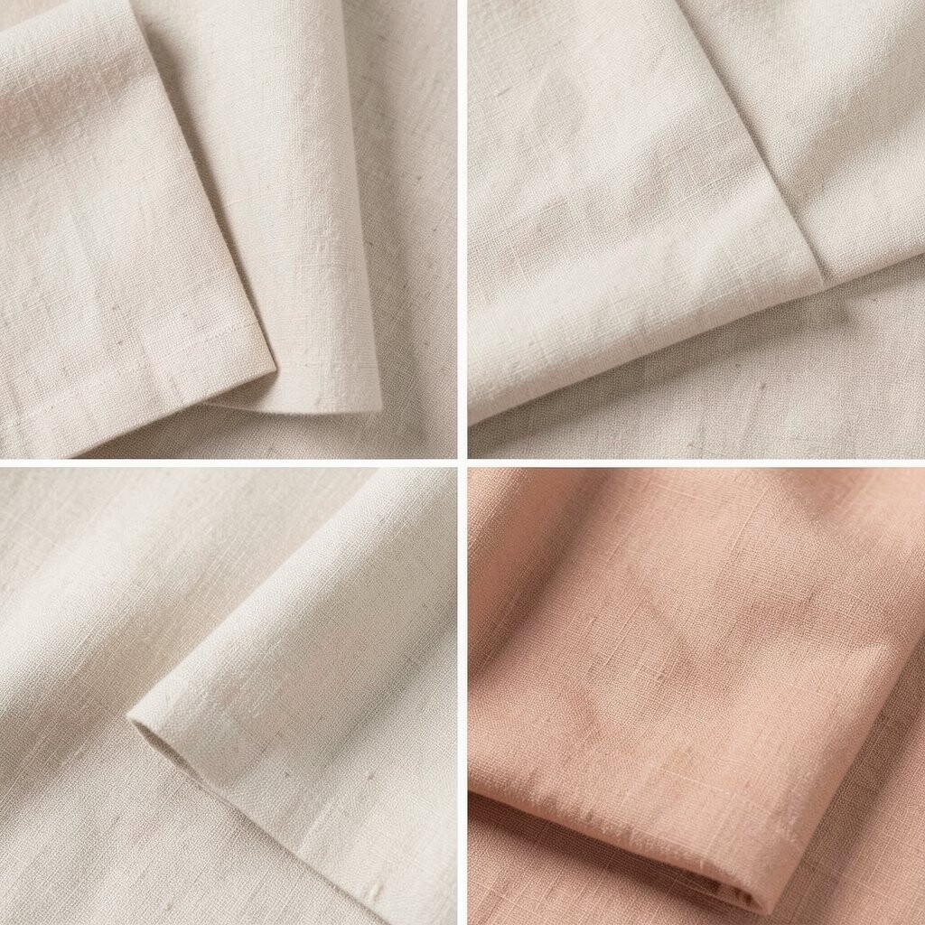
Monochrome Sand + Beige Linen + Light Terracotta Imagine a monochrome sand base with beige linen textures and a small hint of light terracotta.
The space will feel sunlit and calm, like warm sand at the edge of evening.
This scheme benefits you by keeping everything related while still adding life through terracotta.Personalize it by choosing terracotta items you truly love, like a clay vase or a woven wall basket.
Keep costs in mind by buying one terracotta “anchor” piece, then repeating the color lightly in two or three spots. -
20. Deep Teal + Creamy White + Soft Gold Highlights
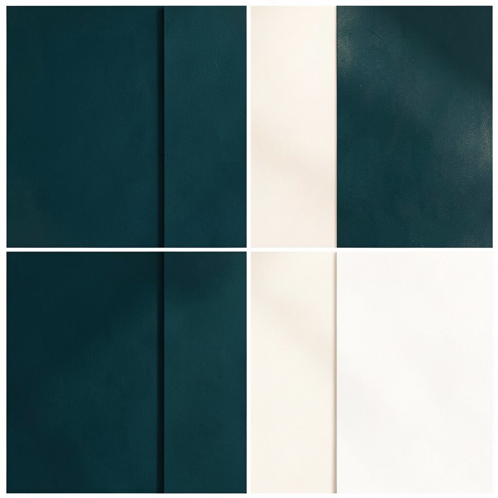
Deep Teal + Creamy White + Soft Gold Highlights Visualize deep teal on cabinets, a dining nook, or an accent wall.
Pair it with creamy white for balance, then add soft gold highlights in lighting and hardware.
The result feels rich, calm, and quietly elegant.This scheme benefits your space by creating a bold-yet-restful focal point.
It is unique because teal brings the calm energy of blue while adding depth like green.For personalization, keep gold accents limited to the most visible areas, like two lamps and one mirror frame.
If cost is a concern, swap in a teal curtain set or a deep teal rug first, since textiles are often cheaper than repainting.For trend relevance, lean into “warm jewel” color stories paired with creamy neutrals and matte textures.
Then finish with soft lighting, because teal looks its best under warm, cozy bulbs.